Logo
The basic logo of Dodo Pizza consists of a text part written in one line and a sign of a bird. In some cases, we can remove the sign or text, spread the text into two lines or drop the logo completely. What these occasions are and how to properly work with the logo, we figure out in this guide with examples.
Types of logos
We have five types of logo: two lines with the sign, one line with the sign, tall logo with the sign, the sign without text, the text without sign. Which logo to pick depends on the task and location of the media.
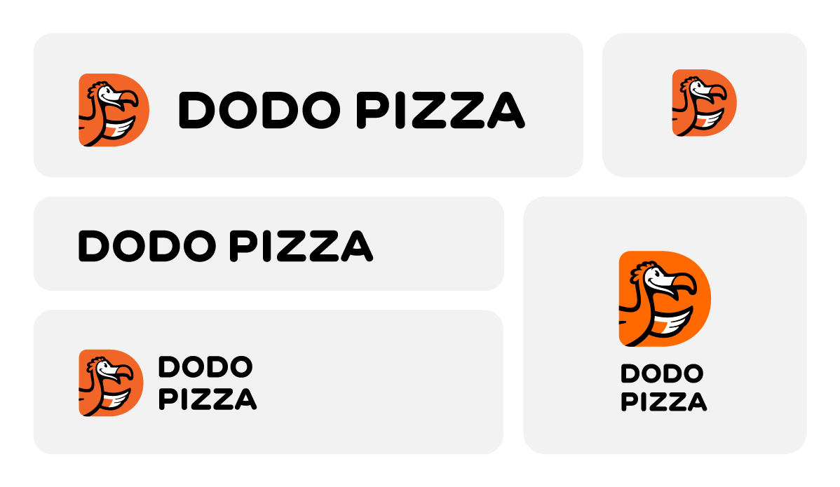
A two-line logo with the sign (Two Line). This is the main Dodo Pizza logo. It is suitable for most formats, including wide and vertical. We use it when we want to highlight the brand. It is relevant for media located in fast-flow zones, where we have only a few seconds to contact the customer, and it is important to make them notice and remember the brand.

One-line logo with the sign (One Line). Suitable for narrow formats such as banners and signboards. It is also used when you want to place a logo on the layout, but do not need to highlight the brand.

Tall logo with the sign (Tall). We use a tall logo in vertical elongated formats or when the composition of the layout itself requires it. For example, this is the version of the logo we most often go for with billboards.
Sign without text (Sign). Suitable for cases when we want to accentuate communication and message on the layout. The sign without text allows you to quickly recognize the brand, “Dodo Pizza”, but at the same time does not overload the layout.

Text without sign (Wordmark). We use the text part of the logo without the sign when we develop a minimalistic design and want to use less graphics. We do such “light” branding on merchandise, tags, pens, toy packaging.
Logo size
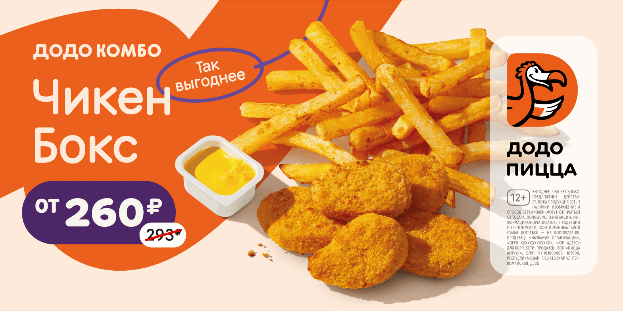
The size of the logo depends on the context of the placement and how important it is to stay visible. We rely on the concept of slow and fast flow zones. In fast-flow zones, the logo should be larger so that the brand is apparent even after a quick contact; in slow zones we can use a small logo or just drop it completely because we already have time to get the person interested in the offer on the layout.
Let's take a look at different media as an example. In video clips, we always show the sign without text in a large way - usually at the beginning and end of the video, because these parts of the clip are best remembered. And we want to be remembered by people who are not yet familiar with Dodo Pizza.
We use light branding on the pizza packaging: we place the text part in one line without the sign on the side of the box, and emphasize creativity in the design. The customer has already ordered pizza from us, and they know the brand, so we avoid creating a “rowdy” advertising media.
In countries where the brand is well known, the logo may vary really frequently. We can consciously make the logo smaller, use only the text part or only the sign, even if the media is in a fast-flow zone. In new markets where the goal is to build recognition, we show the main logo - two lines with the sign - in a large way on most media.
Logo on complex backgrounds
If we place the logo on colored backgrounds, we aim at creating a contrast between the background and the logo. Avoid colors that are too close to orange; try to find a color that is as different from the logo as it can be. If this is not possible, use a logo with a stroke.
Placing a logo with a white text part on an orange background is a mistake. This way the logo “falls out” and is not comprehensive.
Yes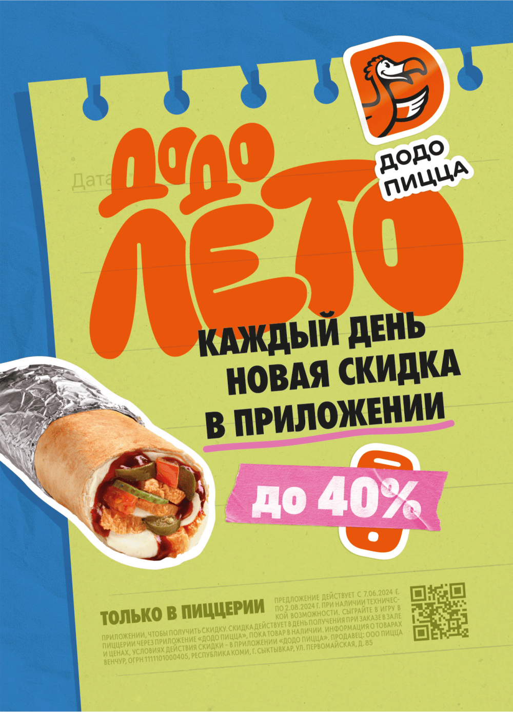
Yes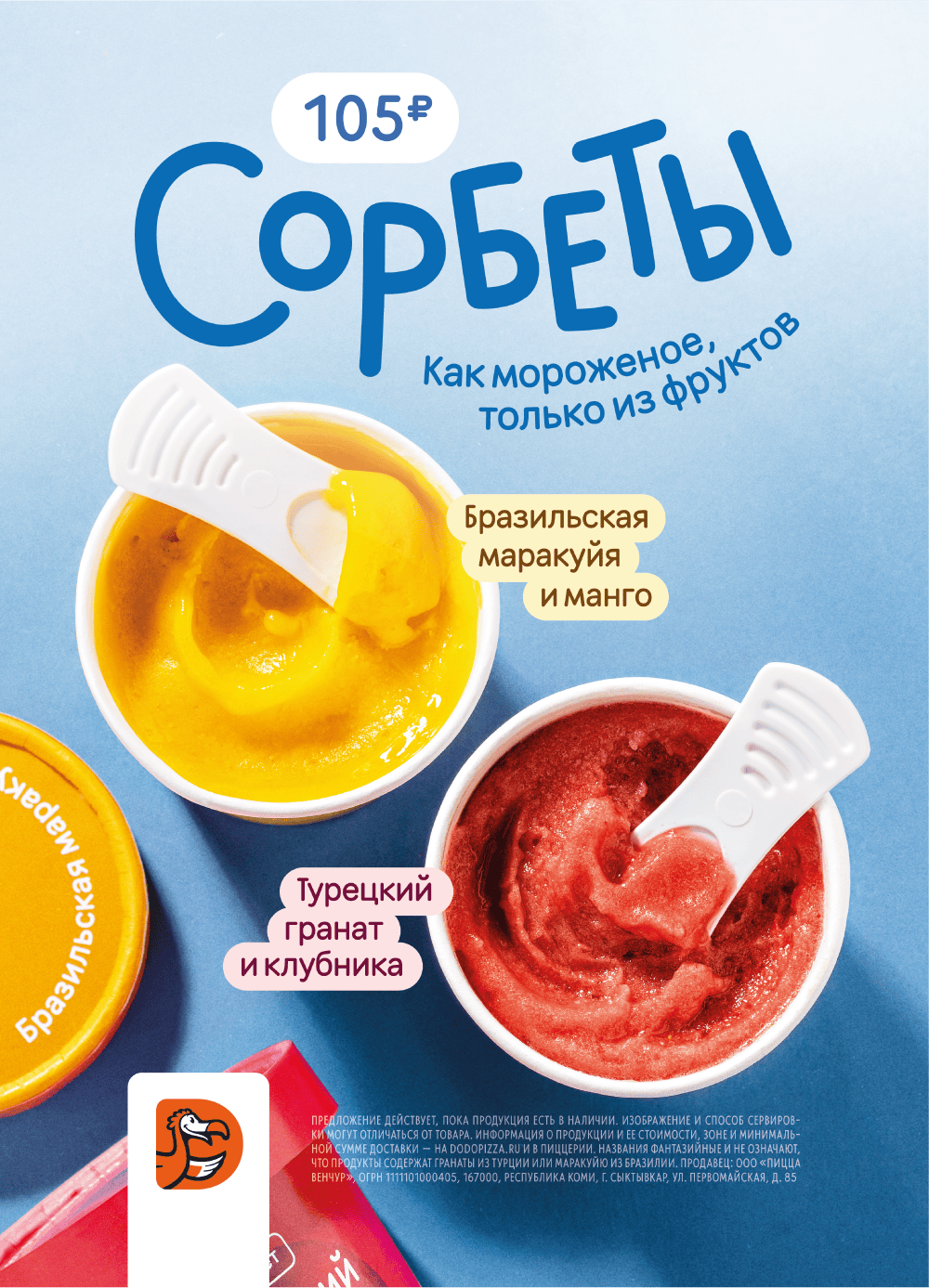
No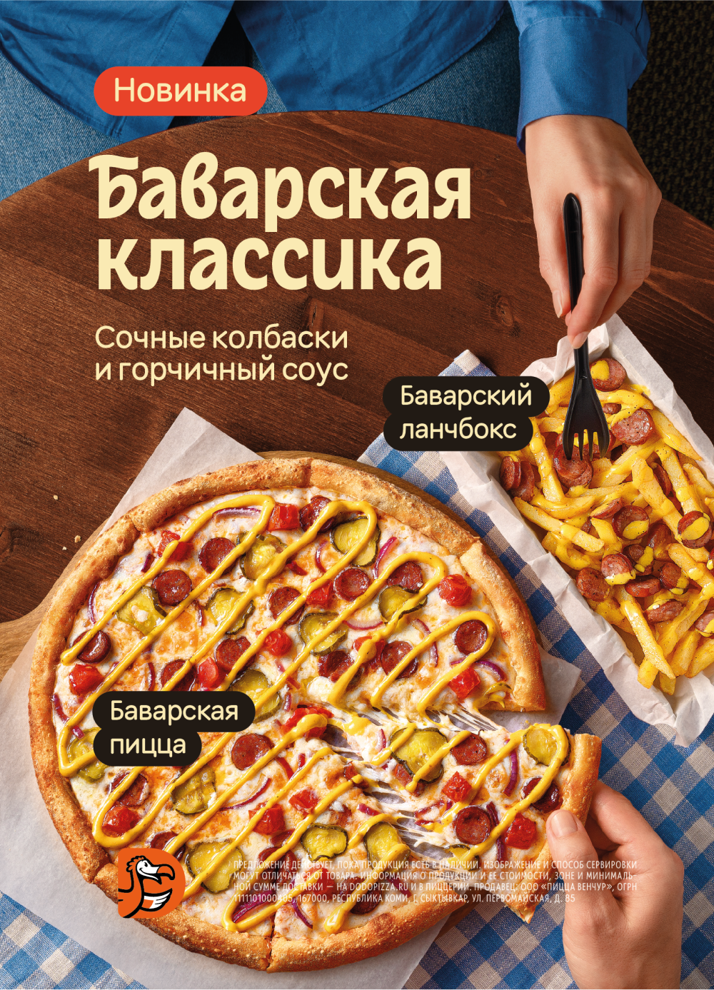
Logo in collaborations
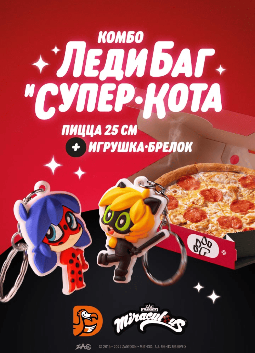
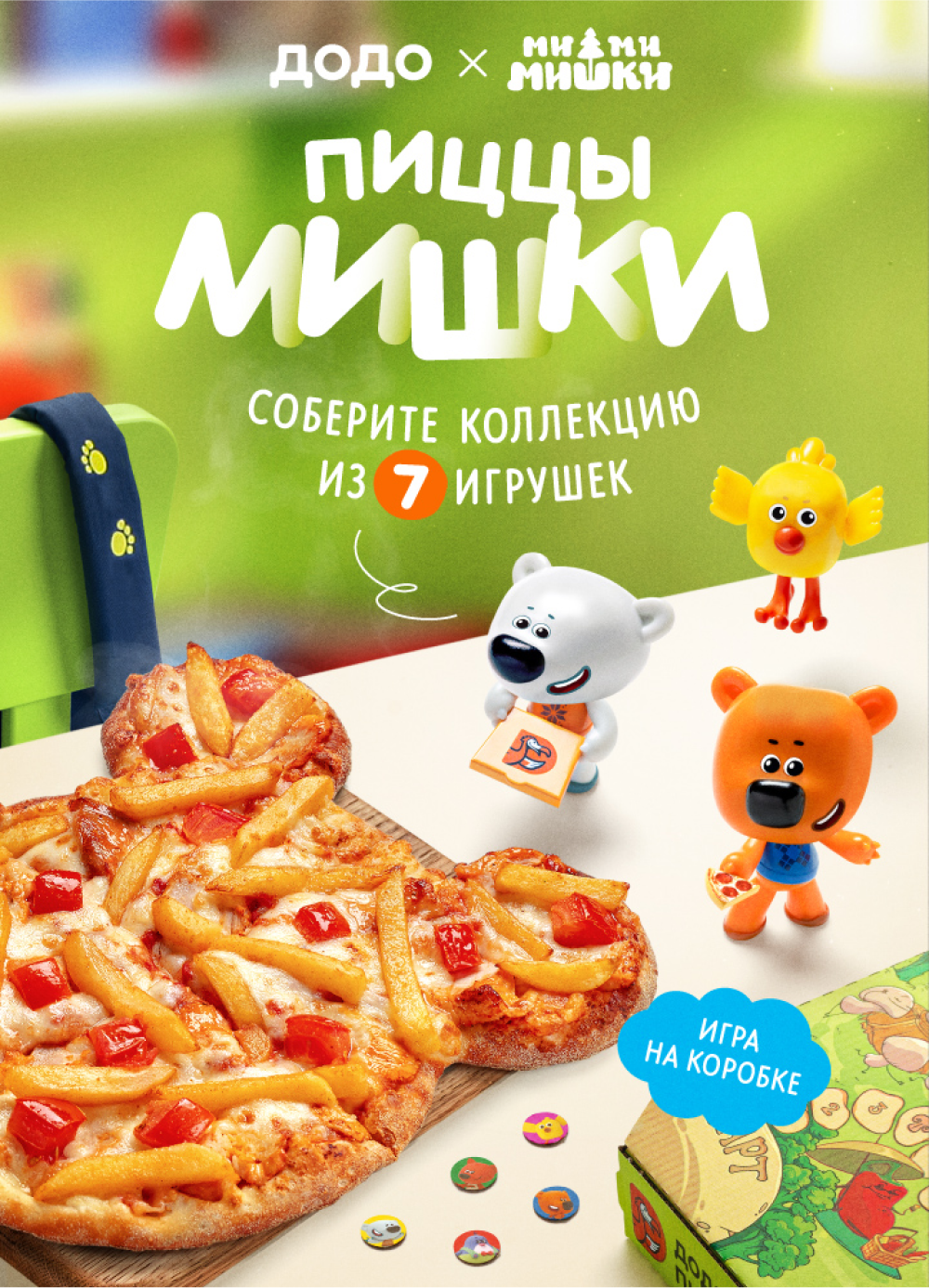
If we develop a special project together with another brand, we place only the text part of the Dodo Pizza logo (without the sign) and the partner on the layouts in this format: DODO PIZZA × Partner's brand name.
There are some exceptions. We use a logo with the sign if we launch a large national project in collaboration with a major brand. This is especially true if the design of the layout is very different from our communications and it is difficult to recognize the Dodo Pizza brand from it.
Normally we don't place the Dodo Pizza logo on the media inside the pizzeria, but we do not apply this rule for collaborations. We put our own and our partner's logo on all layouts - both inside and outside the pizzeria.
When you do not need a logo
We do not place the logo on the media inside the premises: on table tents, cash displays, TV-boards, uniforms. The pizzeria guest is already inside the brand zone, and we do not need to remind them where they are. We aim at highlighting the offer: we tell the customers about new products, promotions, and our app.
We always place our logo on media outside the brand area: street light boxes, billboards, leaflets. This is our opportunity to be remembered by potential customers, and tell them something about Dodo Pizza.
How to not work with our logo
A logo maintains the integrity of a brand. Misuse of the logo can affect its recognition. Download only approved versions of logos, don't change their colors and proportions when editing layouts.
Here are some anti-examples that will help you avoid common mistakes when working with the logo.
Do not use the Dodo Pizza logo to make sign boards for the pizzeria. They are similar to the logo, however, there are individual placement rules for signboards. Instructions on how to create a signboard for your premises can be found in the pizzeria project.
Do not repaint the logo in other colors. Brand colors for the text part of the logo are black or white. The sign is always orange.
Exception: the management company design team may develop logos in additional colors for a specific task, for example, for special projects that spread nationwide or collaborations.
Do not swap the text and the sign. The logo mark is always to the left of the text or above the text (in the Tall version). A sign to the right of or below the text is a mistake.
Do not experiment with the logo orientation. Do not place the horizontal version of the logo vertically and do not put the logo at an angle.
Do not put text next to the bird sign. The main logo consists of a text part (“Dodo Pizza”) and the sign of the bird. These elements can be used separately from each other, but cannot be combined with other elements. For example, you cannot write “Dodo Combo” next to the sign instead of “Dodo Pizza”.
Do not stretch the logo. The logo should retain its original proportions. When editing layouts, make sure that the logo is not stretched horizontally, and that the proportions of the sign and the text part remain unchanged in relation to each other.
Do not make the logo too small. The logo should be fairly visible on a layout of any size. Make sure the text and sign are apparent and easy to read on the media they are used.
Do not place the logo on a “noisy” background. If you place the logo on a photo with too many small details or on a background with insufficient contrast, it will be incomprehensible. Choose a solid color and contrasting background.
Read next:


