

Visual style of in-app stories
General principles, colors, font and typography, layout sizes and grid, buttons, illustrations and graphic elements, photo style, and covers for stories.
The app team has created a space for developing stories in Figma. It's a tool that collects typography styles, rules for using colors, basic elements, buttons, and stories templates and examples. The text below is an outline of the main rules and principles.
General principles
Consistent design.Typography styles, colors, and basic elements are aligned with application styles.
Unified visuals.We use branded typography, colors, and graphic elements.
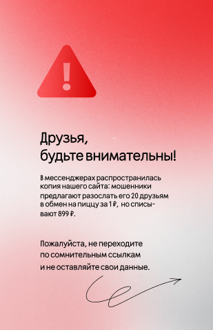
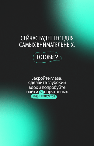
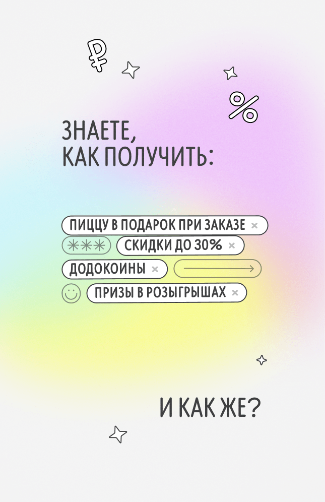
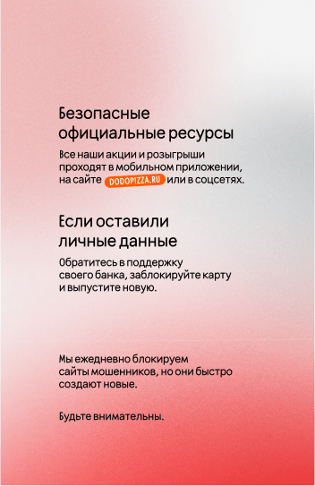
Comprehensible stories.Support the text with visuals: carefully selected images should match the theme, icons and symbols – represent simplicity.
Stories are easily and quickly read. We use plates and illustrations moderately, and avoid overload of visuals in layouts.
Colors
The palette includes primary colors, secondary colors, and gradients. A gradient consists of a primary color and its lighter shade. You can look into the rules for using colors and copy the figures in Figma.
Font and typography
Only two fonts are used for stories. Rooftop for headlines and Inter for typesetting.
Other fonts are not put to use. In some rare cases, you can add lettering designed for promotional layouts.
Layout dimensions and grid
Stories layout size is 1350 x 2085 px.
There are also 4 zones in the stories layout.
- The main working area. It contains the key information on the layout, the text should not go beyond its borders.
- Visible zone. It contains only graphic elements.
- The zone that is invisible on mobile devices. It can be seen only when viewing stories on a computer.
- Button zone.
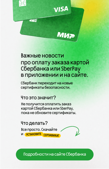
Buttons
In order for users to take a targeted action, there are buttons in the stories. Buttons are divided into two types.
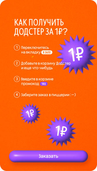
Static buttons.They are always located in the button area. A button without an icon is on the top, with an icon - on the bottom.
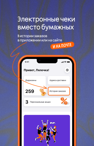
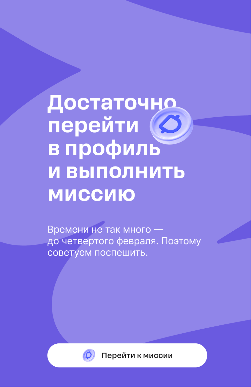
Dynamic buttons.Their function is ordering a product; they can be moved around the layout. In stories you can use several buttons, but no more than three.


Illustrations and graphic elements
We use 3D images in stories that we develop ourselves with the help of our application team.
We also use graphic elements: shapes and arrows.
We do not take stock illustrations or draw them ourselves.
Photostyle
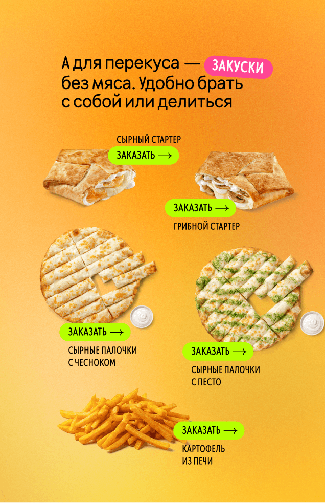
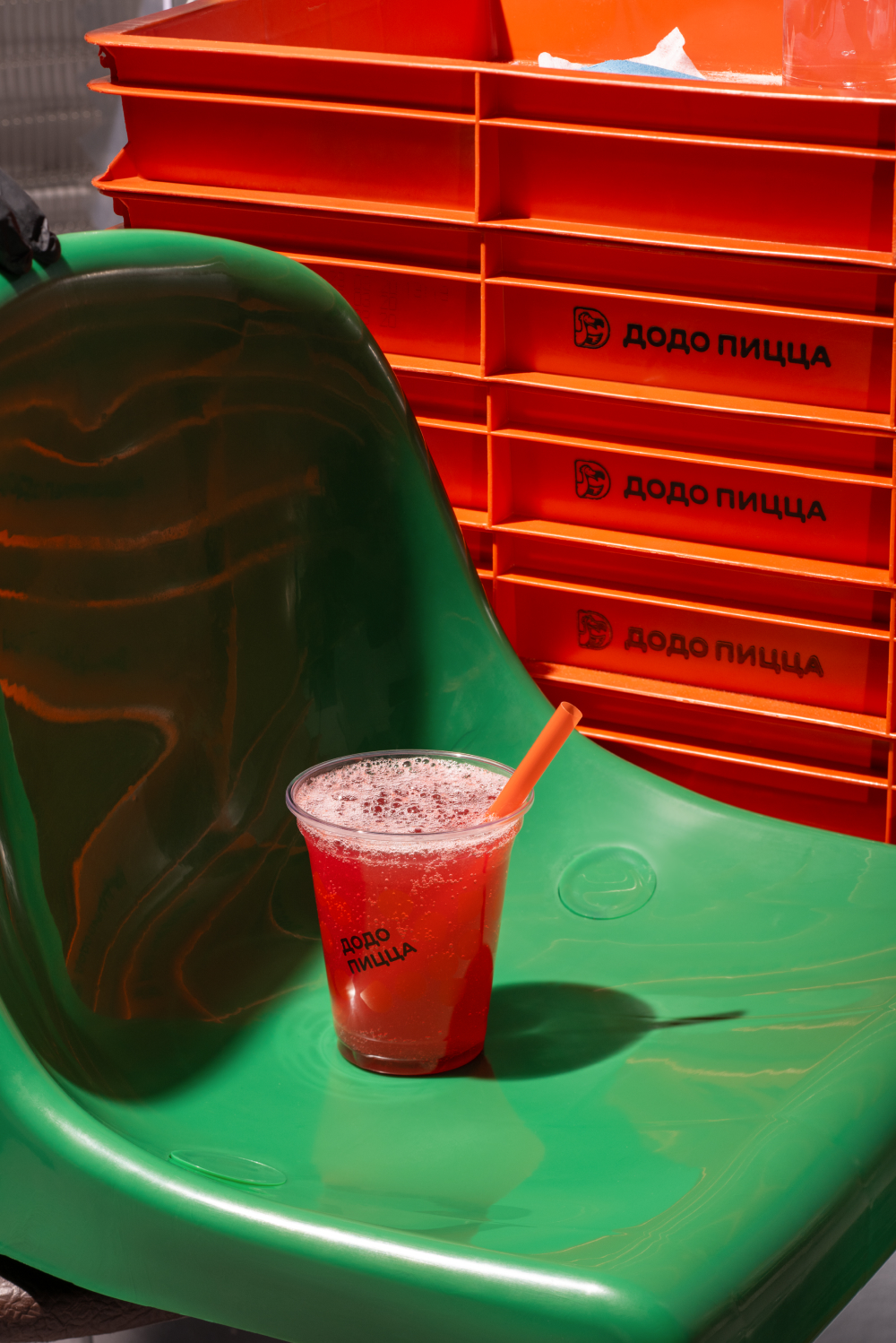
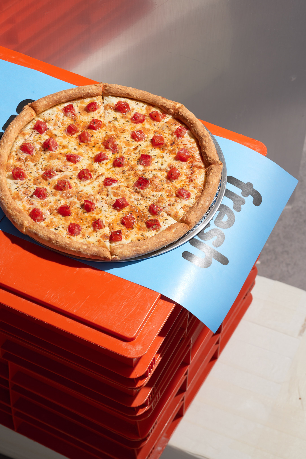
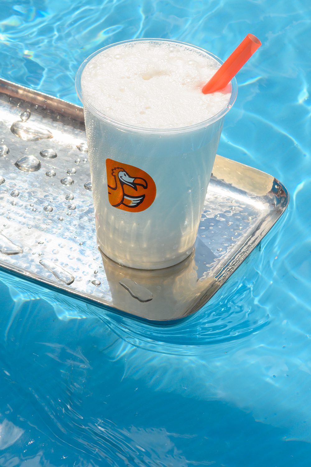
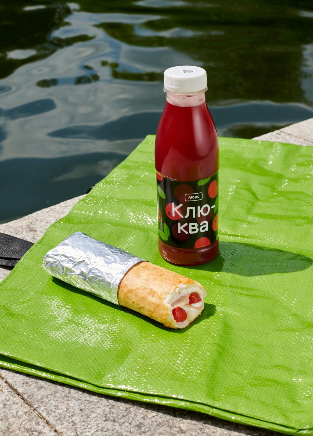
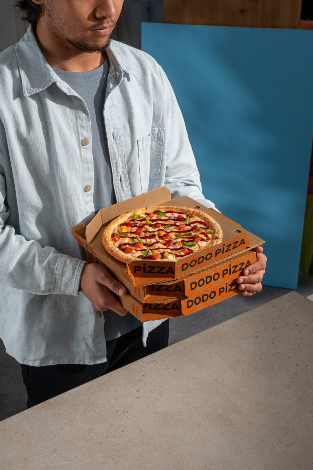
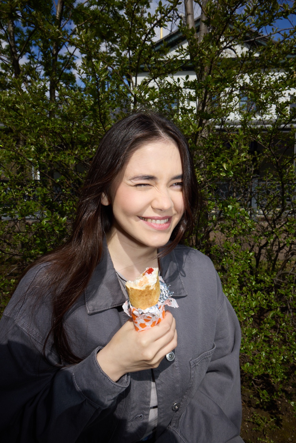
For our stories we may choose various different photos: products in the life environment and from the catalog, or people.
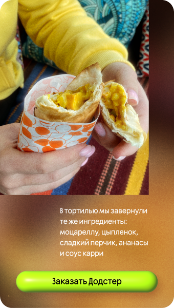
For example, photos of products.

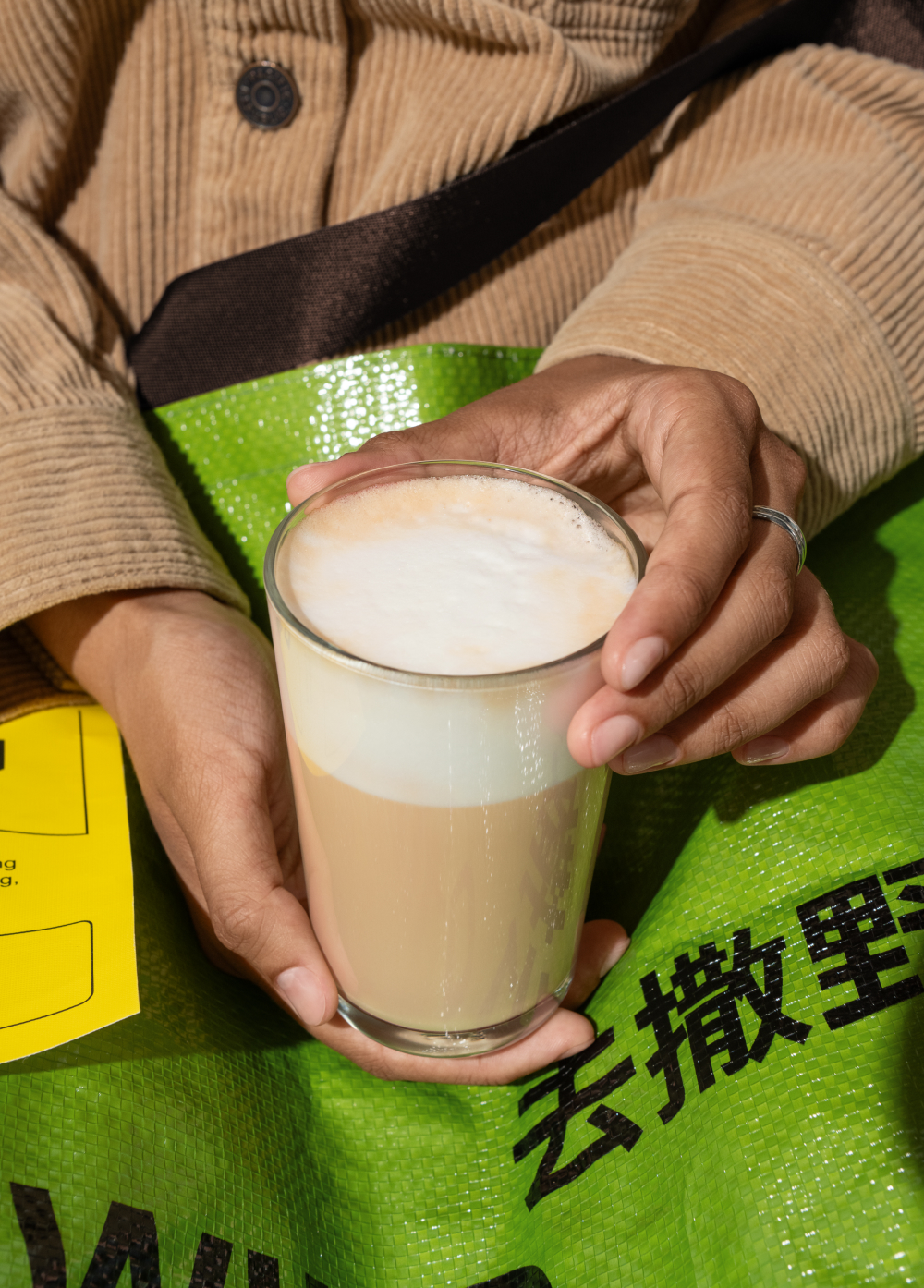
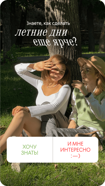
Photos of people.

Photos of products from the catalog.


Covers
Stories covers are located at the very top of the main page of the app, so they require special attention in development. Avoid small details, abundance of graphic elements and excessive color choices.
For example, product photos.


Read next: