

Colors
Main color is a branding element: with it, people recognize brands, even if the advertisement does not contain a logo. Supplementary colors help us to introduce the products, and tell about their taste.
Main color
The main color of Dodo Pizza is orange. In external communications, the main color is often combined with several additional colors. For example, in the layouts for Dodo Combo we paint an orange stroke on which the text is placed, make the plates purple and color the background beige.
Inside pizzerias we tend to be bolder and put the orange aside, because in the brand zone there is no point in maintaining recognition. However, outside the pizzeria we always involve orange to make sure the brand is recognized.
Supplementary colors
We have developed supplementary color schemes for some menu categories. Dodo Combo and “Breakfast” set menu have their own palette. We rely on the palette, but we can change the tones at times if necessary.
Dodo Combo


Breakfast


Color combinations
We normally combine orange with other colors based on the product's characteristics. We also use colors that reflect the taste and showcase the product.
To keep the "dodo-ism", we go for bright, clean and light colors that match well with orange. Do not use dirty or earthy shades. For more information about working with color, see the separate guide Color Combination.
Dodo
Not Dodo
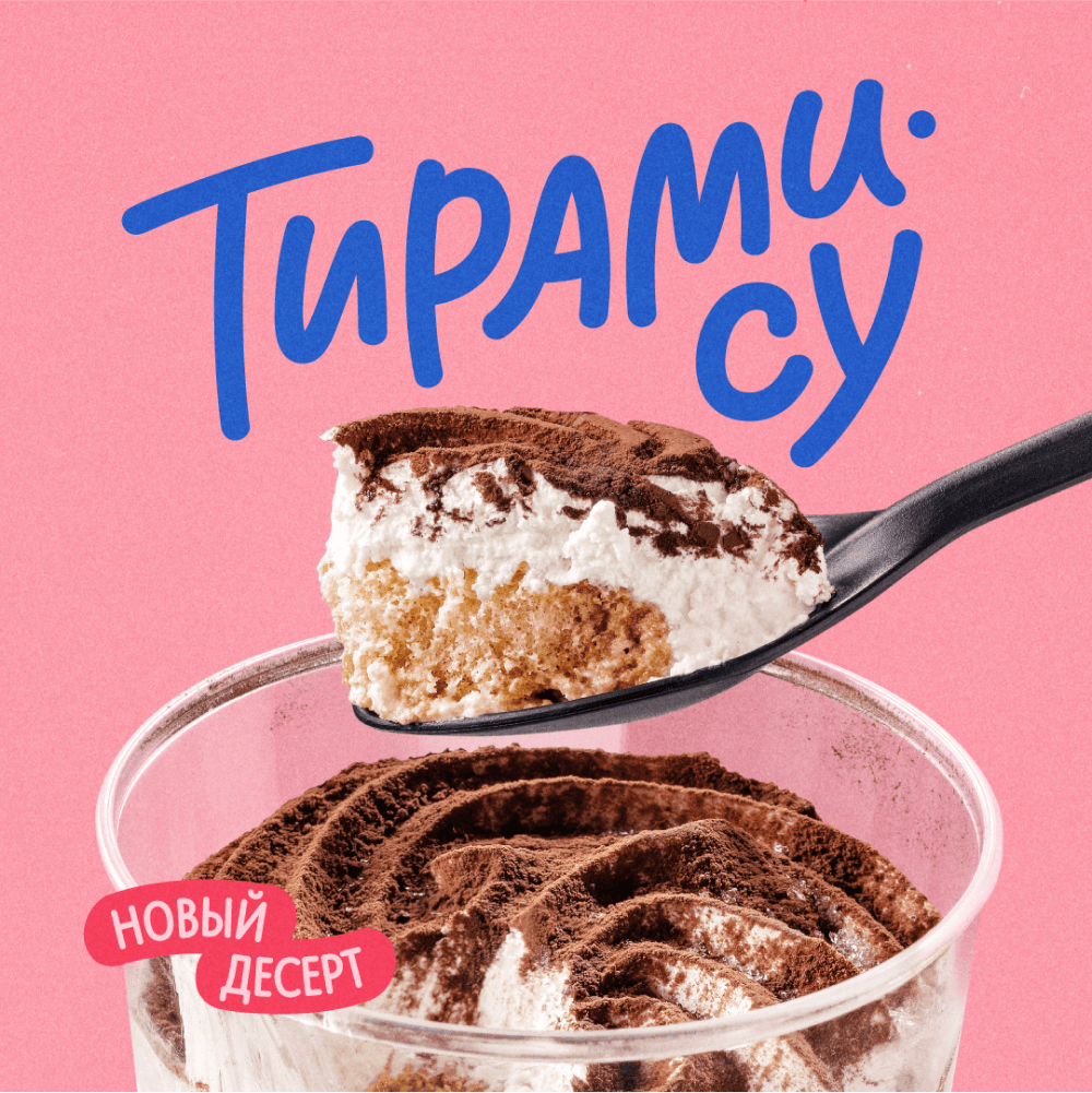
Let's look at a few examples. For desserts, we often use pink or blue-ish shades. Pink emphasizes the sweetness of the product, while blue creates an association with coolness and freshness.
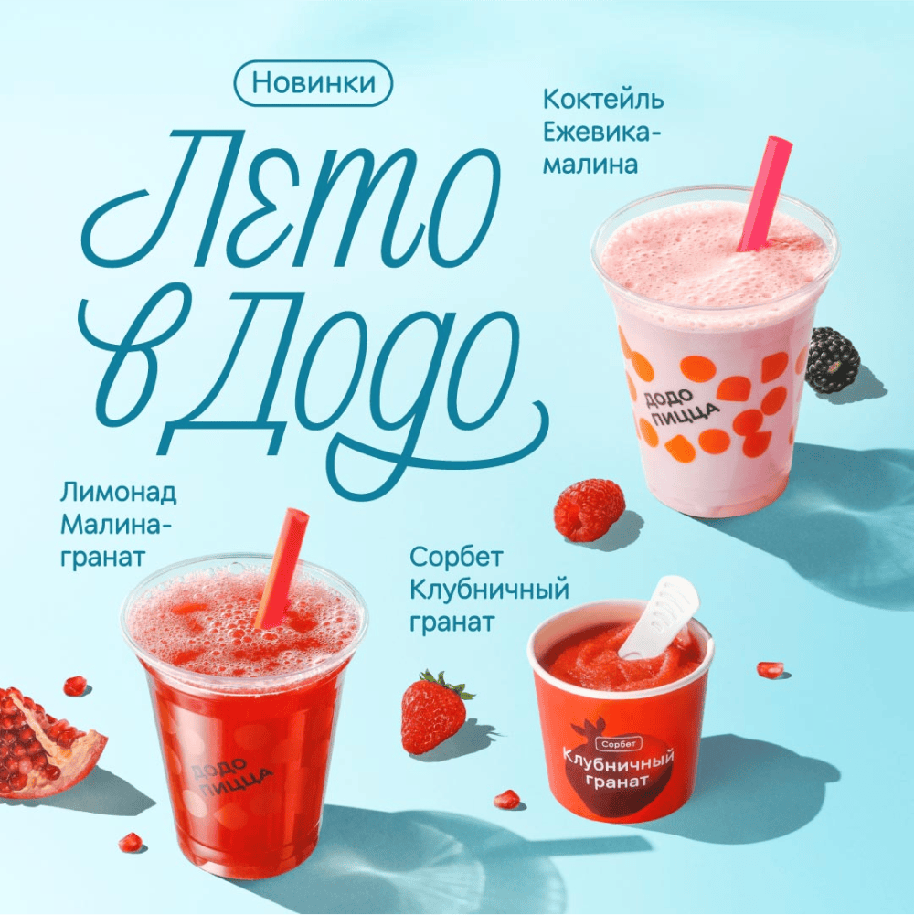
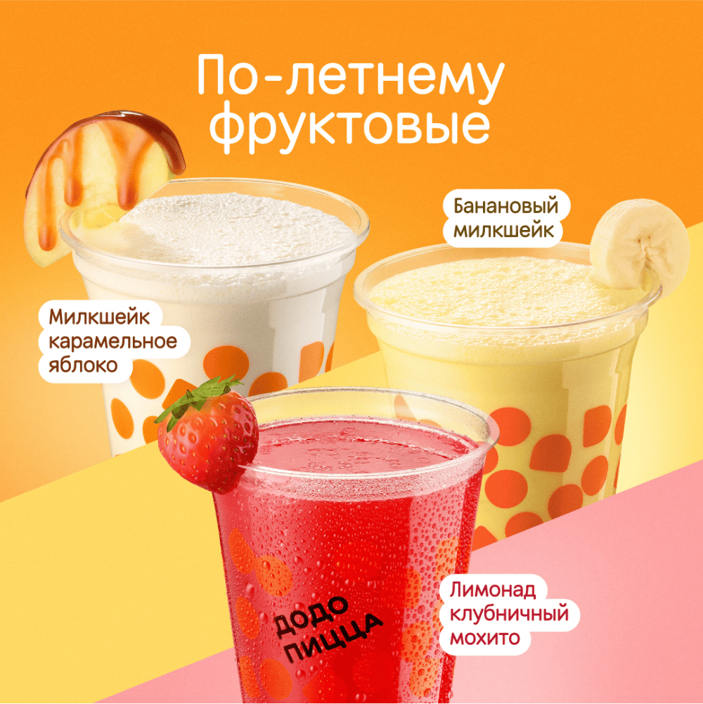
We can also convey the taste of desserts through the color of the ingredients. For example, place a banana smoothie on a yellow background and a strawberry smoothie on a pink background.
If we don't want to display the product in a straightforward way, we emphasize the mood and emotions it evokes. Thus, “Chocolate Shake” can turn into a sweet memory of childhood - bright, vivid, and joyful.

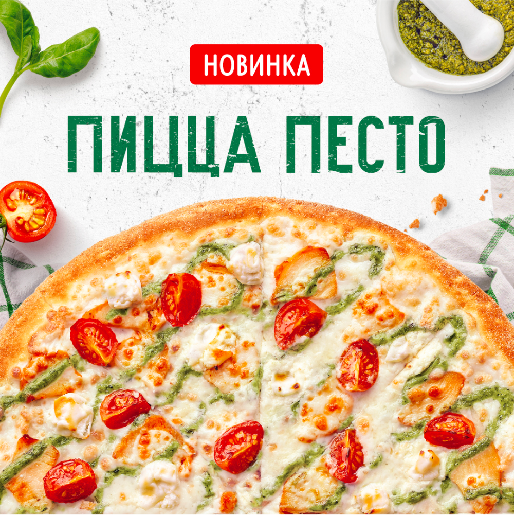
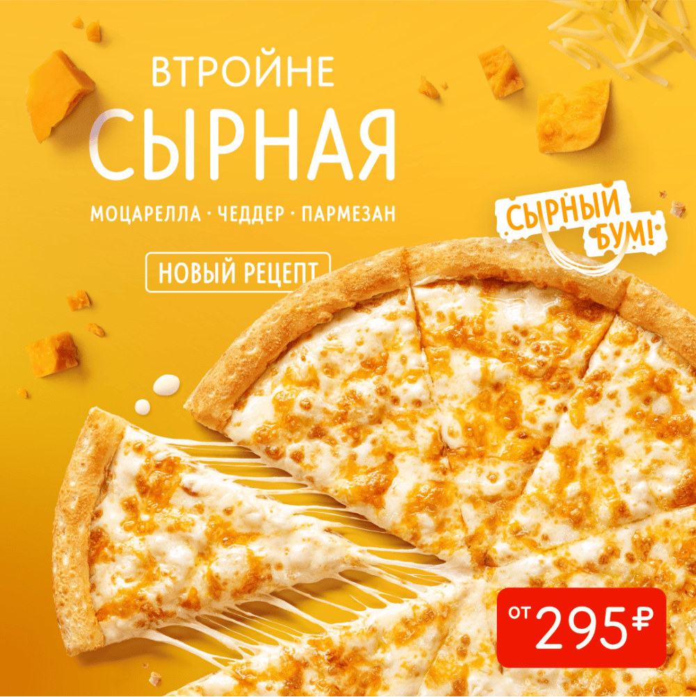
We communicate the flavor of pizzas and appetizers through the colors of the main ingredients. In the examples below, green is the accent color for the “Pesto Pizza” and yellow - for the “Cheese Pizza”.
We do not limit ourselves in terms of brightness and, if the concept requires it, we can even use acidic tones. But we don't make designs just to attract attention. We see color as a tool that helps us to tell our products and our customers to make decisions.
Read next: