
Tone of voice in communication
This document will help you understand the brand’s tone of voice, broadcast human‑centeredness and match the tone to the communication channel.
Dodo's tone of voice features
We already know that Dodo is all about friendliness, openness, and non-toxic communication. Isn't that enough? Sometimes it is. And the following items will tell you about some other sides of the brand.
| Open | With no details | |
| Modern | Derelict | |
| Witty | Sarcastic | |
| Love for terminology | Straightforward | |
| Emotional | Neutral | Distant |
| Humble | Neutral | Bragging |
The way we talk about customers
Our focus is human-centered, not pizza-centered communication. Human-centeredness does not mean that we always have to talk about the customer. It means that the context in which they encounter our message is taken into consideration. We keep in mind how much energy and time they have to read and understand what they want to do right now and what they definitely do not want to see.
Within this approach it is not just the product promotion that we keep in mind, rather than the situation in which the customer has the need for this product. We contemplate on what kind of product will make them happy, and who they will share it with. This method helps to create content in which situations and images familiar to a person appear, and catchy copywriting pops up.
For example, if the reason to order pizza is a holiday, you can demonstrate the product from the host's point of view. After all, it is not the pizza that turns a regular day into a holiday, but the person. In this process, Dodo is present in the context of catering service. Thanks to Dodo, all is convenient, everyone has fun and yummy snacks are on the table, and the host rocks and feels their value, as well as satisfaction.
Our character is a real person, not an idealized image. A human with all their goods and bads, and with a great sense of humor.
They resolve all sorts of situations creatively and inspire us with their actions. Here's how to convey this in communication.
- Show a person inside a situation, set the exposition: where, with whom, what exactly our character is doing.
- Demonstrate the way our character handles their tasks with the help of Dodo. Think of what chores can be done by purchasing a product, getting a discount or some other offer.
- Turn to the theme of everyday life and place our product into it. Eventually, we are turning into a lifestyle brand.
- Avoid associations with sensual pleasure and junk food.
- Don't shy away from showing customers with problems – in fact, we would rather show how they handle them.
- We don't laugh at our characters, but we laugh with them.
The core of our audience is people who care, who are open to the world and remain curious. Children are transformers by nature, and we support them in this. Therefore, when the character of our communication is a child, we speak their language. We do not manipulate children to bring their parents to the pizzeria, but we communicate sincerely and with care.
Key idea
If you can only memorize one idea about Dodo's tone, let it be this:
This phrase fully captures how our communication can be broken down into two items: function and emotion.
“We'll take care of the pizza,” or function. Pizza, ingredients, service, standards - that's our area of responsibility. Everything should be quick and convenient for the guest: from choosing the pizza to scoring the order they received.
Functional communication is characterized by simplicity, comprehensibility, and overall clarity. Even complex things should be simple. The simpler you explain the fun of a new feature - the more people will want to try it.
The goal of any message is to get your point across to your guest. That's why you don't need to use complex constructions, metaphors, apply overcreative and overinformative language in key channels.
“While you take care about the important” or emotion. In brand stories, behavior patterns, and direct communication with customers, we appear to be caring, attentive, funny, and cozy. We talk openly about joys, sorrows, and everything that really matters to both the guest and us. We highlight that Dodo is about human-centeredness, about striving to make this world a better place. In this context, Dodo Pizza acts as a good old friend who will understand, support and tell you something interesting.
You could say that this is a field for creativity. This is where we bring interesting approaches to communication, bright and memorable catchphrases, and build ourselves up against competitors. At the same time, creativity for creativity's sake is not about Dodo either. Any communication should reflect the idea that we have established, just sometimes with a certain twist.
This conditional division will help you find the best tone for communicating in this or that channel. But don't go to the extremes. A lot of media can combine both function and emotion at the same time.
Channels and media
For the sake of clarity, we have categorized all channels and media into conventional categories: function, emotion, and intersection. This is not a default setting, but an experience accumulated over the years. This scheme will help you better understand which way to lean when choosing a tone.
Function
Product names
Product name is a branding element that has an impact on recognition, consumer demand and their trust. The name reveals the properties of the product, distinguishes it among competitors, helps to make the choice and justifies the price.
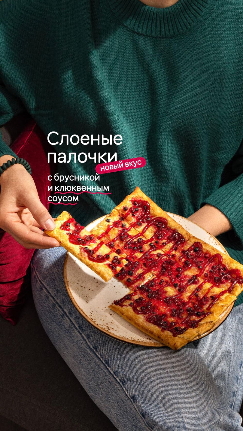
Effectively, we don't have much time for contacting the customer. The clearer the product name, the more likely people will immediately see what it is made of and know whether they want to try the novelty. Therefore, we stick to clear ingredient names and use well known flavors: Pesto, Caesar, Bavarian.
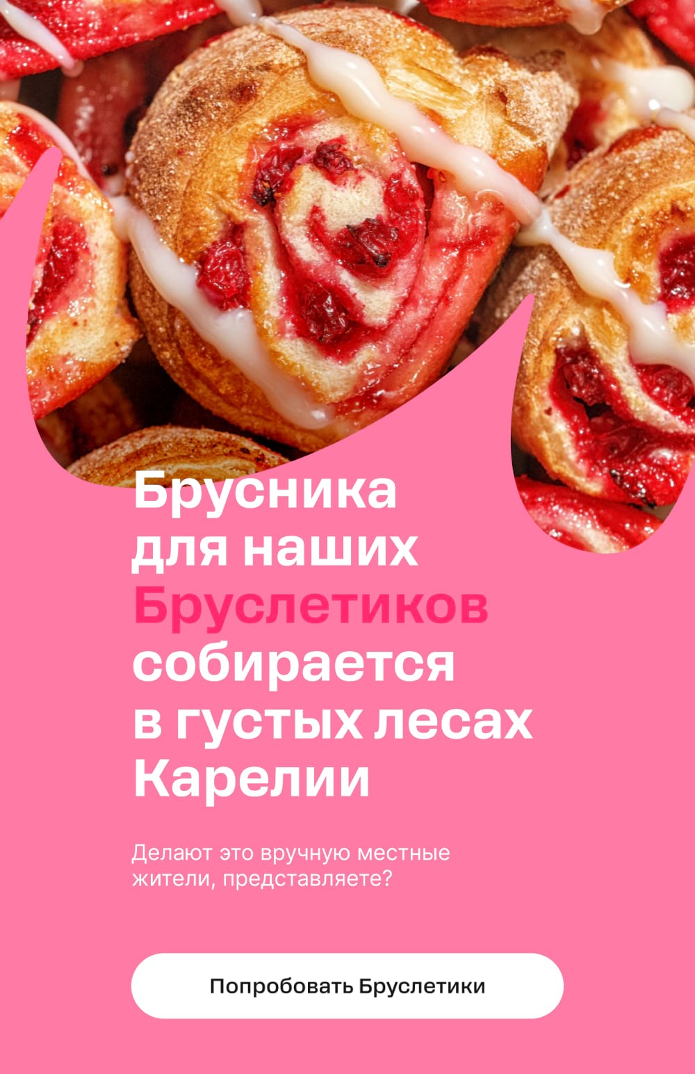
Product Descriptions
Product description is as much a branding element as the product name. The main purpose of the description is to reveal the essence of the product, talk about the composition, unique features, and flavor profiles. It helps to answer questions that might arise and anticipate customer experience with the product, and to nudge towards purchasing it.
If it is possible to disclose the ingredients, we just list them. If there is no such opportunity (which is usually the case with desserts or drinks), we make a reference to clear images and characteristics. It can be nostalgia, familiar taste, quality products.

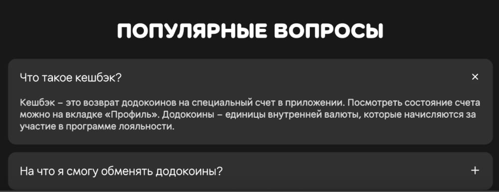
Interface
A customer opens a website or app because they are hungry or want to order from Dodo specifically. We need to help them order quickly and easily. That's why navigation in the app and on the website, description of features and information in sections should be as transparent, clear and unified as possible. You can check how to name items within the website and app in the glossary.
Complex wording, terminology without definitions, repetitions

Short text that users
can understand
Kiosks
Our main focus is to obtain clear and accessible information. Every feature and all steps of the order should be described so that the customer has a really cool experience. In this channel, we can highlight our tech savvy while being a bit goofy. At the kiosks, we communicate with customers in quite a formal or neutral way.
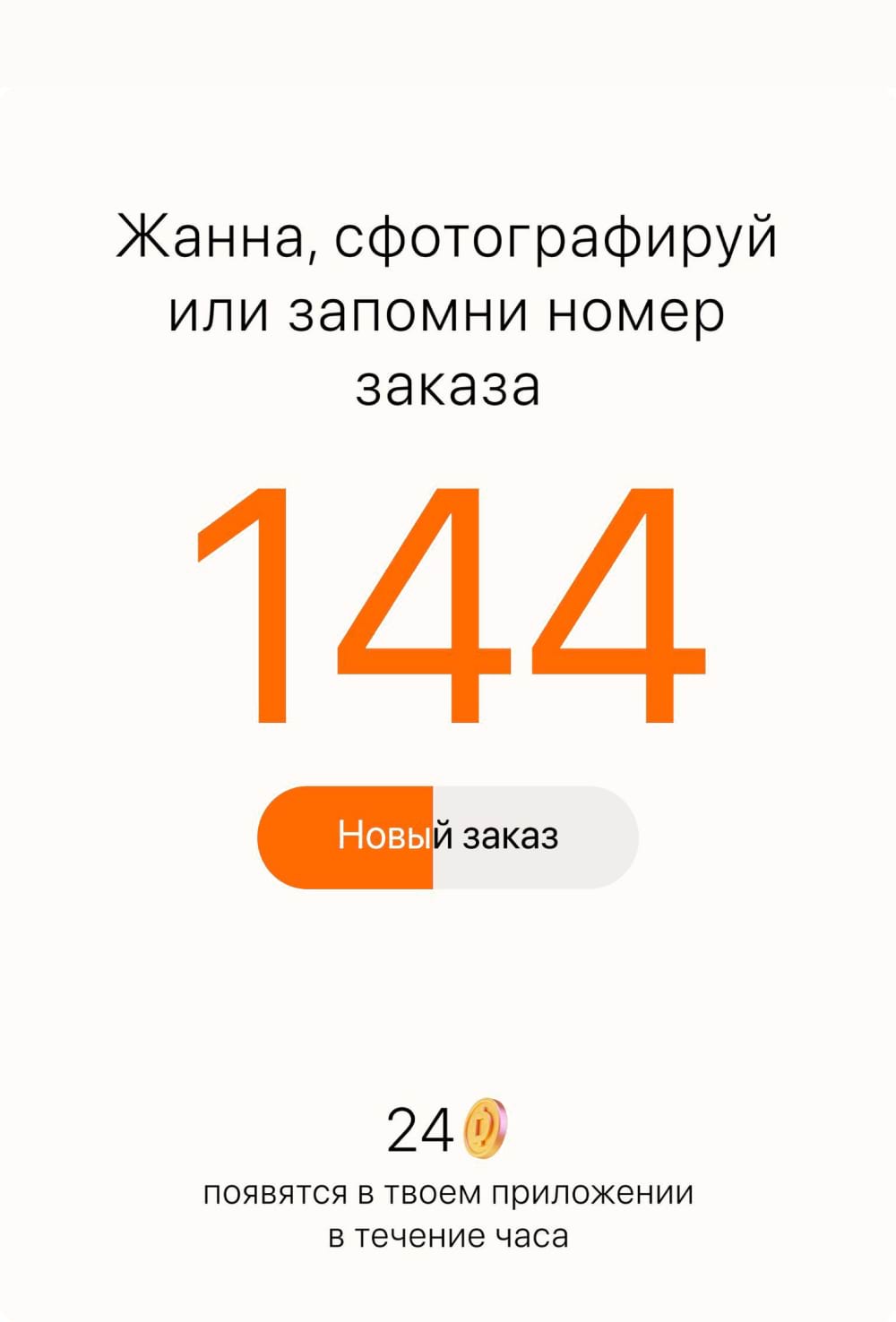
It is not clear how the promise on the screen and the field for entering the number are related
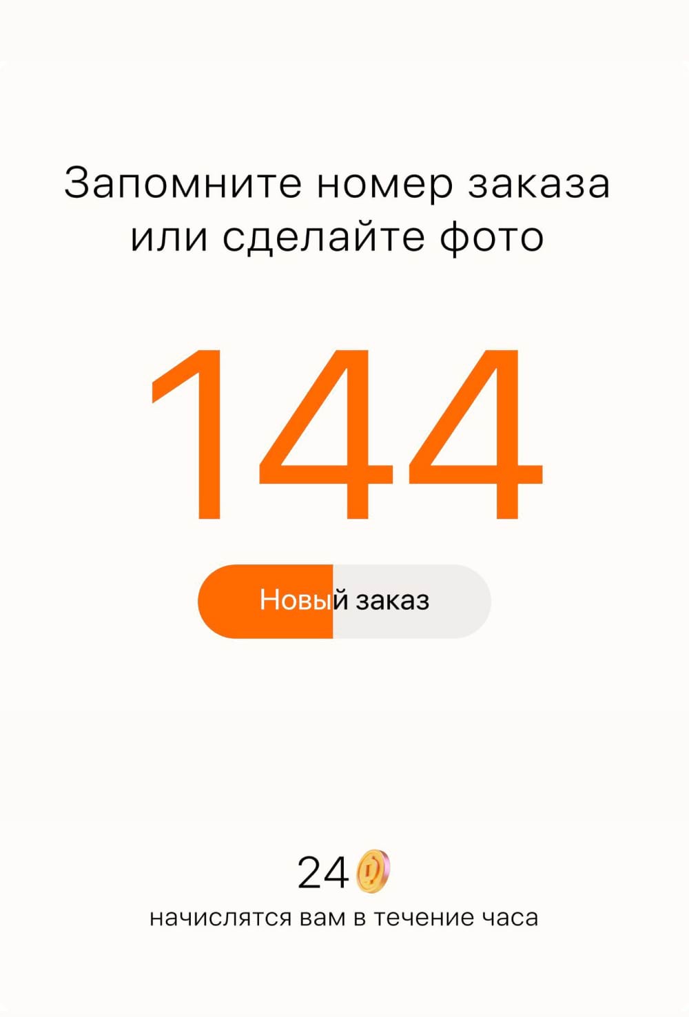
We explain what the customer will get and what they need to do to get it
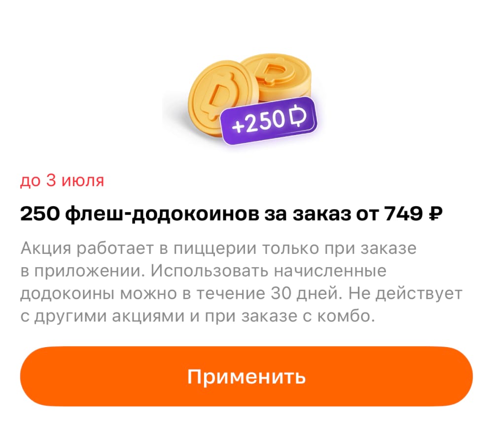
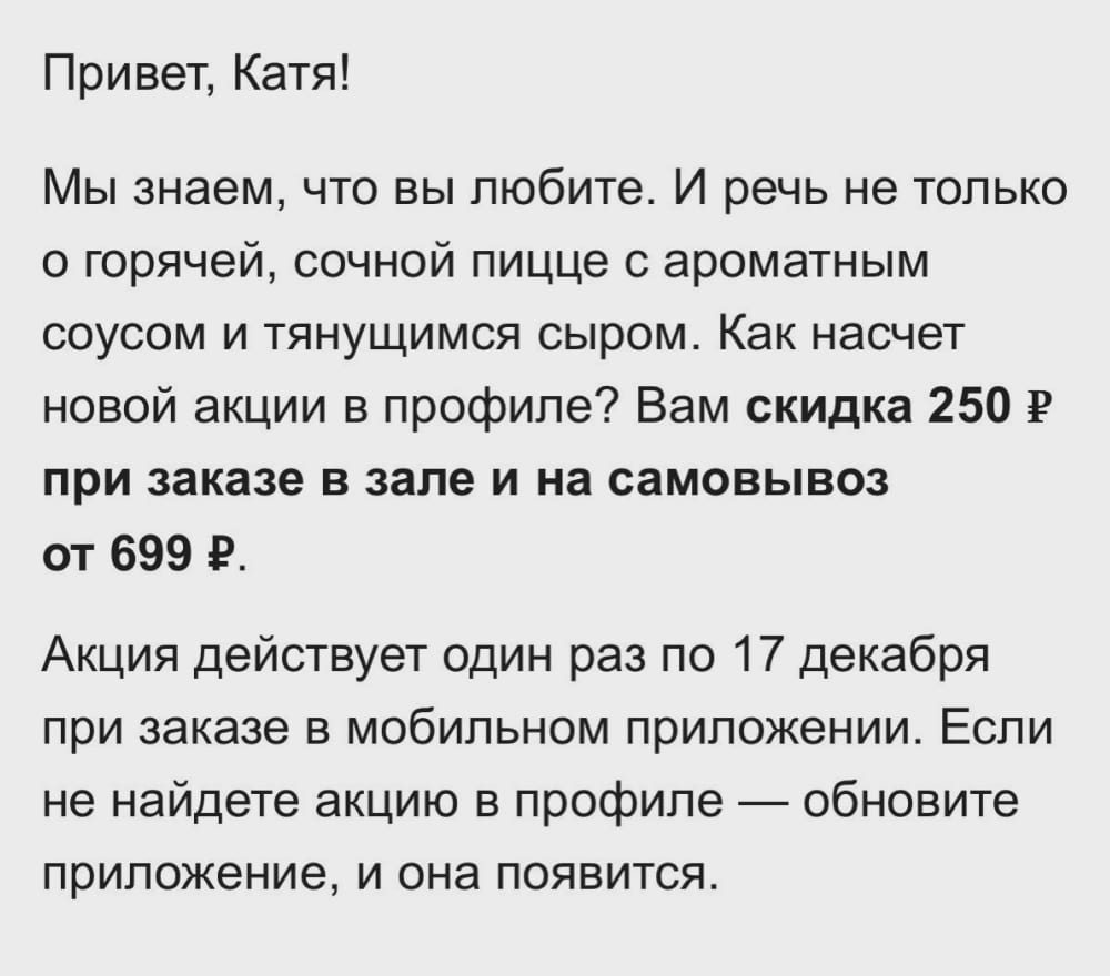
Promotions in the app
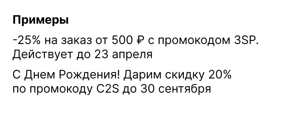
Promotions are small plates with discounts. They are stored and can be applied in the user's profile or in the cart at checkout. There are personalized promotions, promotions for late delivery and for birthday persons. With the app, the goal is to convey the terms and conditions as brief and clear as possible.
Avoid repetition, do not call the pizzeria a restaurant, use “in-hall” and “for pickup” for the type of order.
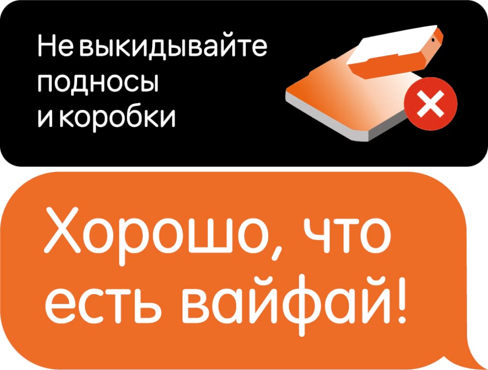
The text is too wordy, terms and conditions of the promotion are vague, too many unnecessary things
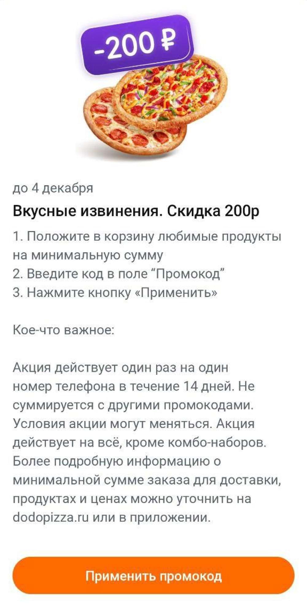
Short text with clear terms and conditions, easy to understand what to do
Promotions on the website
We express the key items of the rules in a short and clear manner. It is better to stick to a limit of five lines. If there is a button, we throw in a short spoiler or describe the terms item by item. Then we lead the client onward, to the landing page.
No example
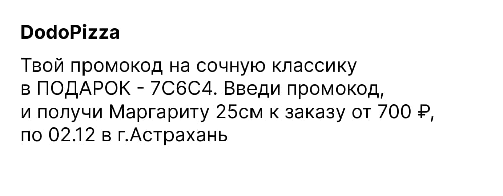
SMS
SMS is a paid method of communication, so we employ it only in cases when it is really necessary to convey information to the user. For example, when we give a promo code for being late or tell about promotions locally. With SMS, it is essential to disclose the terms and conditions in a short and succinct way, so we create them following this guide carefully.
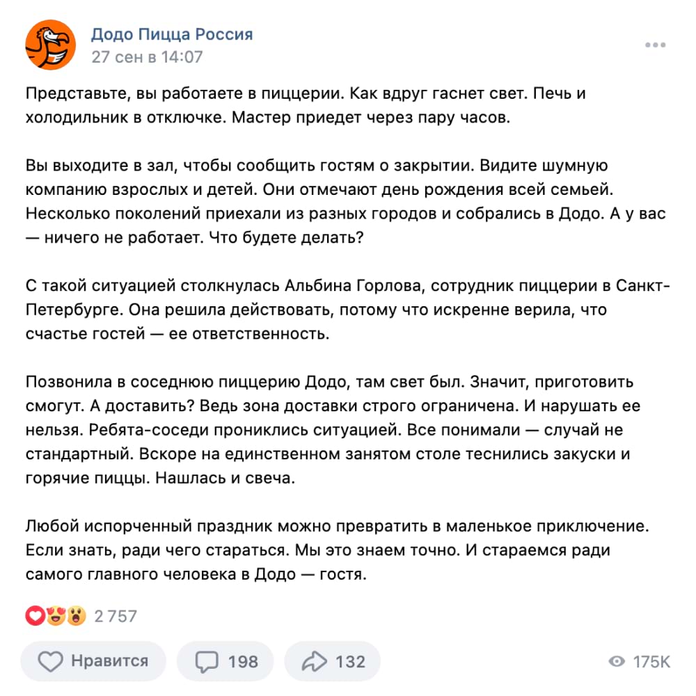
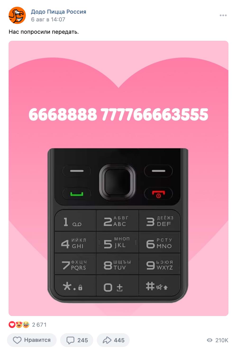
Social media
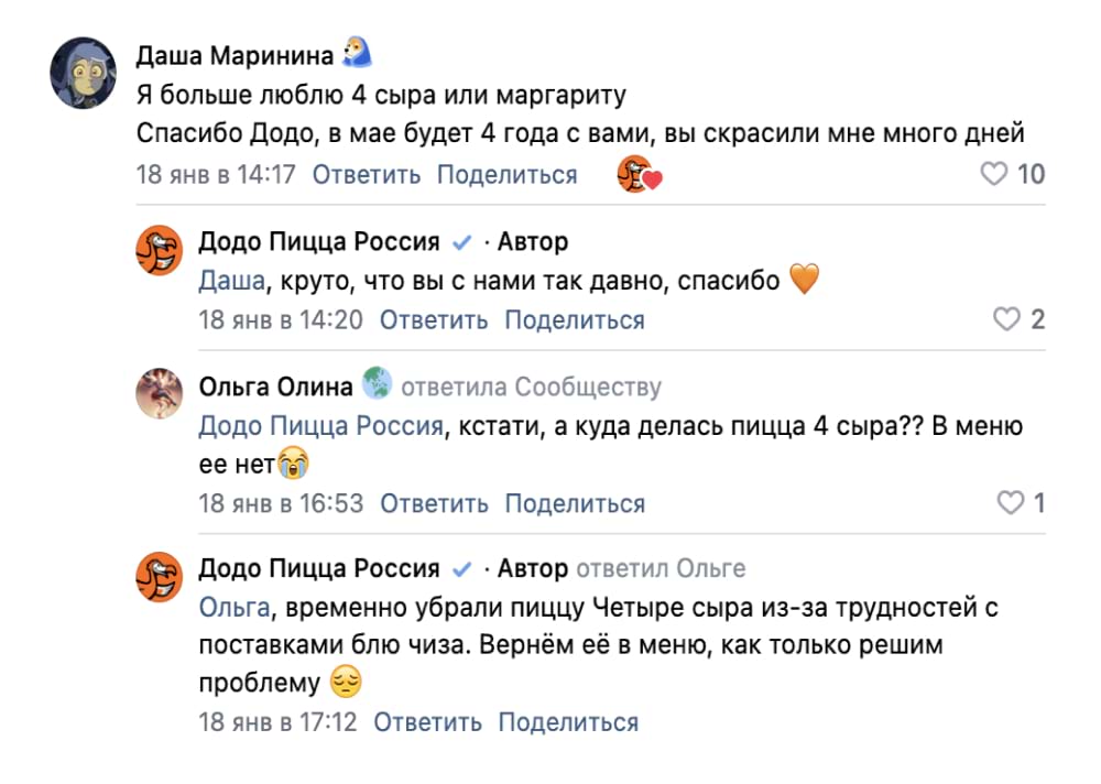
Dodo social media pages are ultimately the embassy for emotional communication. The subscribers are our community. We communicate with them in their language, share news, both good and not so good. We remain open, friendly and cordial. At the same time, we do not contradict the general principles of communication, the language grammar, the products' names. We do not make jokes about the guests, rather than we laugh together with them.
Here, for example, a narrative of such kind reveals the human-centric side of the brand, our attitude towards guests and employees, care and engagement.
No example
Engaging posts are the place for your creativity. Sometimes you don't even need a special reason for them.
No example
Even while remaining honest and open, it is possible to fall short of the tone. It's a fine line that needs to be recognized and not crossed. In the example below, we are desperately trying to justify ourselves as a small local brand. It feels like this because of the wording about taking a deep breath, hoping for understanding, acknowledging, as if to blame. Although a second paragraph is already enough to explain what's going on and why.

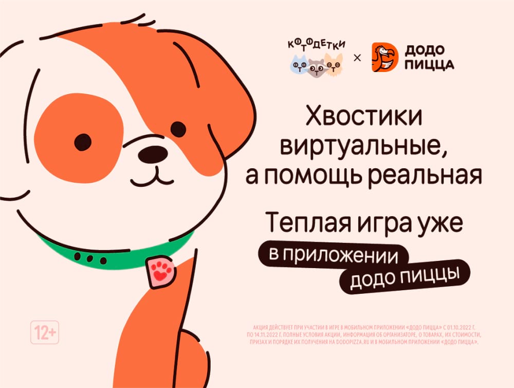
Games in the app
This is a channel where we can interact with the customer for a long time, and tell them stories. So here we can be more caring, heartfelt, funny and creative. The main thing is not to contradict the essence of the game and our positioning.
With the Smeshariki project, we had a fun way of presenting educational information for children.
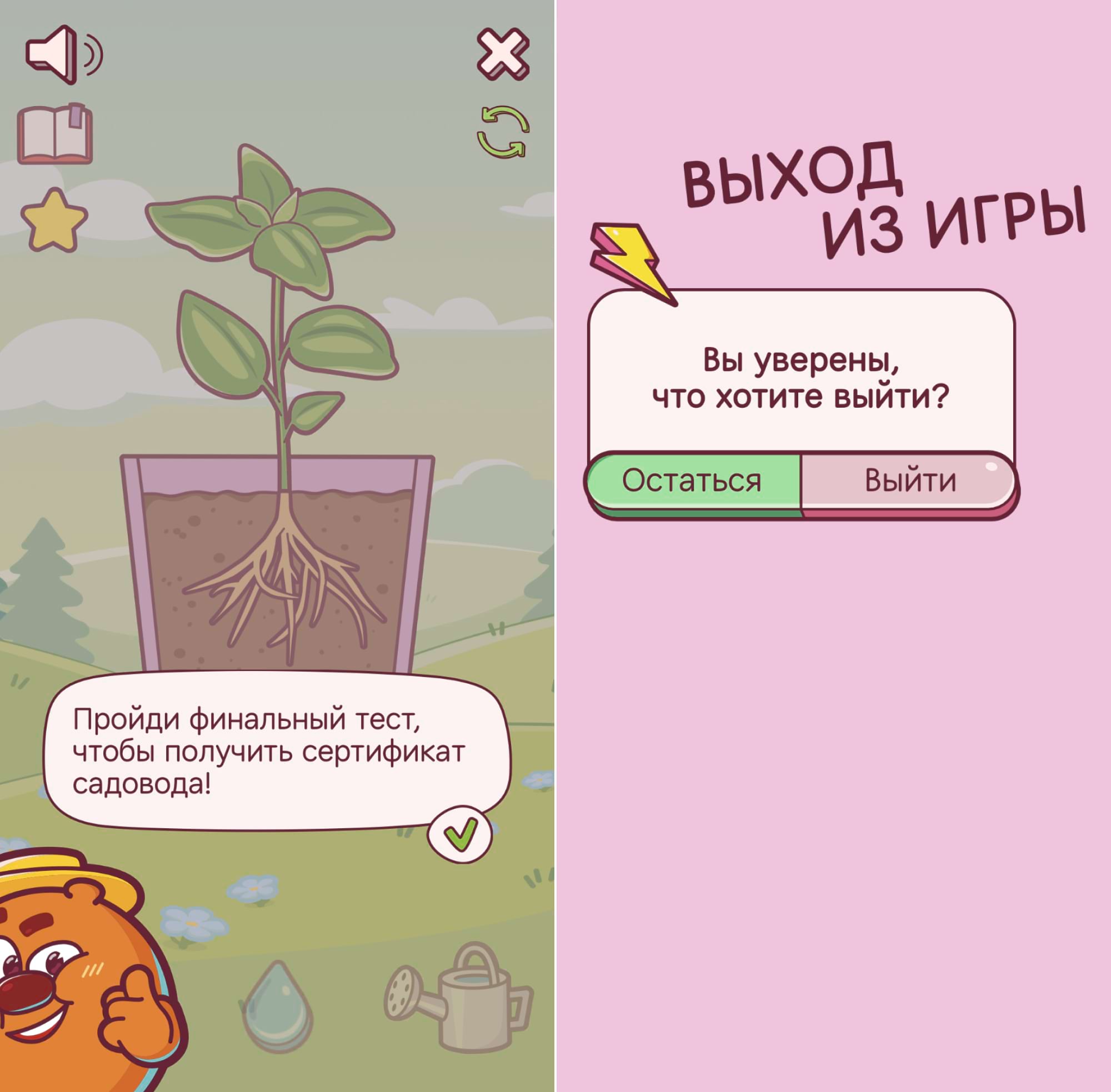
Hvostiki is an example of caring, kind and cozy communication. Everything is written in a simple, yet funny and friendly way that makes you want to come back to this game.
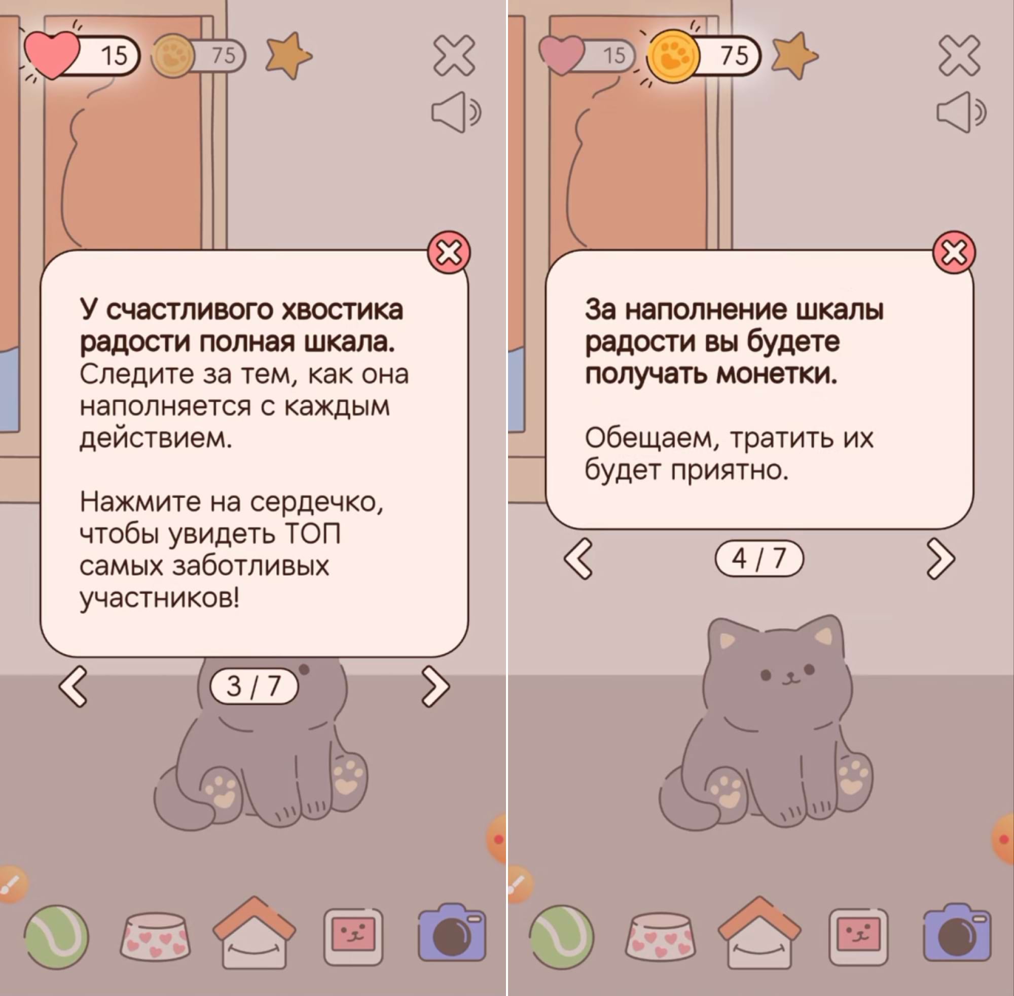
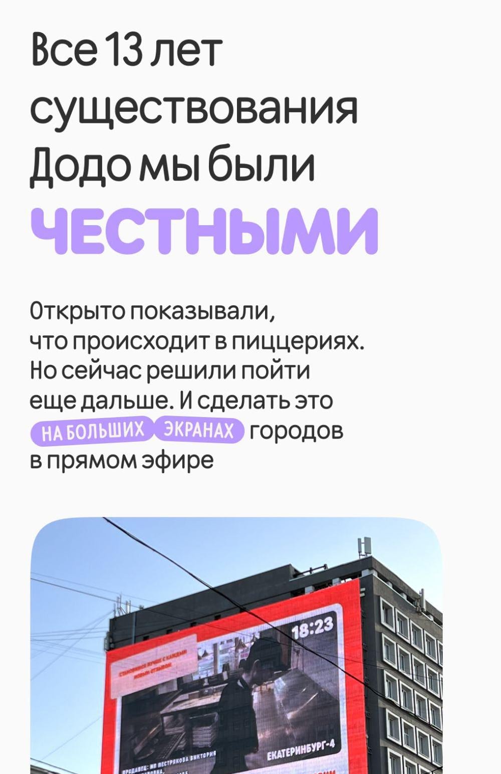
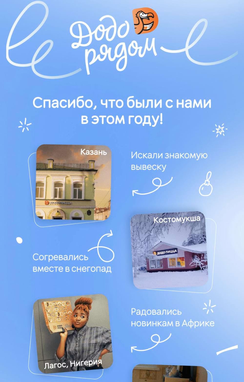
Image campaigns
We don't need to sell or nudge customers to do anything with the campaigns. They help to maintain Dodo's positioning and ensure brand loyalty. Communication that broadcasts our values and makes us stand out from the competitors comes to the forefront, with this non-invasive message.
We can be caring and supportive, as in the “Comfort Zone” or “Dodo Nearby”. Colorful and catchy, as in the “Quality” campaign or the collaboration with ‘Honkai: Star Rail’. We attract attention without contradicting the brand positioning and without entering the extreme zones of ambivalence or hype.
As part of image campaigns, we translate promotional mechanics, in-app games, seasonal novelties. We adhere to the general RC vibe in all online and offline channels, in internal and external media.

Support
When communicating with clients, we don't switch to slang or any other informal register, including the social media talk. But we may respond in a more formal or friendly manner, adjusting the talk to the client's communication style. Memes — yes, but you should also pick them wisely. Political, religious, contradictory ones are better kept for personal correspondence.
The guys have a detailed editorial policy of support in social networks, where examples, cases and internal rules of communication are defined.
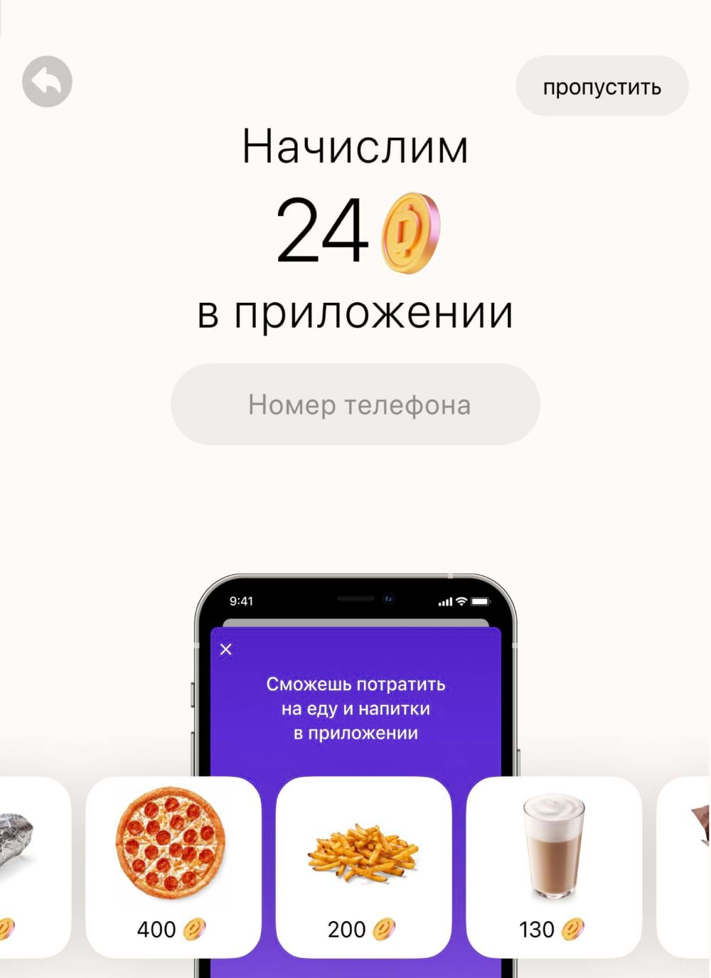
Everything is fine with the tone. But dodocoins should be spelled with a lowercase letter

The rules of tone and editorial policy are taken into account
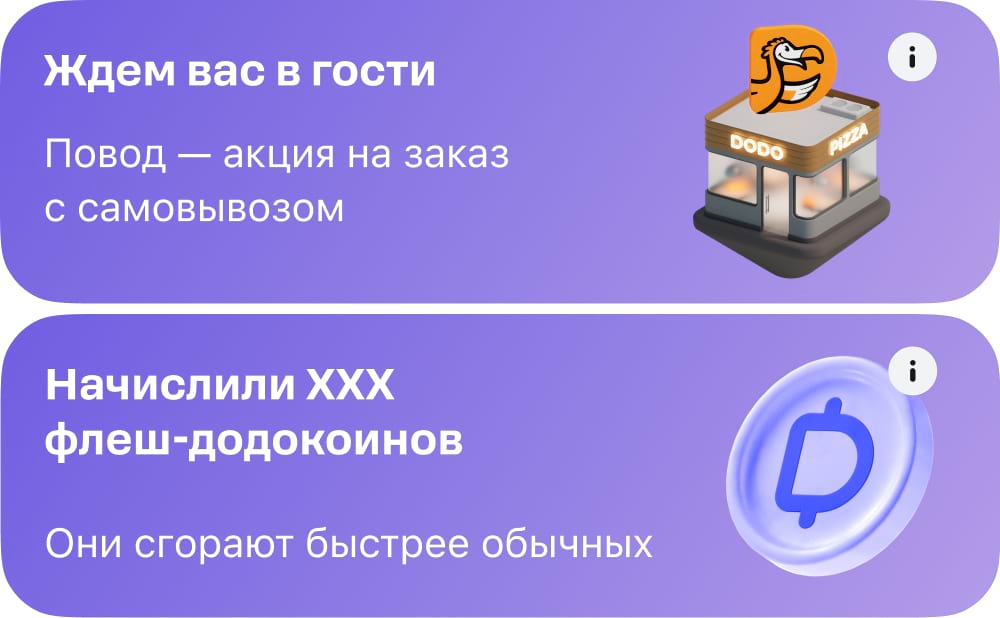
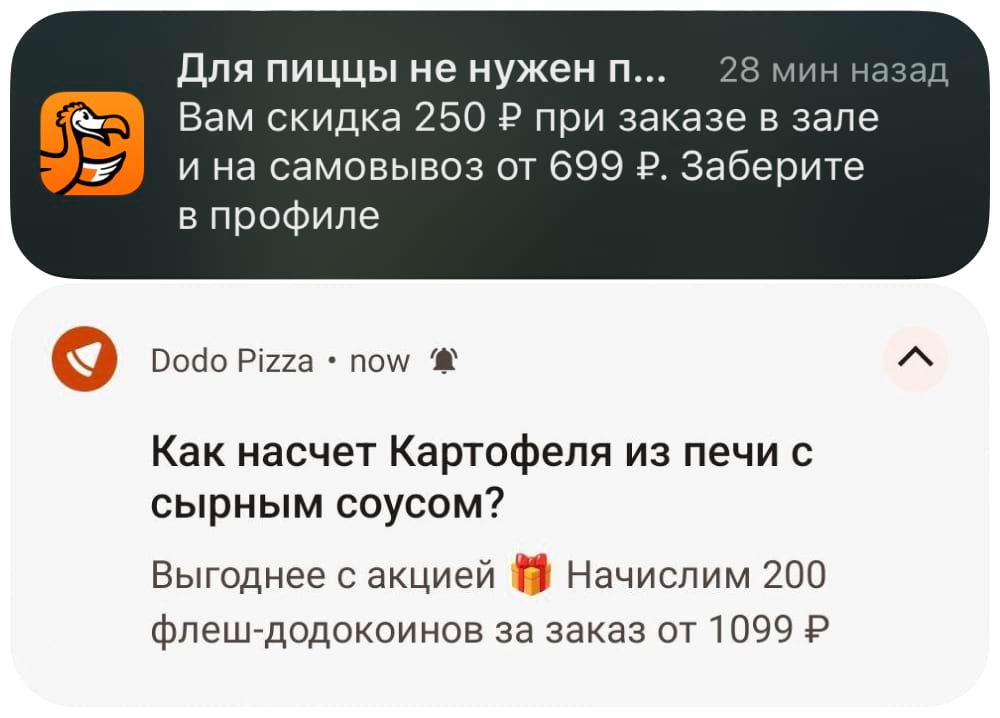
Notifications
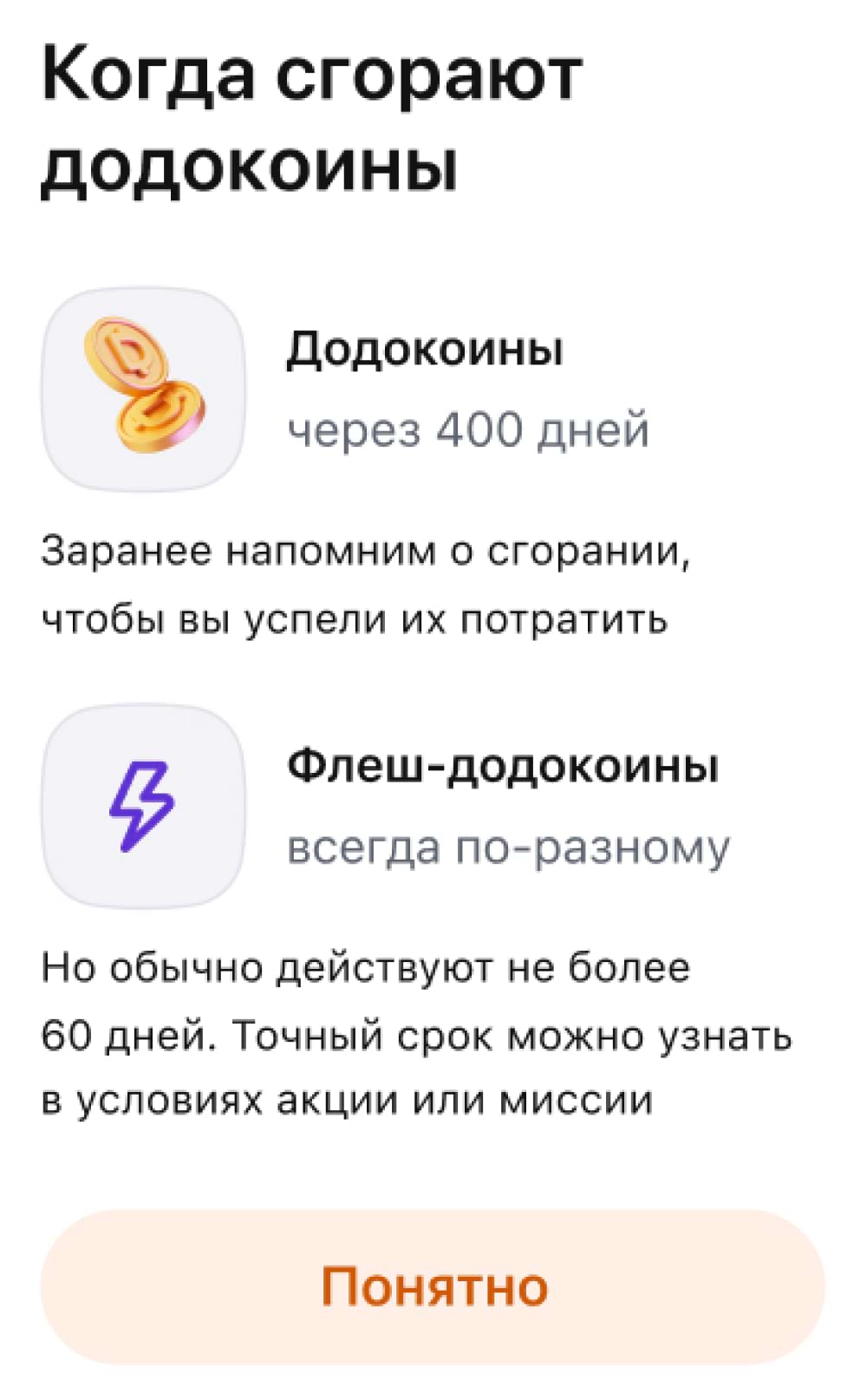
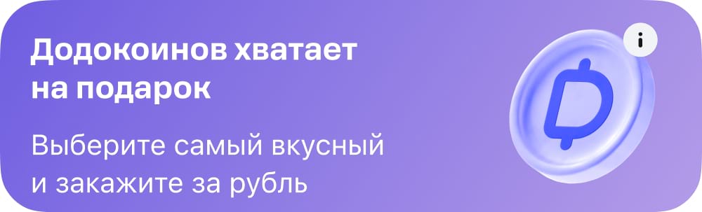
These are text messages on our app's home page. With those, we post about what our user needs to know in order to get some benefit. We tell them about a new personalized promotion, remind about a mission, and warn that dodocoins are about to be expired.
The banner takes up too much space on the main page
One-line heading or subheading
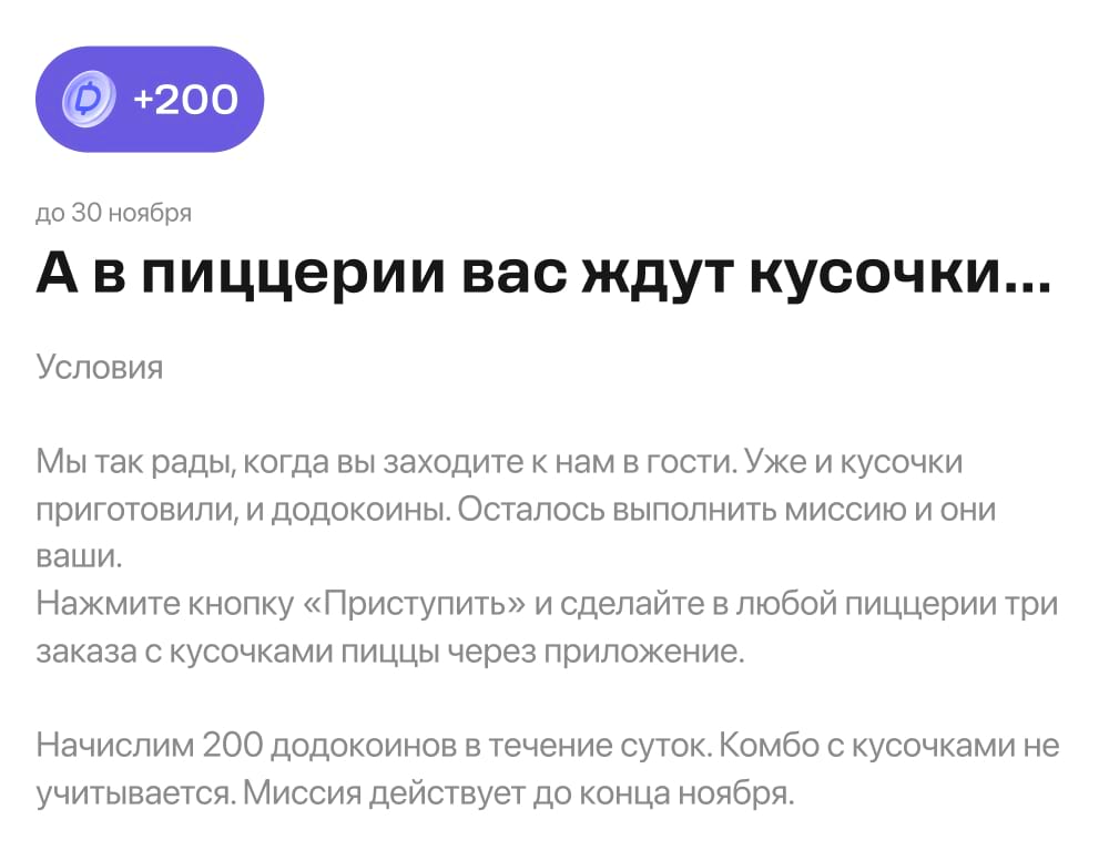
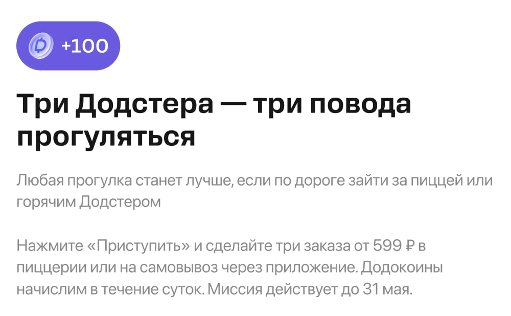
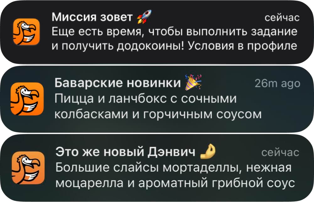
Missions
Missions are tasks that appear every month in the user's profile. For the customer this is a catchy detail of gamification; for us it is a chance to sell more of a certain product and raise our average check.
We can go on a creative side with the headings encouraging the customer to enroll into the mission. After the heading, a 2-3 sentence lead comes where we highlight why this mission is worth accomplishing. After that, there are the terms and conditions.
Too many small elements and subheadings; the text with conditions details is too long, division into paragraphs fails
Small elements are removed, conditions are shortened, the text is easily perceived — thanks to good layout
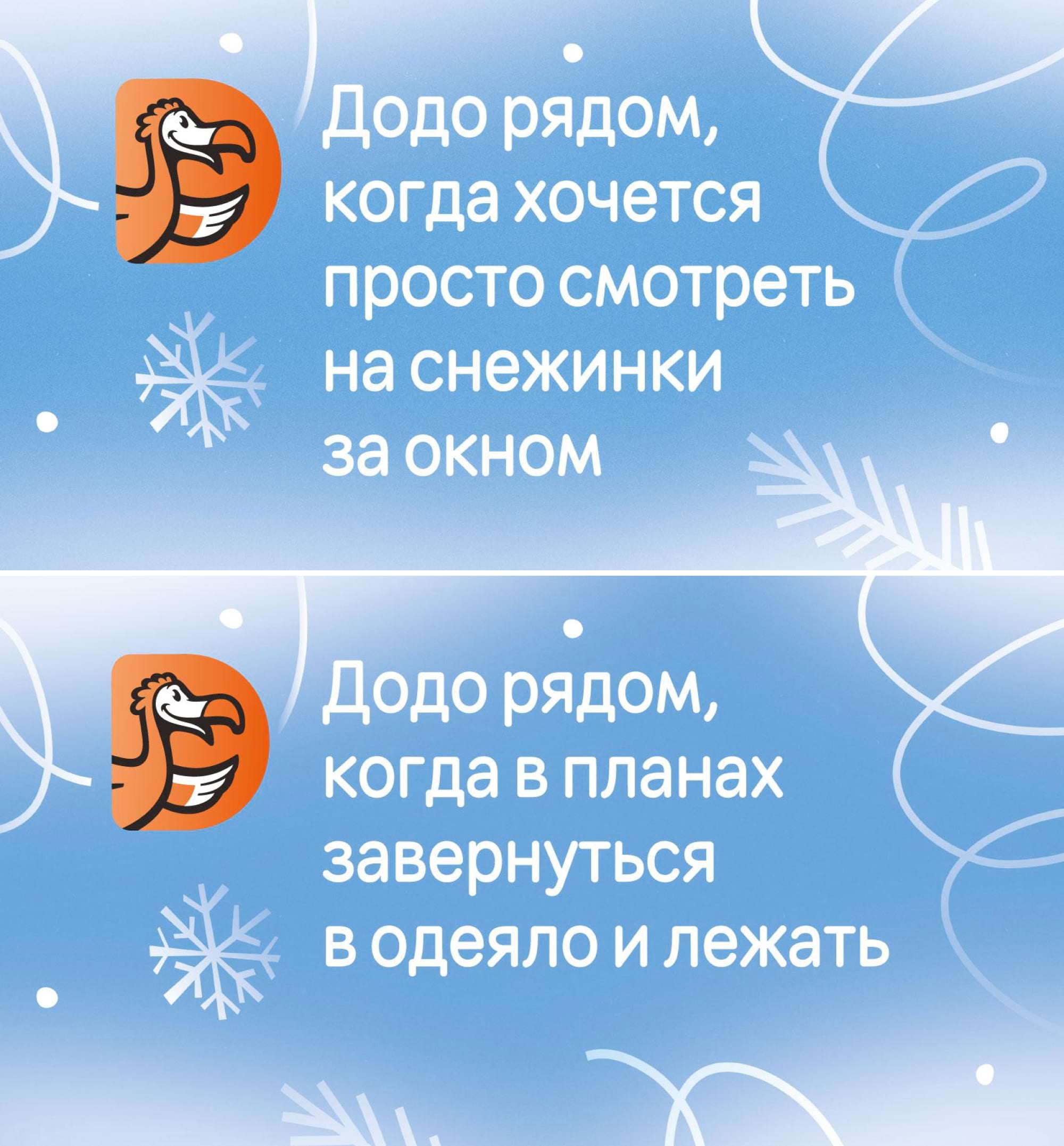
In-app and website stories
It's a communication channel that informs customers, helps with choices and makes our products stand out.
Stories can be somewhat divided into product, image and informational types. With the first and second categories, you can engage the audience through widgets, creative approaches, and storytelling. With the informational ones we speak shortly and clearly, straightforward, in 1-2 slides.
We do not shout out about our advantages
We act more subtly and neatly
Push notifications
These are small pop-up texts sent by Dodo Pizza app.
Push messages come in various formats: with promotions from CVM, marketing, or aimed at customer retention. With the first type we are rather formal. With the second we are on a catchy side, inviting to try our novelty. With the third, we can experiment. This is the point where function and emotion overlap.
Heading is cut off, descriptions are overloaded
Short, brief headings and terms, everything sits well
Email newsletters
In mass emails we write about new products and important events. In trigger emails we talk about subscription discounts, birthday discounts and dodocoin expiration dates. There are also weekly emails with personalized promotions.
The tone of voice can change slightly from letter to letter: it can be more cheerful in a text about a novelty or heartfelt, in an email wishing a Happy New Year. The key thing is to avoid clichés and not to contradict our general principles.
Too many descriptions: we stick to a maximum of two
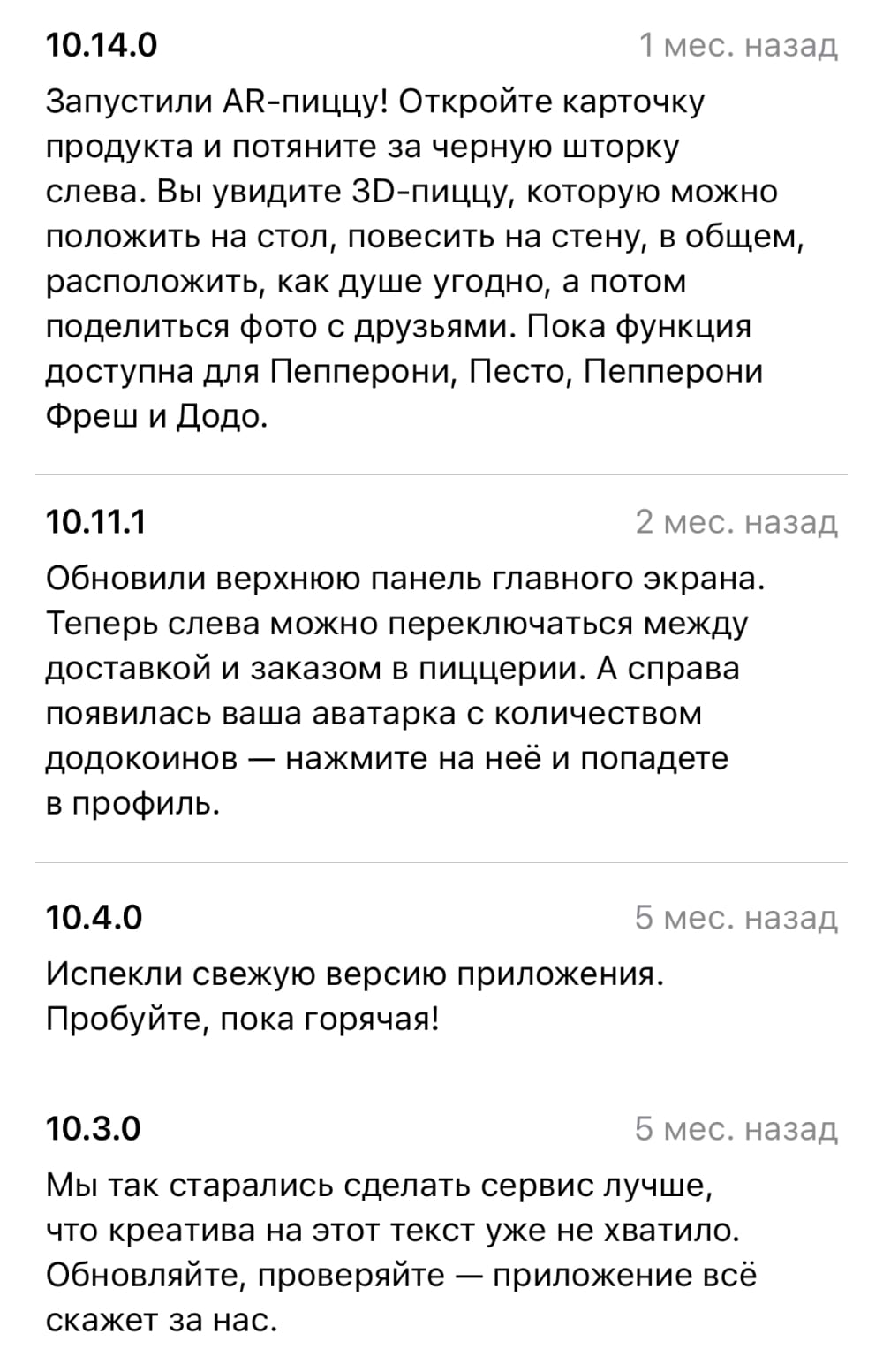
Release notes
Release notes are short texts in the stories, where we tell the customers about updates in the app. It is published when the app version is updated about once every two weeks.
Not the main communication channel, but we like to go over the top :)
The text is too dry, only developers can understand it
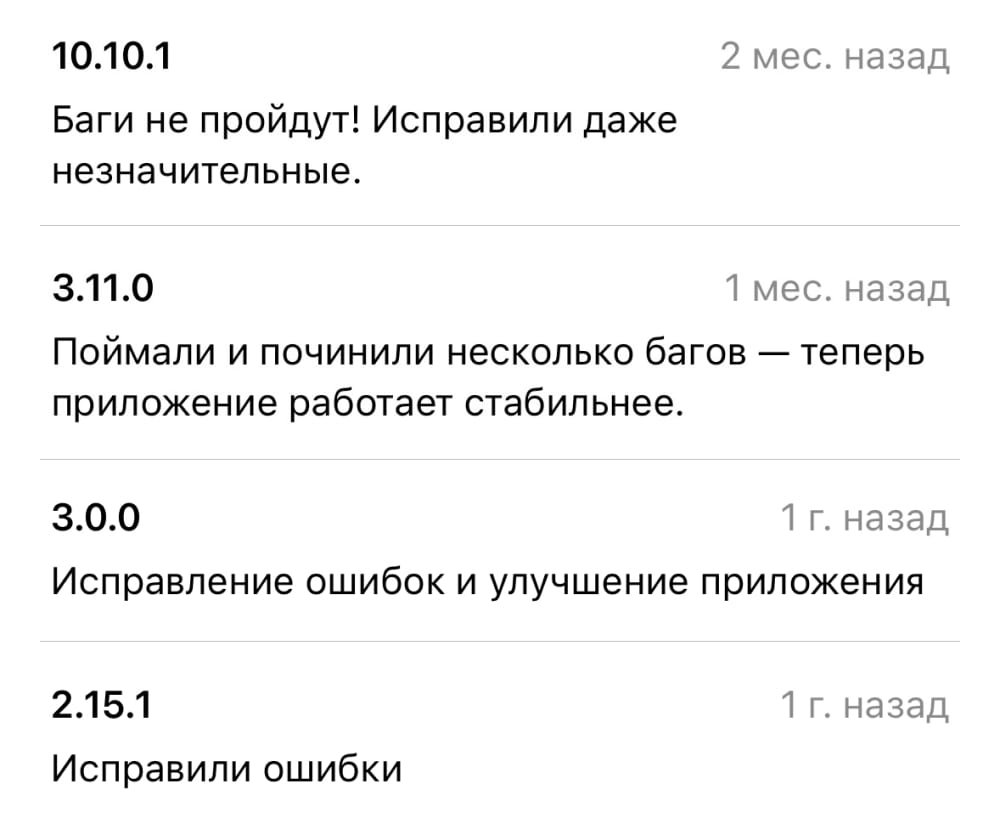
We play with news breaker, tell about features
Trade marketing
Trade marketing also has unique informational signs and stickers. We roughly divide them into “customer experience” and “brand story”. The first category includes messages that guests often cross paths with. Therefore, we strive for clarity, even if we translate a funny message in the signature brand style.
The second category is less frequently encountered by guests, so we can get creative here.
We usually address customers in a neutral language register. The exception is stickers on the pizzeria windows. This media's contact with a possible guest is only a couple seconds. To get the message across quickly and attract people passing by, we have options with quite an informal communication.
Radio commercials
This is an audio channel for talking about promotions, products, job openings and other advertising messages.
A great number of people find it more difficult to listen, so it is important to outline the points correctly. In 15-25 seconds you need to get the main idea into the story. Subtle references and Easter eggs are not a good idea here, but this does not mean that everything should be presented straightforwardly.
With radio commercials, you can go for creative leads highlighting the key message. Be a little goofy, throw in some fun facts. The main thing is not to lose focus and not to shift it for the customers.
Media channels
What we mean here are static and video banners on external platforms like Yandex, Avito, Google. Just like trade marketing, media channels help to support a project, product or other type of message. Therefore, we focus on the project itself to select the tone of voice. The key point in media is to be brief, so that the customer can read the message instantly. But even here it is possible to apply fascinating approaches or creative techniques to capture the customer’s attention. If you need to dive into formats and limitations, ask the Media team for a brief.
More on it in the Digital Guide
Multiple messages on a layout, sensual product description
One message on the layout, concise product description
Landings
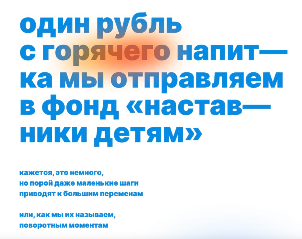
This long read format gives you more space to maneuver. You can be funnier or more heartfelt, play up with some facts and throw in catchy headings. The main thing is not to get carried away and remain comprehensible. When talking about charity or why we cook without gloves, it's of first and foremost importance to get straight to the point. It's equally important to keep an eye on layout and punctuation.
Short dashes instead of long dashes, repetition, overcomplicated wording.
Here is an example of everything being done well. A playful, yet clear headline. Short informative text, proper layout.

We leave space for exceptions and experiments. For example, we refuse to capitalize letters or put a long dash instead of a hyphen. These are not mistakes, but stylistic and visual tools.
Check-list
Read next: