
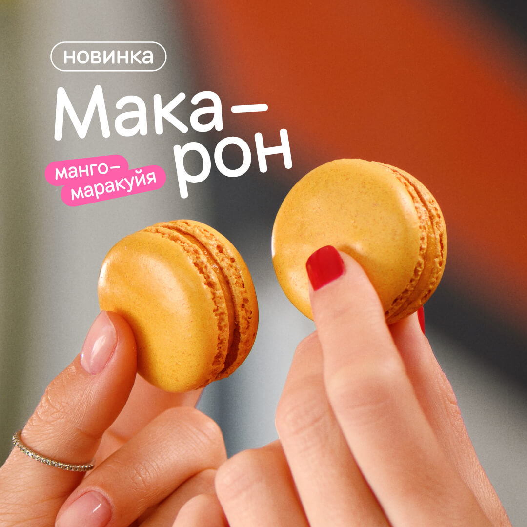
Typography
The four types of text on a standard Dodo product layout are heading, subline, caption and legal information.
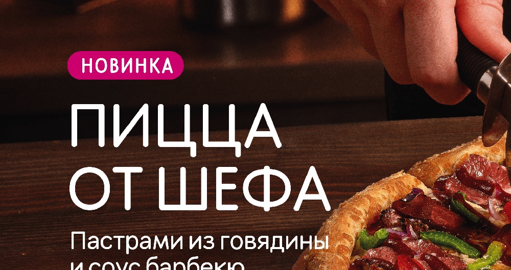
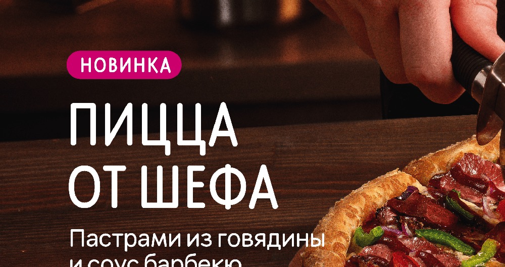
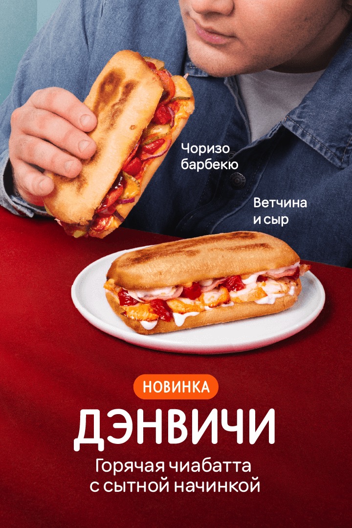
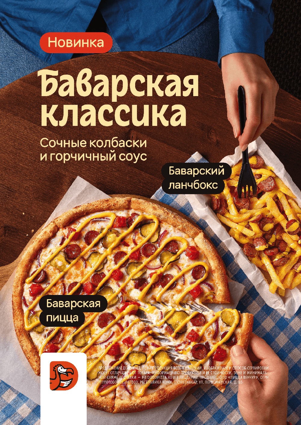
Heading
Heading is the major text element of the layout. It is read first and sets the page structure, so the heading should look solid and have sufficient visual weight. It can be typed in our signature Dodo Rounded font or another accentuating font. The heading has the largest font size In the layout. A long heading is carried over several lines, but no more than four.


The heading should be typed in lowercase letters with the first capital letter. If it occupies 1-2 lines, it can be typed entirely in capital letters. In this case, we use font variation to visually compensate for this feature: we compress the character width to 55-65% of the default value.
To make a two-line heading look like a solid block, we reduce the spacing to 80-90% of the default value.


In headings that are too long, the spacing is not compressed; such a heading already exists by the rules of a text paragraph, especially when there is no subline below.

The thickness of characters in the heading depends on the number of lines in it. For a single word, use “bold” so that the heading has enough weight. For several lines, use font variation and set a medium value between “regular” and “medium”. A block of several lines already has enough visual weight, thus, it will be too massive in bold.

We apply the same principles when using other fonts in the heading.
The rest of the text on the layout is typed in Dodo Rounded font only.
Subline – a paragraph of text explaining the title – is typed in medium or slightly thinner, lowercase letters with the first capital letter. We do not type a period sign at the end of the subline.
Interline spacing depends on the line length: the longer the line, the more spacing it has. A subline usually consists of short lines of 2-3 words, so the interline distance in it is set to about 85%. The subline doesn't fit into the heading interline spacing, but at the same time it doesn't break away from it either.
Yes
No
No
The subline should not be right-aligned, it is always left-aligned or centered. No more than 3 lines are centered.


To make the text in the subline readable, choose the most homogeneous place for it in the photo.
Captions. They are typed according to the same principles as the subline, but the caption is smaller than the subline. In the hierarchy of font sizes, it is a text of the third order. A product caption can be on a plate or without one, if the background allows it.
The caption “novelty” is always inside a plate, but the plate can only have an outline. The “novelty” word can be fully capitalized if the title is also capitalized. In this case, reduce the width of capital letters according to the same principle as in the heading.
The caption is written in lowercase letters with the first capital letter as a subline if it is a stand-alone paragraph. If the caption continues the heading or an explanation of the subline, type it with a lowercase letter.

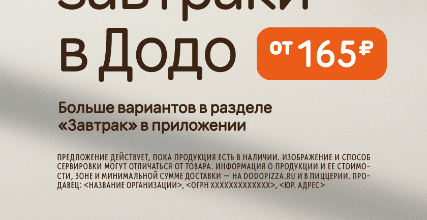
Legal information. It is typed in regular style capital letters; the width of letters is reduced to 40%. To make this block look like a rectangle, we use width alignment. To avoid holes in the typesetting, we turn on automatic hyphenation and, if necessary, manually make inlining and outlining. The last line is not aligned by formatting. Transparency of the text with legal information on the background of the photo 85%.
Read next: