
Сomposition in the layout
Composition arranges the elements of a design into a whole statement. A good composition is such a type of space organization in the layout which sets the correct reading order, leads the viewer from the main to the secondary, and helps to navigate through the information. To achieve such a composition, it is necessary to find the right ratios of the size of elements and distances between them.
Layout Elements
The basic layout elements are heading, text, illustration, and background.
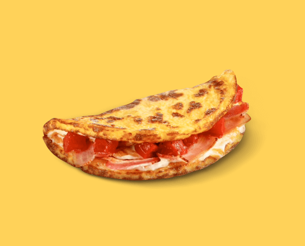
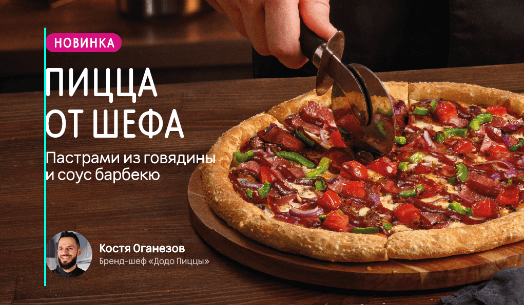
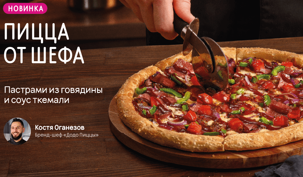
Product. It is always necessary to keep in mind what exactly we are advertising. If we are promoting a product and not a service, then we show the product on the layout. It should be large enough and occupy the majority of space in the composition.

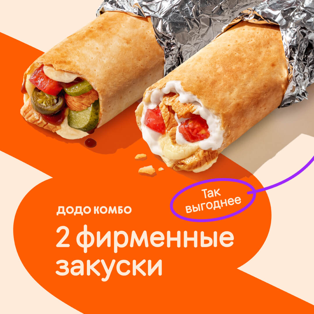
If the product is in a package, the package is unwrapped. If the product has a filling, it is clearly visible. If the drink is in a paper cup, the lid is open. If the product is in someone’s hands, the hand is not covering the product. The model’s clothing and manicure should not draw more attention than the product itself.
Background. The background is created contrasting to other elements. Contrast can be both in tone and lightness. Also, the background should not be too motley, so as not to draw attention to itself and do not make it difficult to read the text. More about the colour is told in the guide «Colour Combinations».
Heading. A visual hierarchy of meanings is important. We start with the main thing, and then go to the details. Thus, it’s clear what the layout is about at a single glance.
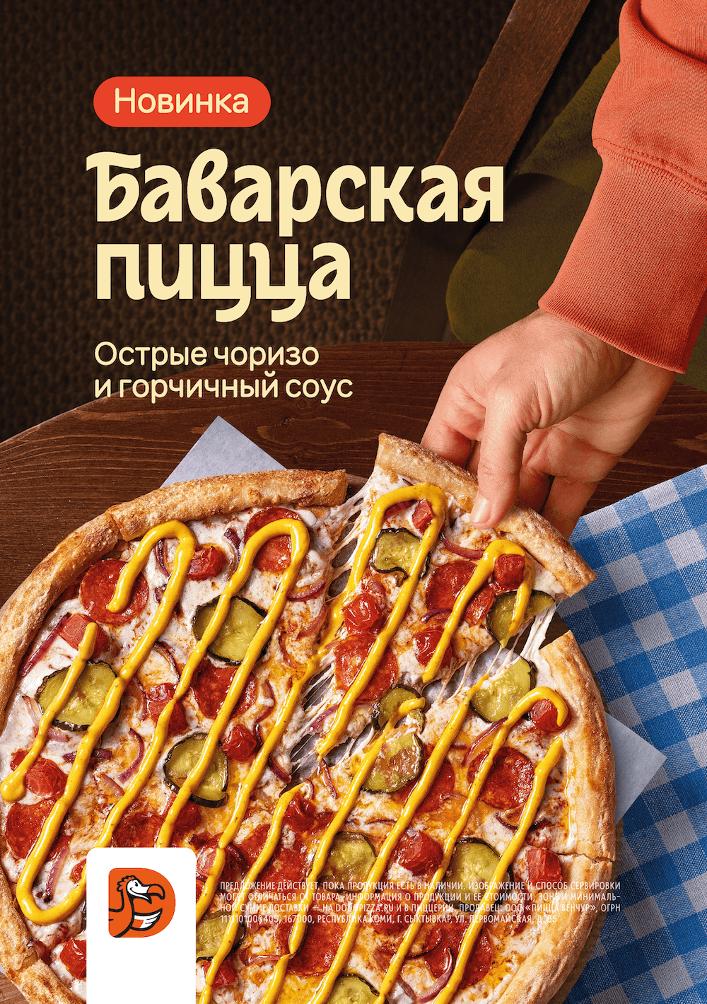
If the visual is about a new product, the heading will be the product name. If the visual is about a special offer, the heading should make it clear what the offer is about: a combo set, or a limited edition product.
Text. We make text blocks on the layout short and unambiguous. We use tags instead of whole sentences where possible. For example, the tag «New» instead of «We have a new pizza».
It is possible to type the name of the product or promotion in capital letters, but we do not type all the text on the layout in such a way: it only decreases readability. Text blocks are typed in lowercase letters with a capital letter at the beginning of the sentence.

When describing the details of the offer, we focus on the location of the layout. The less time a person has to be in contact with the information, the less of it should be there. A small leaflet or a large billboard: the time for reading is minimal. That’s why we place only the most basic things on the layout: the essence of the offer and its mechanics. A poster in a restaurant near the cash register: there’s more time for reading, you can tell more and add details to the image.
Placement Principles
The designer’s job is to harmoniously spread the basic elements within the given format. For this purpose we use the following techniques.
Apply the module principle. It is easiest to make a neat layout using rectangular modules. The advertising medium itself is a rectangle, which means that it can be divided into smaller rectangles without remainder. If you align all the text to the left flag, you can easily make a nice layout without blank spaces. The rectangle will be readable, even though it has only the left corners underlined, the format itself helps to complete the module in the viewer’s mind. With center alignment it is more difficult to balance the composition.

Do the alignment. The designer makes sure that the rectangles are aligned in relation to each other so that there is no «almost but not quite there»-thing. We align them perfectly or spread apart to make the distance more obvious.
Preserve the natural reading order. The information on the layout is perceived in the same order in which the text is read. In Russian, English and Turkish, this is from left to right and from top to bottom. That’s why we place the blocks sequentially as the viewer would observe them: first comes the most important — a large heading, then a subline; then even smaller pieces of information, so that the eye doesn’t dart around the layout in search of continuation. The plate can stand above the heading, it is connected to it and the reading order is not disturbed.
Link the elements. What stands next to each other is perceived as logically connected. Therefore, the heading and subline should not be too far apart. But we take into account the counterspace, do not stick the blocks together, and do not intrude into the interlineage of the heading.
Leave the fields. Counterspace on a layout both separates layout elements from the environment and brings them together. You can’t put text to the edge of the layout: the text can be partially cut off during printing. Also, when the spacing inside the modules is greater than the distance from the modules to the edges of the format, the layout falls apart. The air pressure inside the block is stronger than outside, and the block is shattered and does not look unified.
The bottom margin is usually slightly larger than the top margin to compensate for the visual weight of the layout.
Adding a bar, ruler or frame always creates a new format with its own margins.
Read next: