

Making a sketch
Sketch helps to test the idea in early stages, to get approval from the owner and to compose the terms of reference for the photographer.
We move on to creating a sketch after collecting references. The more detailed the sketch is, the easier it is to "sell" the idea to the team and explain to the photographer what goals we want to achieve.
Sketch is a draft of the layout, in which there is a collage of references or photos from the pre-shoot on the place of the final image of the product. The designer shows the sketches to the project team, approves the direction of the design and only after that proceeds with the development of the layout.
Using references as a starting point
At the stage of collecting references, we find and filter ideas. In the sketch, we work out possible directions. These directions are radically different versions. Not just various colours or angles, but different meanings, situations, and approaches to picturing the product.
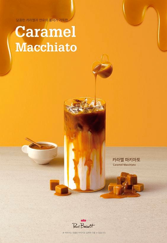
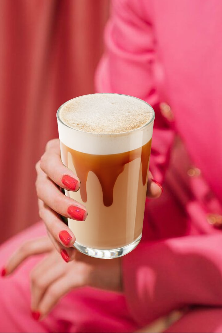
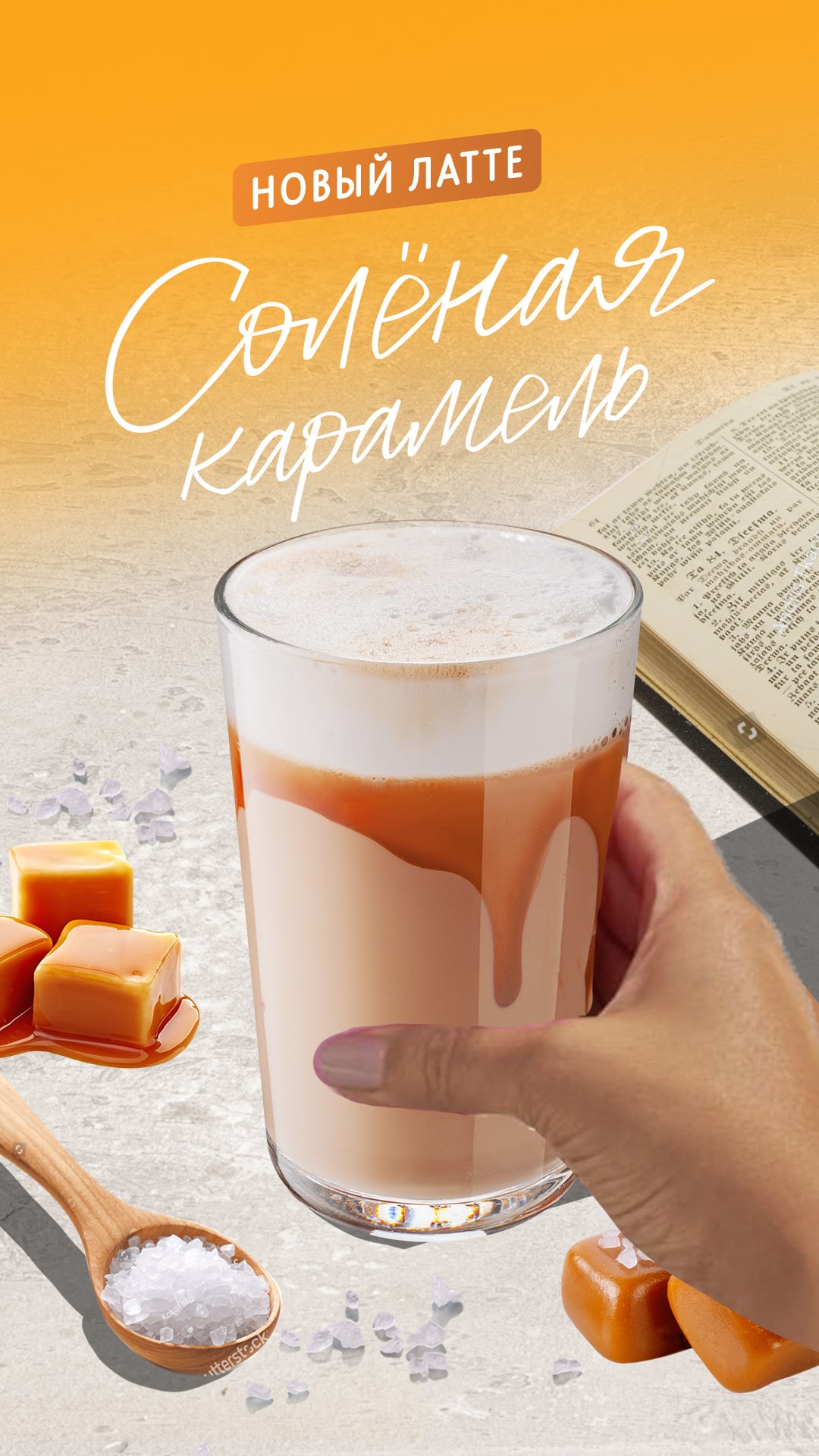
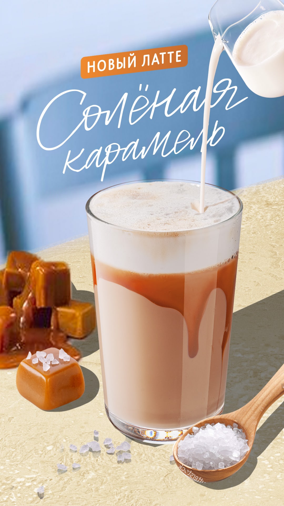
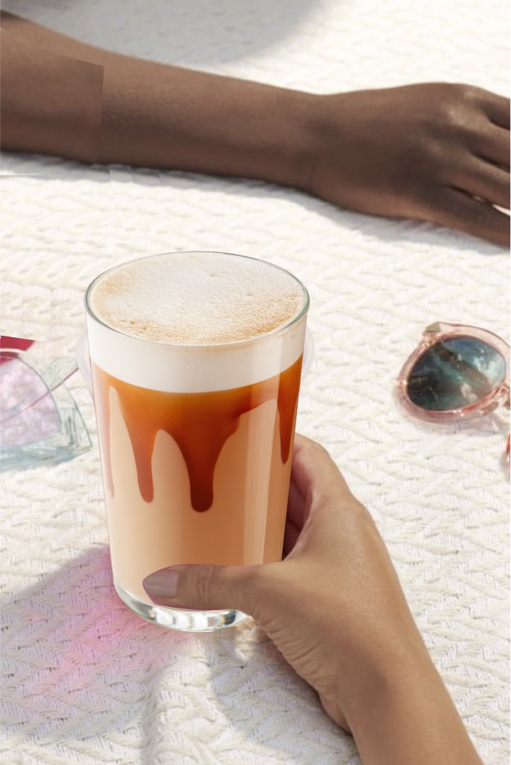
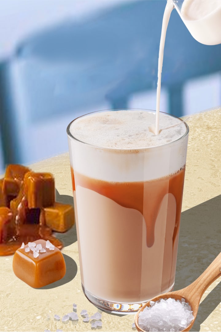
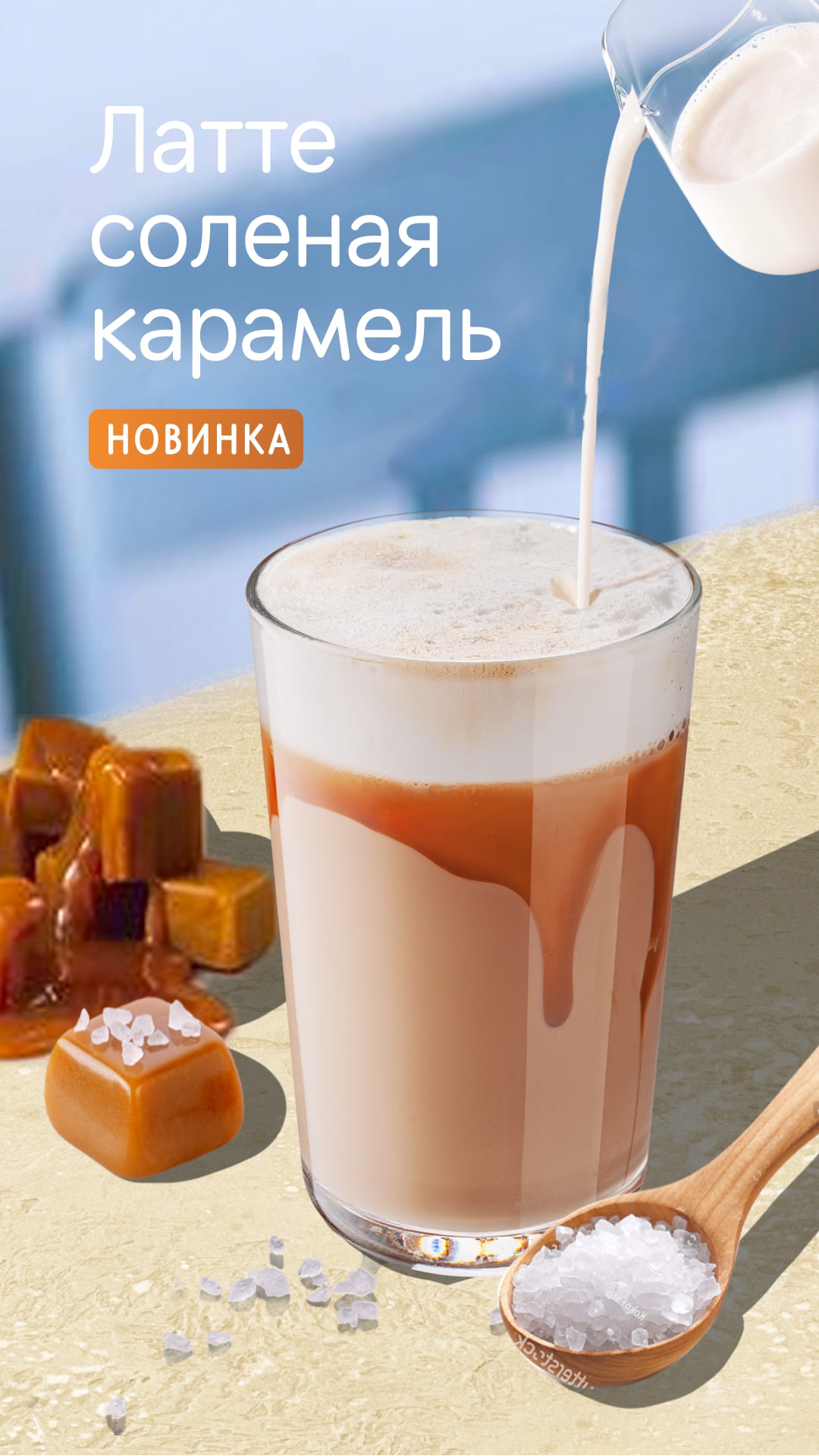
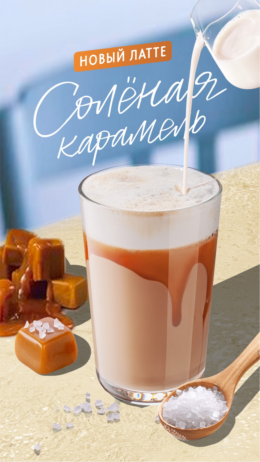
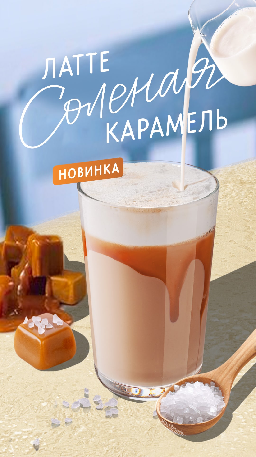
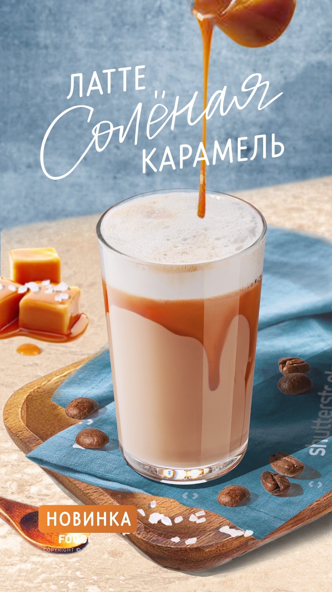
Let's take a look at creating a sketch using the example of a Salted Caramel Latte. This is one of the directions we chose to work on.
Don't give up on weird ideas
Just like finding references, sketching is one of the most loose stages. We work through even really odd ideas, experiment with product presentation, and then adjust the result to the task we’re solving.
Test several directions
Successful alternatives are often born in the process: it may happen that the favourite idea does not work, but a new one will appear at the junction of two others. That's why we develop 3-4 directions, at least in rough strokes.
Work out the key elements of visuals
To make the idea comprehensible, we develop the key visual elements for each direction at the stage of sketching: composition, colour, light, typography, angle. If we plan to place a staged photo on the layout, we also figure out the action, location, and props.

Remember the essence of the product
Determine what's important about the product, and then look for tools to help reflect its benefits. It could be a colour, a texture, or an image from childhood that reminds you of the taste.
Always evaluate the sketch in terms of telling the story of the product. Don't cling to pretty references, but focus on ideas that convey the flavour of the food or the benefits of the offering. If the picture doesn't tell the story of the product, we discard it.
Spotlight the text
Text affects the perception of the layout, and it does so at the approval stage. Poorly assembled text can ruin the impression, so we set accents even on sketches, work out the font, style, colour and composition. Eventually, the team has a more accurate idea of the final result.
Consider the limitations of the media
Let's take a light box as an example. Sunlight falls on it, so sometimes the picture is backlit. Additionally, the printing company can produce a not very contrasty banner, which also affects the perception of information.
We take into account these limitations and select colour and contrast so that the design is well read on all media. Make the product and text contrast to the background so that they are clearly visible even at a distance. Avoid overly dark images, as there is a risk that everything will blend into one dark blur on print.
Finalize the most successful version
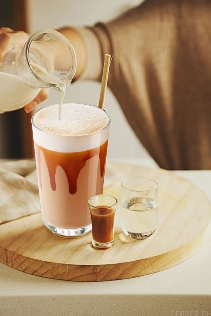
When preparing a sketch, we go from the general to the specific: we choose one or two rough sketches, demonstrate them to the designer, and then work on the most successful version. We try different technical executions of the chosen idea: we change colour, angle, composition. We figure out the solutions which display the product better.
In the example below, we changed the milk in the jug to caramel, tweaked the positioning of elements, added a drink coaster and refined the typography so that the word "latte" is not lost in the visuals.

Test an idea on mockups
A picture is perceived differently on the screen and in the environment, so we check sketches on mockups. If the visual merges with a wall in a restaurant or the facade of a building, we make adjustments: try out other colours, make the product larger, add contrast. All official mockups are collected in a separate folder. Use them!

Prepare a vertical and horizontal sketch
This allows you to reflect on different aspects of the composition and arrangement of elements, which simplifies the process of replicating the design on different media.
Collect feedback from the team
Preparing a sketch is the last opportunity to change the concept or refine the idea globally, so we regularly organize team meetings where we look at mockups and share our feedback.
Conducting a survey
Sometimes a designer likes two options and develops both of them. In this case, we show the sketches to a test group and check which one reveals the essence of the product better.
The final sketch is approved by the designer, and then we start writing the terms of reference for the shoot.
Read next: