
Layout design checklist
We go through this checklist before handing the layouts over. We have now accumulated the mistakes we made when developing layouts and piled them up in a checklist that will help avoid them in your work.
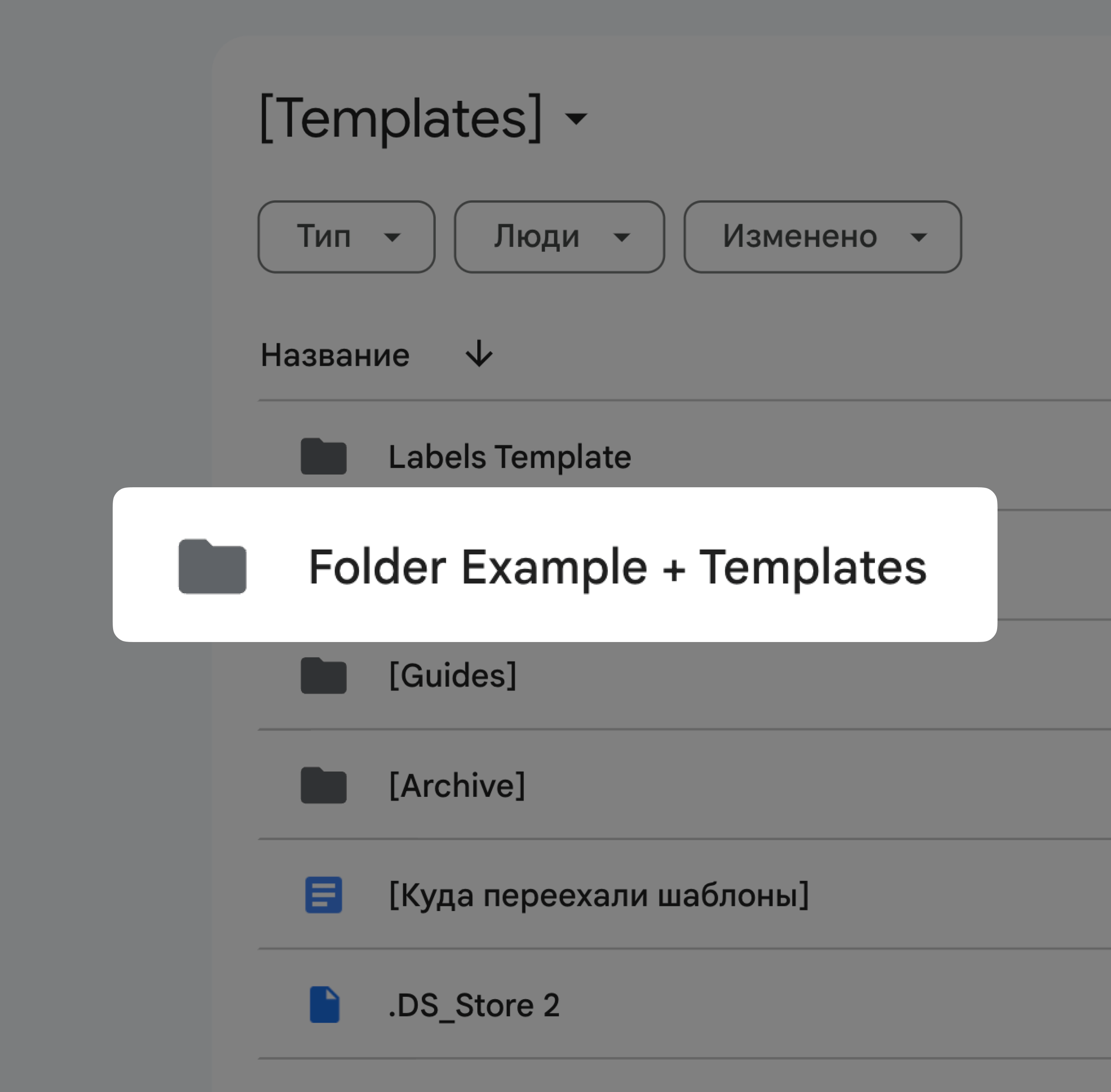
Use an up-to-date layout template
We update our templates on a regular basis, and store current versions in a folder on Google Drive. We use files only from this folder when developing layouts. This helps with overall synchronization: even if a designer somehow misses any information about an update, they will still operate up-to-date templates.
Stick to the proximity principle
Always make sure that the spacing between lines, words and letters is set according to the proximity principle: “objects close to each other are perceived as a unity”.
Use current elements of the design system
We select visual elements from the Elements Library, rather than copying them from previous layouts. The aim here is the same as in the first item: all elements of the design system are updated from time to time, and to avoid confusion, we store the up-to-date versions in one spot.
Dodo

Not Dodo
Round all the corners
Rounded corners are a feature of Dodo's visual style. We round them on buttons, icons, bars and other elements. We leave sharp corners only when it is required for a particular task.
Dodo
Not Dodo
Get rid of annoying touches and “crackling”
There is an unspoken design rule: elements should either overlap or stay at a distance. And we follow this rule. When elements rub shoulders, they end up having these unappealing touches.
Fine-tune the layout
We make color correction, adjust brightness, contrast and sharpness, add reflexes and shadows, correct light and draw details.
Dodo
Not Dodo
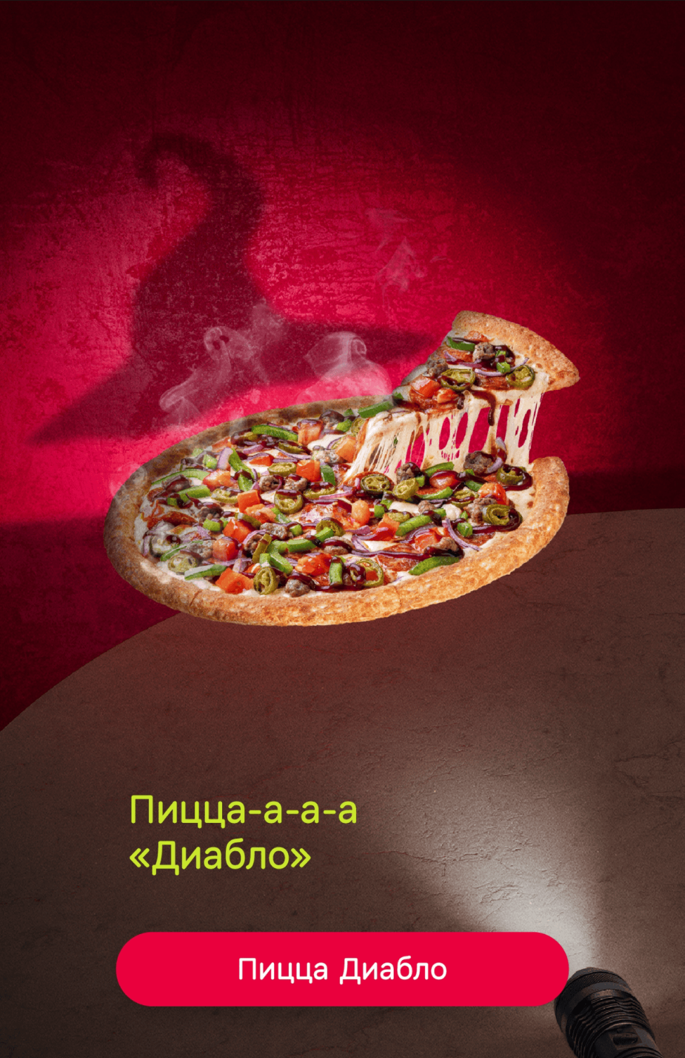
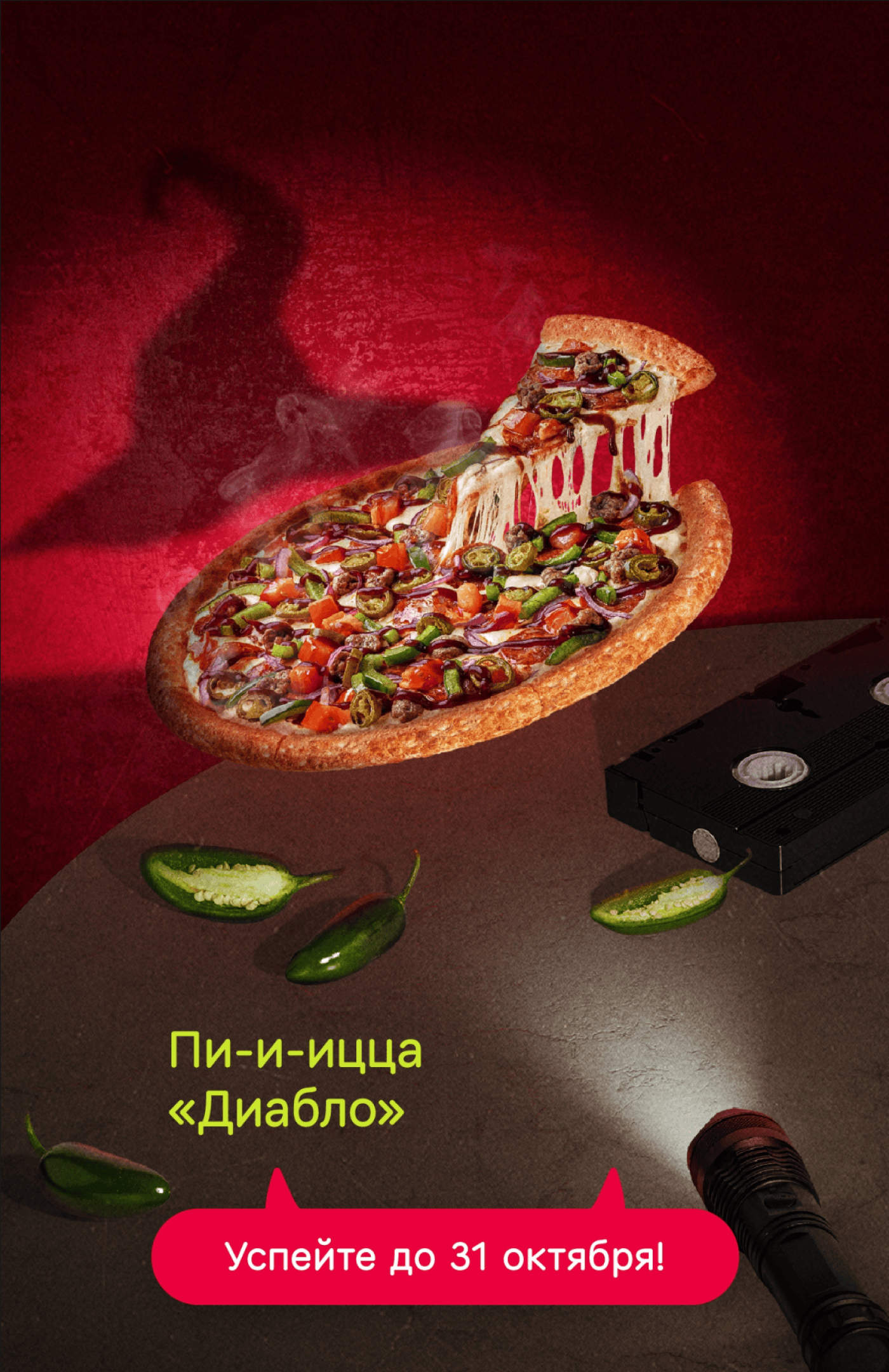
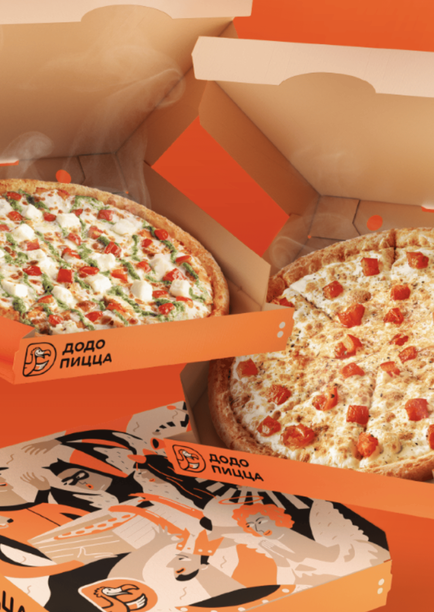
Add steam to hot foods when necessary
You don't always need to add steam to hot foods in your images. For example, if we show people eating pizza in the park, we don't do it because the pizza was taken out of the oven a long time ago. The same goes for coffee with milk foam, there's usually no steam above it. But we show a cup of Americano with steam to highlight that the coffee is hot.
Dodo
Not Dodo
Add crumbs when showing a sliced product
It's impossible to cut a pizza or a brownie without leaving some crumbs. We add them to the layout. Such details are also a part of the “fine-tuning”. They make the composition more authentic, and the product looks more natural and appetizing.
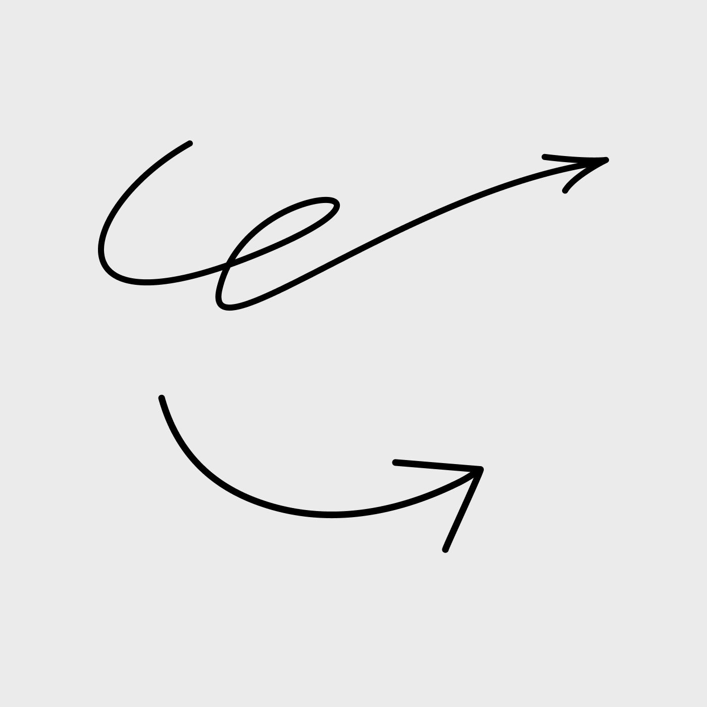
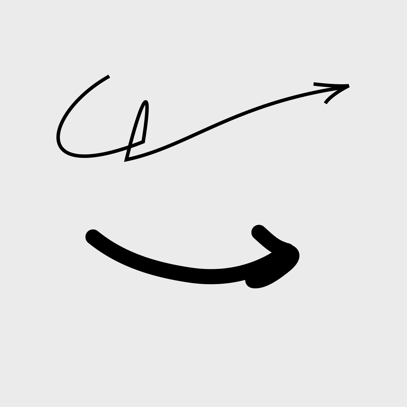
Draw the proper arrow
The Dodo’s arrow has smooth curves, without creases, and a moderately thick outline so that it doesn't distract attention from text and other elements. This arrow is a part of the brand’s visual style, but sometimes we draw the arrow differently if the task requires it.
Dodo
Not Dodo
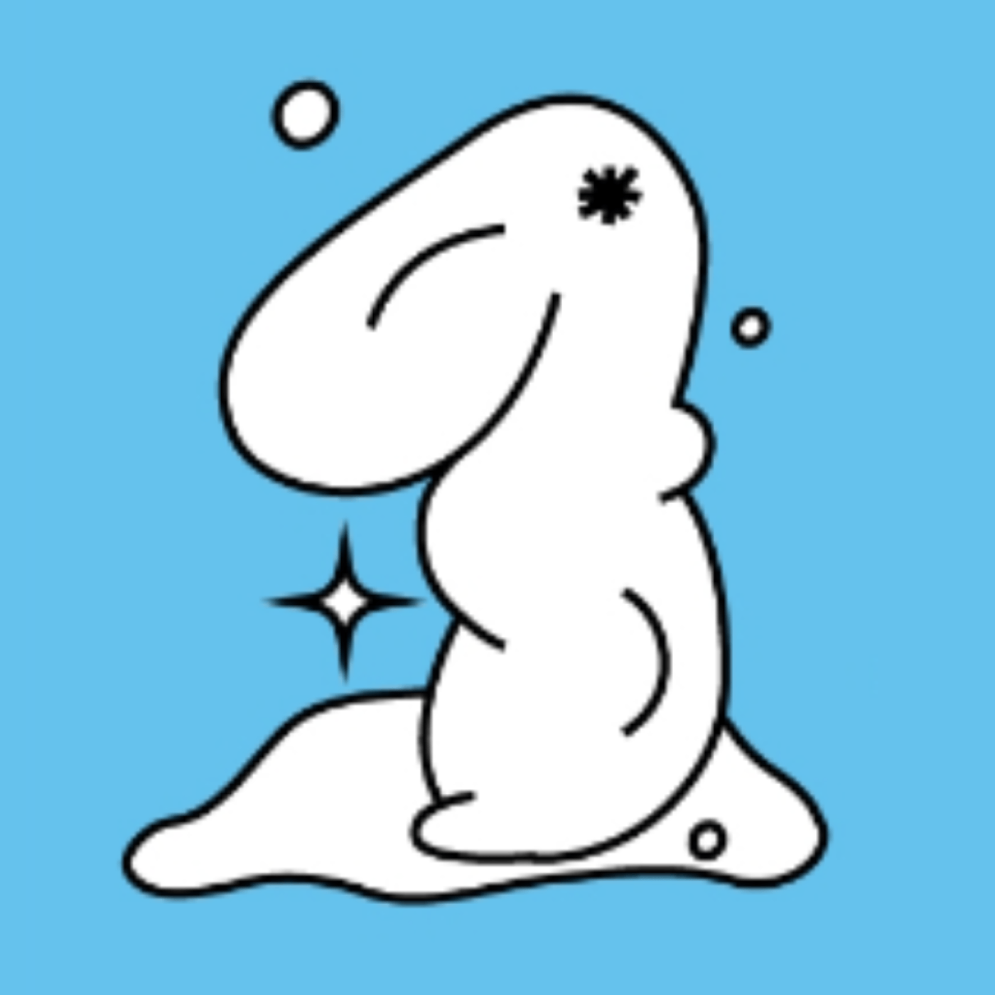
Present your images to the team
When we make illustrations, we are free to unleash our imagination. But don’t forget to make sure that the items remain similar to real objects. Show the images to the team and collect feedback to see if the illustration conveys the idea.
Dodo
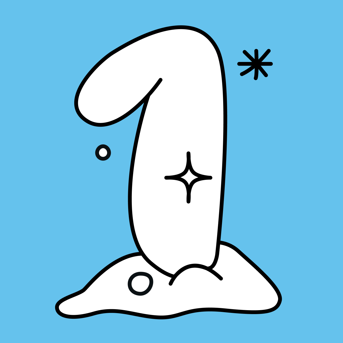
Not Dodo
Make sure the proportions of the layout elements fit the media
Check whether the design elements match the size and proportions of the actual media on which they will be placed. For example, if you are designing a package, print it out and see if the text is comprehensible.
Dodo
Not Dodo

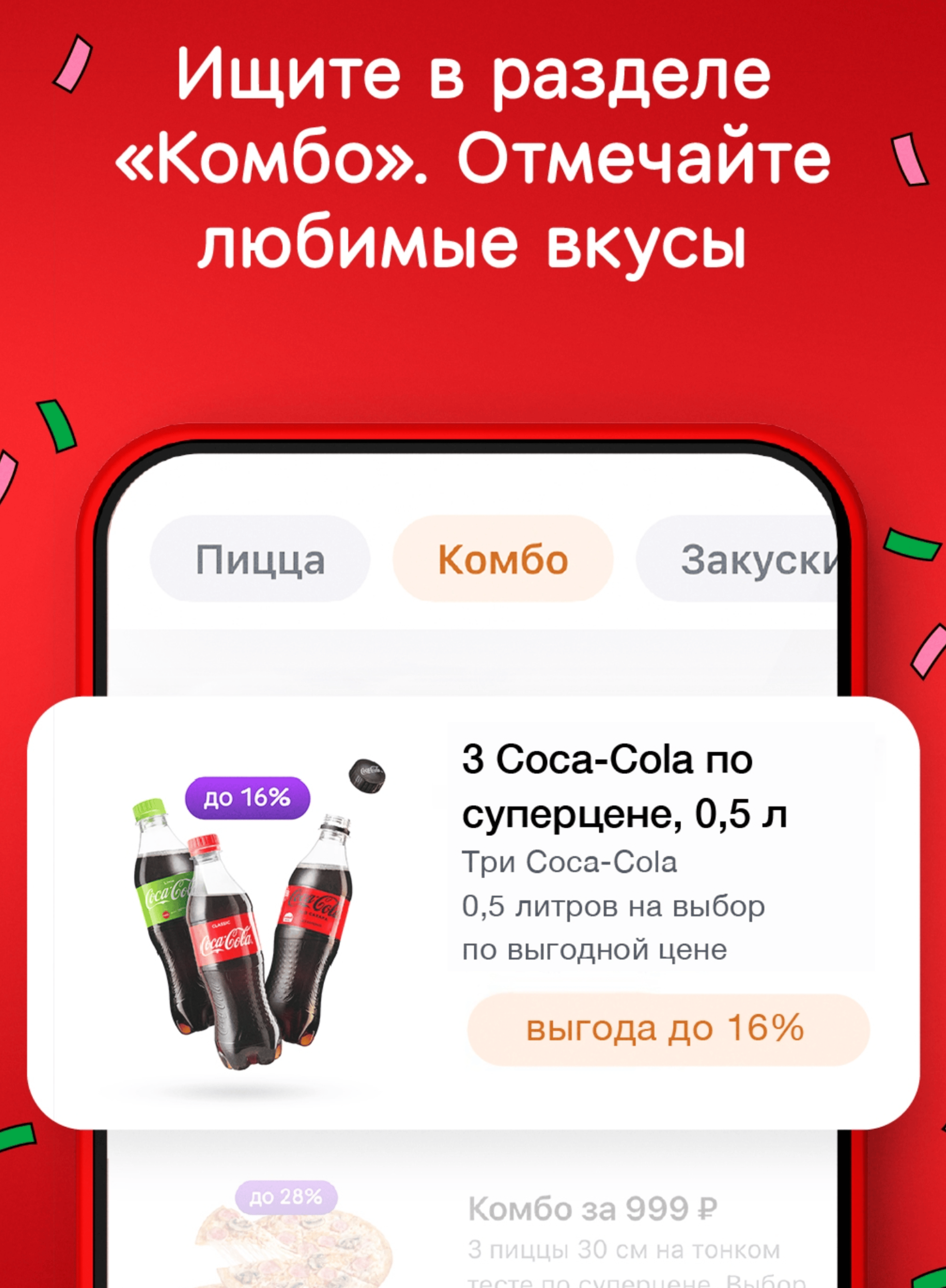
Zoom in on UI elements in layouts
When we demonstrate the application interface, we intentionally break proportionality: it helps to focus attention on key details. Make key elements of the layout larger, and simplify the secondary ones.
For example, if we announce a promotion via the app, we highlight the product category it applies to. If we talk about a new feature, we show the button or section in a large way. A regular screenshot won't work because the user won't understand where to look.
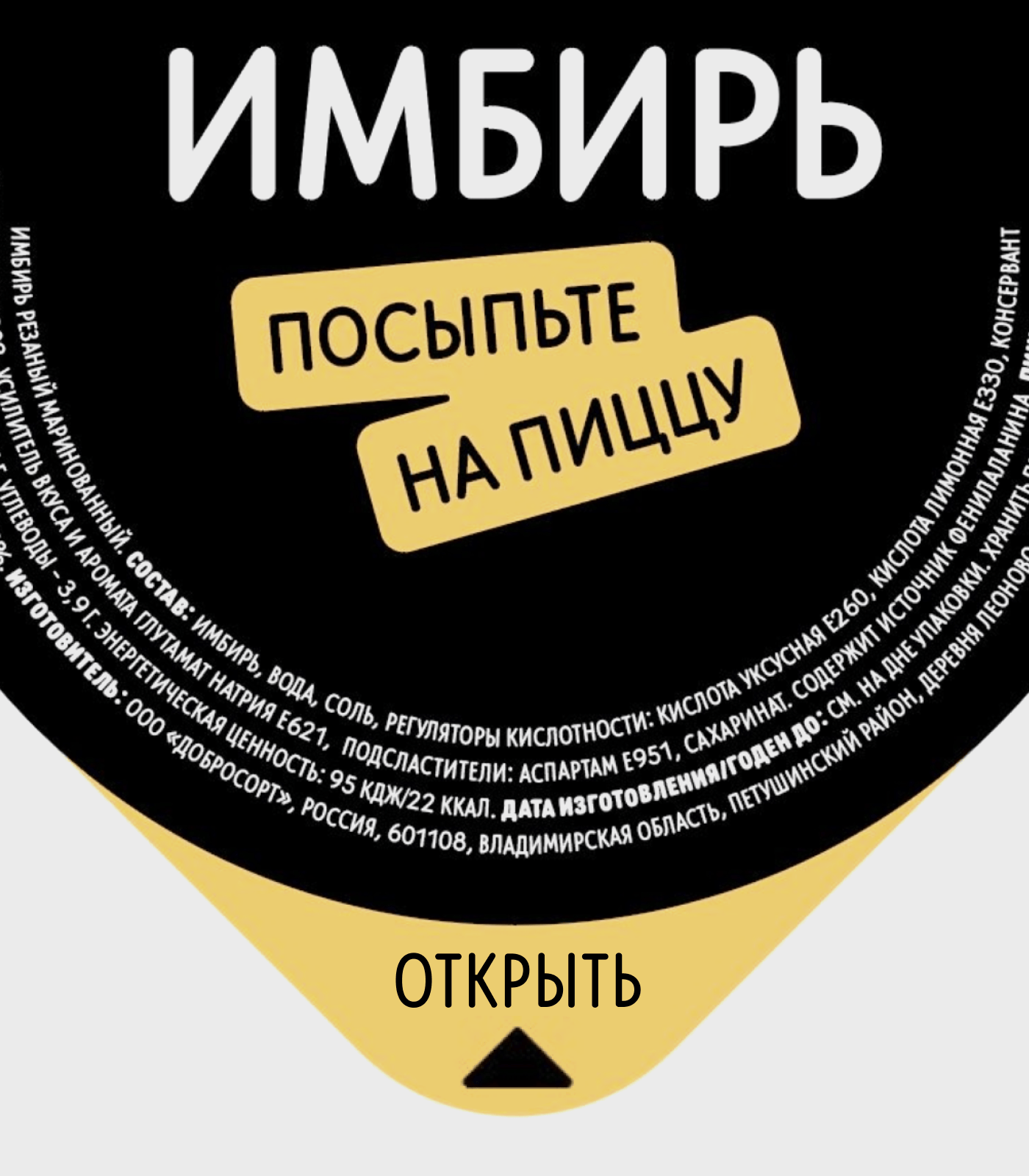
Add legal information to both product and promotional layouts
Legal information is a text block which contains important details about a promotion or product offer. If we don't add this to the layout, we and our partners can be fined under Article 14.3 of the Administrative Code of the Russian Federation for 100-500 thousand rubles.
In a selection of guides “Legal aspects” we talk about how to design legal information items.
Specify partner companies’ copyrights
If we make a layout as a part of a collaboration project, we specify the copyrights of the partners.
Check the layout on the mockup
The perception of the design is influenced by its environment. It may turn out that the background color of the layout blends in with the walls of the pizzeria, and the text is too small for a street light box. Always try out the layout in context and make sure that it will work in real life as it does on the computer screen.
We also store current layouts in a folder on Google Drive. If there is no suitable media among them, we improvise. For example, we go to a mobile app, take a screenshot and try out the layout.
Check the layout on real media
If possible, we check layouts not only on mockups, but also on actual media. In our Moscow office, we have a screen that is the same as in our pizzerias. We test layouts for TV boards on it. We can print a paper tablecloth or a tee-board on an ordinary printer, and we test layouts for social media in accounts specially created for testing layouts.
Read next: