Assembling a master layout
A master layout is an averaged resize of all media. We assemble it to facilitate the process of replicating the visual to the rest of the dimensions.
We put together the master layout after shooting and retouching. We take a sketch as a basis: choose the size of the most informationally intensive and popular media - usually an A1 light box or a 1080 x 1920 px TV board; we work out the technical details of the visual. After that, we approve the layout with the product owner and proceed to replication.
When the process is executed this way, the owner doesn't have to wait for the designer to put together all the layouts. And the designer doesn't recreate all the media over and over again, because they start replicating only after the master layout has been agreed upon.
Check the information with the owner
We often place draft text on the sketch, and transfer the final version to the master layout. At this stage, we clarify the product name, price, terms of promotion, and the text.
Processing photos
We look at how well the photos correspond with the idea, whether the product is well illuminated. If we’re not satisfied with the result, we retouch the photos additionally.
What we do:
- Adjust colour: change hue, saturation, and white balance to convey the right mood.
- Adjust the brightness, contrast, and sharpness of the photos to outline details.
- Add reflexes and shadows to make photos look more three-dimensional and realistic.
- Adjust light: darken or lighten specific areas of the photos to highlight or balance elements in the layout.
Finalizing the composition
If we did not have time to finalize the elements (text, price, photo fragment) at the sketching stage, we do it on the master layout.
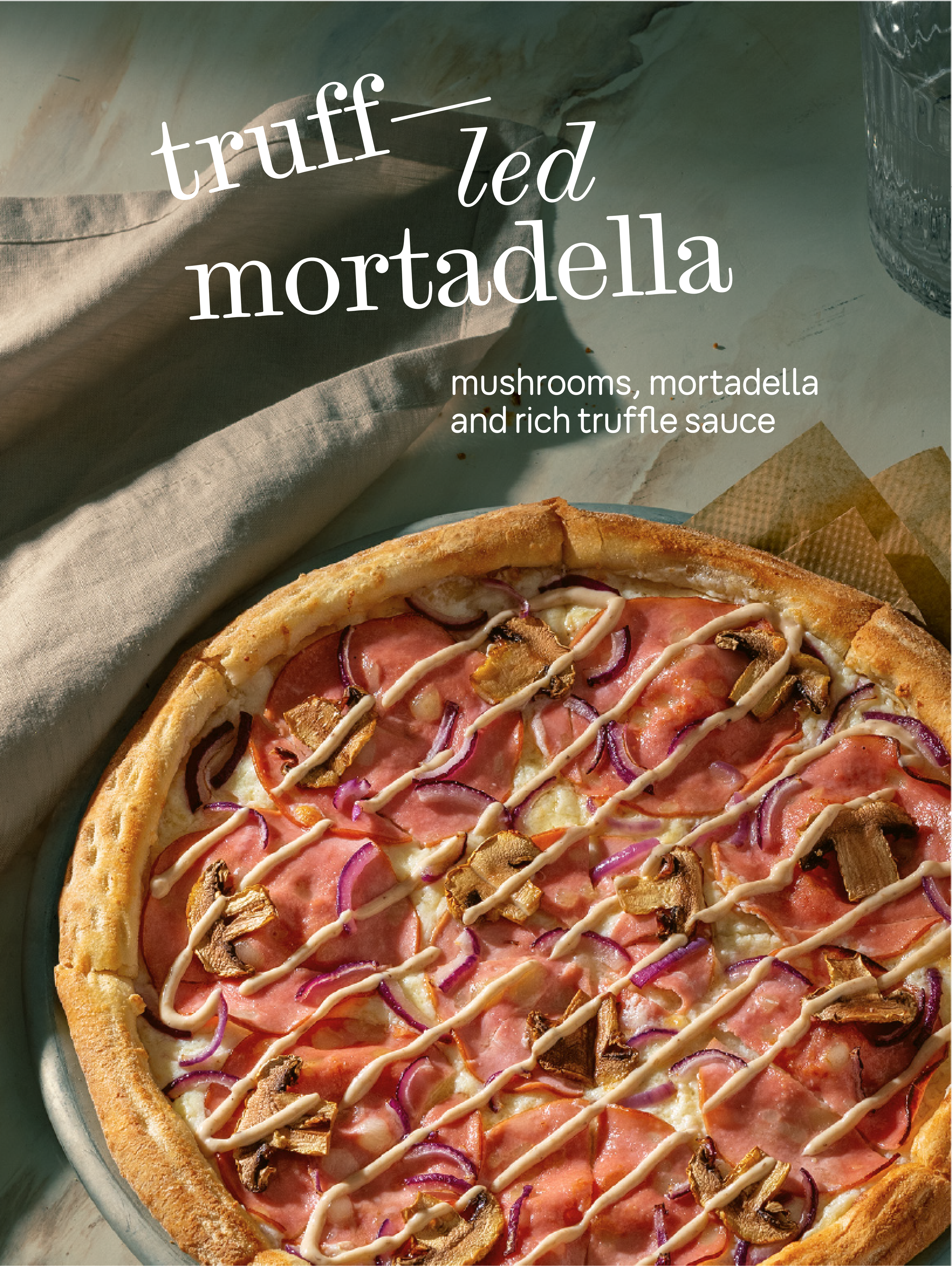
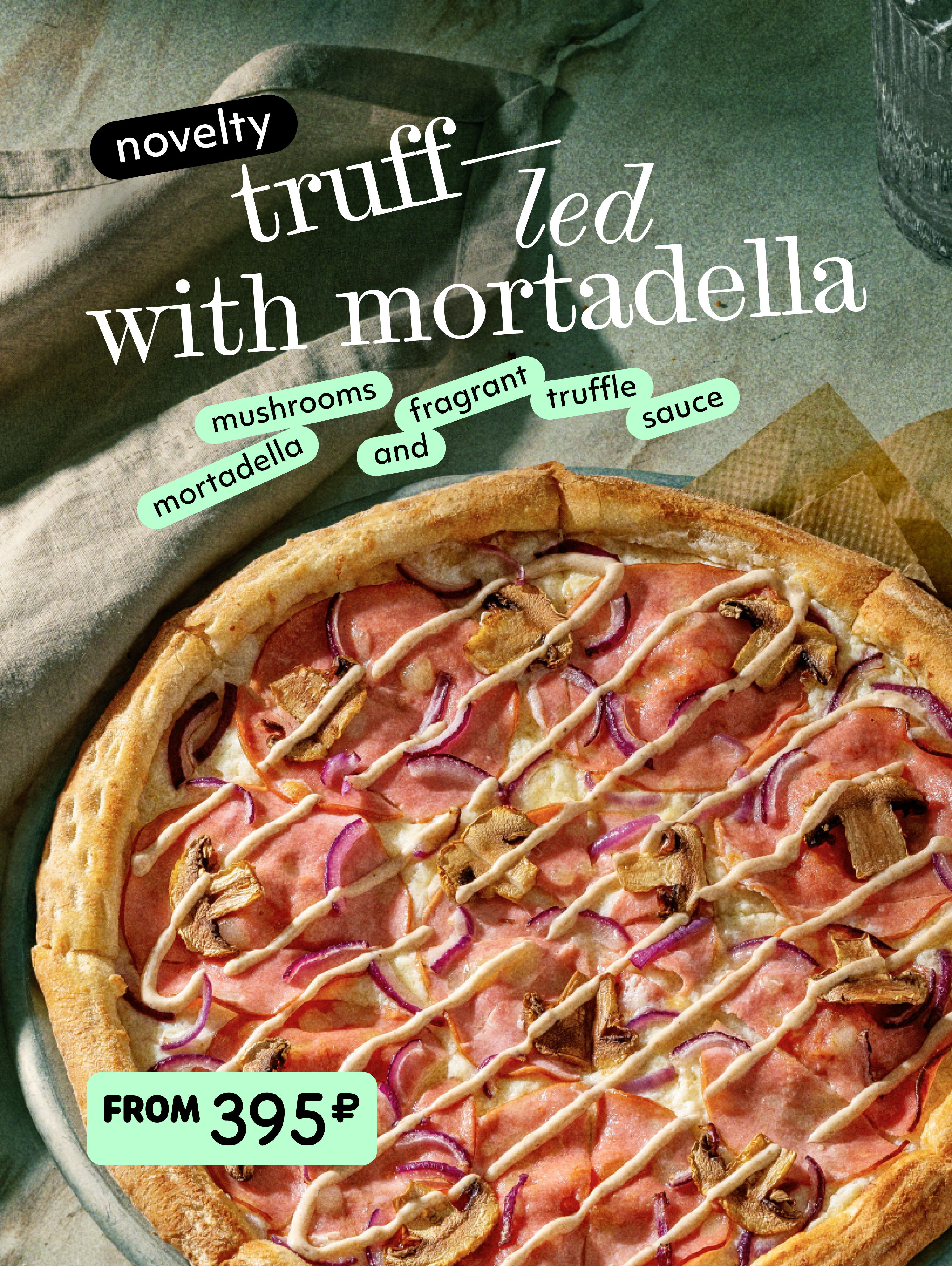
Before

After

Looking at the layout through the customers’ eyes
First of all, the visual should be comprehensible. If it tells about the product and informs the customer what exactly we offer, it means that we have managed to solve the task set by the owner.
If the message seems unclear, we try to rebuild the text composition, increase the cropping on the product or necessary elements, and rewrite the text if needed.
Gather feedback
We show the master layout to the designer and the team to check again how clear the idea is and how well the visuals have been worked out. We take into work those suggestions that help to better convey the essence of the product.
Sometimes at this stage it turns out that the idea is not apparent and the layout does not fulfill its task. This happens if the shooting didn't go as planned and the result was inapt photos. Then we assess the resources: if there is time for a second shoot, we recreate the visuals.
Conduct an audience survey
If the owner is unsure about certain details, such as the product name or the wording of the message, we make several variations of the layout and show them to the test group. We gather feedback and choose a final layout.
When the master layout is ready, we move on to replication - we make layouts for all the other media specified in the brief.
Read next:
