
Paper Cup
We adapt to the local market hot drinks cup layout and prepare it for printing. Here is illustrated step-by-step instruction in the following guide.
Every production facility uses a unique cup mold, and our standard layout does not always fit it. We recommend that you pass on the layout folder and this guide to your production team so they can customize the design to fit the required shape.
Let us take a look at how to insert a logo written in the local language, replace the labels, and properly save the layout for printing.
1. Determine the language
We provide layouts with the logo in English. If English is not the primary language in your country, replace the logo and choose labels with text in the local language using the instructions below. If the English version works well for you, skip steps 4 and 5.
2. Clarify labeling and packaging requirements
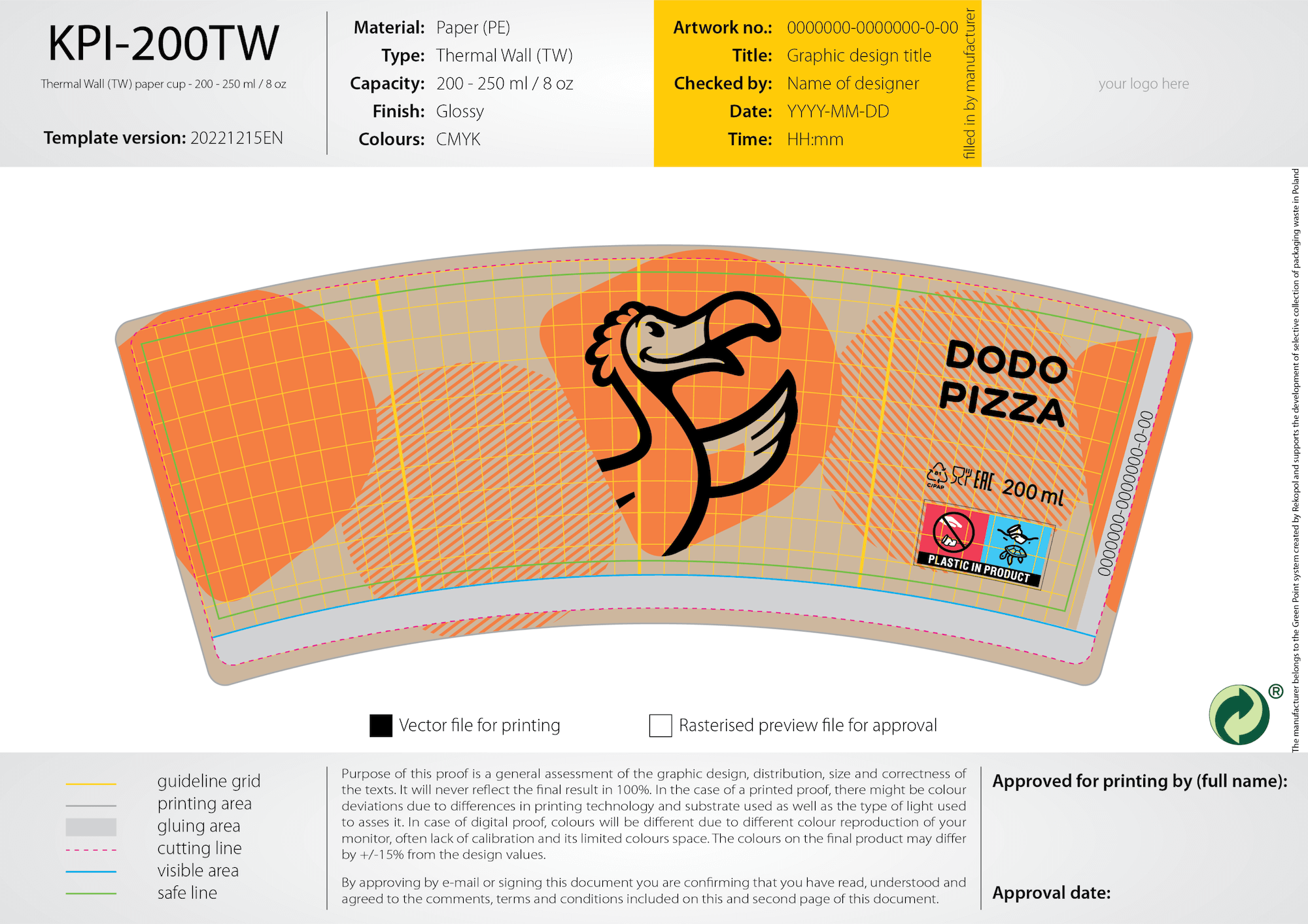
We usually place three labels on the cups in accordance with European legal requirements. Requirements may vary from country to country. Therefore, before editing the layout, address your legal or production team to find out which mandatory elements must be on the packaging.
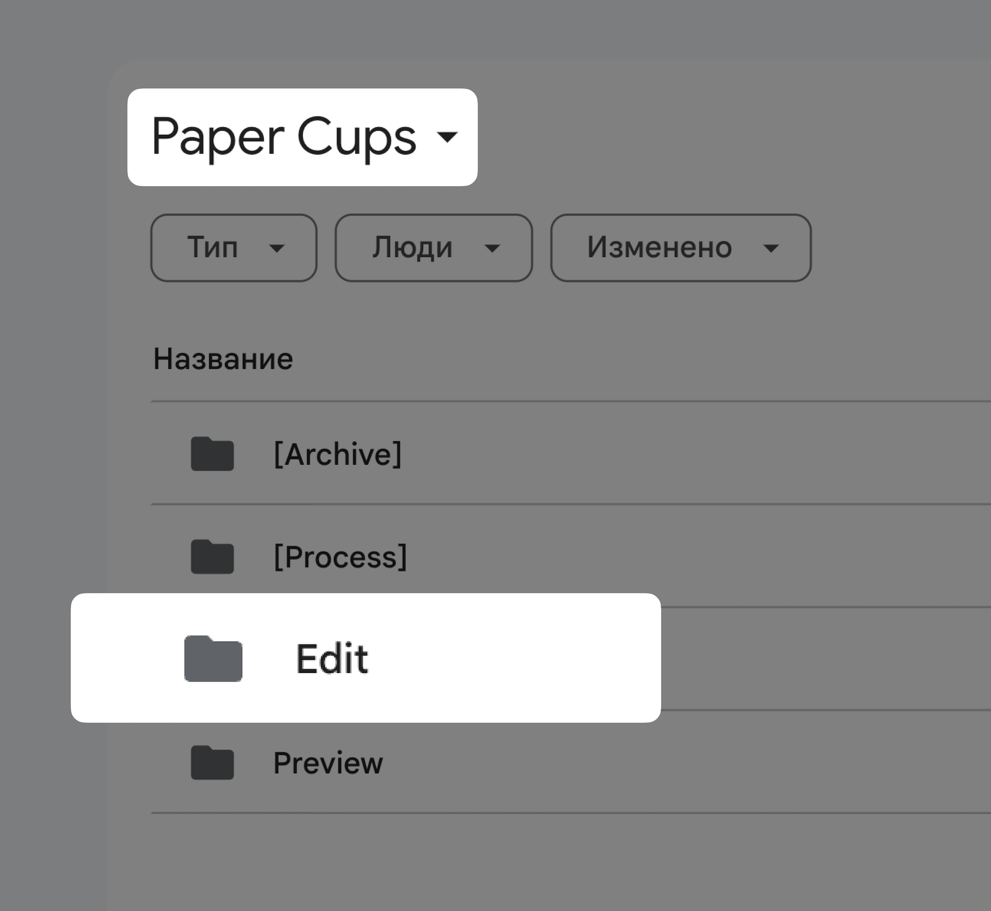
3. Open the Edit folder
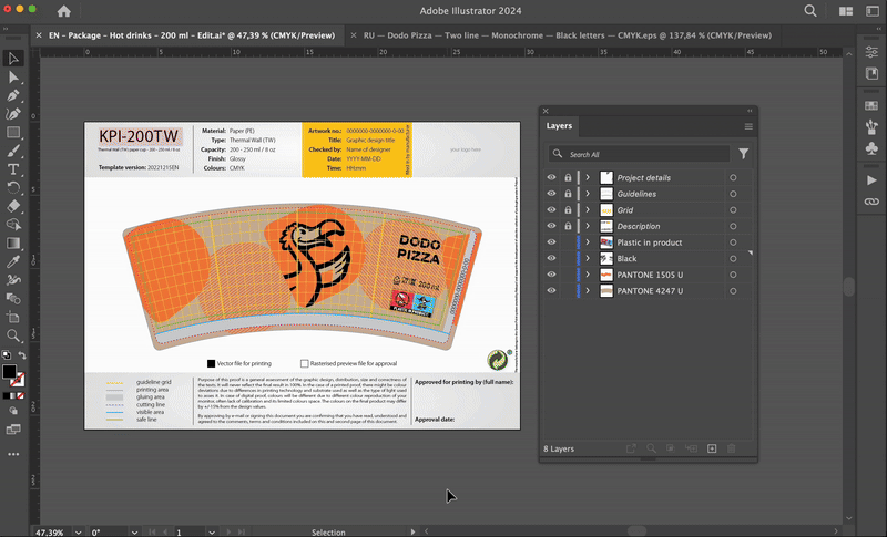
The layouts for cups are stored in the “Paper Cups” folder. Open the “Edit” folder and find the layout for a cup of the desired volume - 200, 300, or 400 ml. Open the file in Adobe Illustrator.
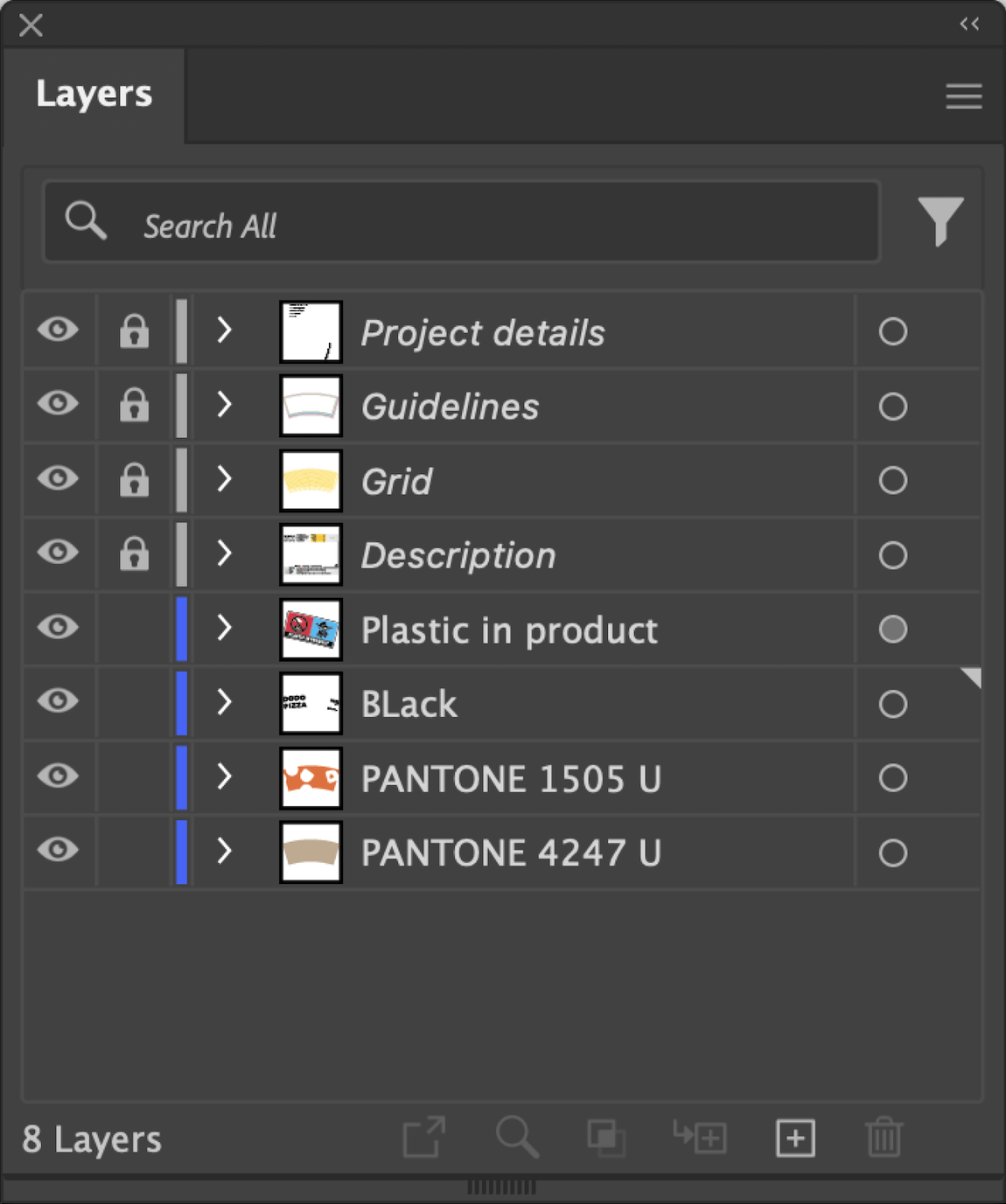
There are two types of layers in the layout: technical layers and layers with basic elements.
Technical layers
All technical layers are marked with gray and closed for editing. While working with the layout, you can disable their visibility by clicking on the “eye” icon. These layers include:
- Project details - information about the project in the yellow block, to be filled in at production.
- Guidelines - contains three important areas on the layout for the production specialist: printing area, gluing area and trimming line.
- Grid - a grid of guides, which helps to align the design elements on the surface of the glass.
- Description - information layer, contains information about the colours on the cup, as well as descriptions of what each colour and line type means on the layout.
Layers with basic elements
This layout has two main colours, as well as the colour of the craft paper used to make the cups. The “Plastic in product” icon is placed on a separate layer.
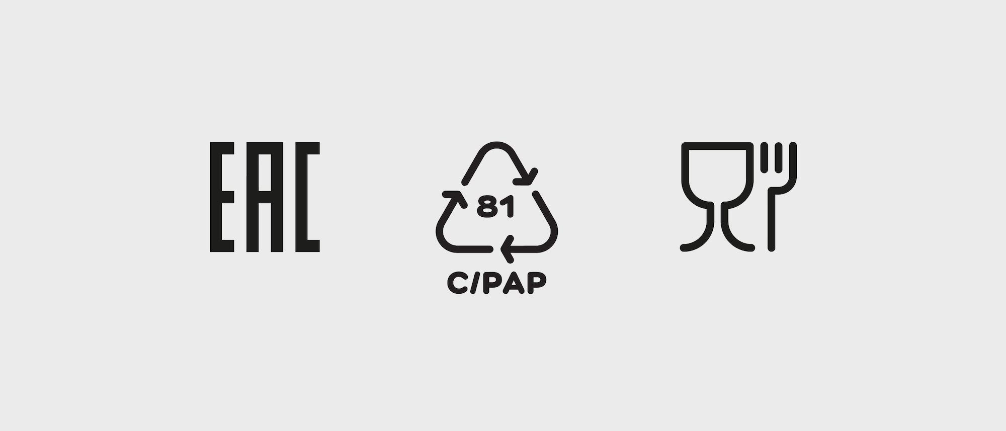
- Plastic in product - a label that indicates the presence of plastic in the packaging. The layer contains icons with descriptions in different languages for most European countries.
- Black - the layer contains all layout elements in black colour: logos, labels, cup volume.
- PANTONE 1505 U - the layer contains all elements of the layout made in Dodo’s signature colour, orange PANTONE 1505 U.
- PANTONE 4247 U - craft cardboard colour. If you have managed to find quality craft paper suitable for food products, this layer is not printed. If there is no craft paper available - print this colour, imitating craft paper.
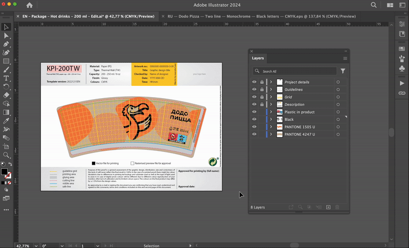
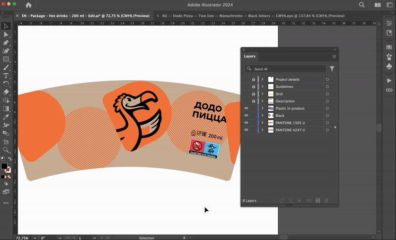
4. Replace the logo
Find the logo in the language of your choice in the Logotype folder. You will need the text part of the Two Line logo.
To replace the English language logo, copy the version in your local language and insert it into the layout. Delete the old logo and paste the new one in its place. Navigate yourself with the gridlines and the left edge of the “Plastic in product” label, align to the left side (left off). Make sure the logo does not cross the green scheme line (safe line). If the new logo is longer than the English one, you can reduce its size a little.
5. Replace the “Plastic in product” label
The layer with the same name contains labels with descriptions in different languages. Find your country in the drop-down list and replace the label.
6. Replace the labels
We do not yet have a uniform database of labels for different countries. Therefore, check the legal requirements in advance, search the Internet and download the required icons yourself. Remove unnecessary symbols, and instead add labels relevant to the country in which the packaging will be used.
Make sure the colour of the icons matches other black elements in the layout. Use 100% black with a CMYK code of 0 0 0 0 0 100.
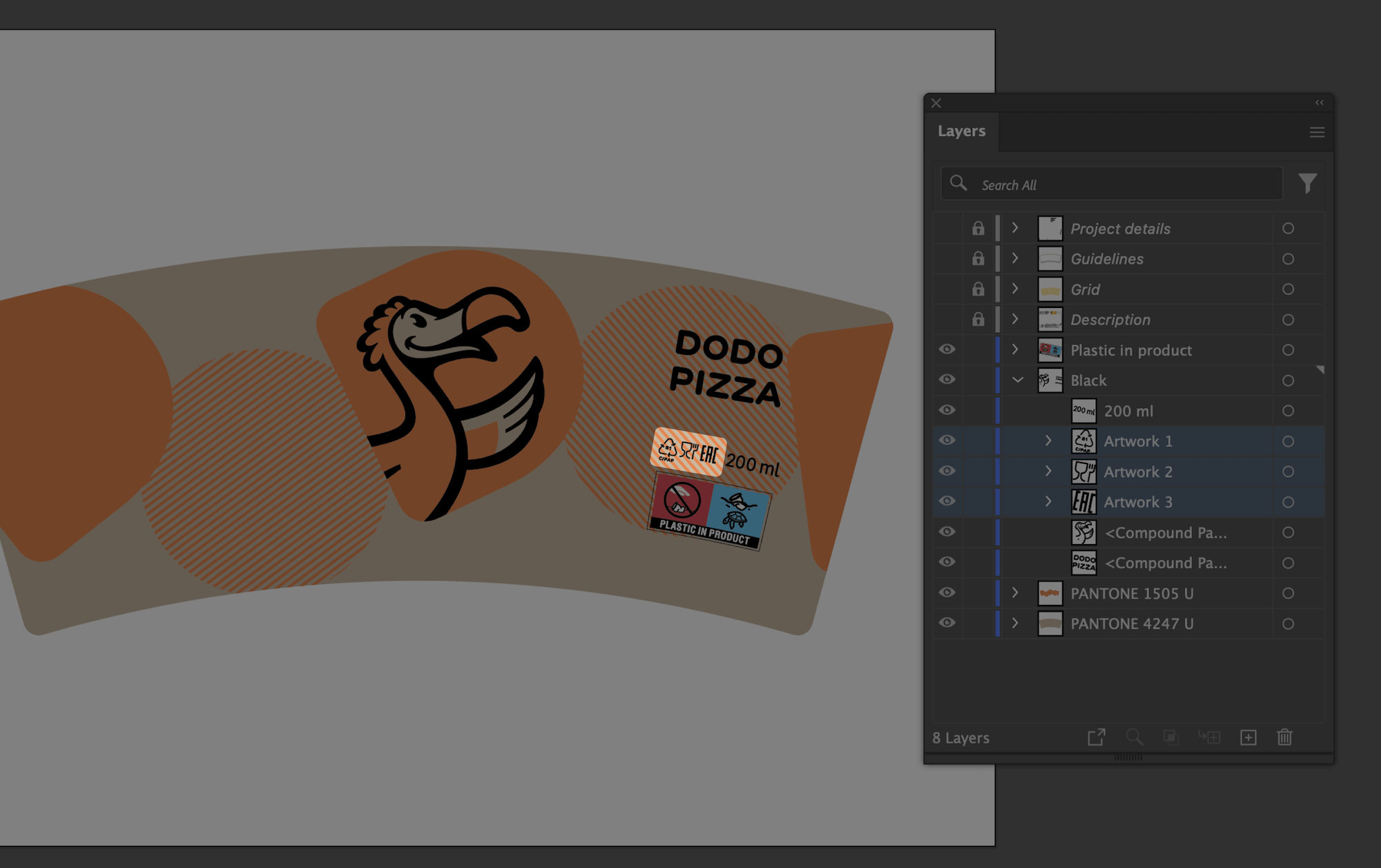
7. Replace the cup volume, if necessary
We do not specify the volume of the cup, but the amount of beverage in it. This means that the "200 ml" marking reflects how much coffee we have poured into the cup. If you have different portions, put this information on the packaging.
8. Save the layout for printing
Make sure the main colour elements are on the appropriate layers - PANTONE 1505 U, PANTONE 4247 U and CMYK black 0 0 0 0 100.
Save the layout as a copy in .ai format so you don't lose the layers and source data. When saving, change the ending of the file name from “Edit” to “Print”.
9. Check the layout on the media
Print out the layout and assemble the sample by gluing the cup. Make sure that all elements look normal, the logo is not deformed, important details of the layout are visible and the glue layer does not overlap with them.
10. Hand the layout out to production
Send the entire “Paper Cups” folder with the “Preview”, “Edit”, and “Print” files to production. The “Print” file is your edited layout, assembled for a specific cup shape. If the layout matches the shape that is printed at the production facility, the manufacturer will take the “Print” file.
If it does not match, ask the specialists at the production site to edit the design and fit it to the mold. They will need an “Edit” file to do this.
Be sure to request a sample cup before you start printing the entire batch.
Read next: