

Making Stories
We have developed rules that help to make stories interesting, increase the number of views and brand awareness in general. Here are instructions on how to design visuals and texts, and the nuances of individual sections. This guide is constantly updated.
Visual
We make a simple visual, and ensure recognition with the help of background, font and accents. We rarely use gifs and third-party artworks and do so once at a time, because they make the brand visual style too blurry.
Backgrounds. We use Dodo palette and photos for backgrounds.
- We use palette backgrounds for brand communication, surveys, reposts, contests and promotions. You can download the backgrounds here.

Brand communication and polls 
Brand communication and polls 
Reposts 
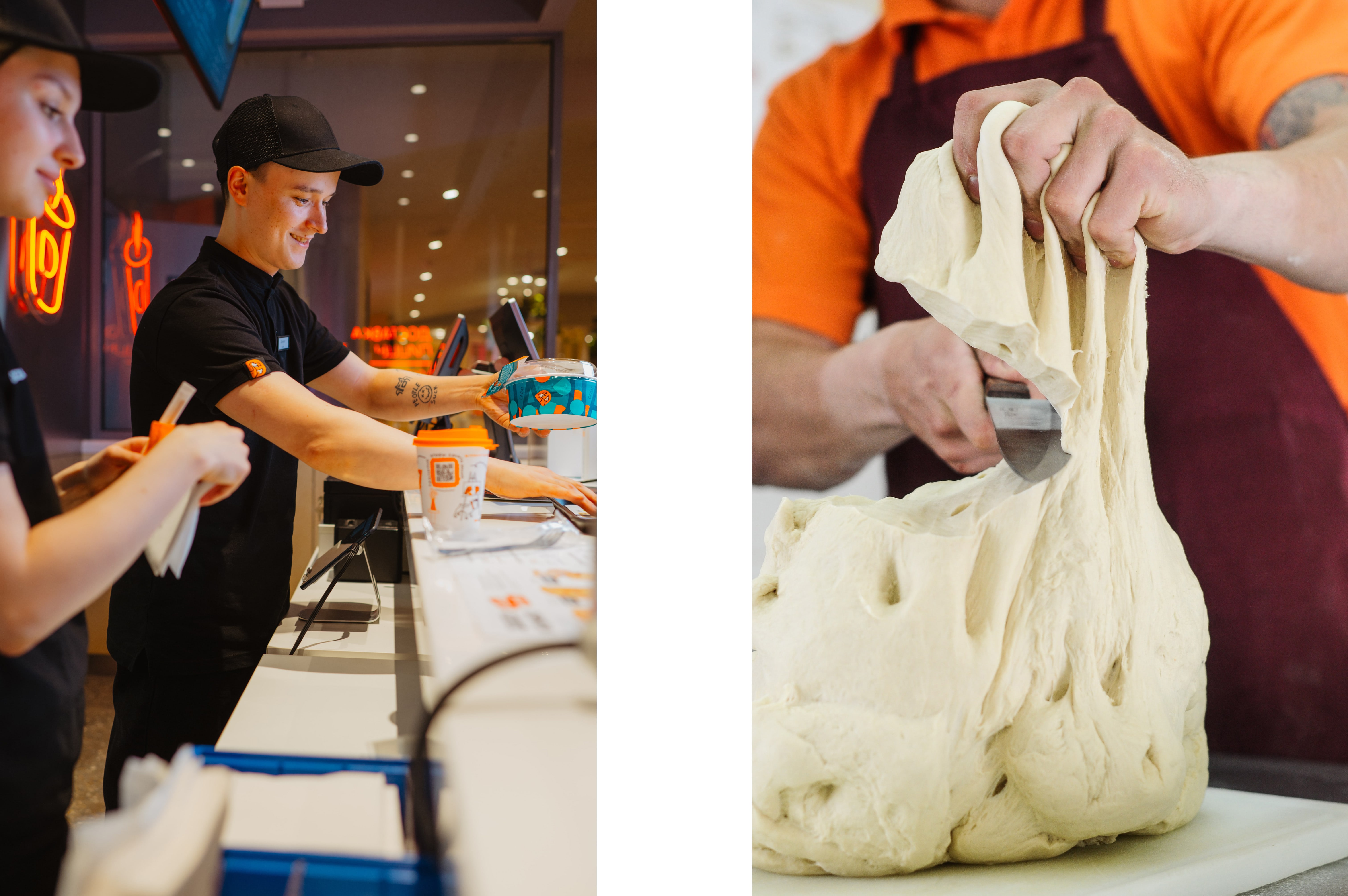
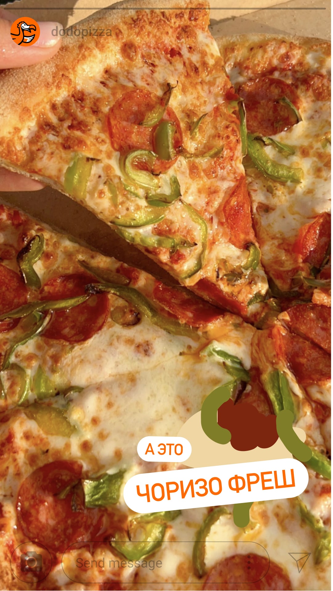
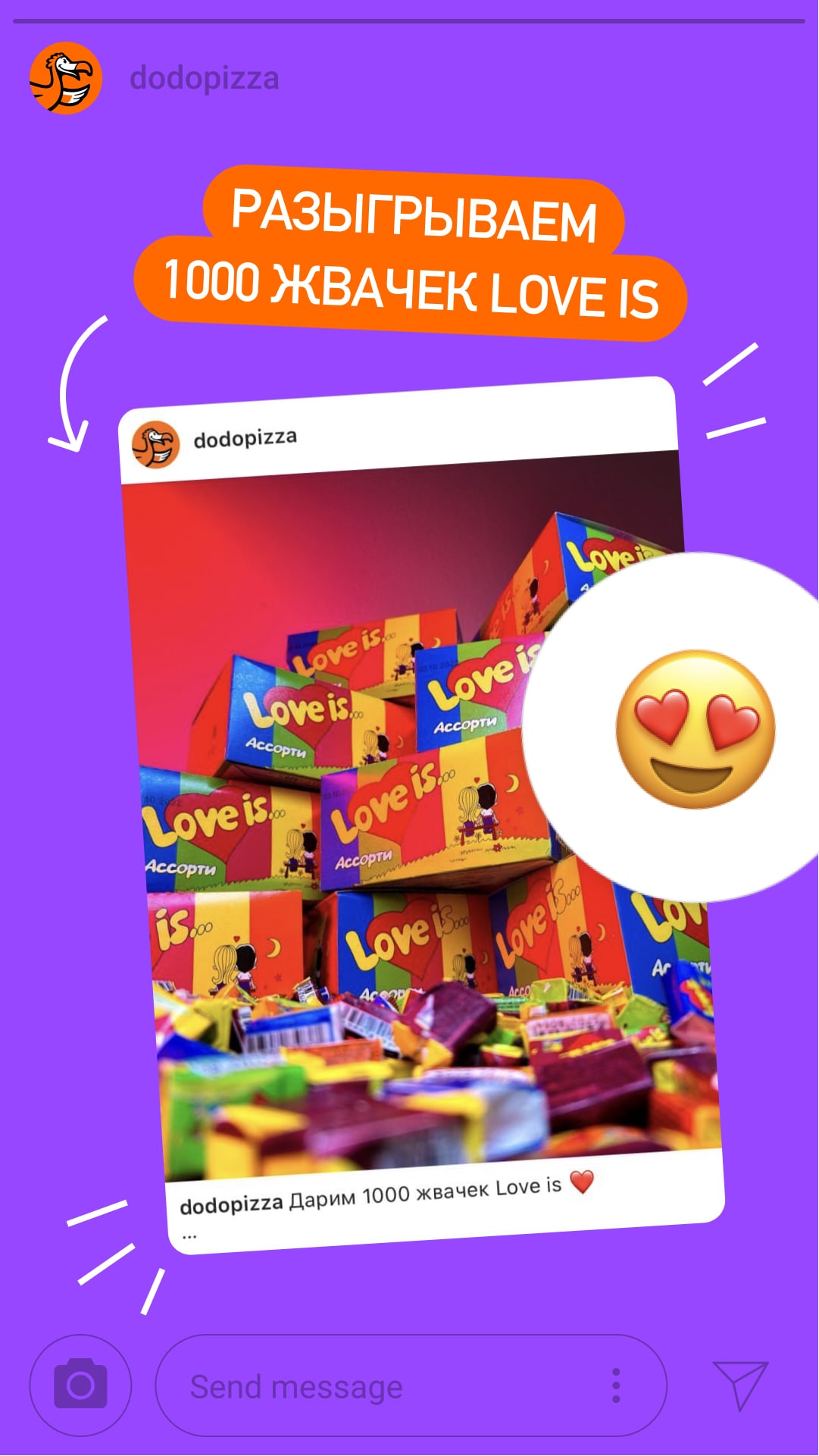
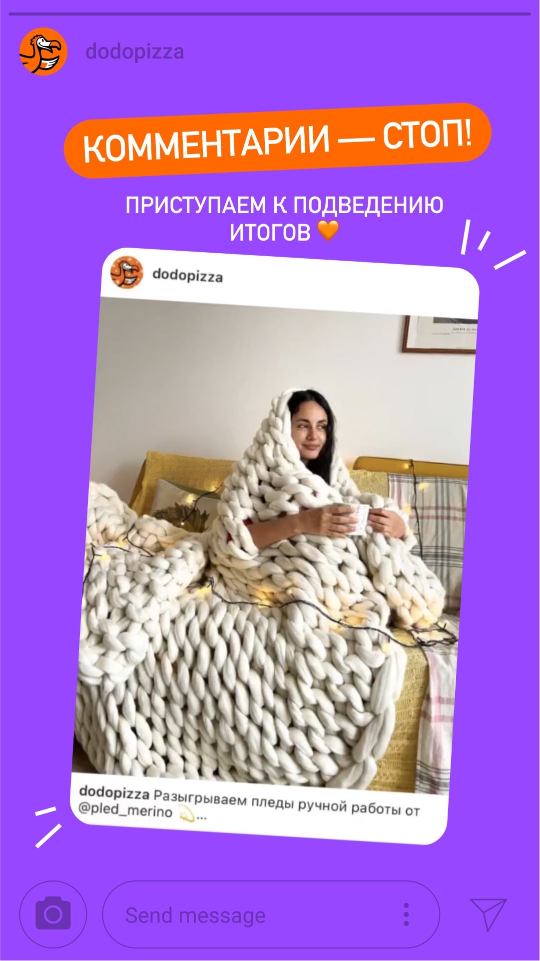
Contests, raffles, promotions - In other cases, we use photos. We have a photo bank for stories, and you can find content there. For lifestyle sections, it's better to take photos on camera locally and use your own unique shots: the stories will be more lively and more trustworthy this way. Do not use overly detailed and patchy photos for backgrounds.

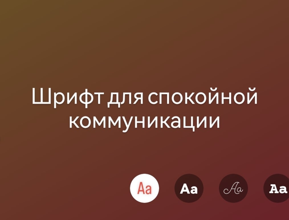
Fonts.We mostly use Instagram fonts because stories look lively and cool with them. On rare occasions we also add branded fonts, Dodo Rounded v2 and Dodo Rounded Black: there’s an instruction for installation and use in the the brandbook.
The style, size and colour of Instagram fonts depend on the communication type.
If you don’t have a stories designer on the team, Instagram fonts can be used. The font style, size and colour are picked according to the communication.
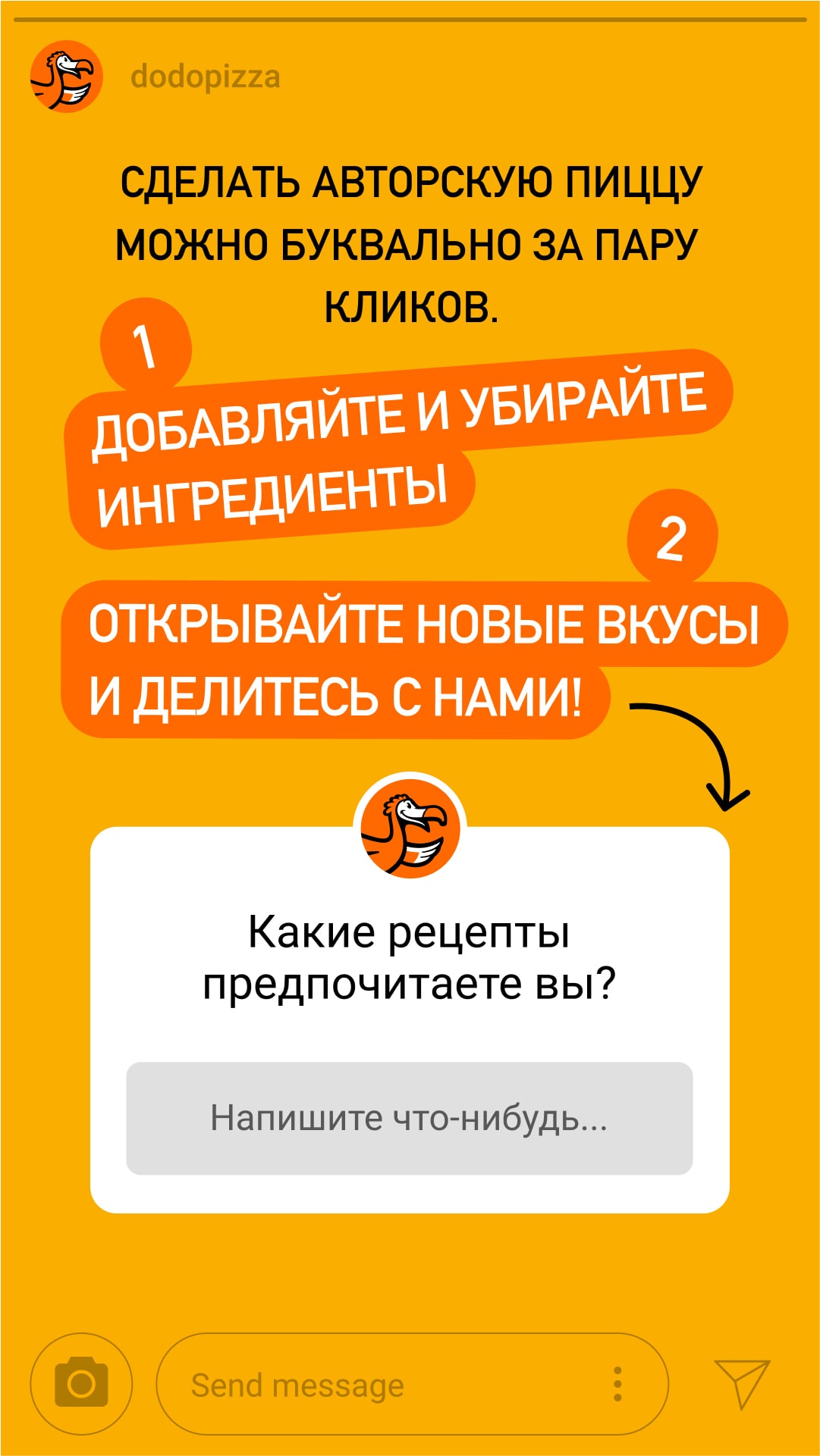
- A lowercase font is for relaxed communication. For example, for everyday stories when we address the audience.
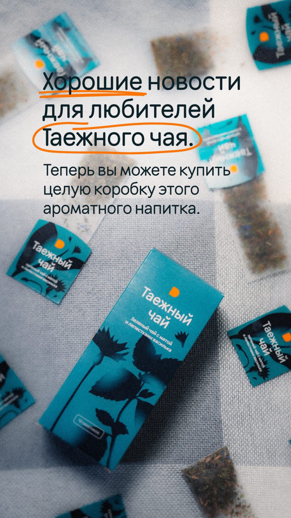
The first font suggested on the app - Uppercase fonts and orange strokes for headlines are for instant communication. When you need to quickly draw attention to a contest or product, for example. It is better to take the stroke colour with a dropper from the Dodo logo.
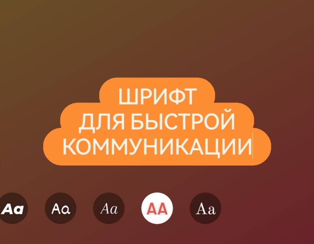
The penultimate font suggested on the app
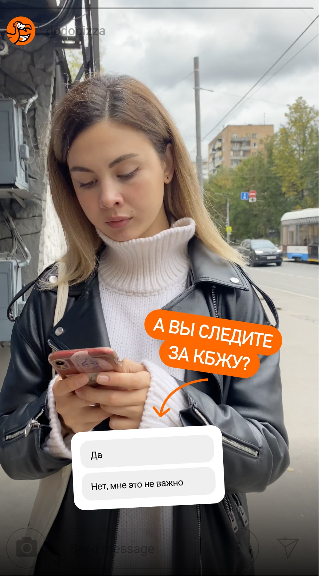
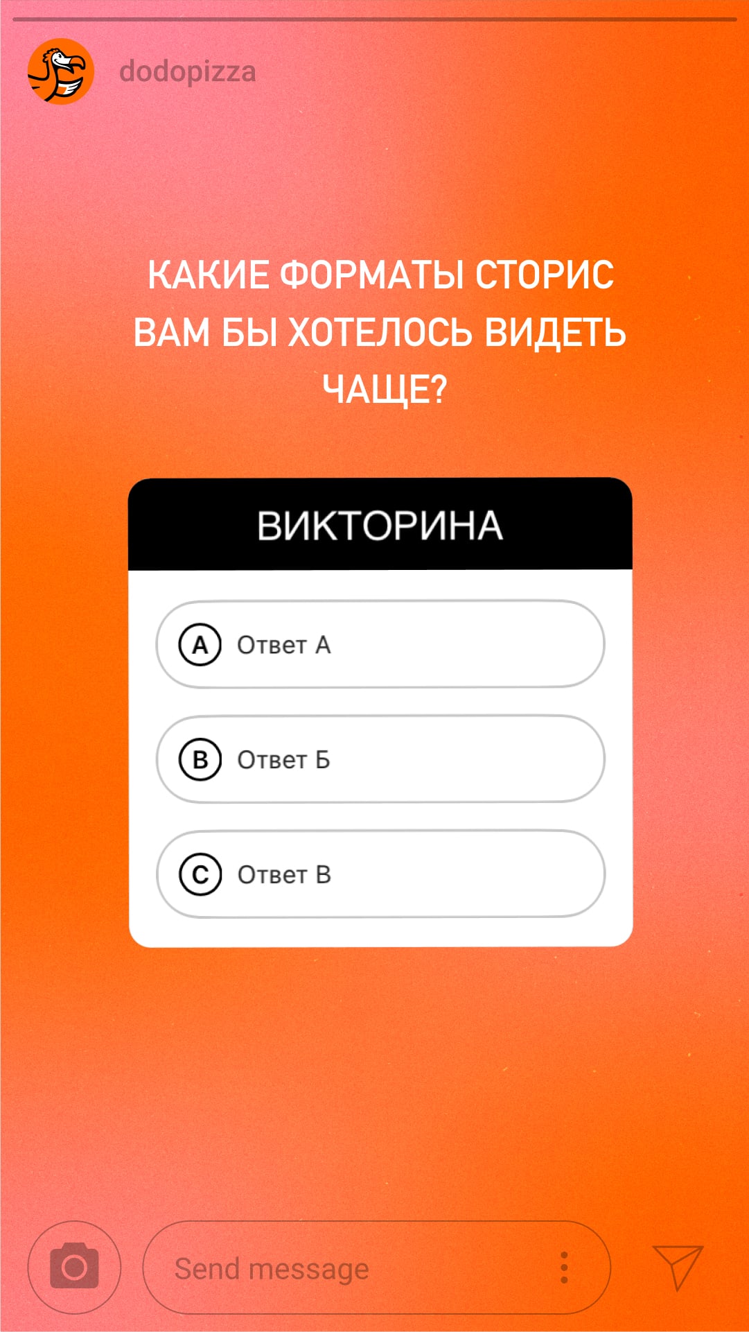
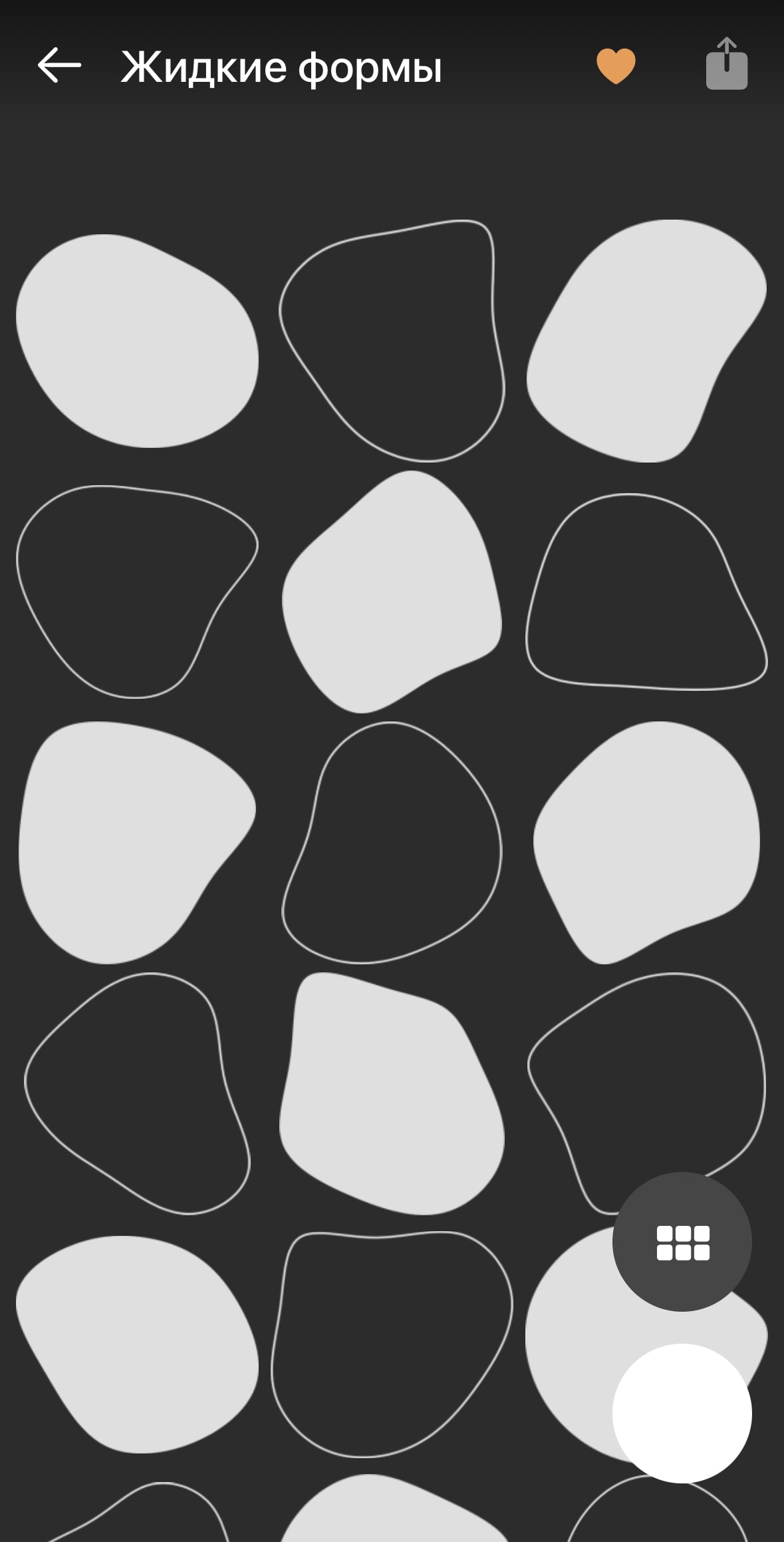
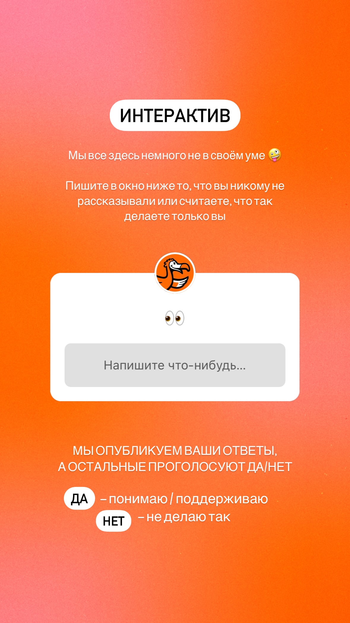
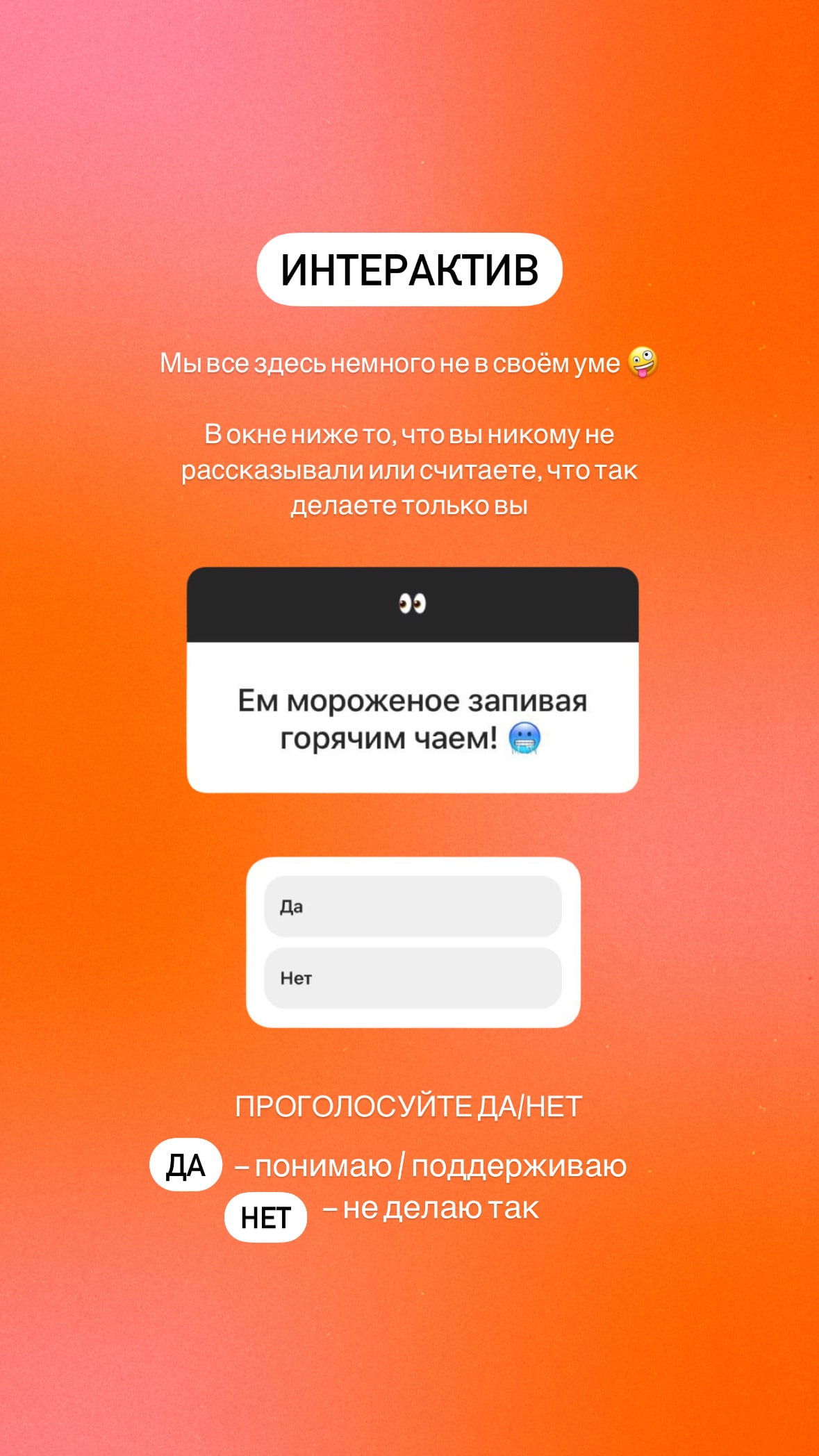
Accents. To put accents, we use plates, Instagram widgets and rendered elements such as arrows and circles. For polls and votes we add Instagram widgets.
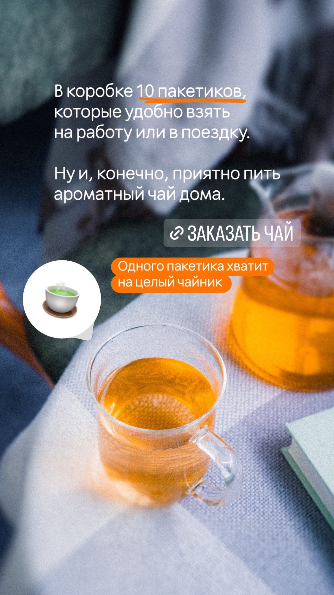
- Plates are for price tags, navigation and short phrases in Instagram font: uppercase with strokes. We usually do it in orange and white colours. In product stories, you can change the plate colour to match the product, if it is appropriate.
White text on orange background and vice versa 

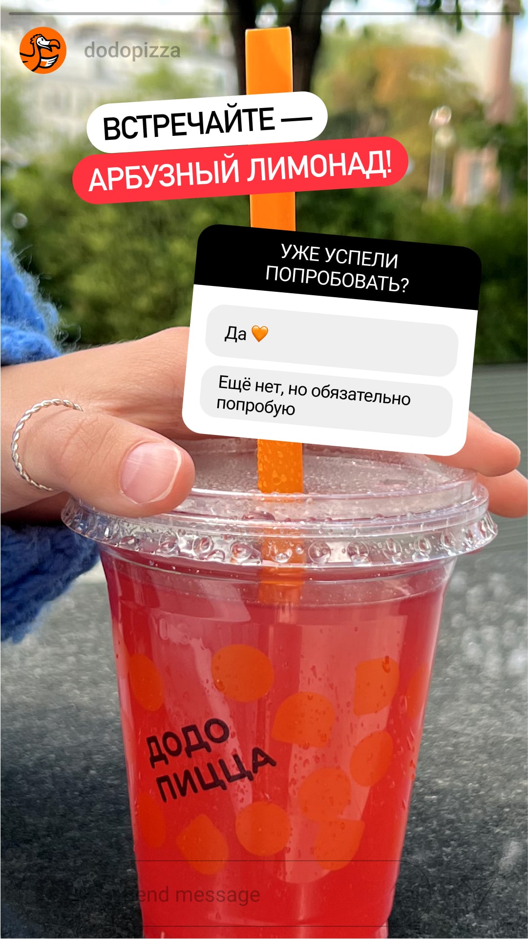
Plates in product colours - Instagram widgets: tools for polls and voting on the Instagram Stories editor.

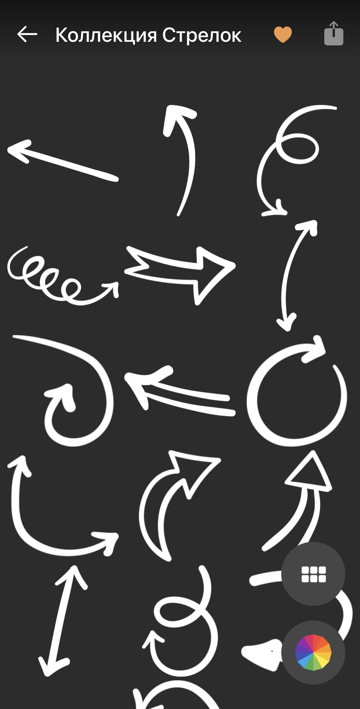
- Rendered elements: arrows, circles, strokes. You can download them here.
We also take the arrows and plates in the Summer.Fonts app and use them in our colors.
Text
This is what the text of the stories should be like.
Text is visible.Use backgrounds that are easy to read on. If you need to post a detailed photo, add backgrounds.

There is a logic to the narrative.The first slide is an introduction: we briefly write what we will talk about. Then comes the main part where we develop the topic in detail. And you can add a call to action on the last slide, for example, to visit an action page or make an order.
Text is coherent.The text in stories is a narrative split into several slides. Each story should be a follow-up to the previous one. Here’s how you can check yourself: remove the pictures and read the whole text; if the message and logic remain - you can publish it.
The distribution of the text through the stories should also be logical: it should not suddenly break off. Here’s a helpful rule: one story - one thought.

Interesting.Here are a few ways to make stories interesting:
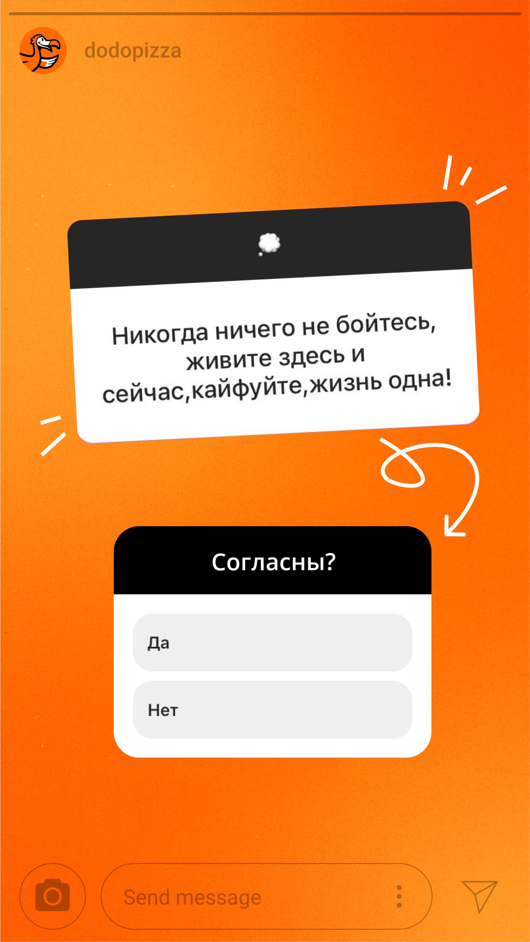
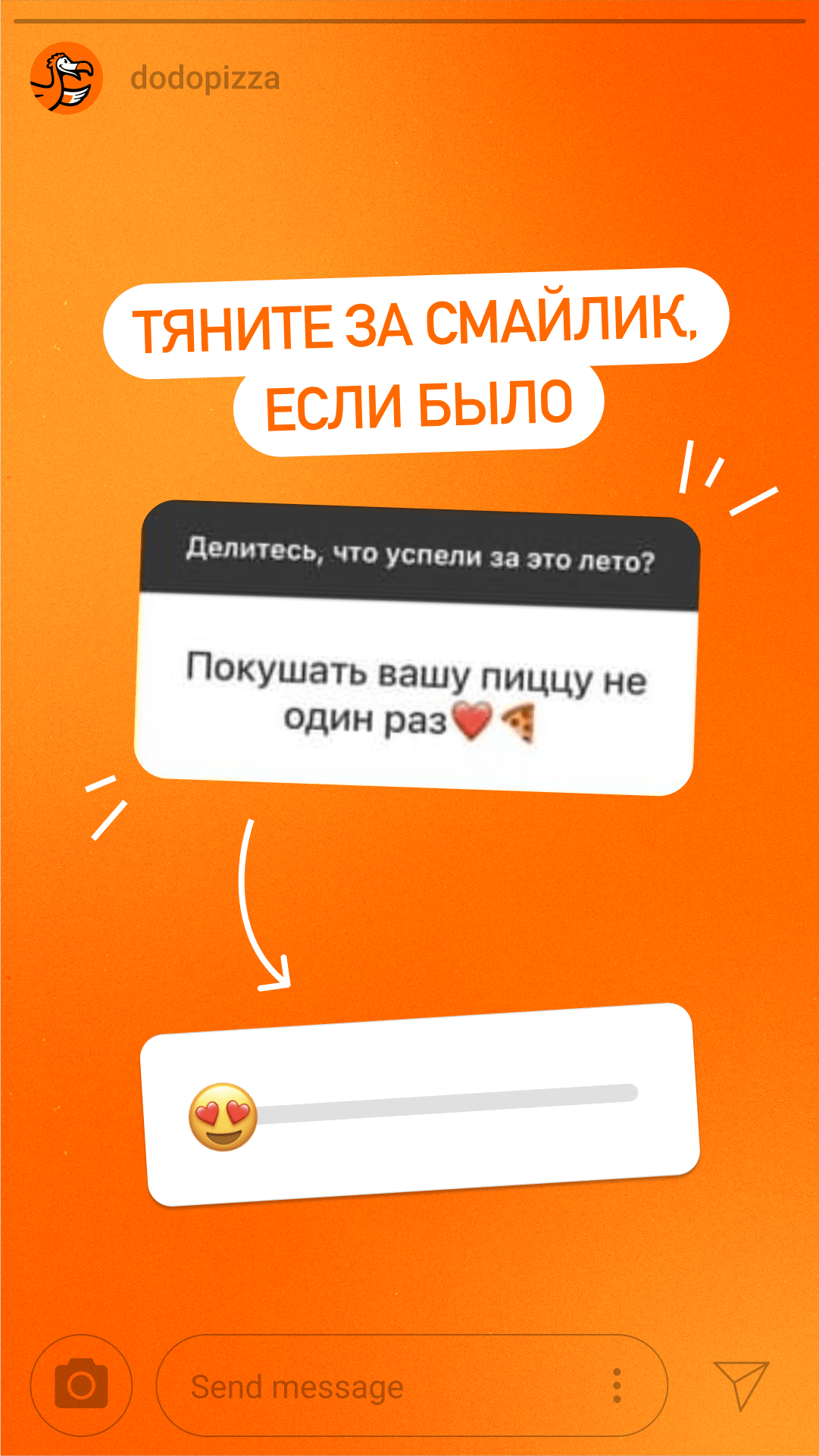
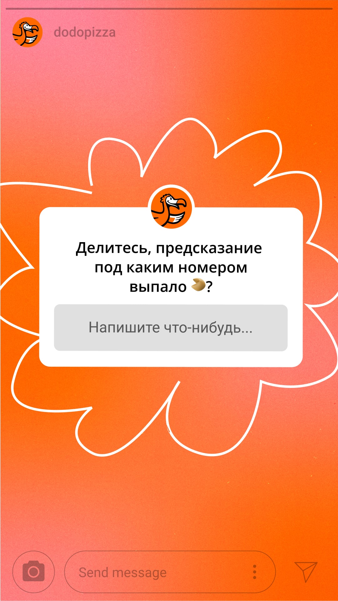
- Communicate with the customer through stories: ask questions, offer to choose an answer option, post riddles.
- Add intrigue to the first story to make the user want to move on to the next one. You can add drawn arrows to the photo.
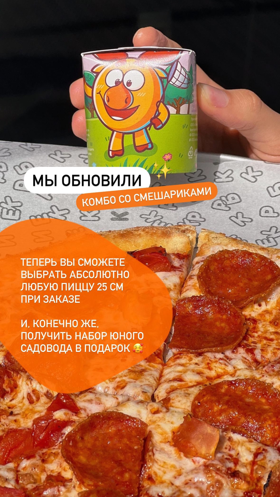
- Give useful information. For example, tell about the combo through the benefit: you can buy your favorite pizza at a lower price.
Simple.The text should be easy to read. To do so, replace complex words with synonyms, break off long sentences into short ones, write the most important things, remove murky spots, and do not place a lot of text onto one story.
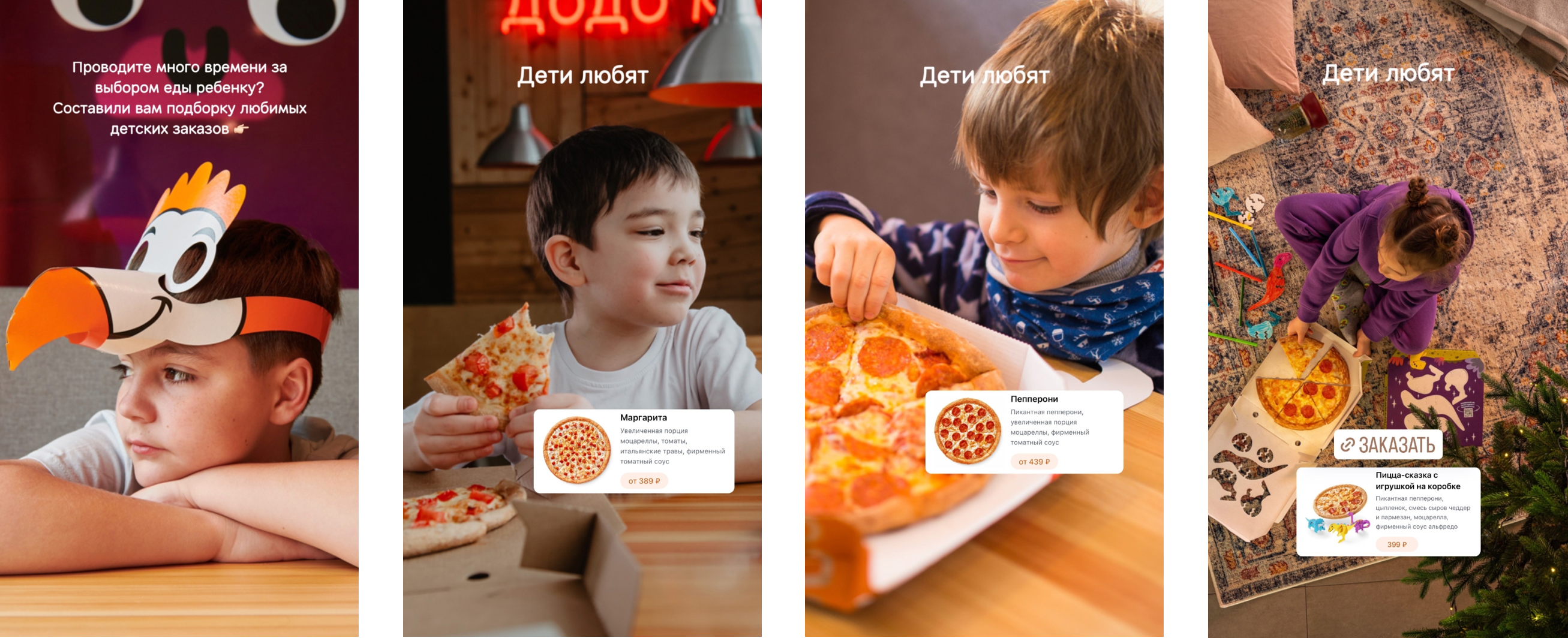
Example photo: dodo beak, boy with a slice of pizza.
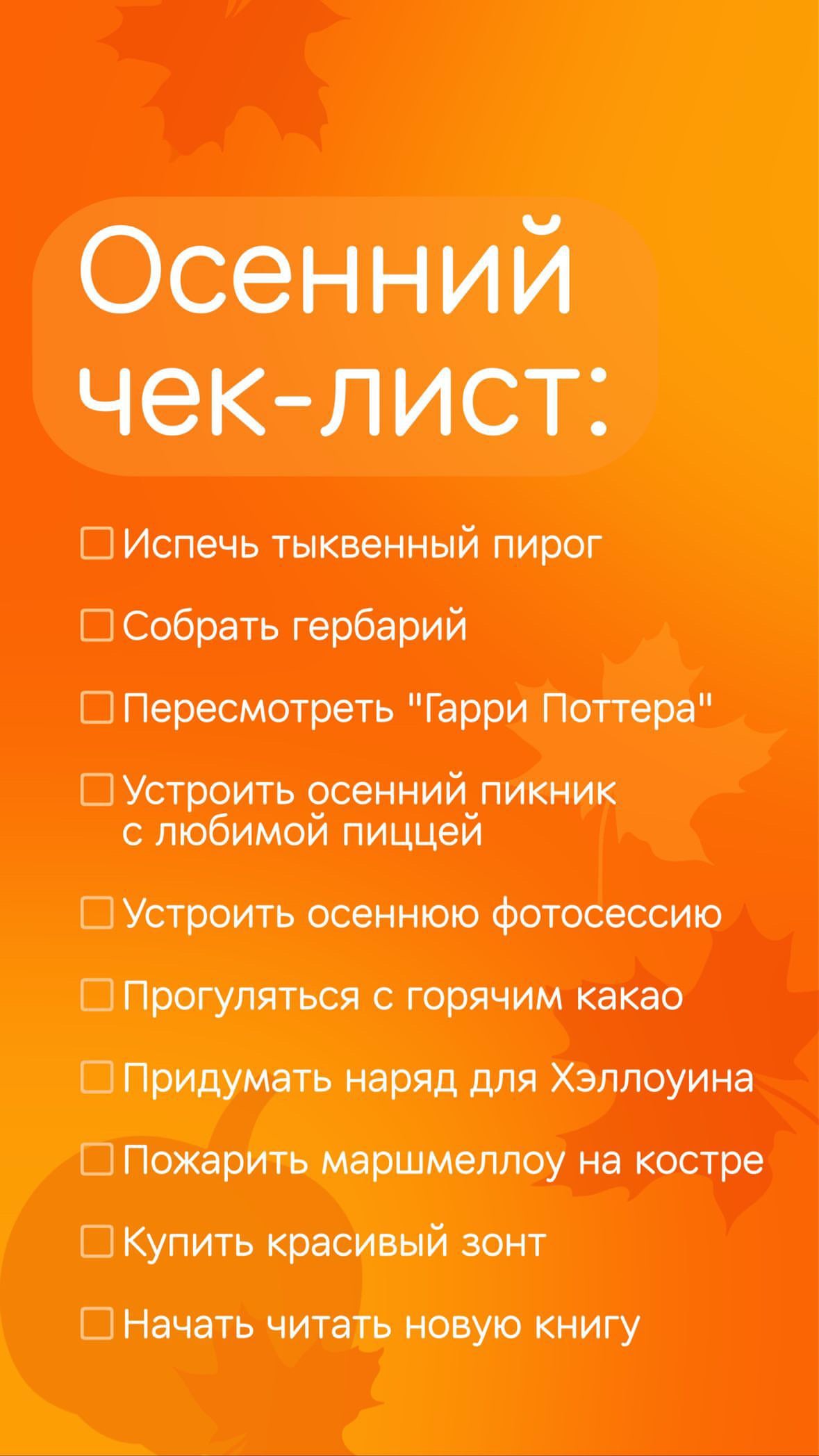
Structured. We use paragraphs and lists, if something is listed. The key thing in the text is highlighted by colour, font size, lettering. Thus, it is easier to perceive the information. It is crucial to not overdo it with accents and meanings: it is better to highlight one idea.
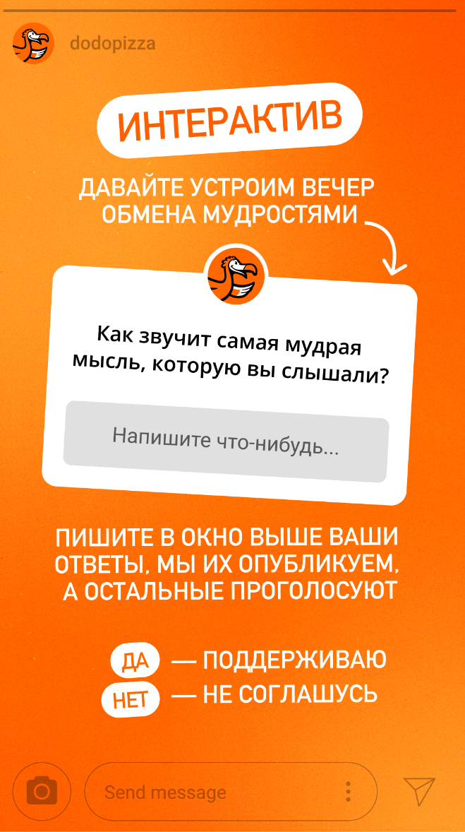
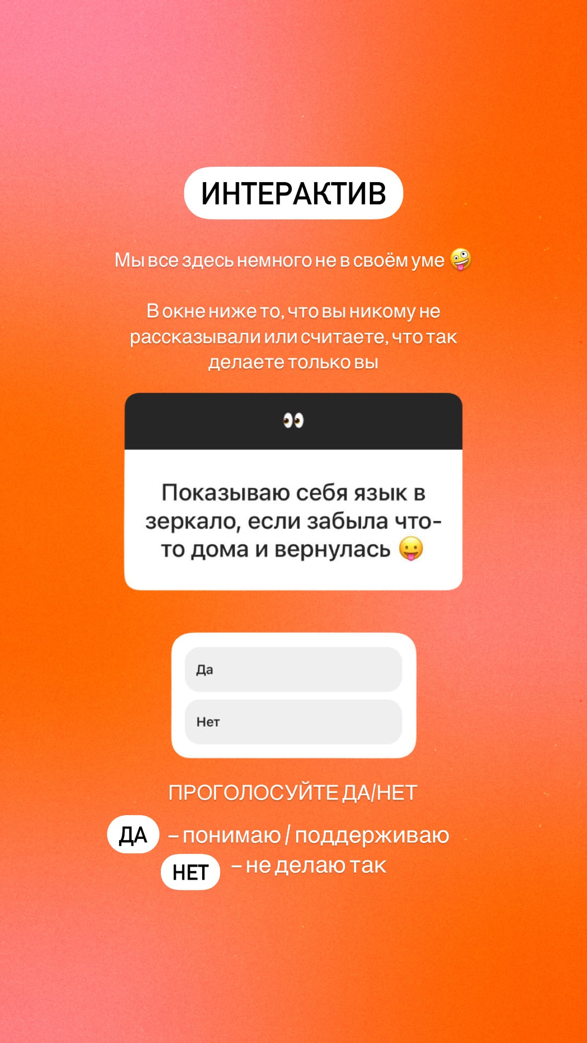
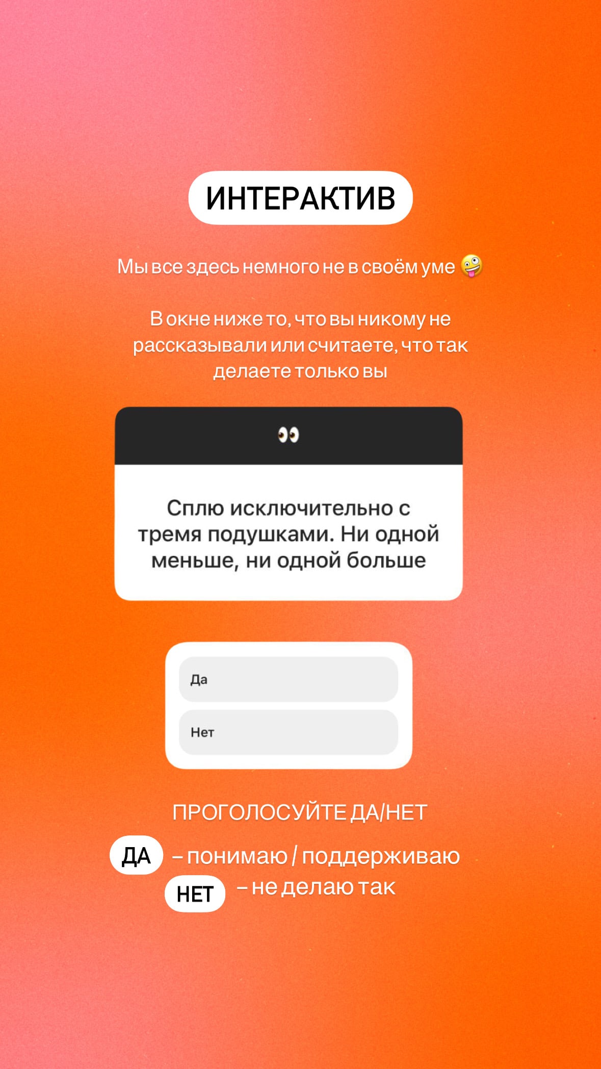
Engaging.Add interactive components to stories: games, polls, riddles. On stories like these:
- Add the label "Interactive" to make your stories stand out.
- Simply and clearly tell the users what they are asked to do.
- Choose interesting topics and wording to make them want to participate rather than skip the story.
Sections design
Some sections have their own design nuances.
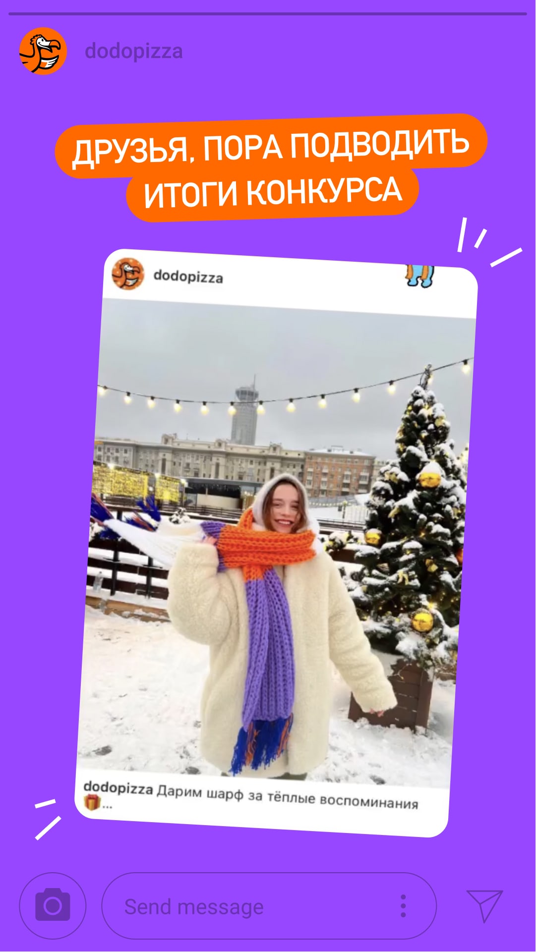
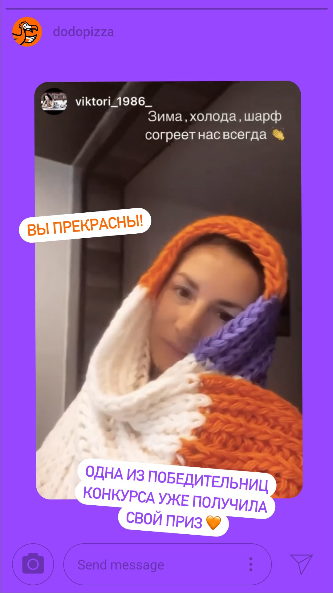
Raffles.Choose purple colour for the background, orange colour for the plate as an accent.
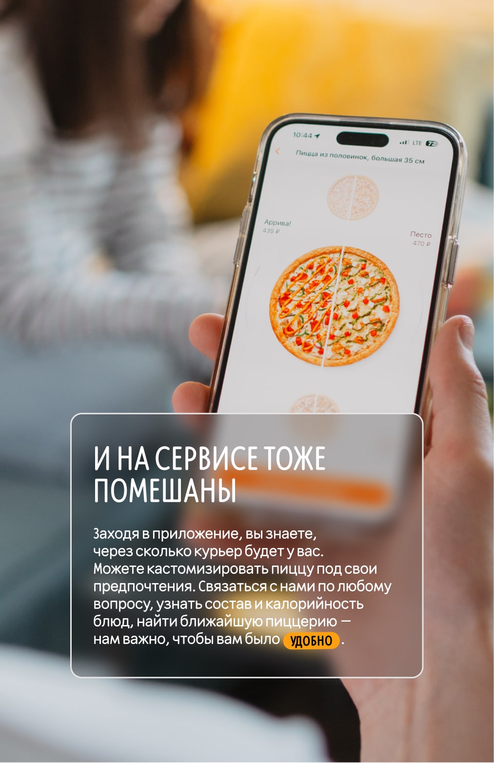
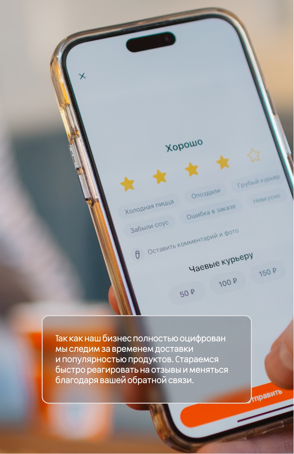
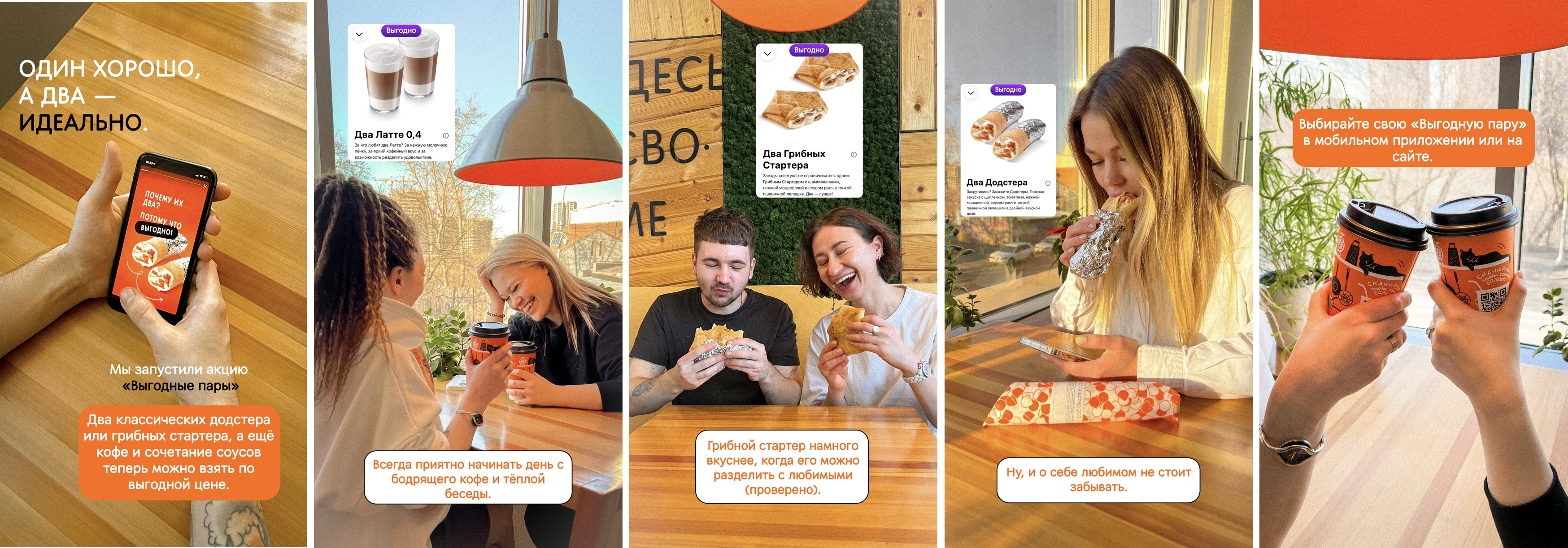
Discounts.We do not make a straightforward accent on discounts and promotional offers. Therefore, we do not sell "head-on", but build storytelling through showing the benefits for customers. We show one or two products at maximum on one story, as in the example.
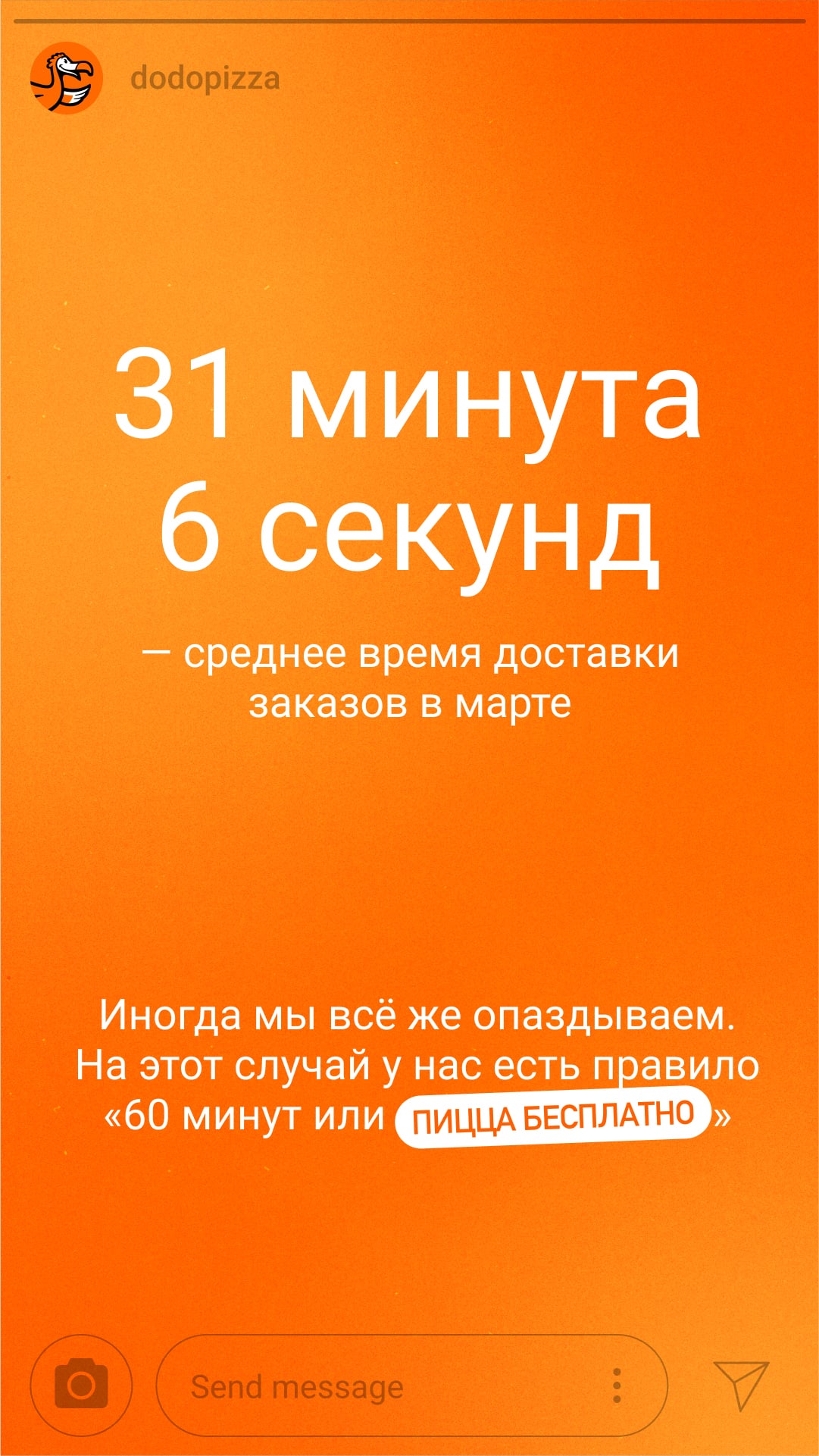
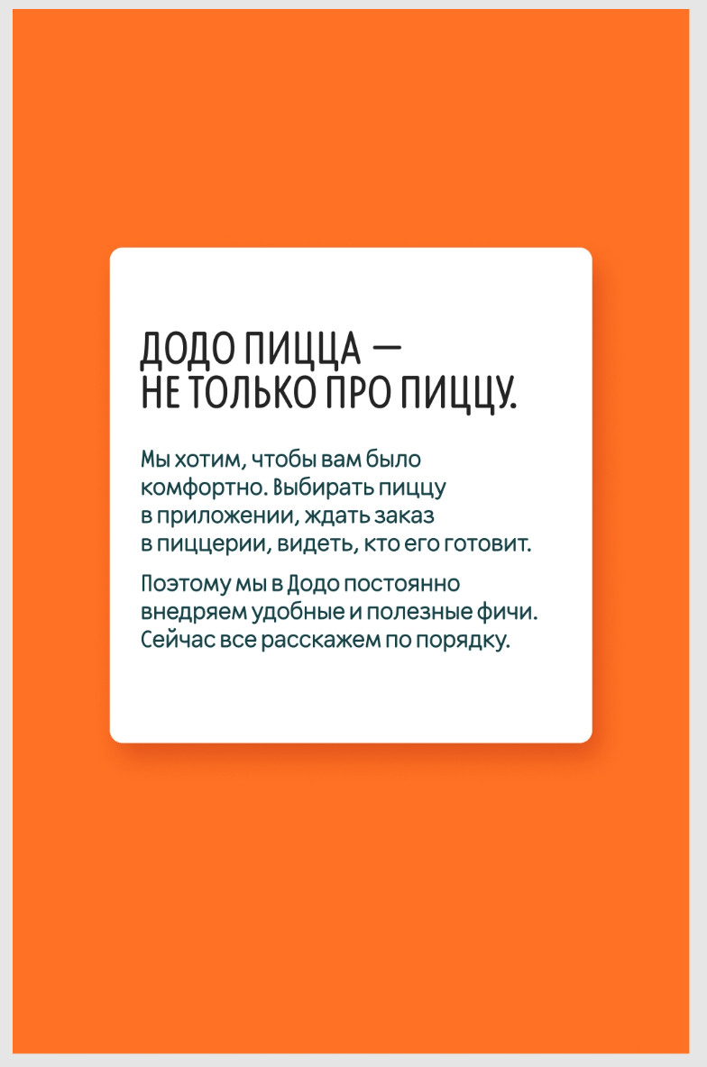
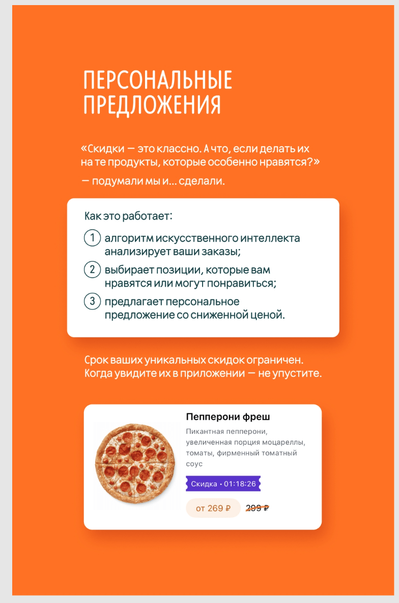
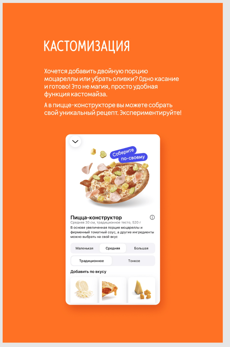
Informational stories.We make layouts for informational stories look simple and affordable, without design for design's sake. Here’s the key techniques:
- Information is quick and easy to read;
- Plain backgrounds, low-contrast gradients and simple and large patterns;
- No photos or special effects;
- Simple typography;
- Schematic graphics.
Read next: