Basics of catalog photo shoot: algorithm and common mistakes
To ensure that the photos on the website, in the app and on the TV menu look uniform and represent the brand's products in a quality way, we have put together rules for shooting and image processing. In this guide we explore the features of preparing catalog photos and typical errors that could emerge.
Quality of the photo
High quality, high resolution images with good lighting are what we pursue when preparing product photos for the catalog.
- Shoot products with a high-resolution camera. Prepare a source image of at least 3000 x 3000 px: this will allow you to edit and scale the photos without loss of quality. Prepare a png image of 1875 × 1875 px with a transparent background for publication.
- Make sure the image is clear, the picture is not blurred and displays the colours of the products accurately.
- For the shooting, adjust white balance to match the given lighting conditions. Shoot in RAW format for more accurate colour reproduction when processing photos.
- Avoid taking shots of the product on your phone. Use a camera with a long focal length lens (70-100 mm) to not distort the shape of the product.
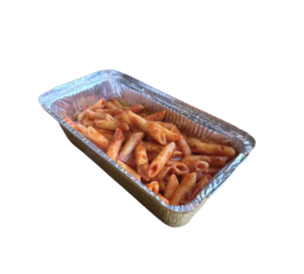
Yes
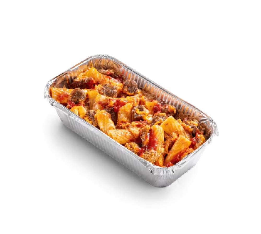
No
Up-to-date design
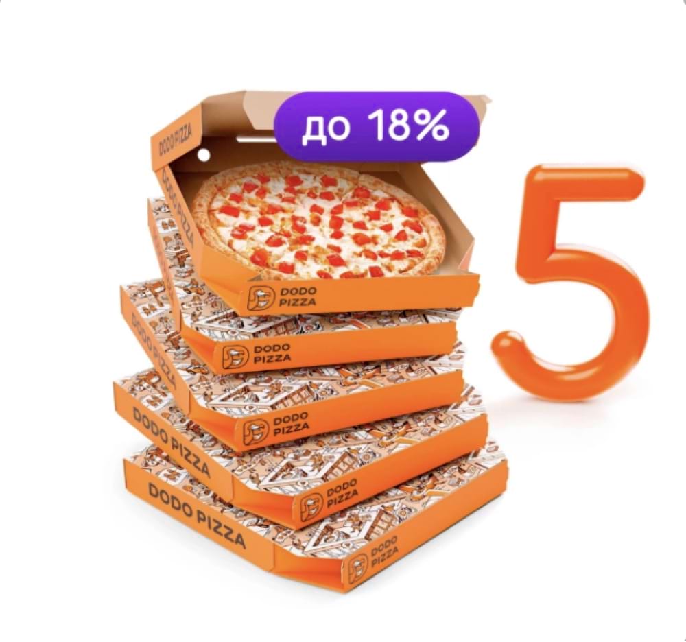
We update our packaging design every now and then. It is important to make sure it is relevant so that the product photos in the catalog are in line with the current brand look. You can find the current design in the memo.
Yes
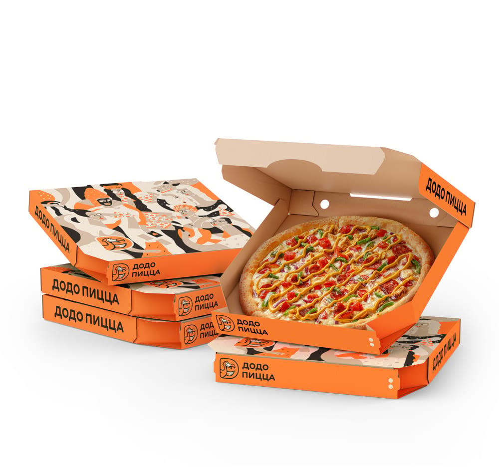
No
Light and shadow
The shadow in catalog photos should not be colored, but black and translucent. If you need to finalize the shadow, follow the light source so that the shadow matches the light falling onto the product.
For traditional and thin dough pizzas, make a uniform shadow using a template. For pizzas shot in perspective and other menu items, make a translucent shadow using the video instructions. When following the instructions, skip the 3:20-4:06 snippet about tinting the shadow, as the shadow should remain black
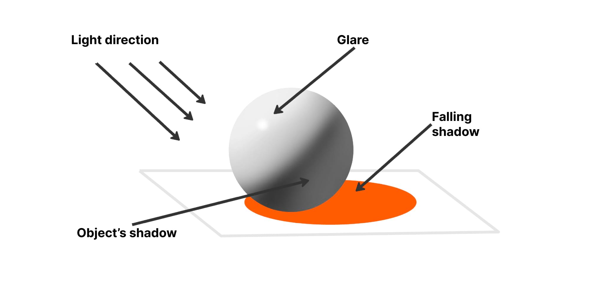
If the lighting is well-adjusted during the shooting, then natural shadows will be the outcome in your photos, and they are easier to work with. Here are a few tips to help you avoid common mistakes.
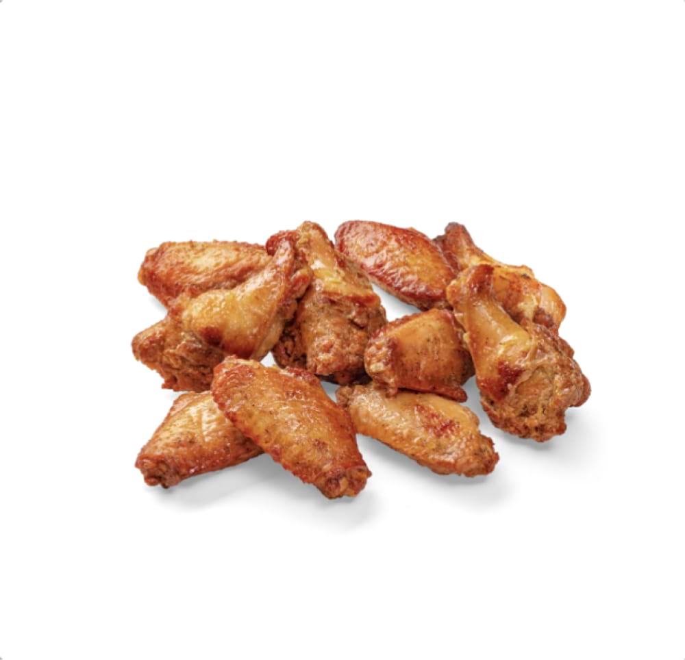
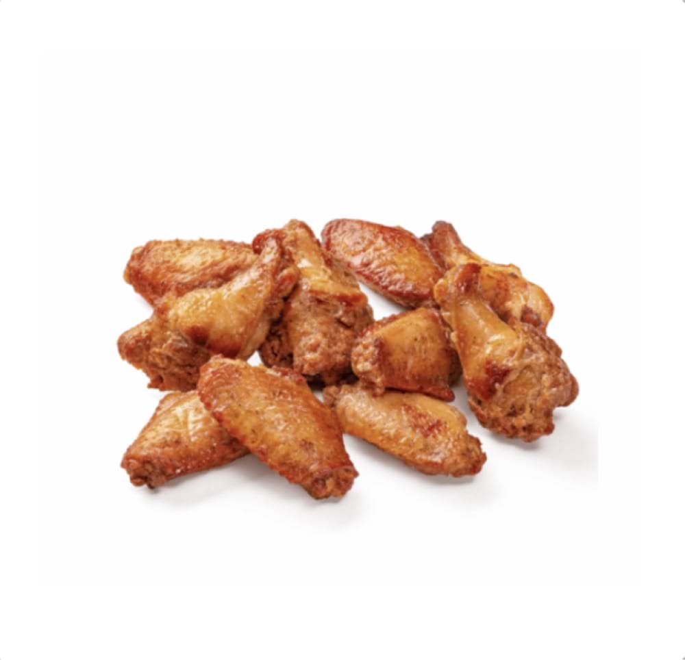
- Make a black, translucent shadow. Right now, we don't do coloured shadows because the app has a dark theme and a coloured shadow looks sloppy in it. If the product photo was taken in poor lighting and there is no natural shadow, contact a professional retouching specialist to finalize it. If this option is not available, leave the product without a shadow.
- Make sure that the shadow of the product is not cropped by the image edge. To check this, overlay the curves above with the left slider pushed to the right. Then you can see the exact shape and size of the shadow.
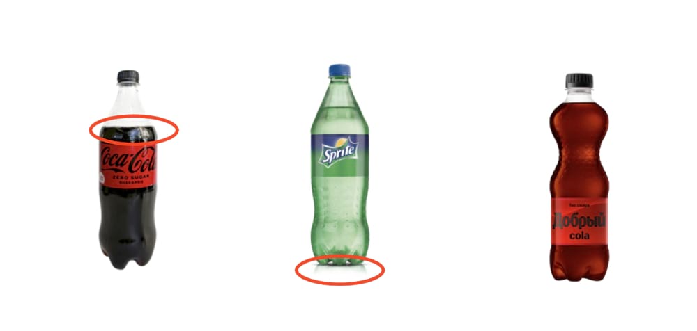
- Watch for glare. If you take the photo of drinks yourself, remove the coloured glare from the drink on the surface, add a gray translucent shadow, or leave the photo without a shadow.
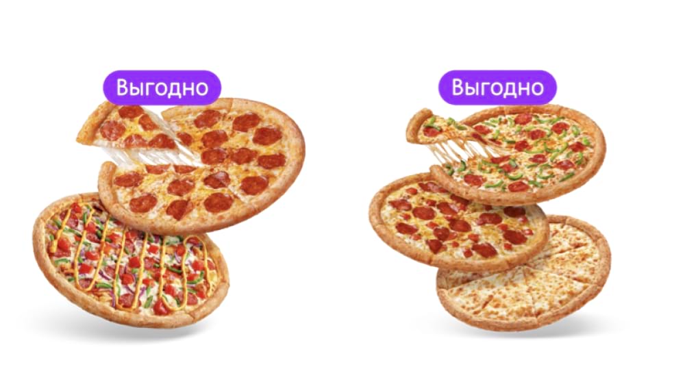
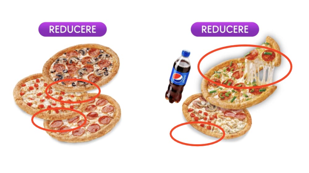
- Follow the pattern of falling shadows in combos. Shadows should fall on the products below (the shadow from the top product should fall on the product at the bottom) and on the horizontal surface of the scene.
- Customize transparency. Make sure that transparent objects (such as glass cups) look good in both dark and light themes.
Yes
No
Yes
No
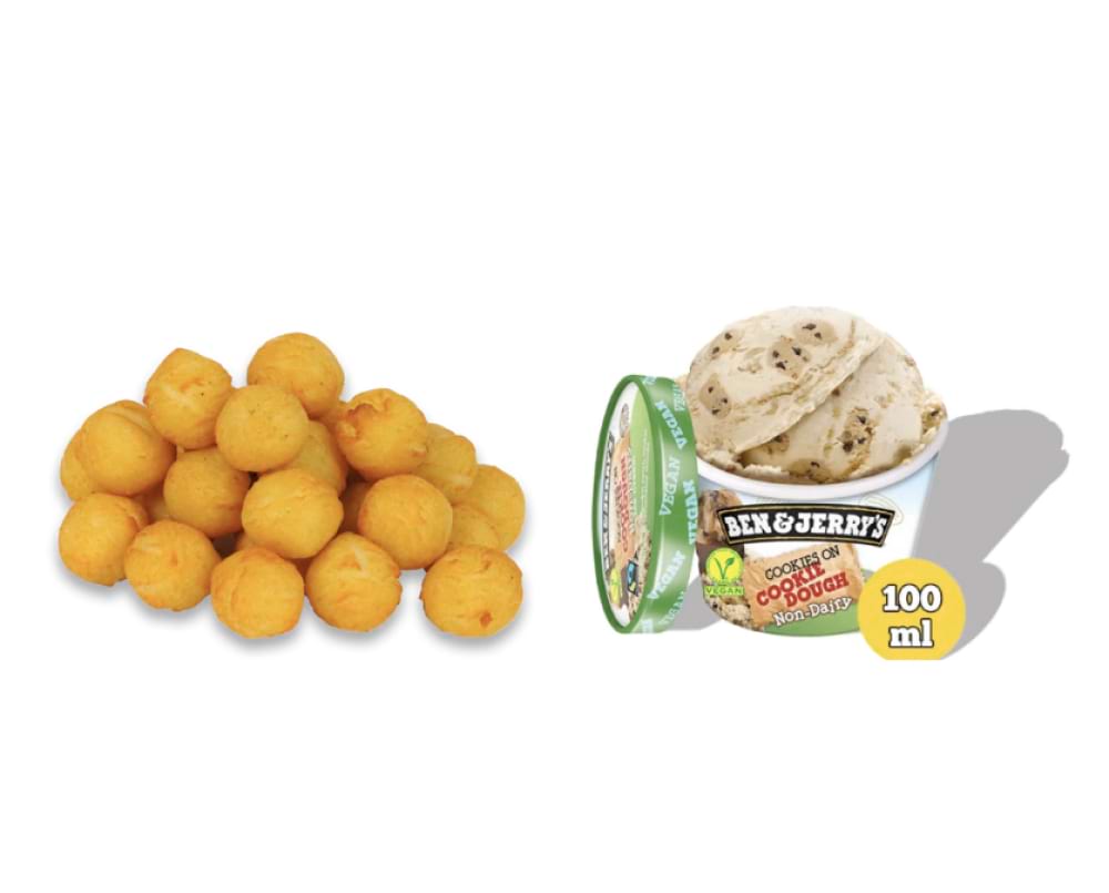
Yes
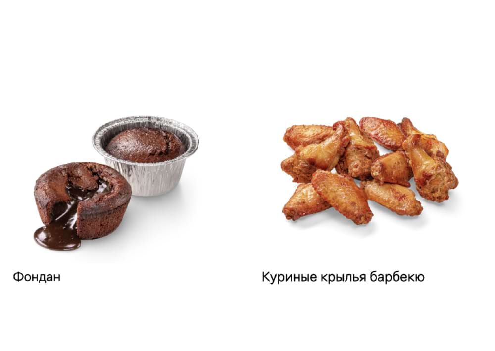
No
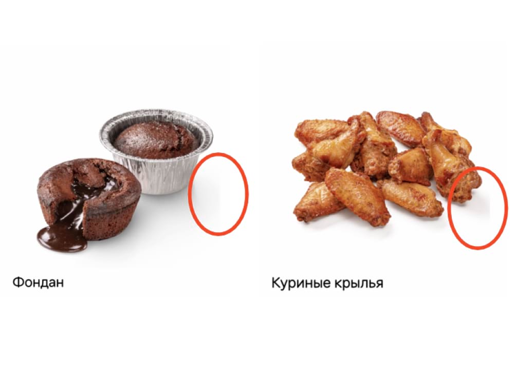
Yes
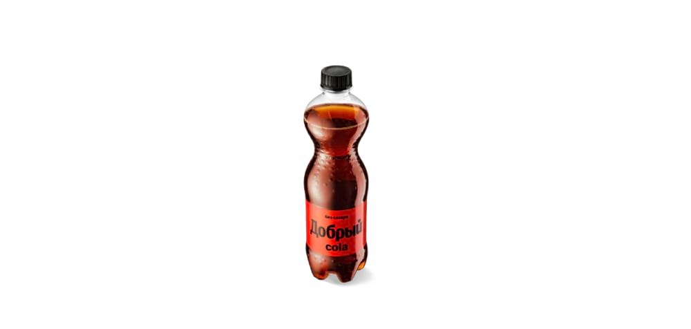
No
Yes
No
Horizon and perspective
Level the horizon. Make sure cups and other objects standing on a surface are also leveled and not tilted.
To avoid distortion and maintain the proportions of objects in your photo, use a lens with a focal length of 80-100 mm (when using a full-frame camera).
Angles for shooting pizza
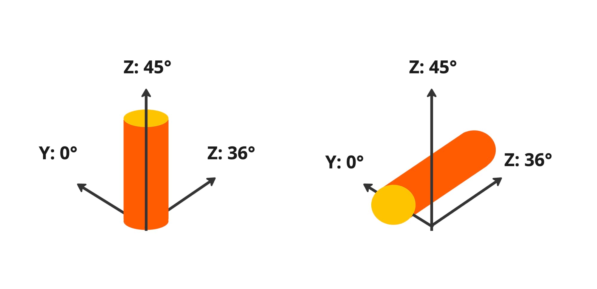
There are two basic angles for shooting pizza for the catalog: from above and in perspective. We have prepared templates that will help you to shoot pizzas and maintain correct shape. You can adjust the geometry of the shape on a retouching stage.
If you shoot the pizza from above, use the template and make sure you follow these rules:
- Pizza is almost perfectly round.
- Vertical cut of the pizza is at a 90° angle strictly.
- Pizza slices are equal, but not necessarily perfectly symmetrical.
- Pizza crust tends to be an even circle shape, but with natural thickenings and bubbles.
If you shoot pizza in perspective, here is a template for reference. For traditional and thin dough, one shape fits all: an ellipse.
From above

In perspective

Angles for beverages, appetizers and desserts
Beverages, appetizers, and desserts should be shot on the same surface, from roughly the same angle, to maintain the same style and visual integrity of the catalog. Keep the natural shape of the objects and make sure they appear stable on the surface.
Yes
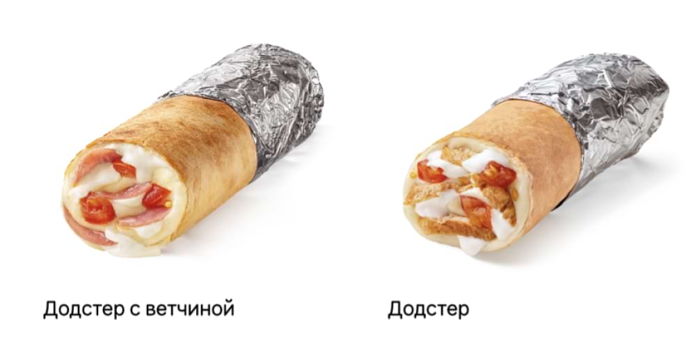
No
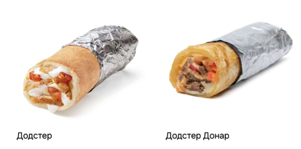
Yes
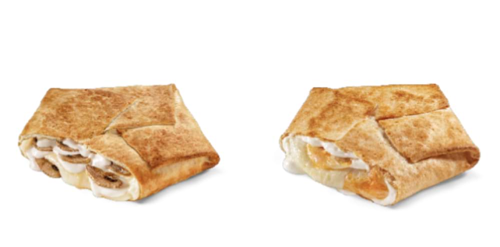
No
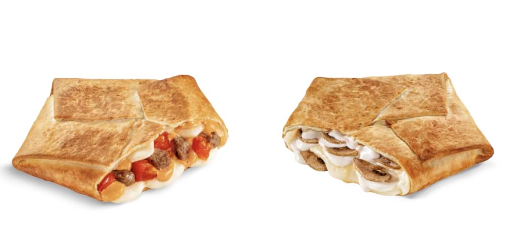
Objects proportionality
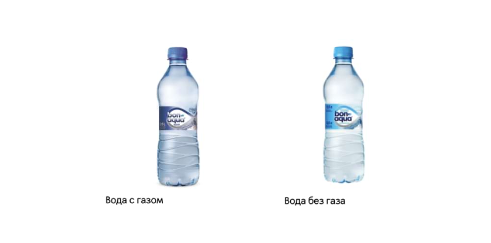
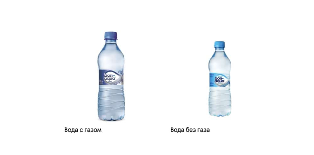
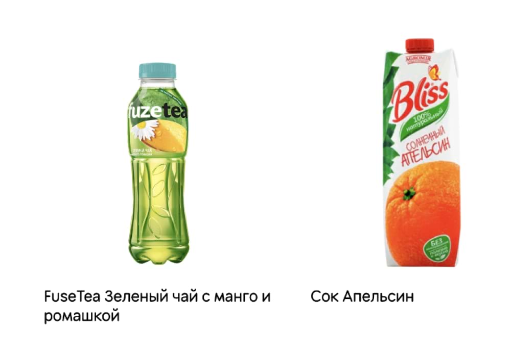
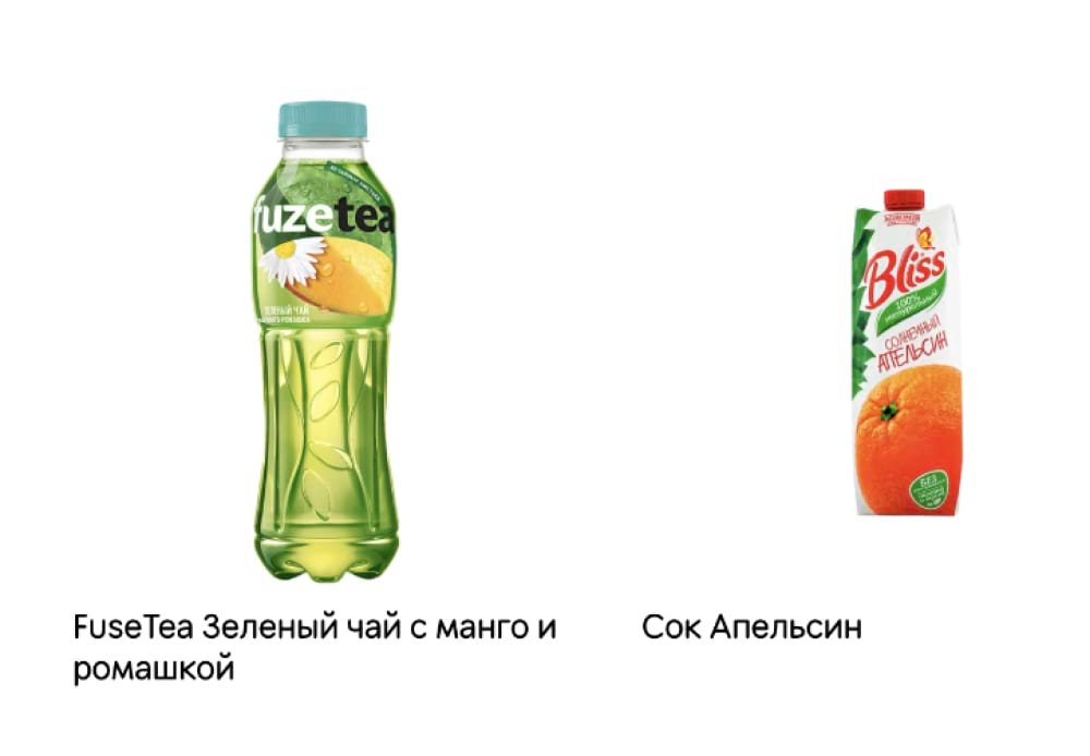
All similar objects should be roughly similar in shape and position in the frame. Watch out for proportionality both for individual photos and in the context of the entire catalog. Learn more about it in the guide Food Proportions.
If you offer products of the same type in different sizes, such as a standard and a small Dodster, change the scale of the products to highlight their difference.
In photos for combos, also maintain proportionality among products, but adjust the scale depending on the location of the objects. For example, if one product is farther away, it may be slightly smaller than the products in the foreground. Let's take a look at some examples.
Yes
No
Yes
No
Yes
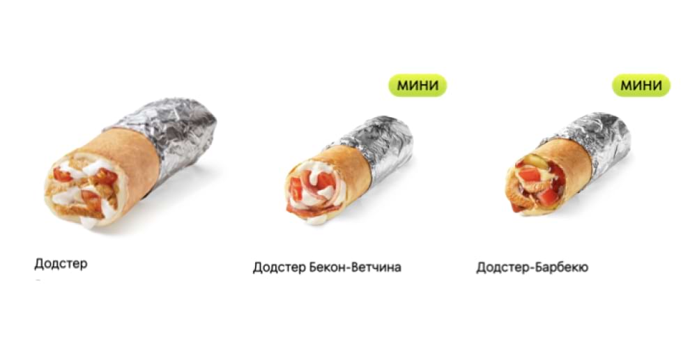
No
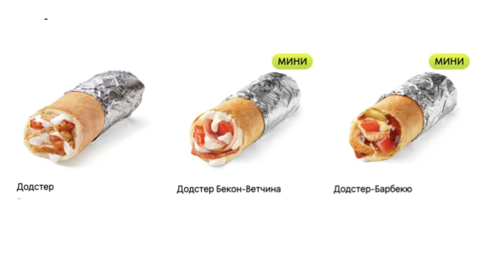
Yes
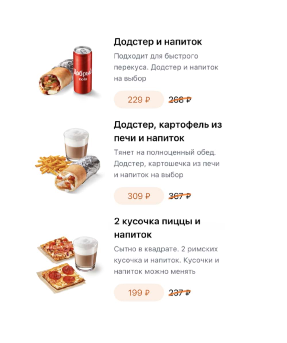
No
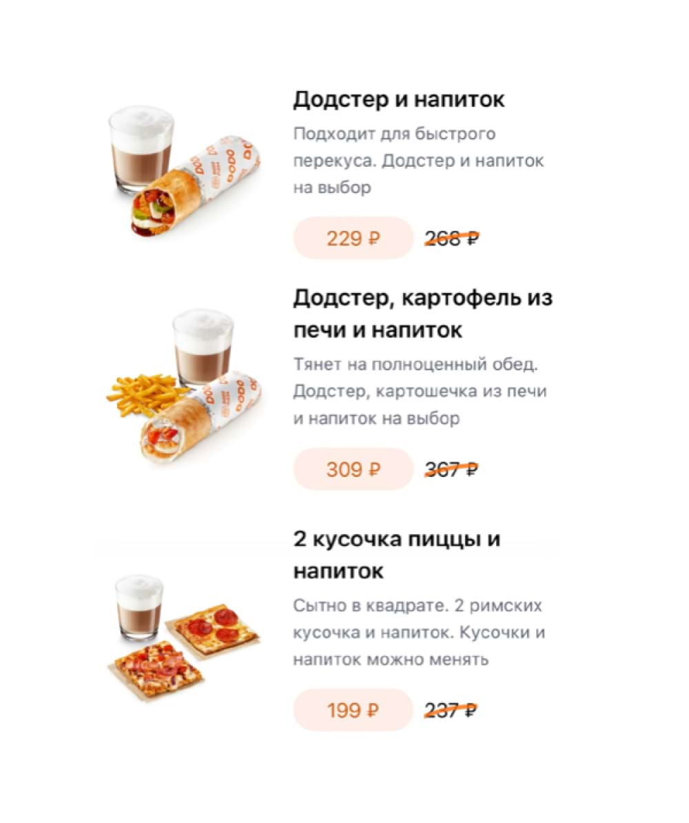
Yes
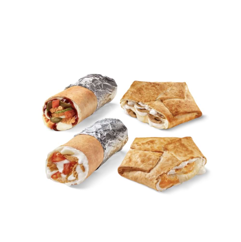
No

Scale
You don't want to make a product too big or too small in a photo. Your task is to ensure consistency in the size of the products on the different menu pages and make the photos visually comprehensible for customers.
Yes

No
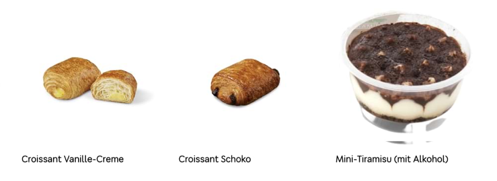
Product composition
A combo is always a composition of products. Place products close to each other to visually convey the idea of the combo. At the same time, all products should fit within the edges of the layout while maintaining their integrity and recognition. Here are a few rules to help present the combo correctly.
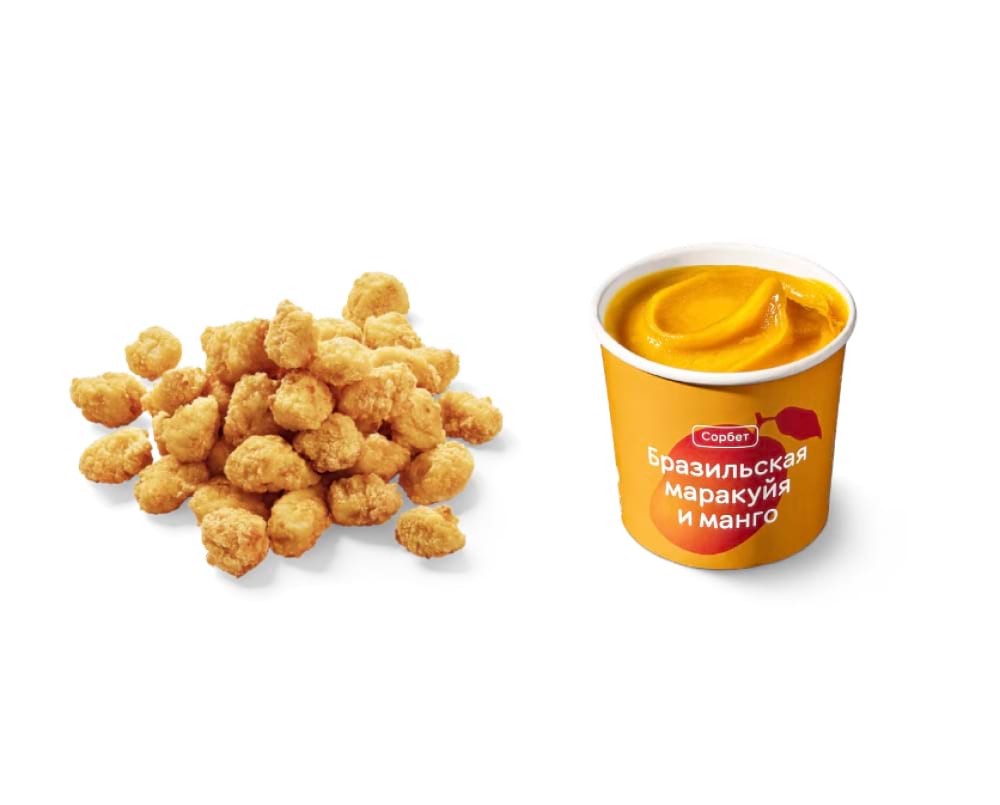
- Ensure the integrity of the composition. Use the same quality photos with the same colour rendering and light source. Make sure the products are on the same surface.
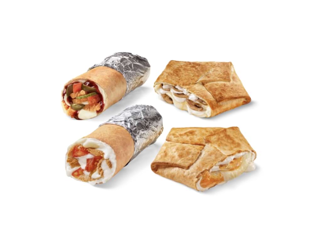
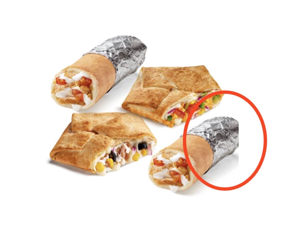
- Do not crop product images. Look for a composition that allows to place all items in balance while keeping them proportionate.
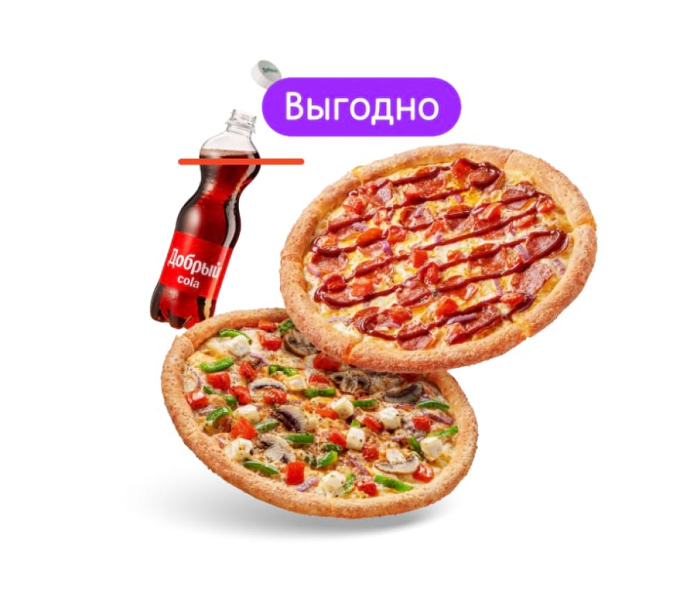
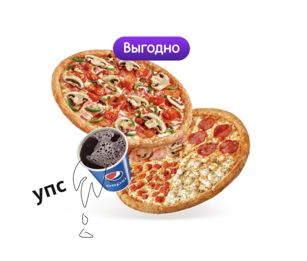
- Remember the laws of gravity. Make sure the liquid in the package obeys them: the surface of the water must be parallel to the surface it is on, regardless of the inclination of the vessel.
- Do not finalize the design. Do not do background fills or add additional design such as texts, logos, or plates.
Yes
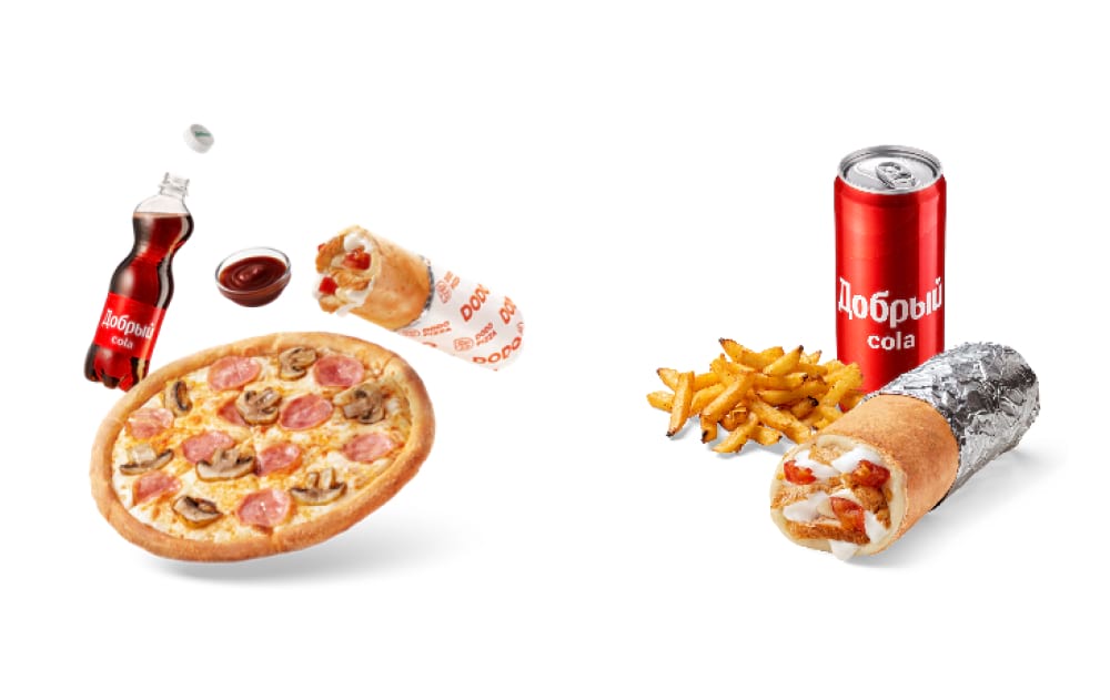
No
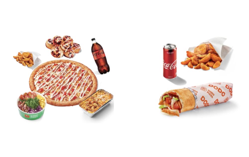
Yes
No
Yes
No
Yes

No
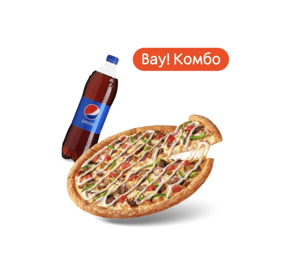
Yes
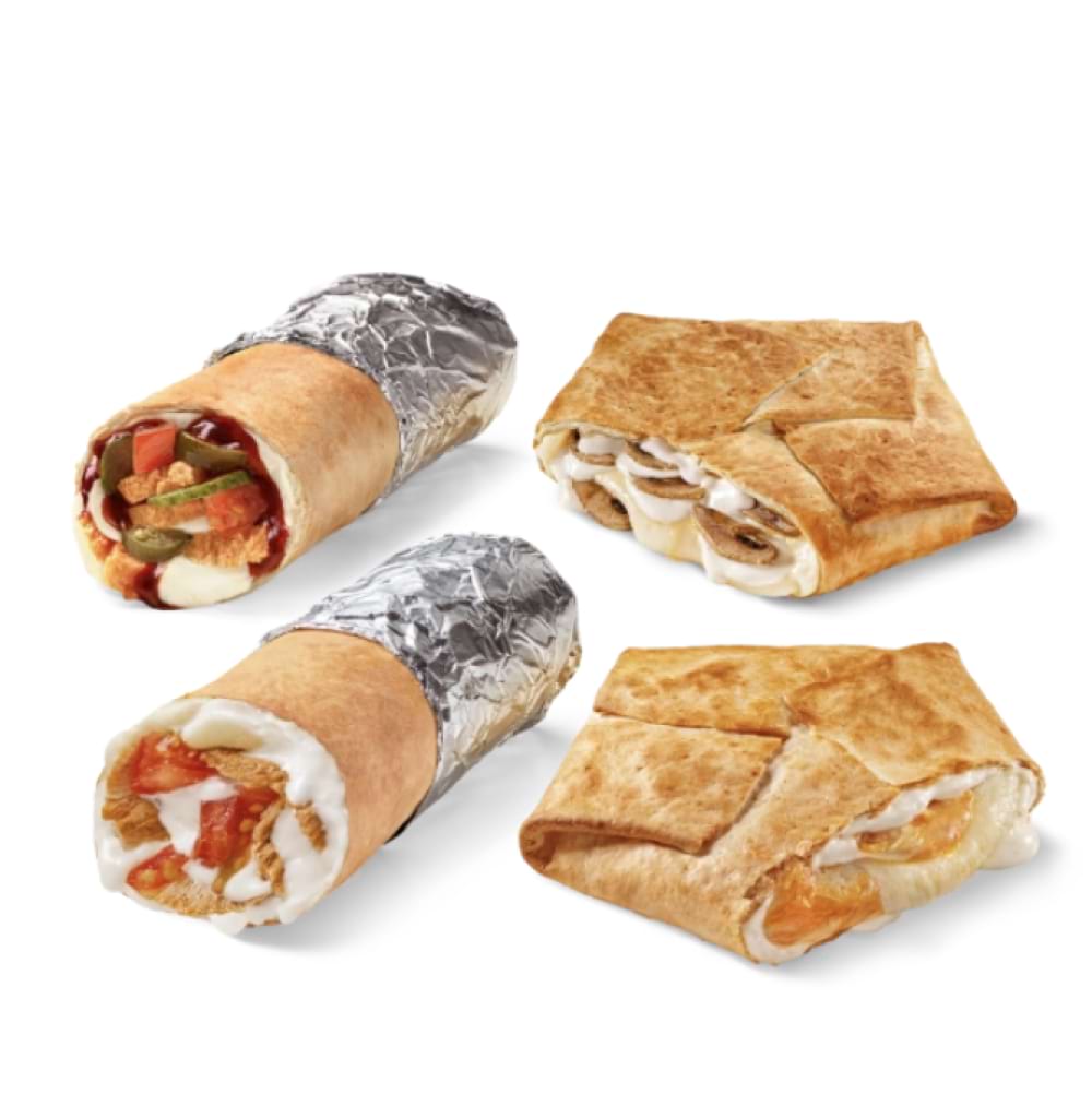
No

Plates and other elements in catalog photos
Do not use plates or other graphic elements in catalog photos. It is acceptable to add a partner's logo if you are launching a product as part of a larger collaboration.

