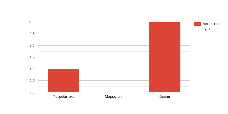
The Consumer – Marketing – Brand communication model
We use the Consumer-Marketing-Brand (CMB) model to split a communication into components more quickly and understand whom it is most targeted at.
The CMB model helps to set accents within the visual item when several messages need to be placed on the layout at once. It often happens like this: a marketer and a brand manager approach the designer, each of them trying to solve a different task, and, as a consequence, they see the result differently. At the same time, pizzeria guests have their own requests, and sometimes these contradict the tasks that marketers and brand managers set.
Let’s take an example: the marketing team needs to increase pizza sales this month, so they want to run a banner advertising two Margaritas for the price of one. The brand manager wants the company to be attractive to associates, so they suggest a no-discounts policy — it’s not respectable otherwise. A mom of a child who is allergic to almost everything wants to know if there is any salad in the pizzeria.
The designer is faced with the question: what to put on the visual in the first place? The “Consumer – Marketing – Brand” communication model takes them out of misery.
How to use the CMB model
According to the CMB model, a design can respond to the needs of three groups: consumer, marketing or brand. One visual can have one thesis or several: the requests of which group to prioritize and how many messages to place on the layout depends on the specific task and communication zone.
Before assembling the layout, we make a complete list of theses: consumer needs, marketing and brand push. We rank all these items according to their importance and then distribute them on the layout, based on the area of placement and the capacity of the media.
We will not place marketing push, for example QR codes, on the restaurant door, because visitors will not notice them or will not have time to scan them. But we will print them on the table tents, which people look at while waiting for the order. We will keep only the information useful to guests on the door, which is opening hours.
It’s important for the designer to consider the context of the interaction and distinguish the requests of one group from another to understand whether the final layout solves the problem at hand.
Consumer
"I want to have breakfast for no more than 200 rubles"
"My child doesn’t eat sausage/cheese/vegetables, what can you offer?"
Marketing
"10% discount for moms with strollers"
"This burger is on special today"
Brand
"We tried 145 varieties of local pepperoni before choosing the best one for our pizza"
Examples of visuals with different accents
For the sake of clarity, let’s take a look at the examples of different types of communication and break down how design can respond to consumer, marketing and brand needs.
-
Marketing push + consumer needs + brand push
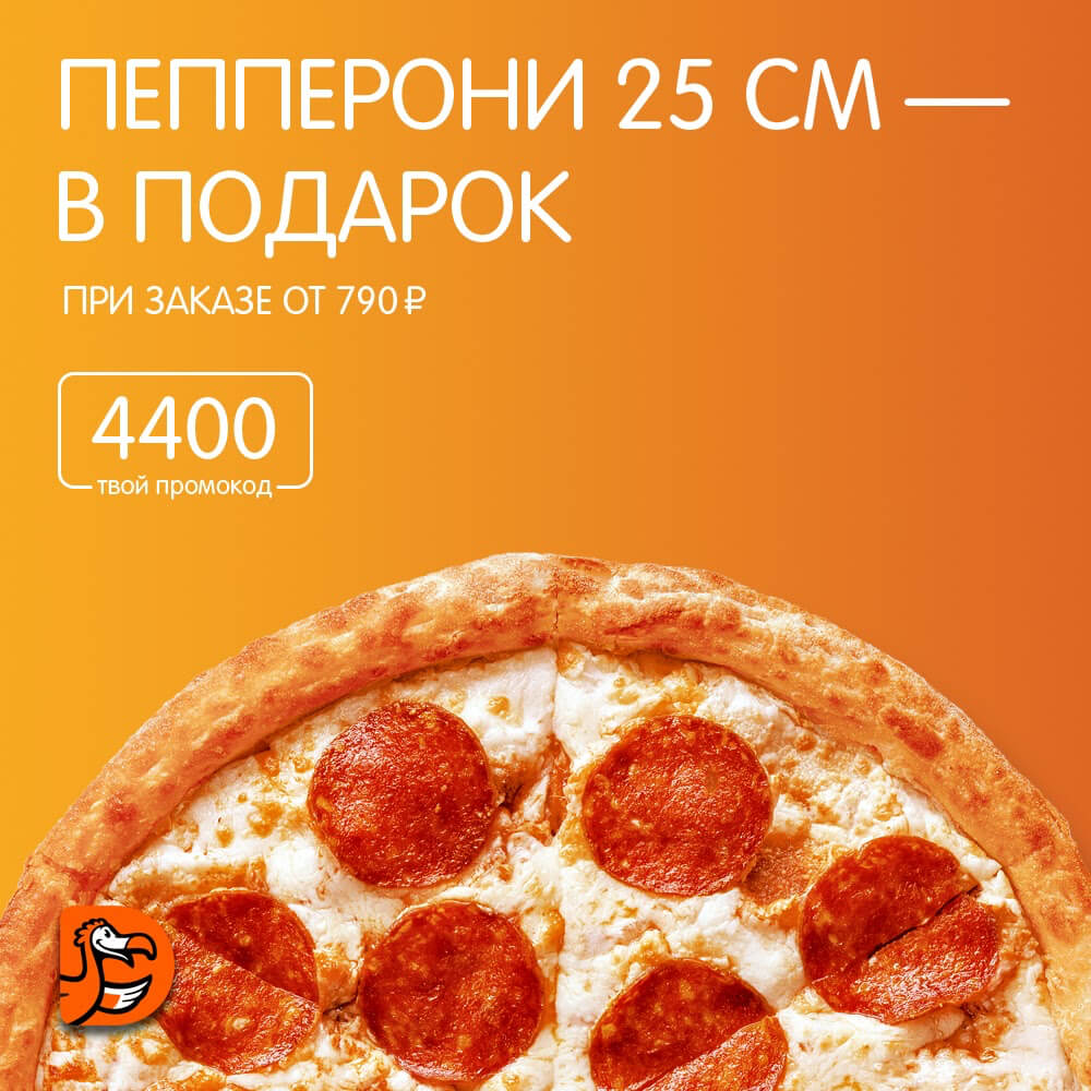
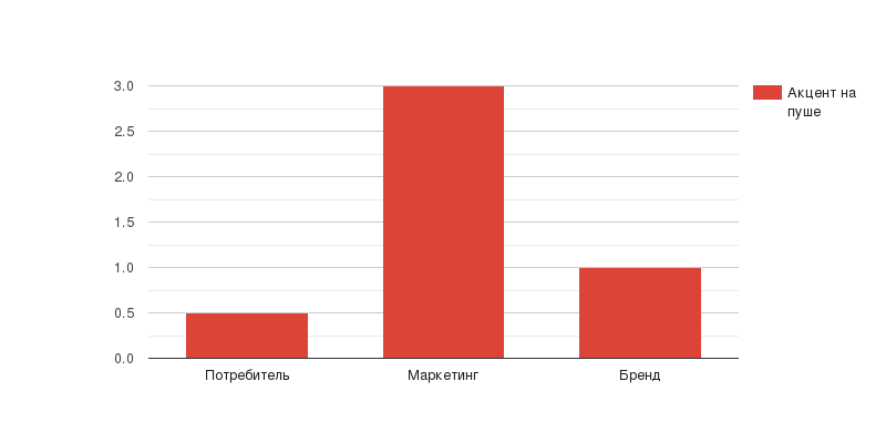
The visual solves the marketing problem and responds to consumer needs, telling about the promotion and offering a hearty meal at a bargain price. The brand is present, but there isn’t too much of it: a small logo in the bottom left corner. People realize that they are looking at a pizza advertisement, but after 5 seconds of viewing almost none of them will remember which company advertised it.
-
Brand push + marketing push
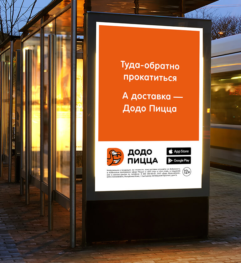
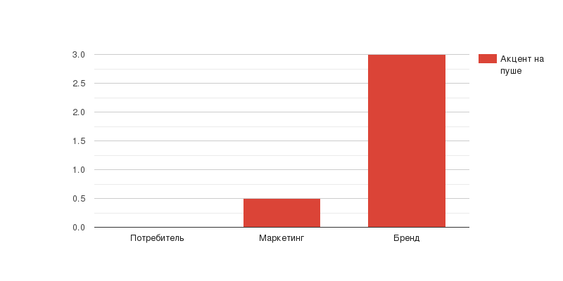
The banner below features a brand meme and a marketing meme. For the brand it is the message “Dodo is delivery”, the distinctive orange colour and the logo. For marketing – app store icons that tell us that we actually have an app.
This is an example of not a particularly good design, because the visual tries to tackle, but does not actually solve the marketing problem. If we want to increase the number of app downloads, we need to add CTA – and emphasize the marketing push.
If we want to make advertising work for the brand itself, we should remove unnecessary things, for example, store icons, which are impossible to track whether someone clicked on the link and downloaded the app anyway.
-
Marketing push + brand push
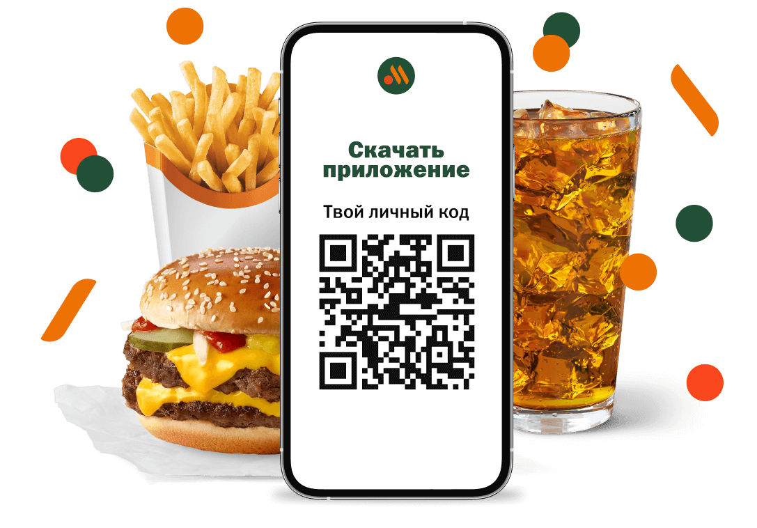
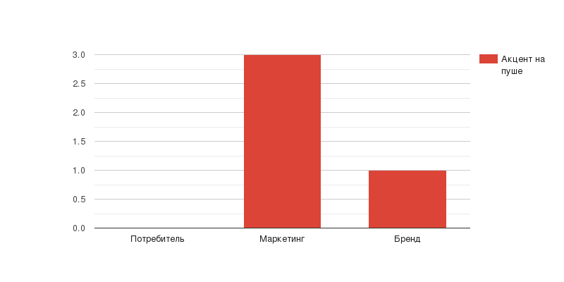
This visual has recognizable product, colours and logo – the brand is present. The emphasis is on marketing push: there is a straightforward call to download the app and a QR code to track the effectiveness of the ad.
-
Consumer needs + brand push
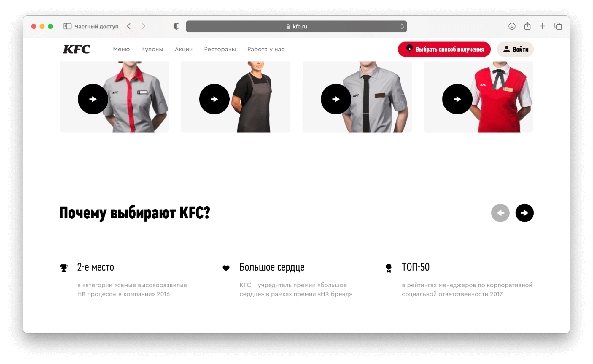
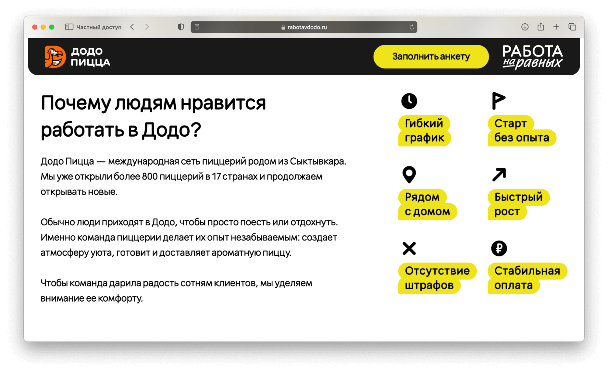
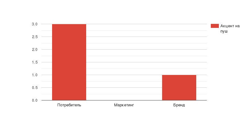
Advertising is not the only area whereThe CMB model works. In the example below, the brand acts as HR, with readers, potential Dodo employees, as the consumer. Emphasis is on the reader’s needs: the block is entirely devoted to the benefits of working for the company, and the brand appears only in the first paragraph. There is no marketing at all.
-
Brand push + Consumer needs
In HR communication, the focus can also be on the brand itself, as in this example: the top of the screen lists job vacancies with links to details about each, followed by a block about the company.
