
How we show the product on digital layouts
We put a compact and clear text on digital layouts. It describes the product through real attributes. We show products as they are in real life, and use post-processing moderately.
Text
-
Describe the product through real attributes. Imagine that you need to tell the specialists in a large production facility what the product should be like. Everyone understands the word “sophisticated” differently, but everyone will understand what “crispy” means.
Dodo
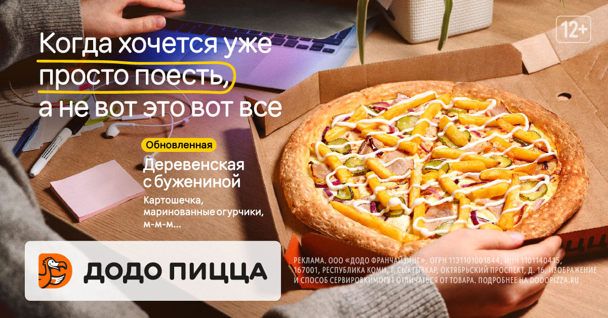
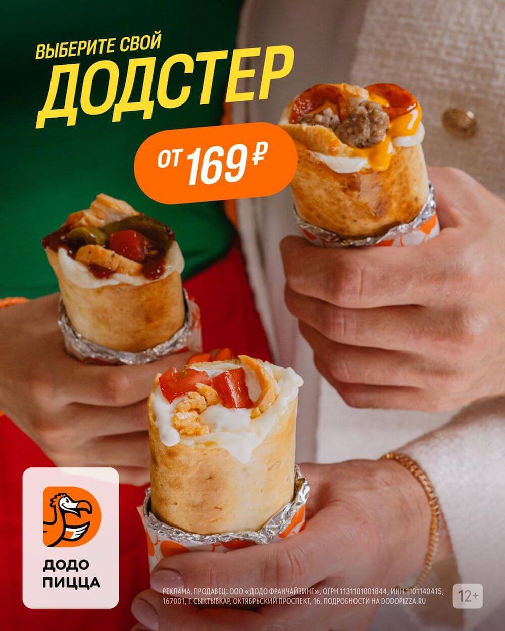
Real attributes: crispy, stretchy, flavourful, fresh, firm, golden, hot.
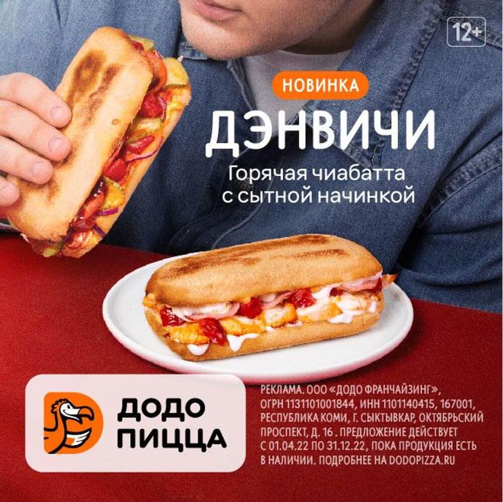
Indicated the name of the product, described it through comprehensible attributes (hot, nourishing) and communicated that it is a new product 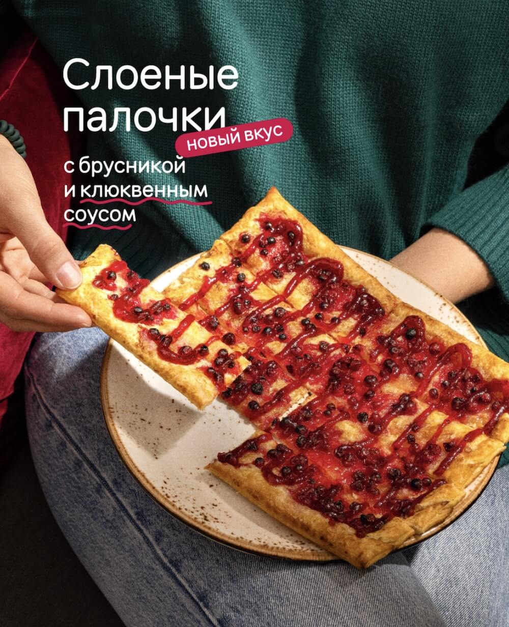
Listed the ingredients; implied the “new flavour” plate to communicate the novelty with the layout Not Dodo
Words that refer to concepts and abstract images: sophisticated, delicate, bold, precise.
Words “the one” give us no information about the product 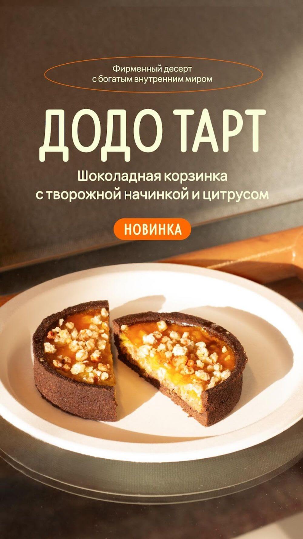
The layout has a “novelty” bar, but the text calls the recipe a “specialty”. The message is misleading Communicate facts, avoid metaphors and sensual images. The person who sees the advertisement should spot the main thing about our offer: composition, ingredients, name or other specific facts about the product. If we emphasize the filling, we don’t exaggerate. If we list the ingredients, we do not leave things unsaid or create intrigue for the sake of intrigue itself (secret ingredients, sacred recipe).
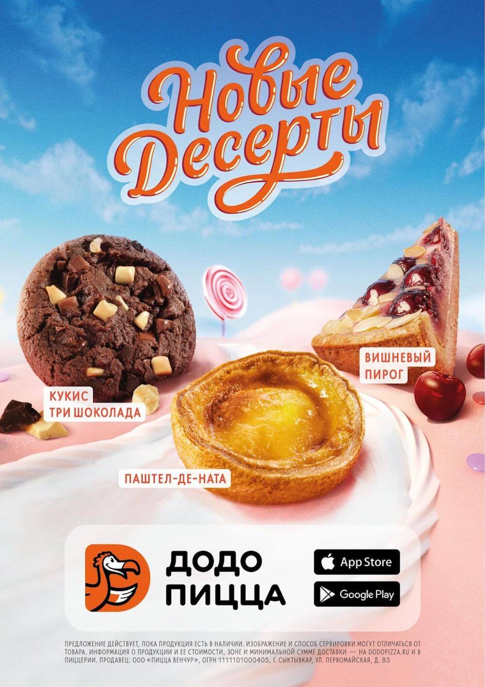
Dodo
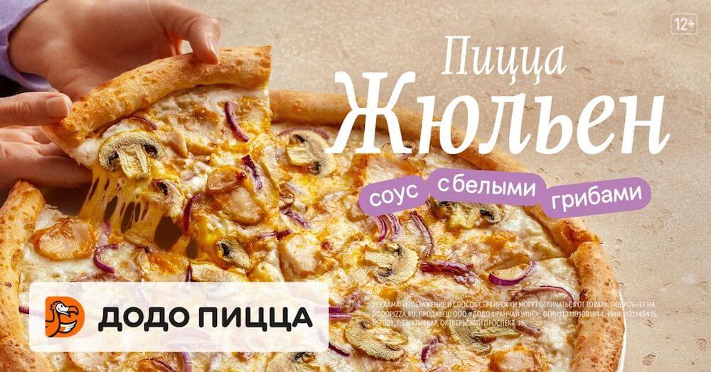
The name of the pizza and the ingredients list is what a customer will remember Not Dodo
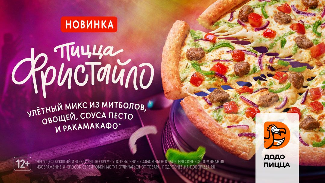
The name doesn’t tell you anything about the flavour. There is ambiguity left – it’s unclear what “rakamakafo” is -
Leave only one message on the layout. At the master layout design stage, we gather all the information about the product and prioritize the messages: we choose what is important to communicate first. We keep only the key message on the layout.
Dodo
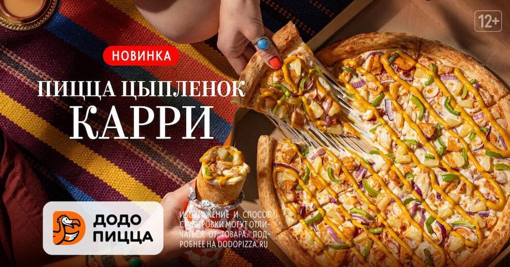
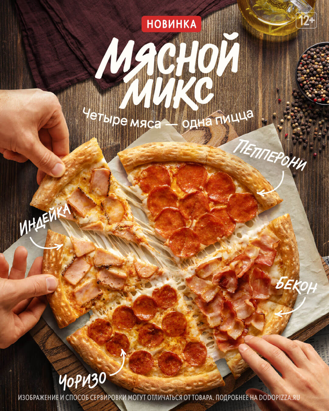
Layout tells about the new pizza: we indicate the name and emphasize that it is a new product Not Dodo
Two messages on a layout is too much. It’s important to put the name of the pizza in the heading, list the ingredients and emphasize that we've updated the recipe. Metaphors and sensual "m-m-m-m" are best avoided 
There’s no message on the layout. Or it’s lost behind the metaphors
Image
- Display the product realistically. Real dishes with original composition are in the frame. We don’t inflate expectations: we show what the product will look like when a guest or an app user receives it. Crumbs, non-ideal vegetables or pieces of meat are the truth.
- Don’t go over the top with post-processing. Make sure the picture has natural colours, shadows and light.
Dodo
The product looks realistic on all layouts: natural colours, shadows and light Not Dodo
Plastic and caramel-ish food. Lots of photoshopping and post-production 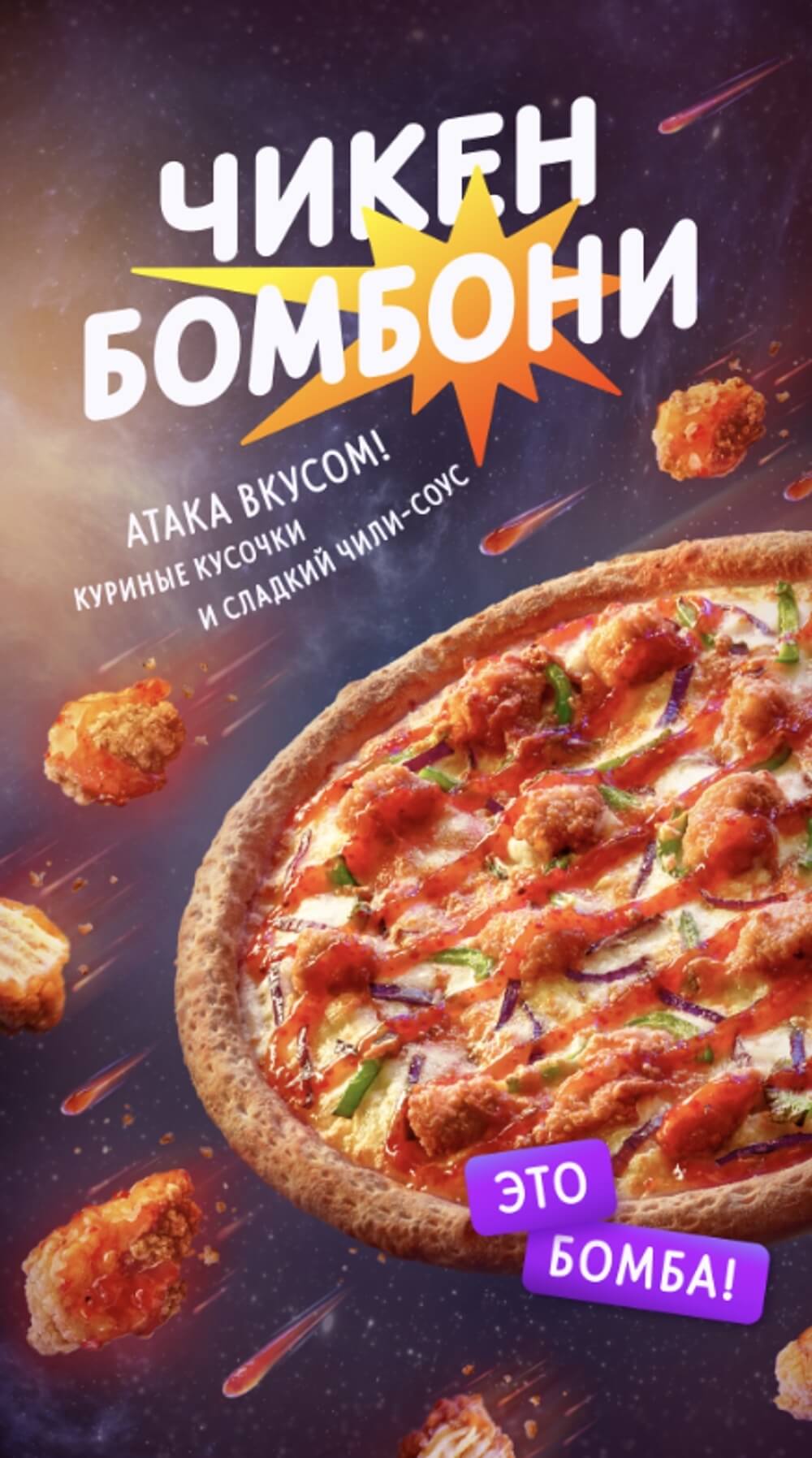
Fantasy world, lots of photoshopping: pizza floating in the air surrounded by chicken pieces 
Showing the perfect product inflates expectations
Read next: