

Plates in the app
To highlight a product in the mobile app catalog, we use colored plates with a short text message. Plates help to navigate through the catalog and draw user’s attention to special items in the menu. You can download plate templates in Figma here.
Style
The style of a plate is its shape, color, and the message conveyed through the plate. Let's take a closer look at all these style components.
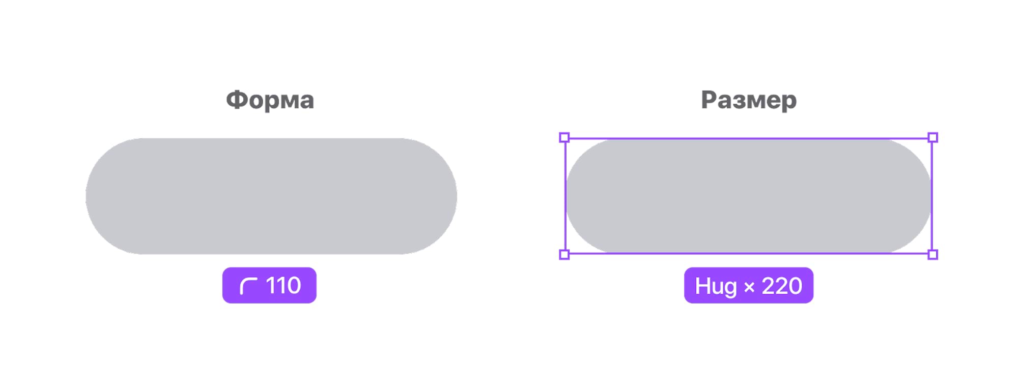
The shape of the plates and their height are the same throughout the catalog. Only the length varies, depending on the size of the content.
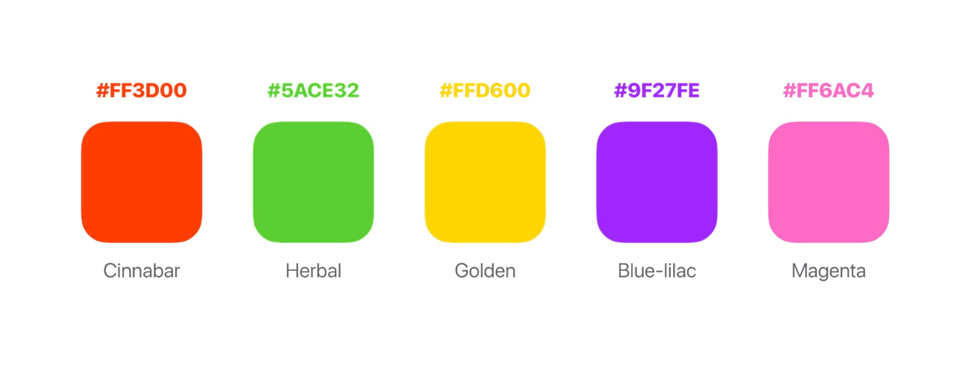
The color of the plates is based on market patterns and color psychology, with a total of five color styles in the palette.
We put in clear text on the plate, i.e. we do not use words with ambiguous interpretation and intriguing phrases. Most often the information message in the plate is expressed by a noun or an adverb.
We also make the text in the plate as short as possible, so that the user can instantly grasp its idea.
Yes

No

Plate types
Depending on the type, plates are used in all product categories or only in some specific ones. Let's take a look at all types of plates and their use.
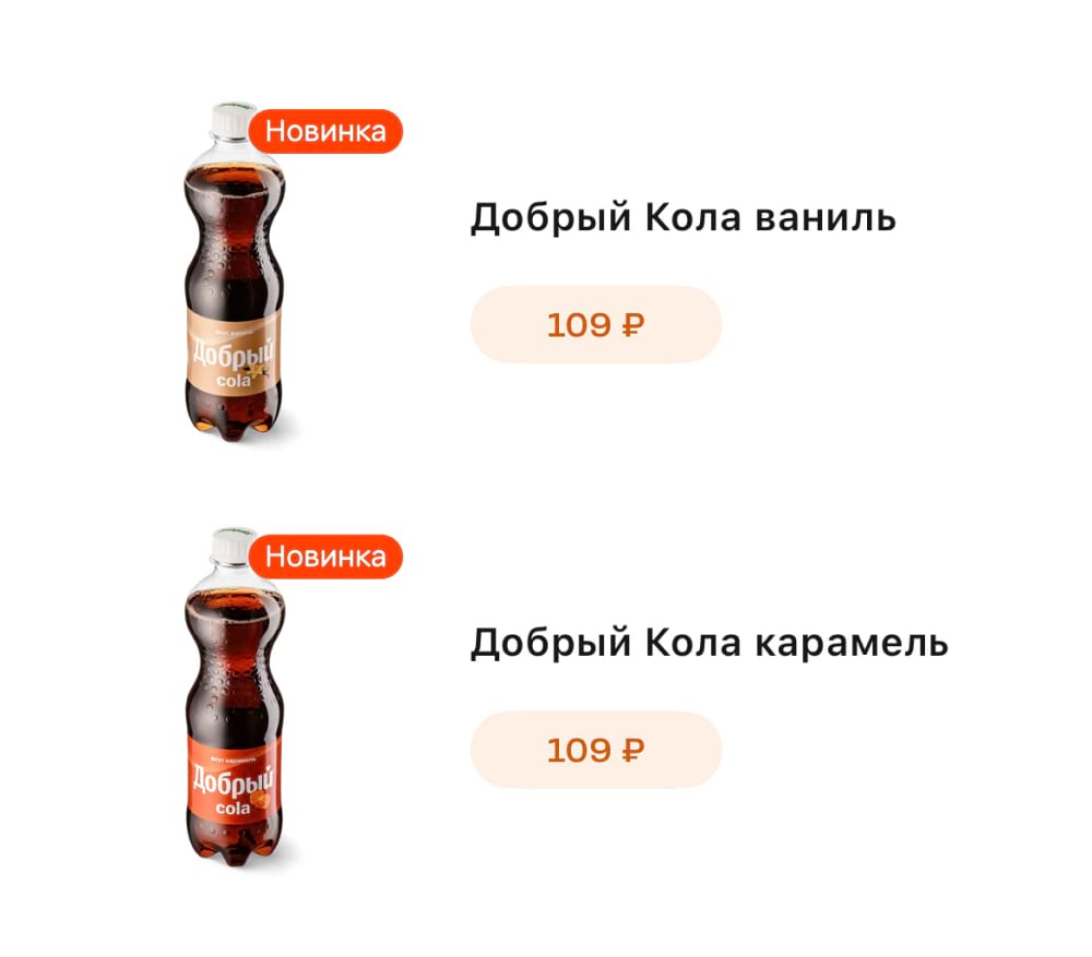
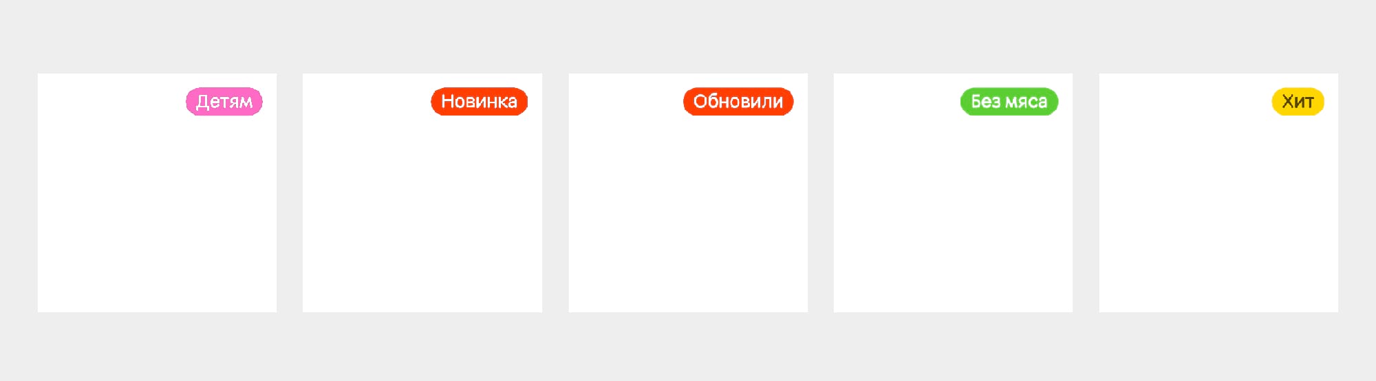
Information plates are used in any product category and carry a message suitable for each product on the menu.


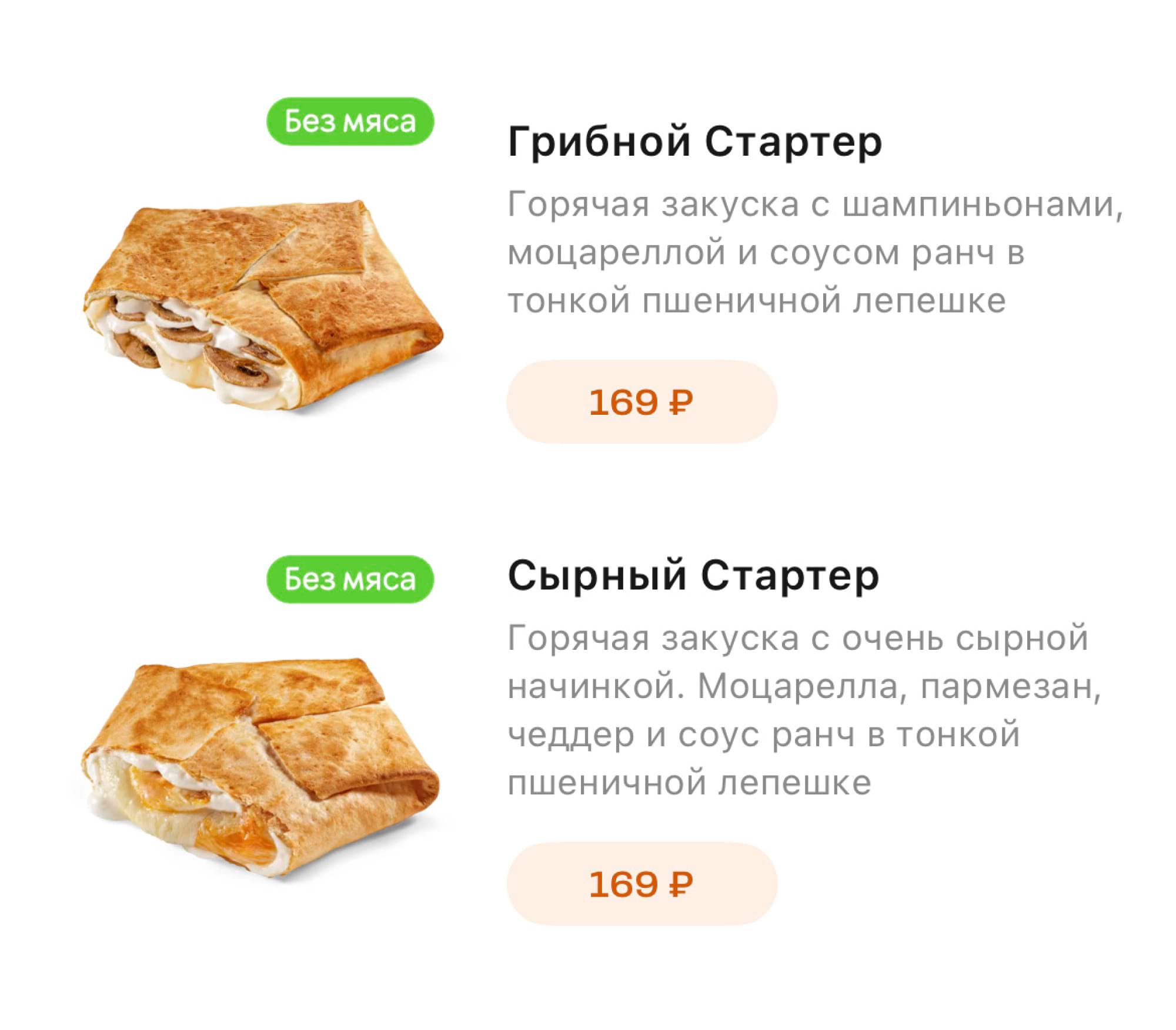
Gastronomic preference plates have only one type so far - “No meat”. It is used only for products in the “Pizza” and “Snacks” categories.

The target audience plates contain one type of plate so far - “Kids”. This type is used if the product is intended for a narrow audience.

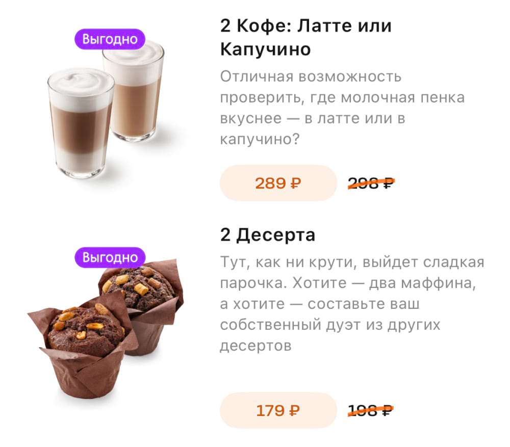
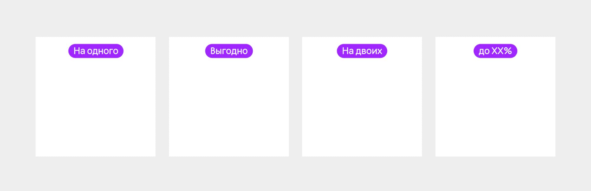
The combo plates contain six types - “Benefit”, “For one”, “For two”, “Up to 19%”, “Up to 20%”, “Up to 22%”. The plates of this group are used only in the “Сombo” menu category.


Placement
We place all plates, except for the combo-type ones, in the top right corner with 110 px indents at the top and right.
Plates for combos are placed in the center.
One product can have only one plate per each.
Read next: