
Marketing mechanics in promotional layouts
Marketing mechanics are tools and methods used to increase audience engagement and sales in general. They include promotions, discounts, contests and other special offers. In this guide, we look into the key strategies used in Dodo and share recommendations that will help you put the accents accurately on your promotional layout.
To make marketing mechanics work and deliver results, you need to clearly define the goals for the campaign and find out what needs a particular layout should cover. For example, pizzeria guests want delicious food for decent money, marketers want to attract users to the app, and brand managers want to broadcast brand values. Whose needs are more important?
The prioritization algorithm helps answer this question: we make a list of all the points we want to communicate, and then we subtract the least necessary one by one. As a result, we are left with key messages, which we distribute across the layout.
Visitor needs
Get benefits
Eat
Marketing needs
Tell about the promotion
Encourage to use the app
Brand needs
Maintain brand awareness
Communicate the brand's mission and values
What exactly should be on a promotional layout and how to distribute theses to make the marketing mechanics work, we analyze in the following sections.
Benefit
In layouts like this we translate the idea “pay little and get a lot”. We offer customers a discount, gift, promo code or product for a new (and better) price. Here are the key elements we employ in so-called benefit layouts.
Heading. In the heading, we write the pitching point. For example, “Profitable pair”, “Pizza + drink”, “2 for the price of 1”.
Communicating benefits. We try to highlight specific figures, such as new and old prices: it is easier for the customer to make a rational choice when they can clearly see the details. If we can't give exact prices, we put a promo code or a percentage discount. If we want to show the benefits of buying several products at once, we list all of them.
Product Photos. Demonstrate what is in the offer. If we want to show the benefits of buying several products at once, we list them all.
Clarifying information. Specify the terms of the promotion or any necessary information about the conditions. For example, “only on February 29 and March 1”, “valid in the pizzeria”, “30 cm”, “the composition of the combo can be adjusted”; the title specification: “two slices of pizza for the price of one”. Make sure that the clarifying information does not distract attention from the heading or from demonstration of the benefit.
Common mistakes: the benefit is not obvious, complicated terms of the action, what is shown is not what we sell.
No
The benefit is shallow. The “2 punches” offer is highlighted, not its exact essence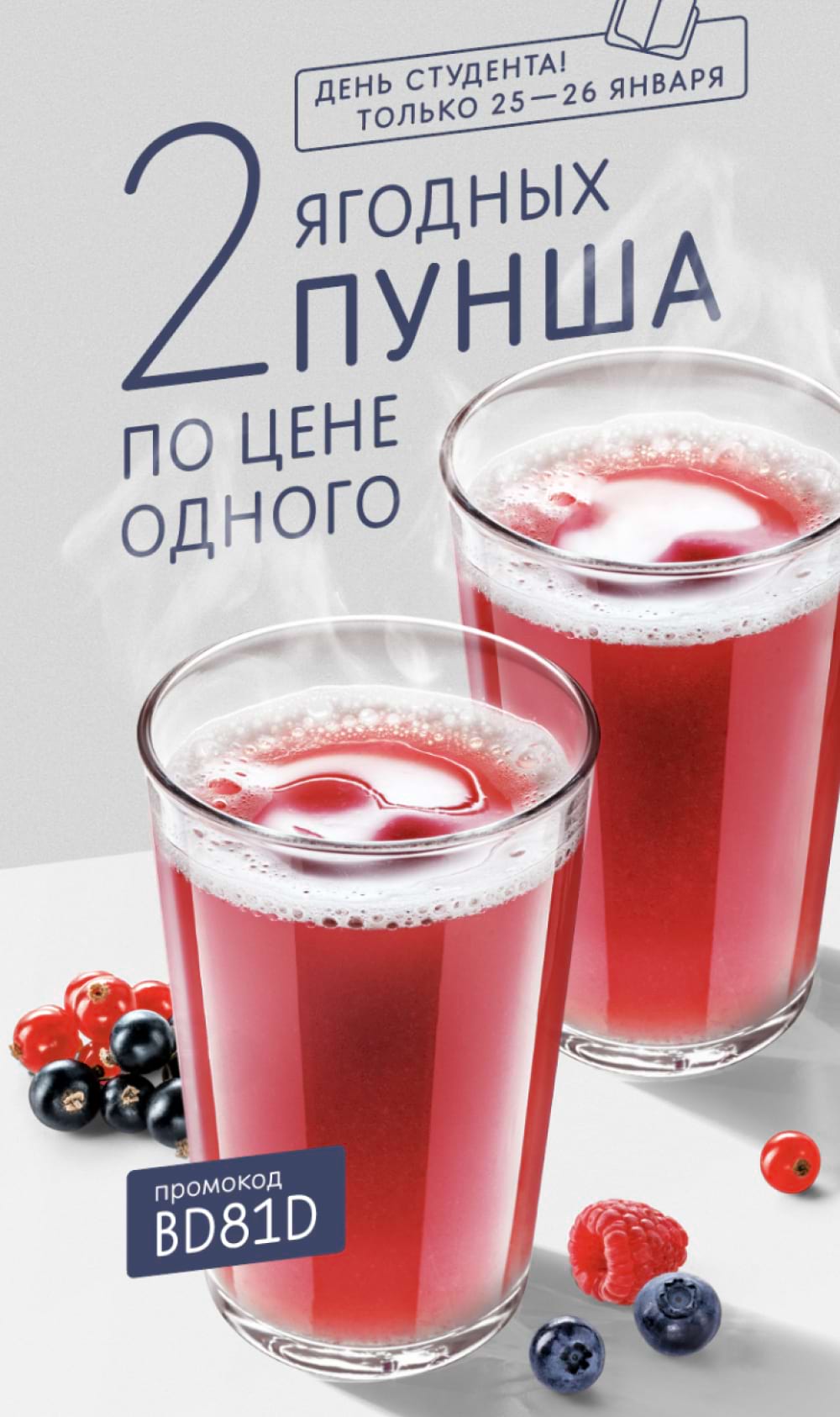
Yes
The benefit is clear. The important message “2nd is for free” is highlighted for the customer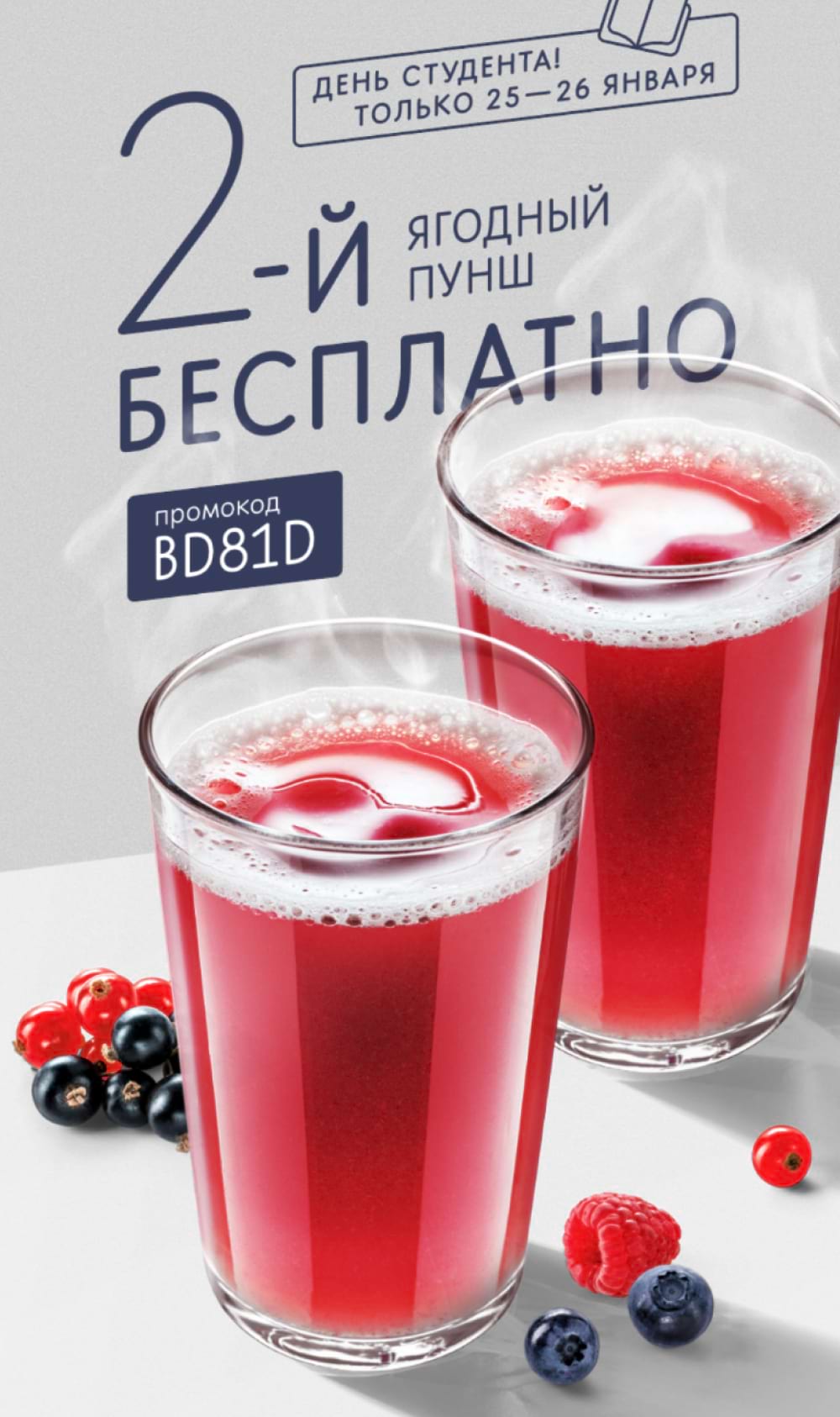
No
Customers may not know we have pick-up yourself service and it’s unclear what needs to be done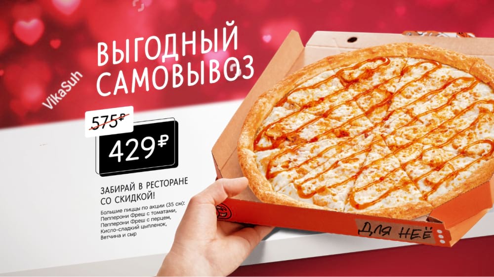
Yes
We disclose the terms of the benefit and put the call to action into the heading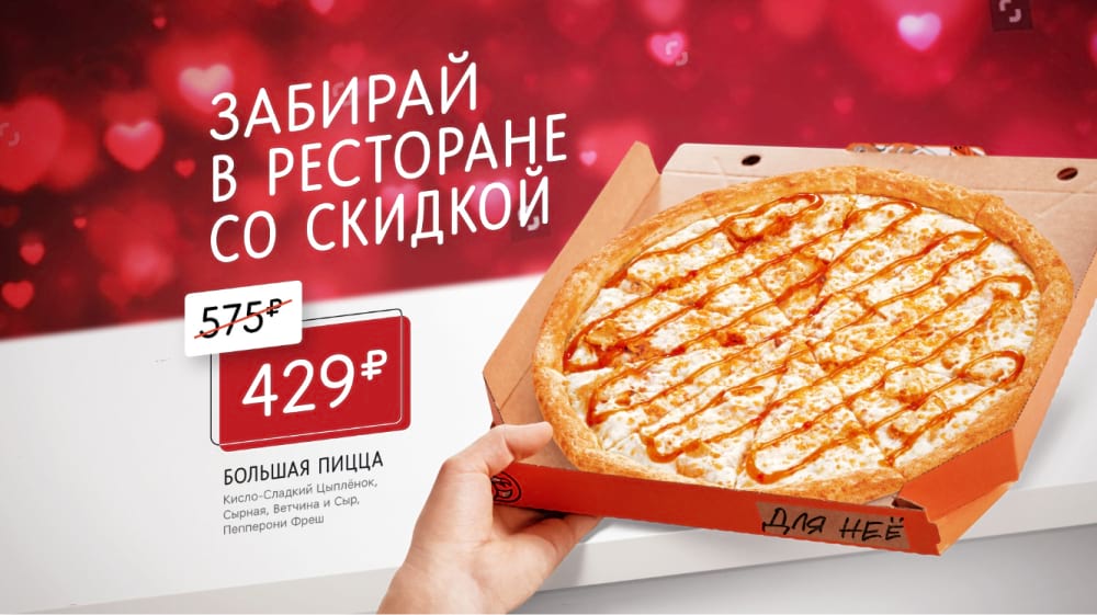
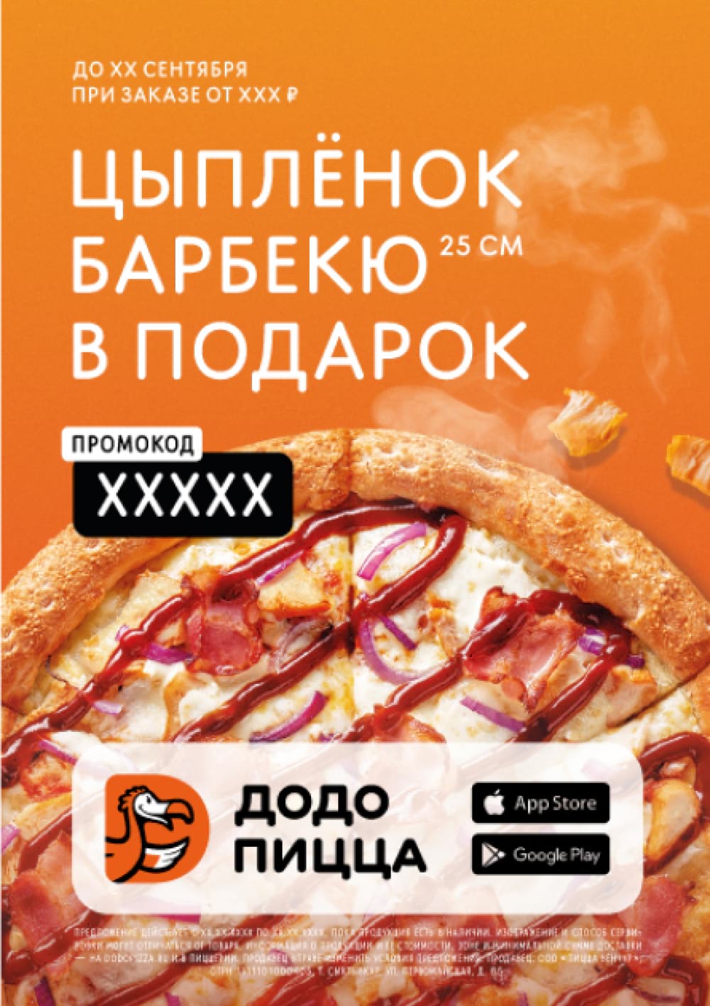
Temporary promotion
We use this mechanic when we want to communicate that a great offer is only valid through a limited period. Here are the key elements we use in our temporary promotion layouts.
Heading. Here we outline the offer or a warm-up to it. For example, “Gift”, “Black Friday”, “-10%”.
Benefit showcase. If you do not formulate the key benefit in the heading, put it further into the layout. We aim at showing specific figures, for example, new and old prices: it is easier for the customer to make a rational choice when they see the specifics. If we can't give exact prices, we give a promo code or a percentage benefit.
When showing a price, use a price enhancer - add “total”, “only from” or cross out the old price.
Period of the promotion. This is the main condition, so highlight the terms on the layout so that customers see them right away.
Product Photo. Present the product, but do not distract attention from the price. In some cases, we drop product photos and only tell about the promotion. Black Friday layout can be an example.
Promo code. If we offer a promo code, we emphasize it on the layout so that a customer will definitely notice it.
Clarifying information. We put additional terms and conditions of the promotion, or specify the heading, if necessary. Make sure that the clarifying information does not distract from the heading, the period of the promotion and the details of the benefit.
Common mistakes: promotion dates are hidden and detached from the unique selling point of the heading, there are no dates for the promotion, and the benefit is shallow.
No
The period of the promotion is not highlighted enough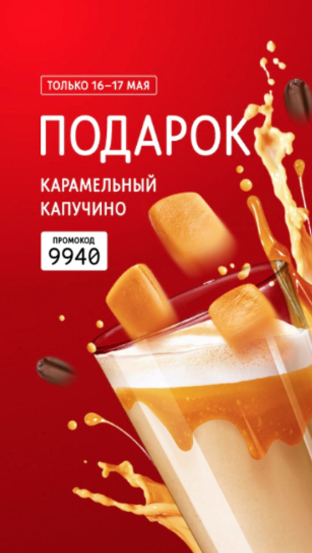
Yes
The heading contains the main thesis, highlights the terms of the promotion and the promo code, and outlines the conditions for receiving the gift.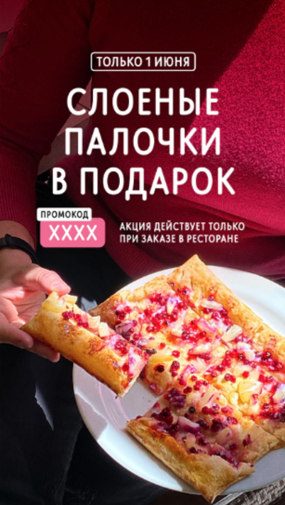
On this layout, the profitable offer is more important than the product photo, so we don’t showcase the pizzas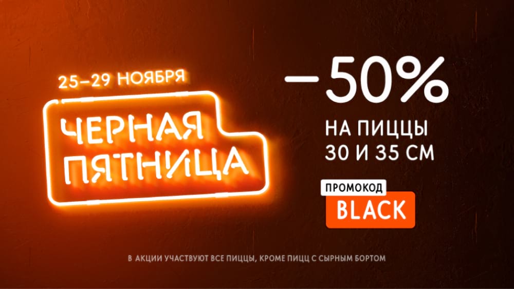
Hot deal
We use this mechanic when we offer to buy a product at a very low price (in its category in the restaurant market). Here are the key elements we employ in layouts with hot deals.
Heading. The product (“Fragrant Coffee”) or the selling offer ("Coffee Subscription").
Price. Exact price or its lowest point (price “from”).
Enhancer. “Total”, “Just from” or the old price which is crossed out.
Product photo. We showcase the product, but keep the focus on the price.
Clarifying information. Volume (weight, size) for this price. For example, “for 0.3 l cup”. We can specify the characteristics of the product (“100% Arabica”). Make sure that the details do not distract from the heading and price.
Common mistakes: Price is detached from the heading, no price enhancer, emphasis is shifted from price to picture or heading, clarifying information contradicts the main point.
No
Clarifying information contradicts with the main point. Accent is shifted from the price to the picture.
Yes
The heading contains the sales offer, the price is accompanied by an enhancer, and a photo of the product is shown.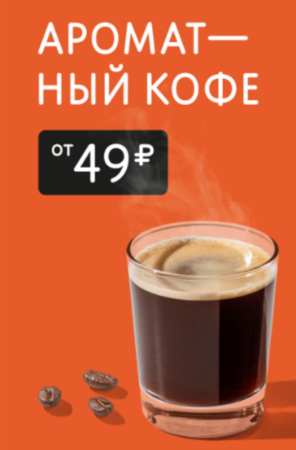
No
The heading leads away from the price to itself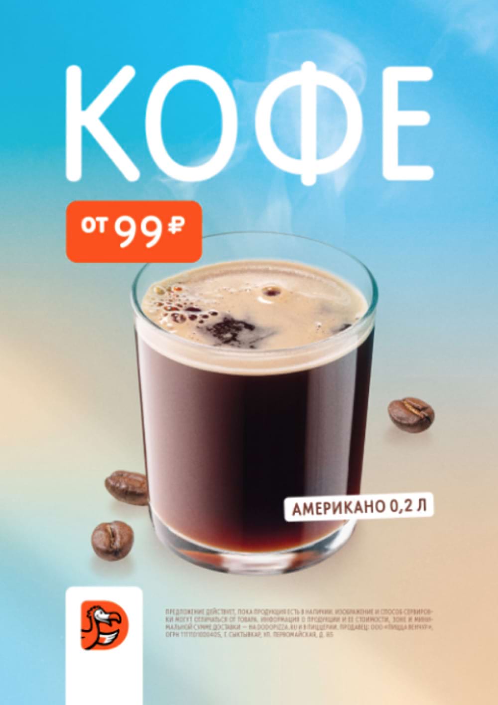
Yes
Accent on the price, product photo works as a background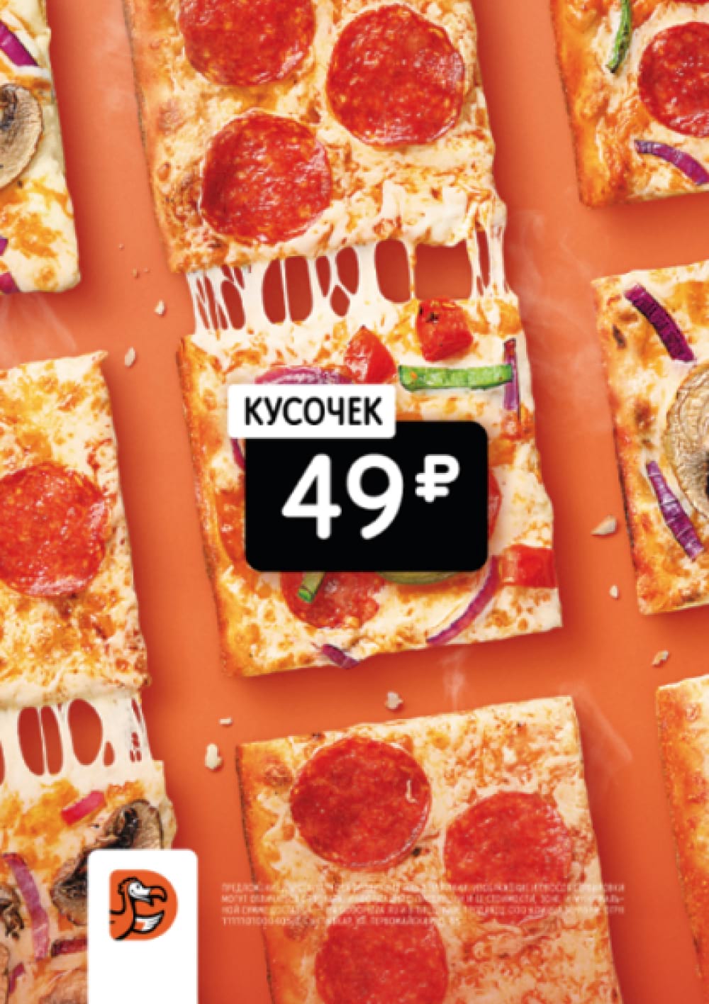
No
Price is detached from the heading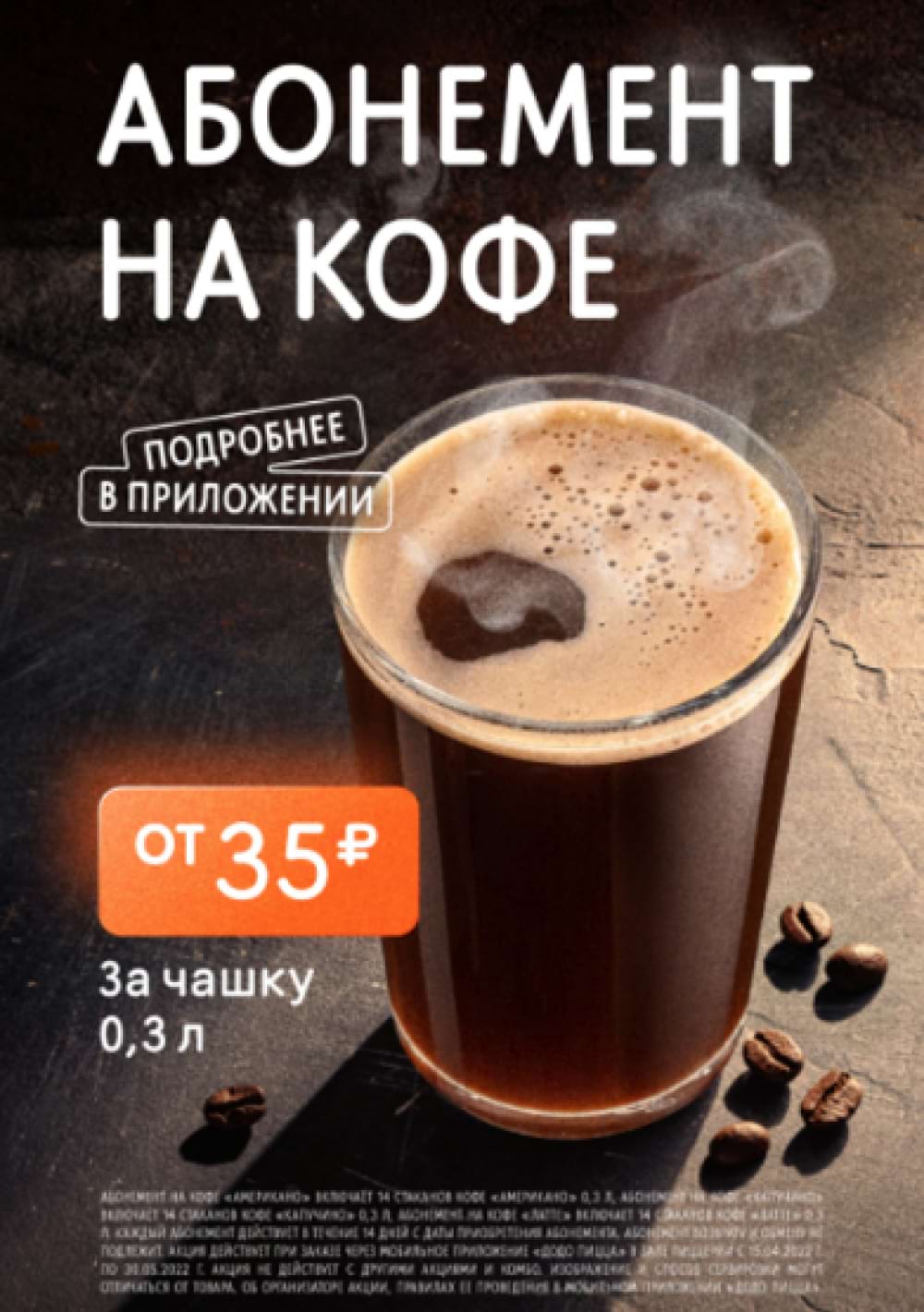
Yes
All the key elements are where they are supposed to be: the price is next to the heading, the volume of the drink is indicated, there is an enhancer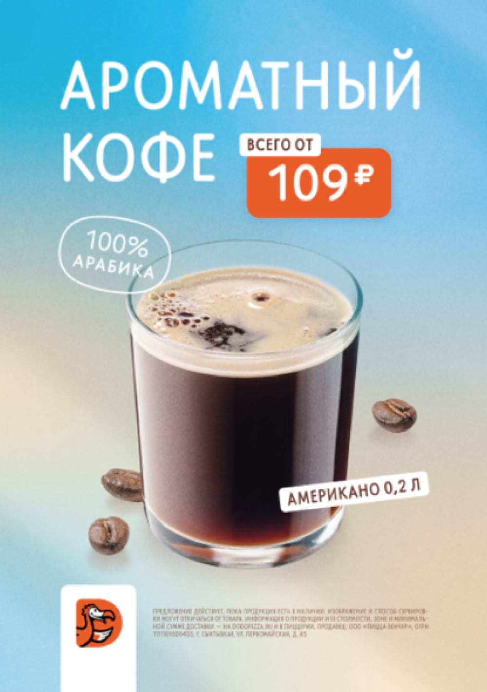
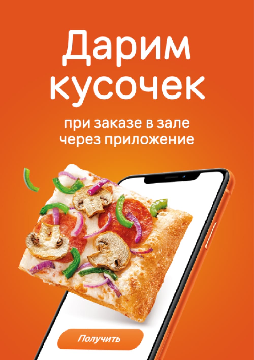
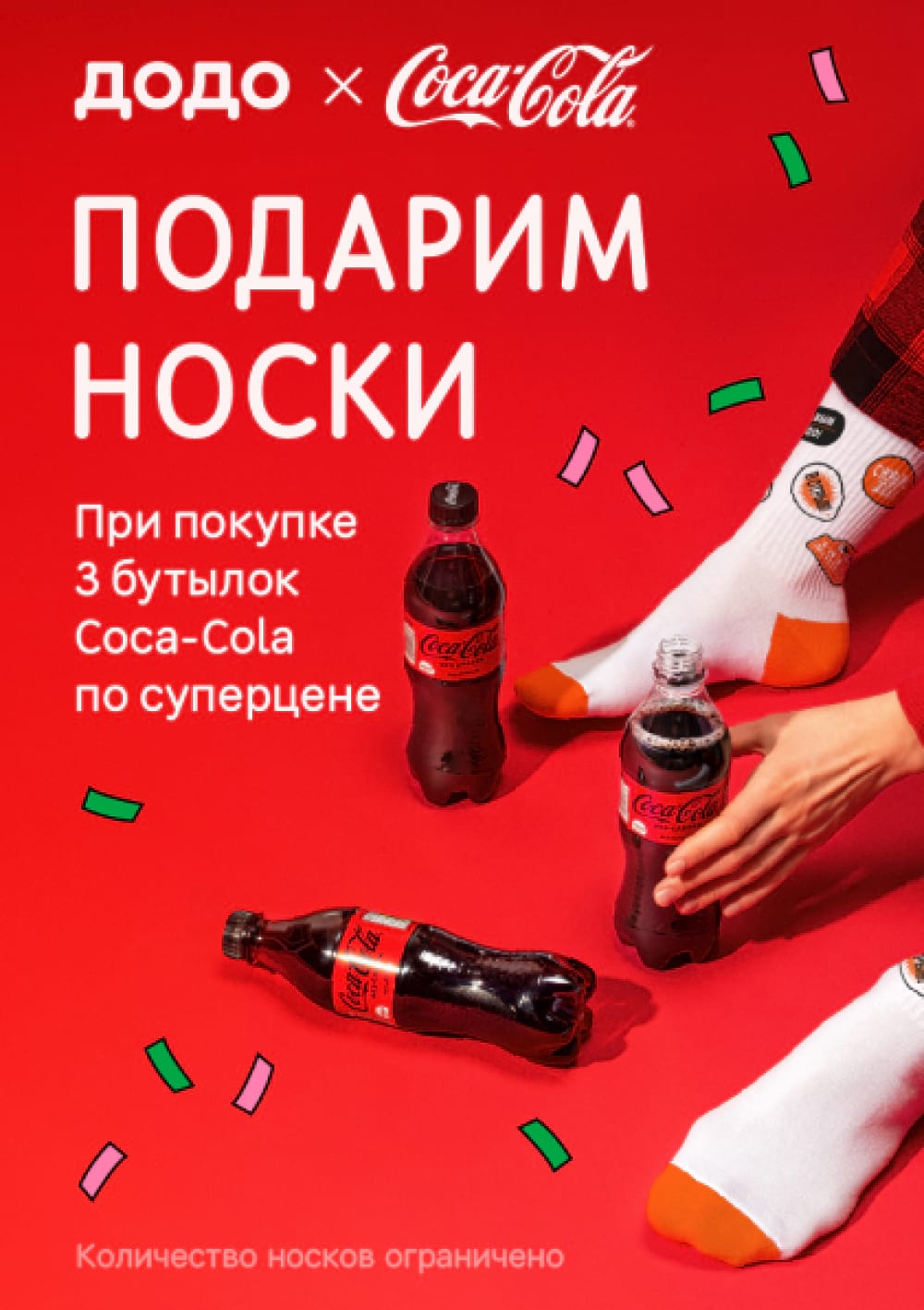
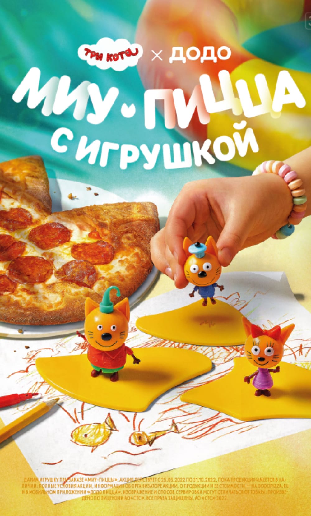
Bonus for fulfilling a condition
On these layouts, we say, “We give or offer a product at a very favorable price under so-and-so conditions”. Here are the key elements we use in layouts about the condition bonus.
A heading with the bonus. For example, “A pizza slice for free”, “Large pizza for 1₽”.
Product Photo. Display the product, but do not drive attention away from the bonus.
Bonus condition. “When you accumulate 800 dodocoins in the app”, “If you order in the hall through the app”, “If you buy 3 Coca-Cola bottles at a great price”.
Clarifying information. We can see additional conditions of the promotion, its dates, and a promo code. Make sure that the clarifying information does not lead away from the bonus and the wording of the conditions of the offer.
All layouts emphasize the heading with the bonus, show the product, specify the terms of the promotion
Yes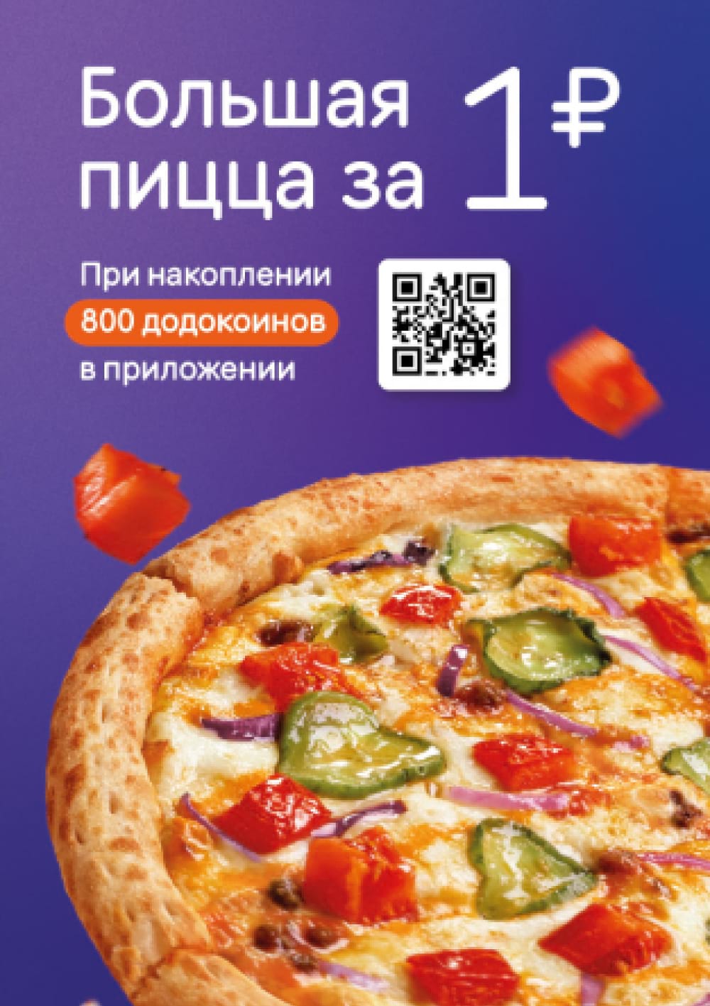
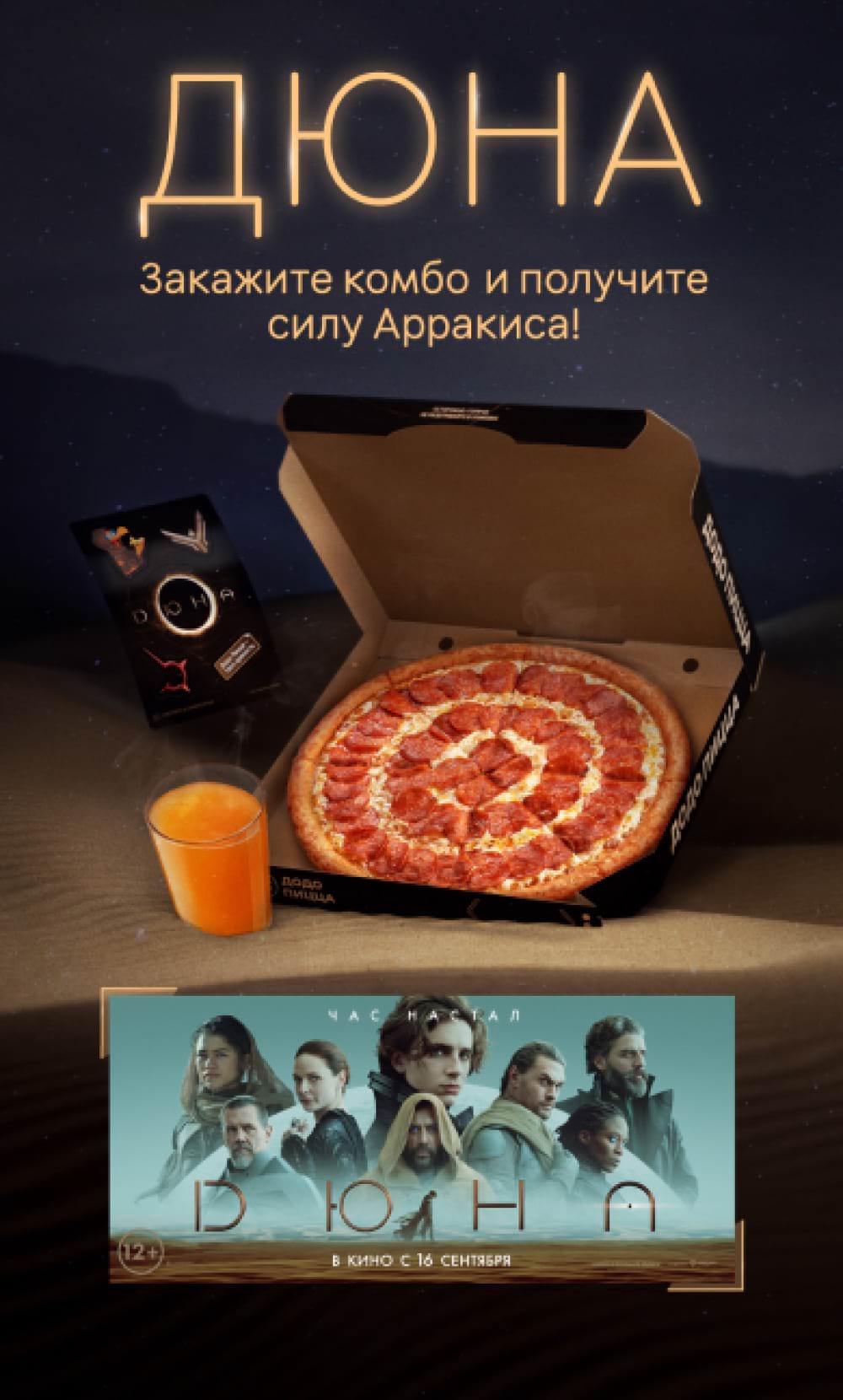
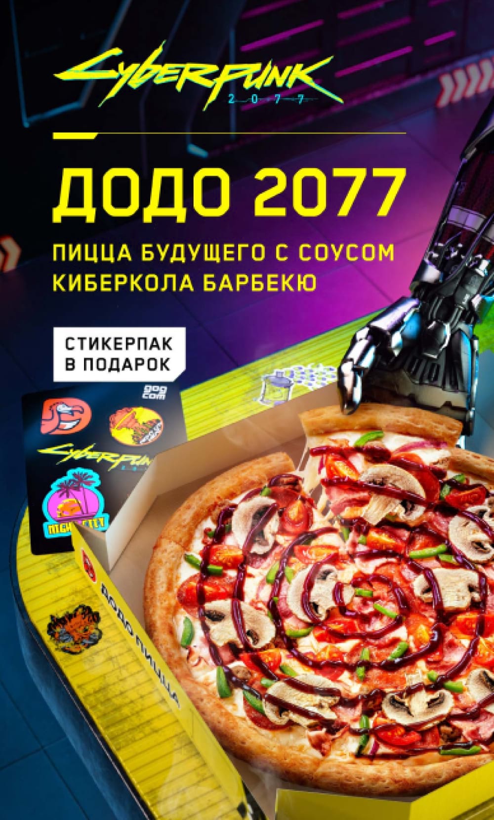
Projects for a narrow target audience
If we make layouts for a narrow target audience (sports fans, movie buffs, children, gamers), we emphasize elements that highlight the relation to the game, movie or event. Here are the key elements of layouts for a narrow target audience.
Vibes, setting, co-branding. We convey the theme through visual elements of the event, game, movie. For the sake of creating the proper vibes we can drop our brand fonts, orange color and “dodo-ish” illustrations.
Product photo. Display the product, but do not distract attention from the main theme. The product photo can be small.
Logo. Always add the Dodo Pizza logo to maintain recognition.
Promo terms and conditions. Describe the terms of the offer clearly and specify call to action. We don't overload the layout with information: we tell the main thing, and disclose additional details in other communication channels.
Common mistakes: overloaded layout, Dodo Pizza brand is equal in size to the project theme (the layout reflects the Dodo brand, not the project itself).
Examples of layouts for a narrow target audience. All layouts are designed in the style of the project; Dodo Pizza brand does not grab attention to itself
Yes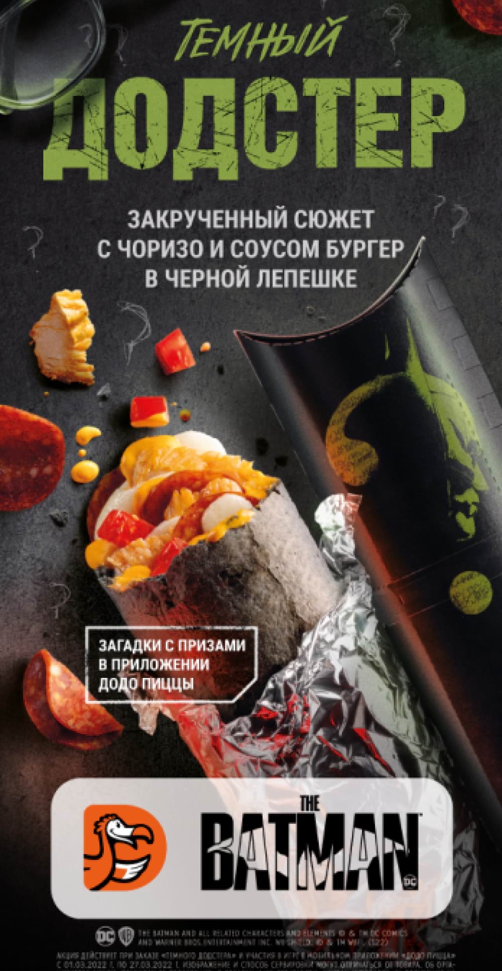
Complex mechanics
On these layouts, we offer to participate in a giveaway or receive a guaranteed gift for taking a particular action. As a rule, these are promotions with a long period of validity.
In such cases, the content of the layout is often dictated by the communication channel, and the promotion itself may have a unique name that doesn't capture the essence of the mechanic, so it needs to be specified. Here are the key elements of layouts for complex mechanics.
Benefit. Emphasize the opportunity to win a prize or the benefit.
Information about prizes. If there are prizes, always show or tell about them.
A way of getting benefit. Formulate a short thesis that describes the essence of the promotion. If there is too much information to learn about the promo, we give a link to other channels where we disclose the details of the promotion.
Do not overload the layout with details. The main goal is to capture attention and lead people to another channel.
Promo terms and conditions. We may specify the terms of the promotion or additional terms of the promotion.
Common mistakes: overloaded layout, overly complex mechanics, complicated and unappealing terms (small benefit).
No
The message is not clear, the benefit is small, and the conditions are too complicated for the customer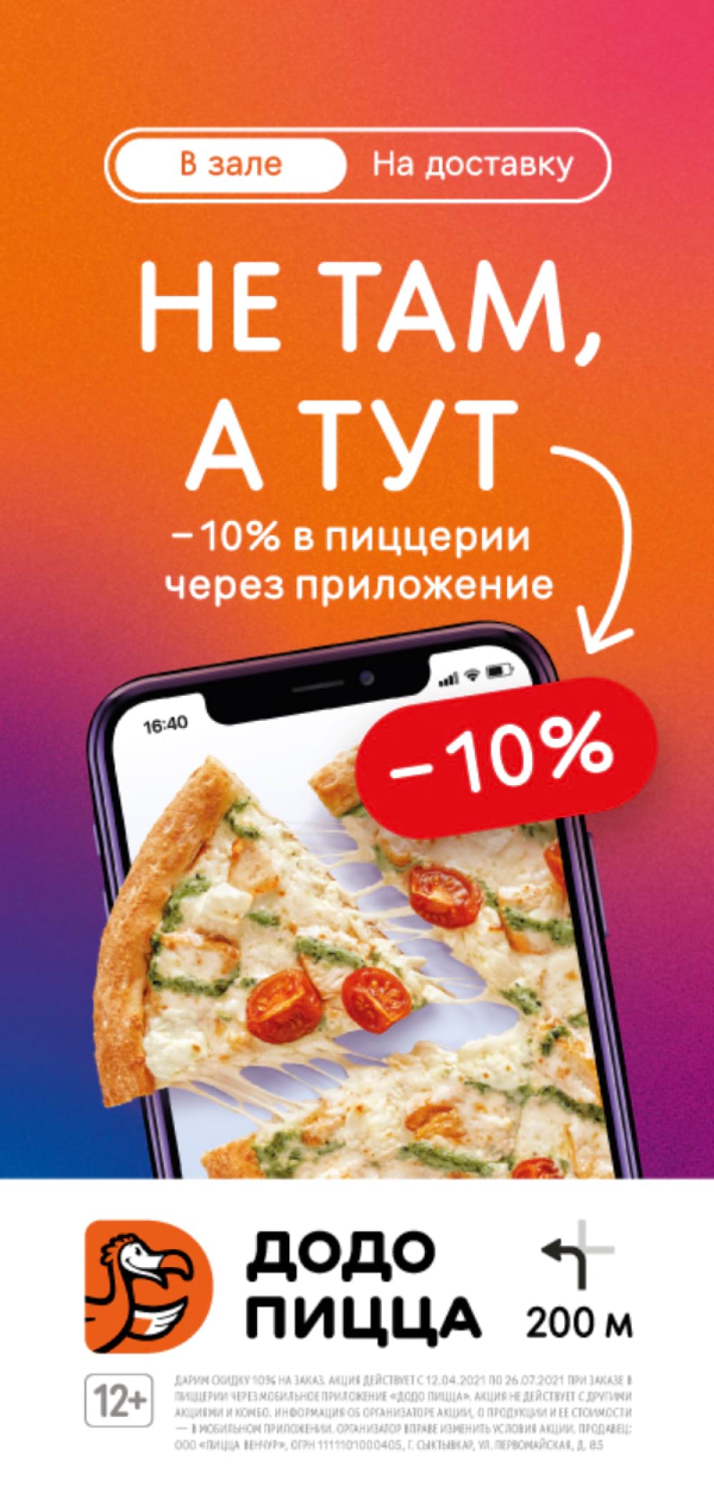
Yes
The opportunity to receive a gift is highlighted, and the users are instructed to get details through the QR code
Brand layouts
In these layouts we inform the customers about the changes, while conveying the brand values and image. The challenge is to communicate why our changes are so compelling and important to them. Here are the key elements of brand layouts.
Information about changes. Briefly report what happened. Formulate things “in the customer's world”, and do not overload the layout with details. When developing layouts, we check theses from the point of view of relevance for customers.
Brand identity. We use corporate colors, fonts, and illustrations.
No
Overly creative heading. Focus is on creativity rather than what is important to the customer
Yes
The thesis is formulated “in the customer’s world” and there is information about the opening and a profitable cashback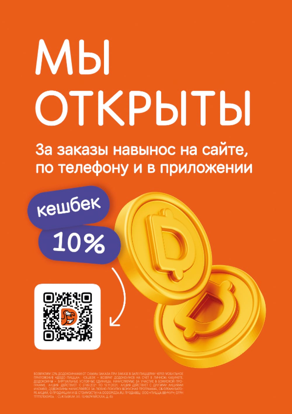
Read next: