Redesigning a local layout
Let’s redesign a local layout made for Yerevan. The layout features a seasonal offer: pineapple rolls and tea. There is a heading, price tags, all the products are displayed and everything seems to be in the right place. But the products on the layout are not assembled in a composition that looks complete, and the essence of the offer is not really obvious. The elements are arranged rather chaotically; it is difficult to seize the main thing.
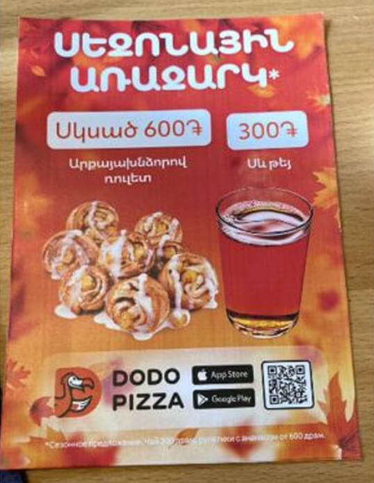
Here's what you can do to make the layout work.
Take a ready-made leaflet template. You can download it right here. The template has markup, a bottom plate with the logo, and legal information. The markup will help us not to lose the margins in the process.
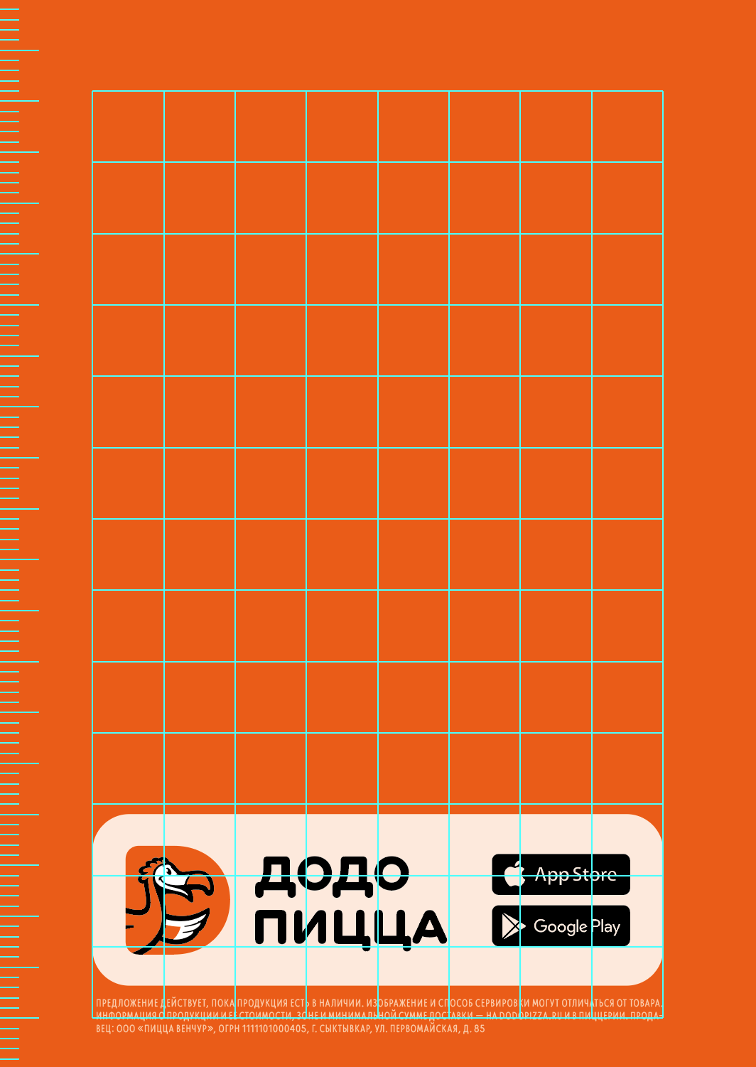
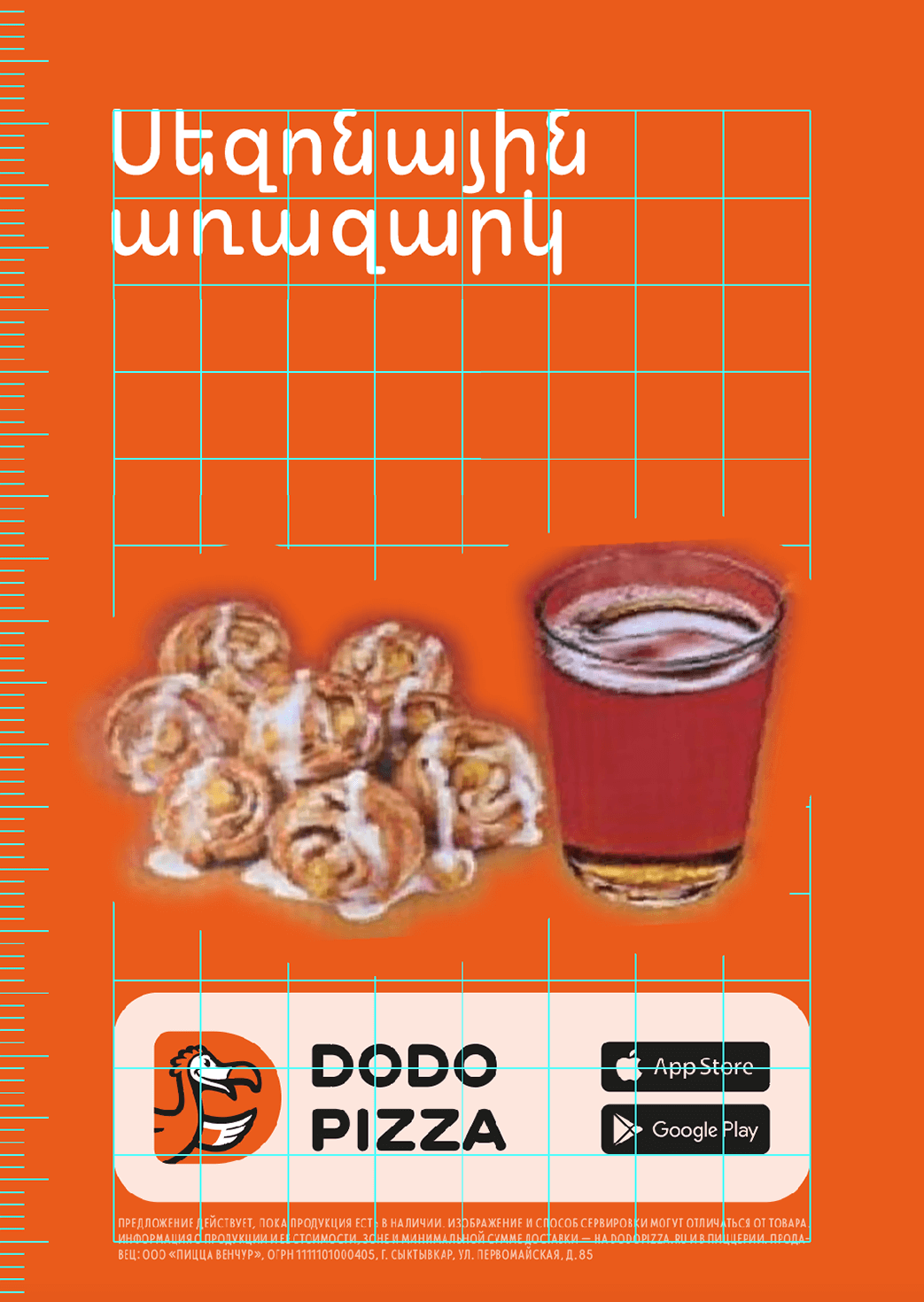
Start the work with the heading. We will make the simplest rectangular composition with left-edge alignment in this layout, so we are going to put the heading according to the markup in the upper left corner, with the text also aligned to the left.
The text should not go beyond the borders marked on the template. An asterisk footnote near the heading is not needed. All necessary details are simply written in the legal information at the bottom of the layout.
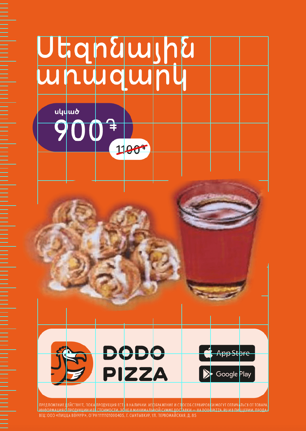
Let's deal with price tags. The task of the promotional layout is to communicate the benefit. Now, looking at the leaflet, it is impossible to understand what exactly it is. The benefit of the combo set is the price, which is located lower than the products total price. Let's sum up the prices on the leaflet — that's the full price of the set. We can make up the "before" price and put the final price tag. Now the promotional offer becomes more obvious.
The price tag plate is a “pill”, a rectangle with fully rounded corners. We keep this “rectangularity” of the layout, and align the price tag on the left edge.
Change the product photo. Right now, the foam on the top of the glass makes the tea look more like beer. And the rolls are stuck in a not very appetizing pile. Let's take other photos where the tea looks like tea and the rolls are in a box.
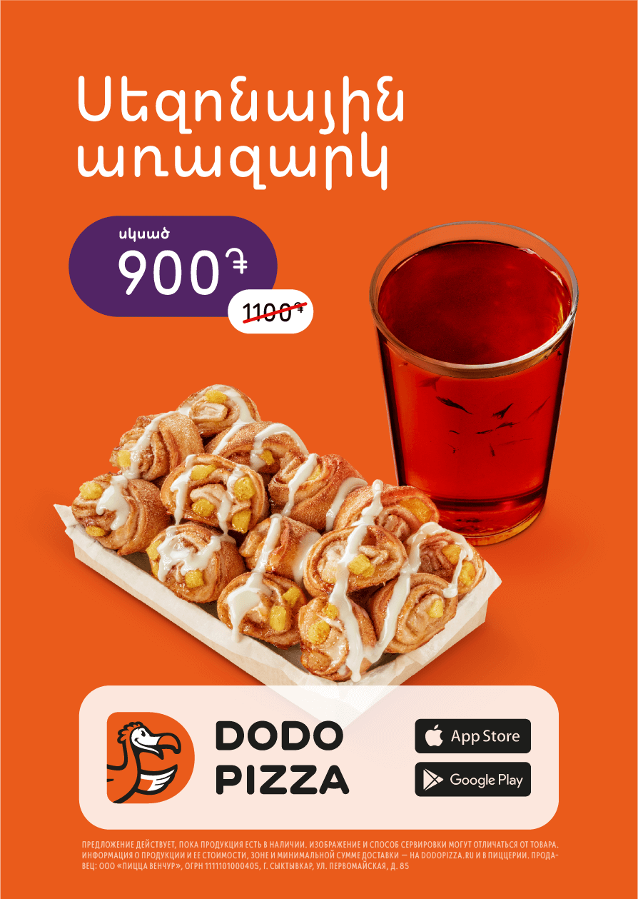
Add captions to the products. This can be done on a separate plate next to the product itself, but in our case the word "pineapple/արքայախնձորով" is too long, so it is better to place the name after the title, as a subline. The subline should have an unambiguous point of attraction, not hang equidistantly between the title and the price tag. Therefore, it is closer to the heading than to the price, but it does not intrude into the heading's interline spacing.
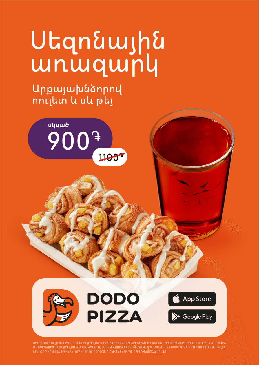
Replace the background. The composition already looks good, now let's change the background to a more dessert-ish one. The background with leaves is not in the Dodo style, besides, products are more visible on a light pink background than on an orange one. We talk about how to pick up the background colour in the guide about colour combinations. We change the text colour and price tag as well as the background.
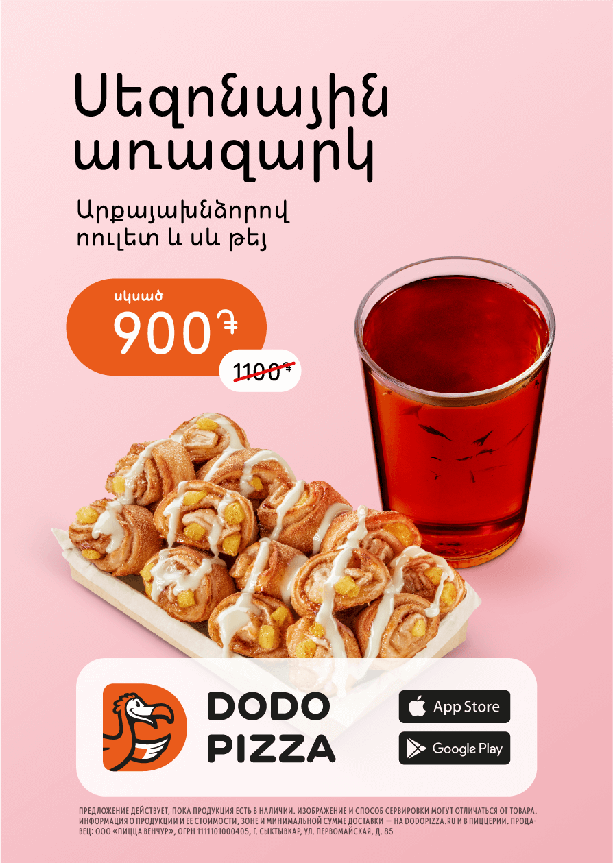
Do final balancing of the composition. When we changed the background colour, it became noticeable that the leaflet footer is heavier than the top and the composition is not balanced. Let's fix this by adding boldness to the headline and price.
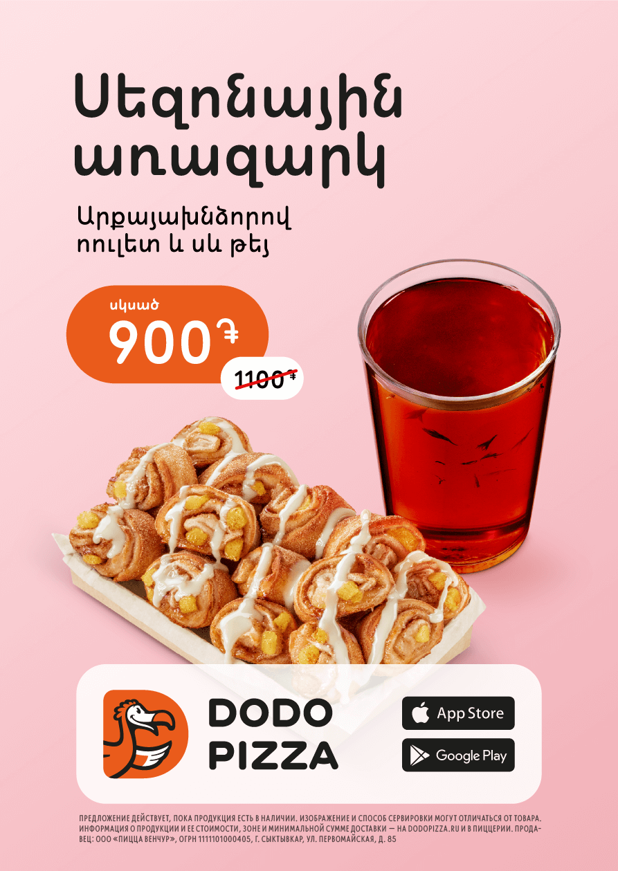
Insert the legal information. Instead of the one in Russian, which was in the template, we put the current one for this layout. To formulate the legal information correctly and take into account local legislation, you should consult a lawyer.
Before — after
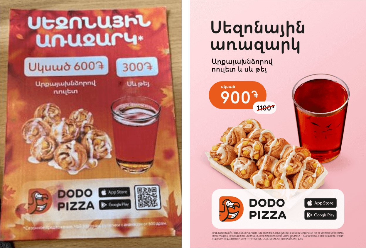
We now have a simple and clear layout. The essence of the message is read effortlessly, the products do not merge with the background, the layout is simple but neat.
Read next:
