
Dodo combo: a guide on style
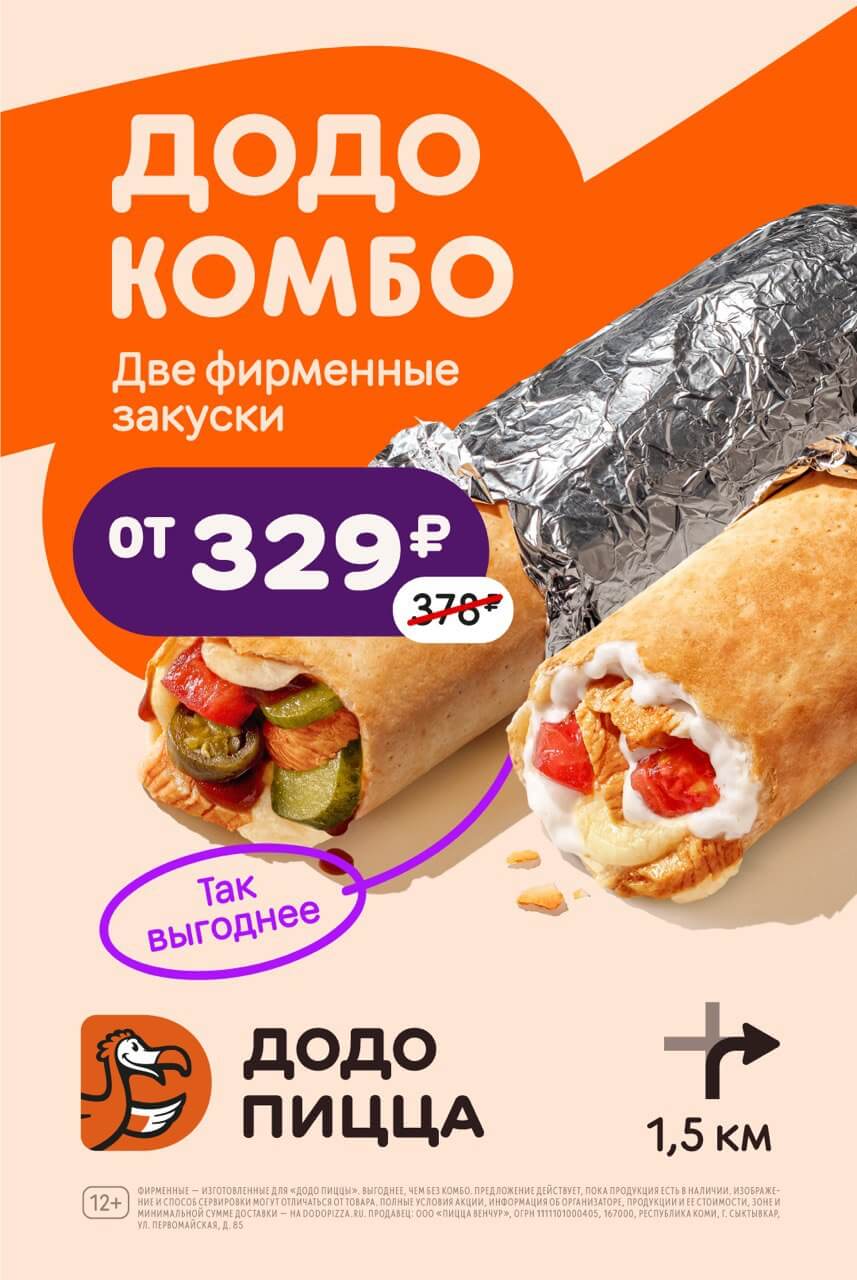
When developing Dodo-combo layouts, we adhere to a unified visual style. We always showcase the product and the offer itself intensely, emphasizing the benefit with the help of coloured plates and other additional elements.
Logo
There are two versions of the logo for combos: one-line or two-line. Which one to go for depends on the task. If we want to emphasize a particular combo, we make its name larger, and use the logo as a secondary element: we place the one-line version with a smaller font size.
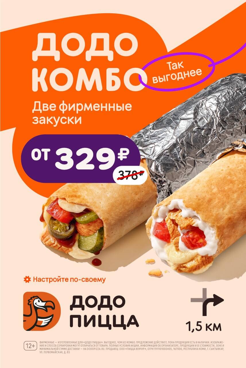
If the layout promotes combo as a category in the menu and emphasizes the logo, we choose a two-line version.


Colours
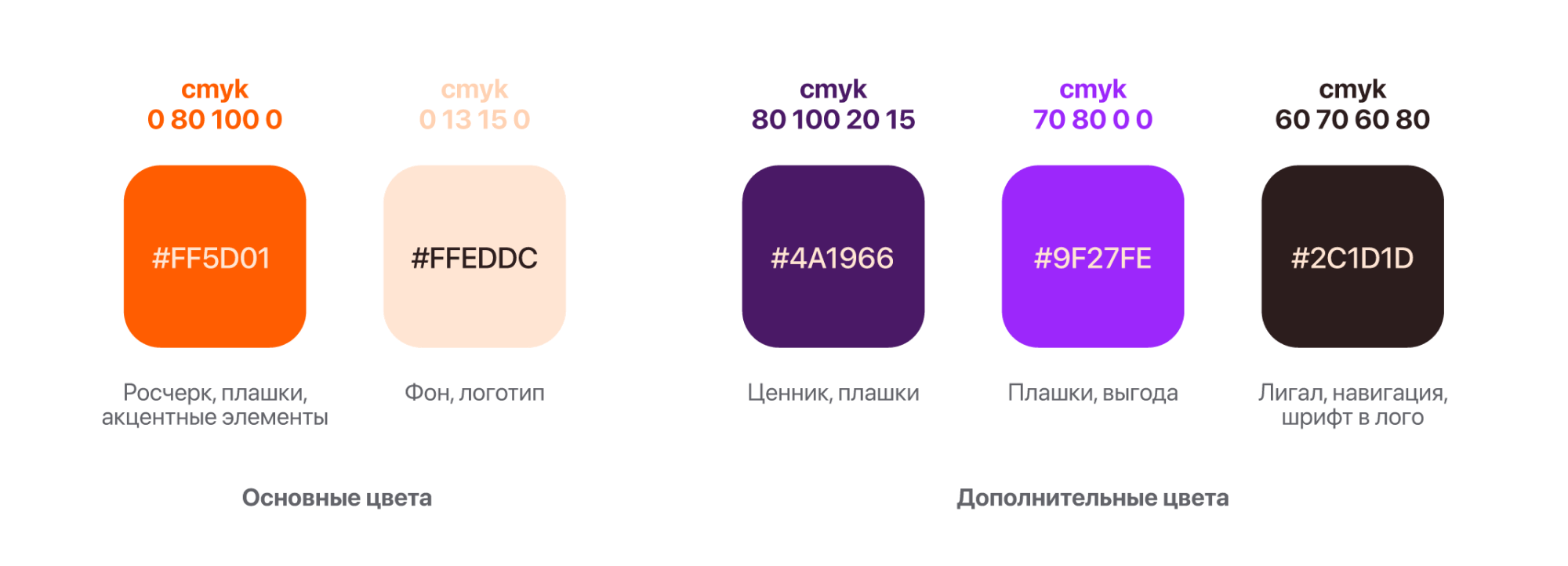
For the background, stroke and logo we take our main colours; for price tags, plates and legal information additional colours are possible.
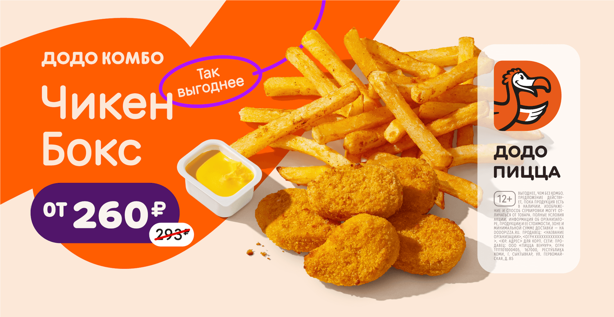
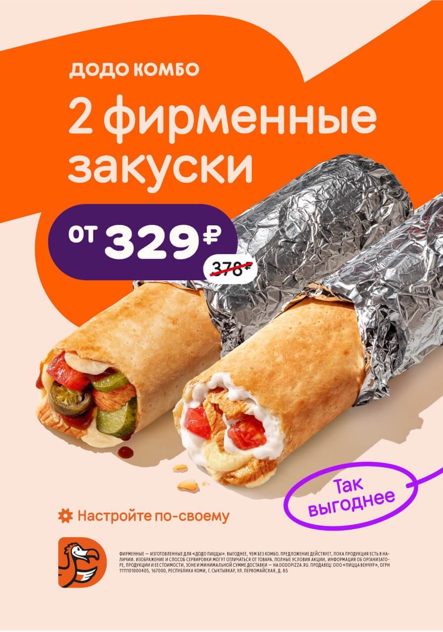
As a rule, we make the stroke and logo orange #ff5d01, leave the background light #ffeddc. Dark purple #4a1966 highlights price tags, and bright purple #9f27fe emphasizes the benefits, if we do not specify the exact price.
We use dark #2c1d1d for the legal information, navigation and the logo font.
Graphics
We use three graphic elements on the layout with combos: stroke, loop and “Create your Dodo-combo” plate.
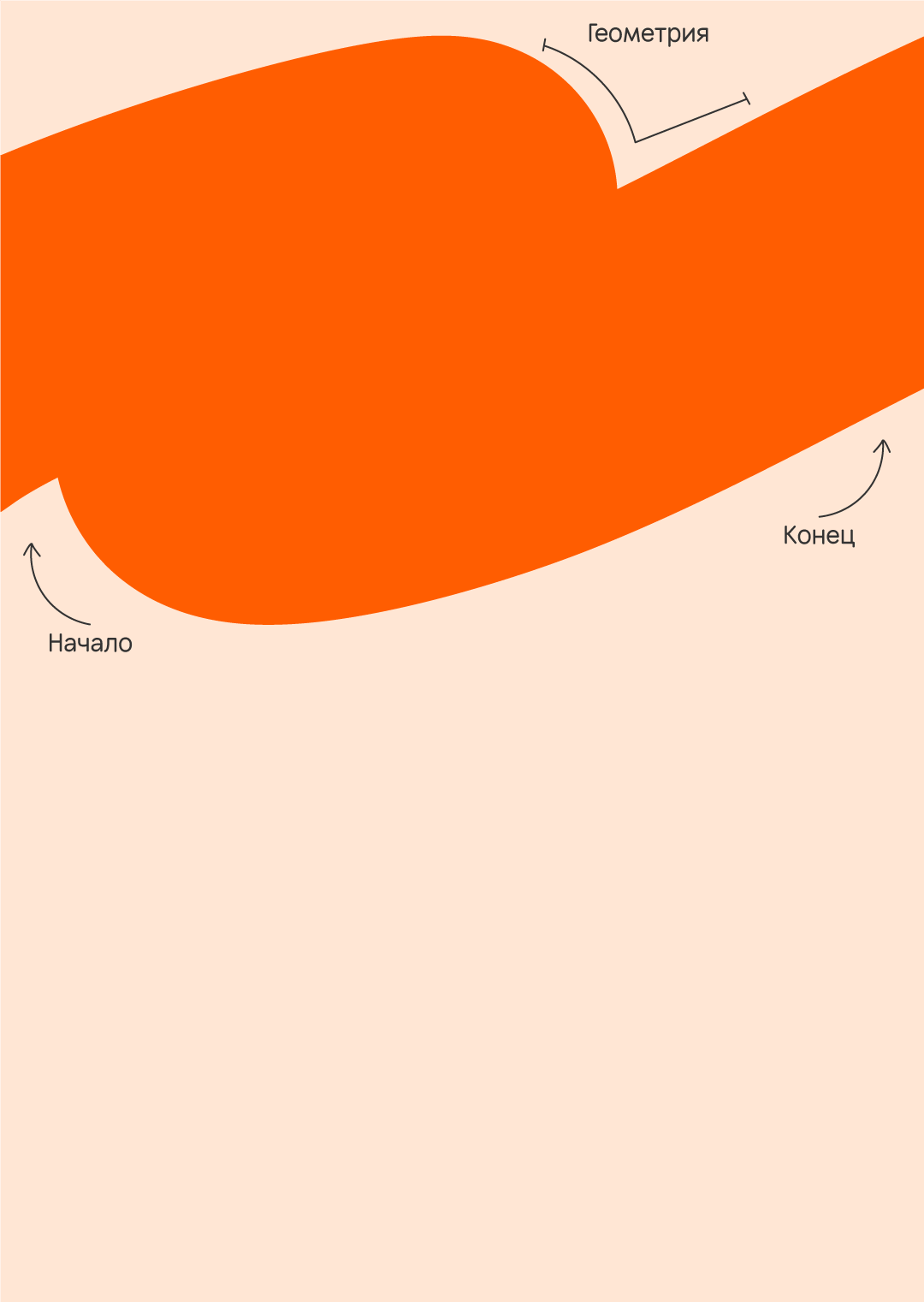
Stroke
The stroke is one of the main elements on combos layouts. It works as a background that outlines the logo area and text. We don't draw the stroke from scratch, but use an asset that we adjust to a specific layout.
The line can be flexible and change its direction, but we keep the scheme of its geometry. The stroke can remain expressive, but it should not create a sense of chaos and look like a stain.
We aim at finding the optimal thickness for the stroke: make it stand out enough to attract attention, but not so bold that it takes away the focus on itself.
Yes
No

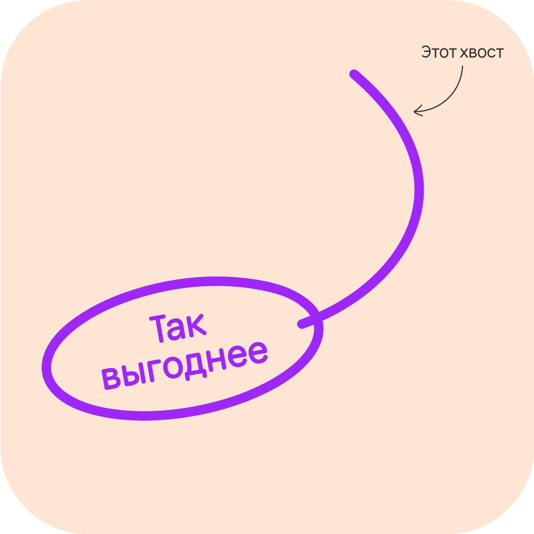
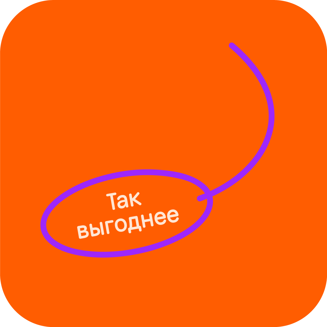
Text loop
The loop is most often used together with the logo to emphasize the benefits of the offer. If the loop is placed separately from the logo, it should not be tied to a specific product, because its role is to emphasize the benefits of the combo as a whole. Do not place the loop below the price so as to avoid visual noise.
Make the tail of the loop smooth, avoid any creases. The direction of the loop is adapted to the location and format of the media.
The loop colour is #9f27fe, the text can be #ffeddc on an orange background or #9f27fe on a light background.
Yes

No
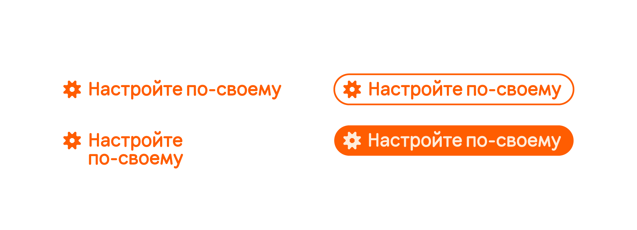
Customizing combos
We use the “Create your Dodo-combo” plate in the layout when we want to emphasize the ability to adjust the composition of the combo to the customer's liking.
Price tag
To highlight our value offer, we use two types of plates: a plate with a specific price or a plate with information about benefits.
Price
On each layout, place a purple plate with the current price and a crossed out old price for comparison. Mind the spacing between the signs.

Benefit
If a specific price is not possible, use the “Benefit” plate or indicate a discount percentage.
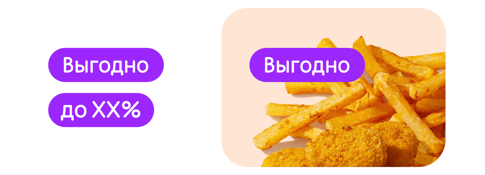
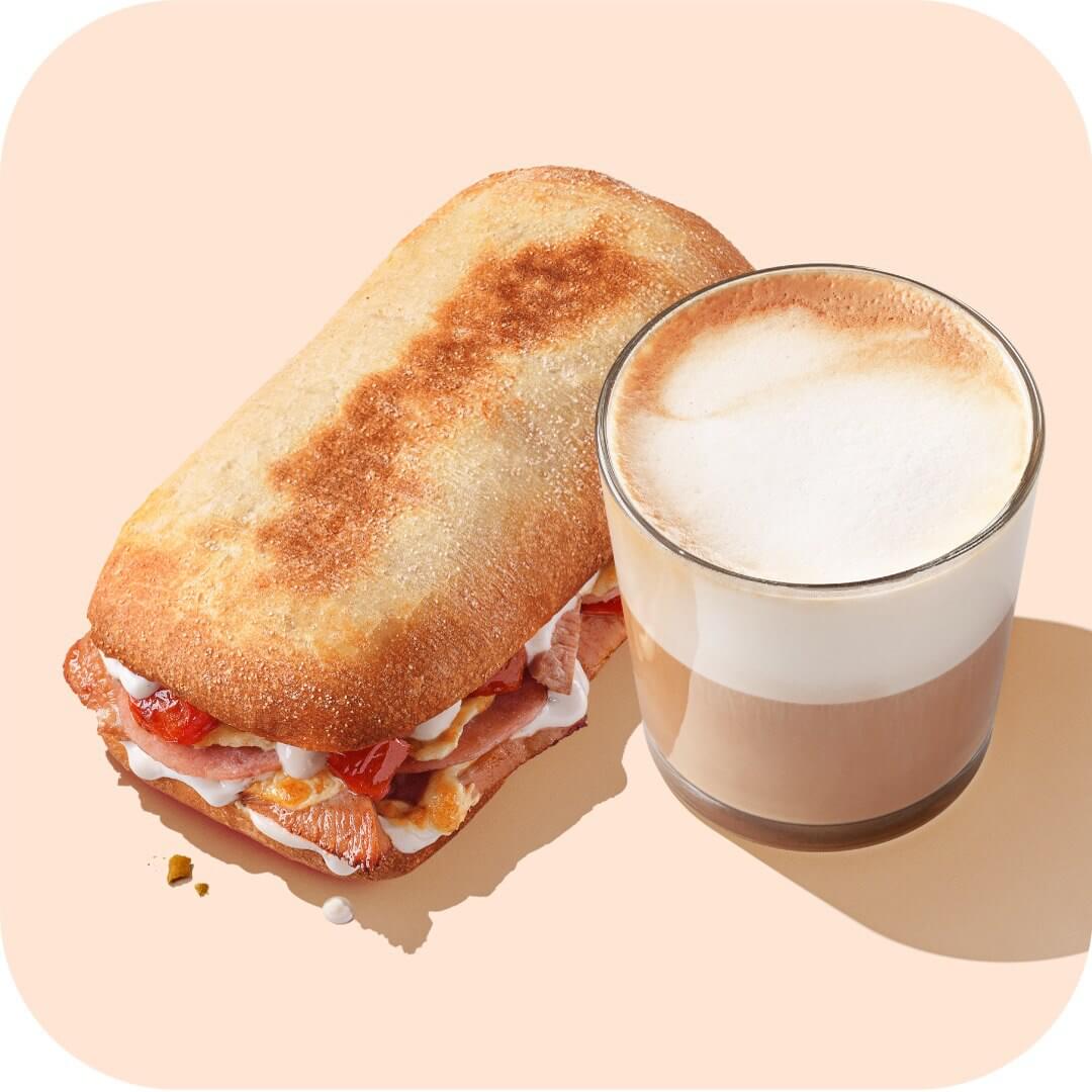
Photo style
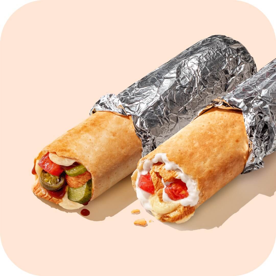
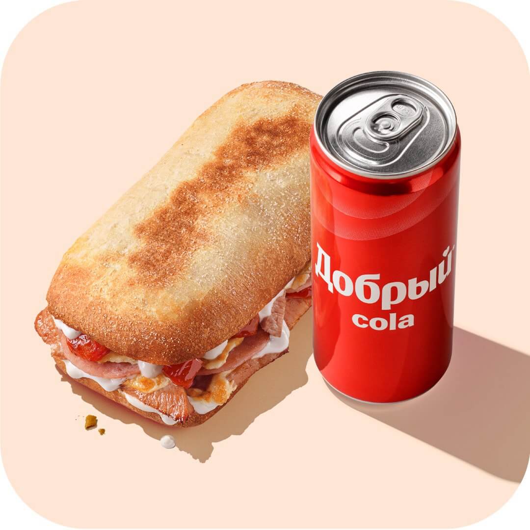
For photography we use bright sunlight, which creates long and contrasting, but not too dark shadows. We stick to the corporate style, aligning the result with already existing layouts.
We place the products close to each other to visually convey the idea of the combo. Show the food as naturally as possible: leave crumbs and sauce drips on the layout, don't overdo it with post-processing.

Read next: