
Kids parties visual style
The Dodo's children visual concept is shaped by photos, graphics, corporate colors and typography. Here we tell you how to work with these elements if you need to bring some changes to the ready-made layouts.
This guide only covers standard digital layouts and trade marketing layouts.
Ready-made layouts in two languages
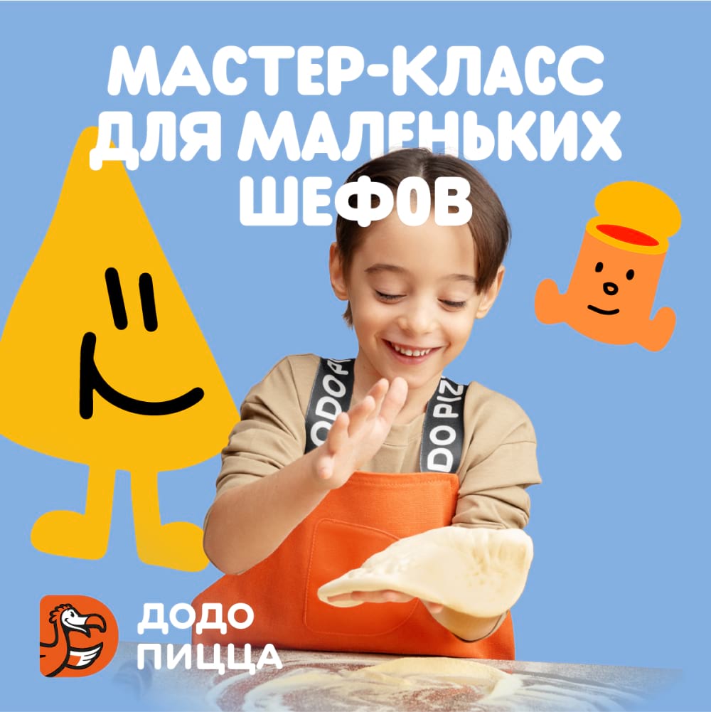
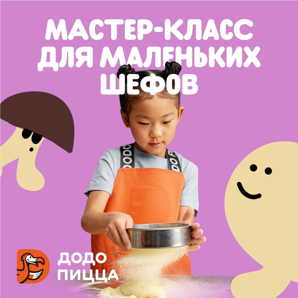
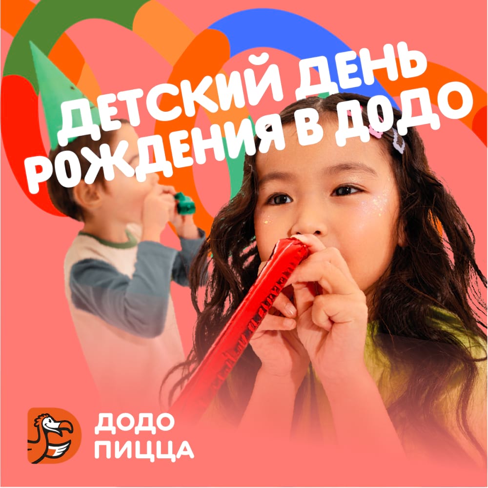
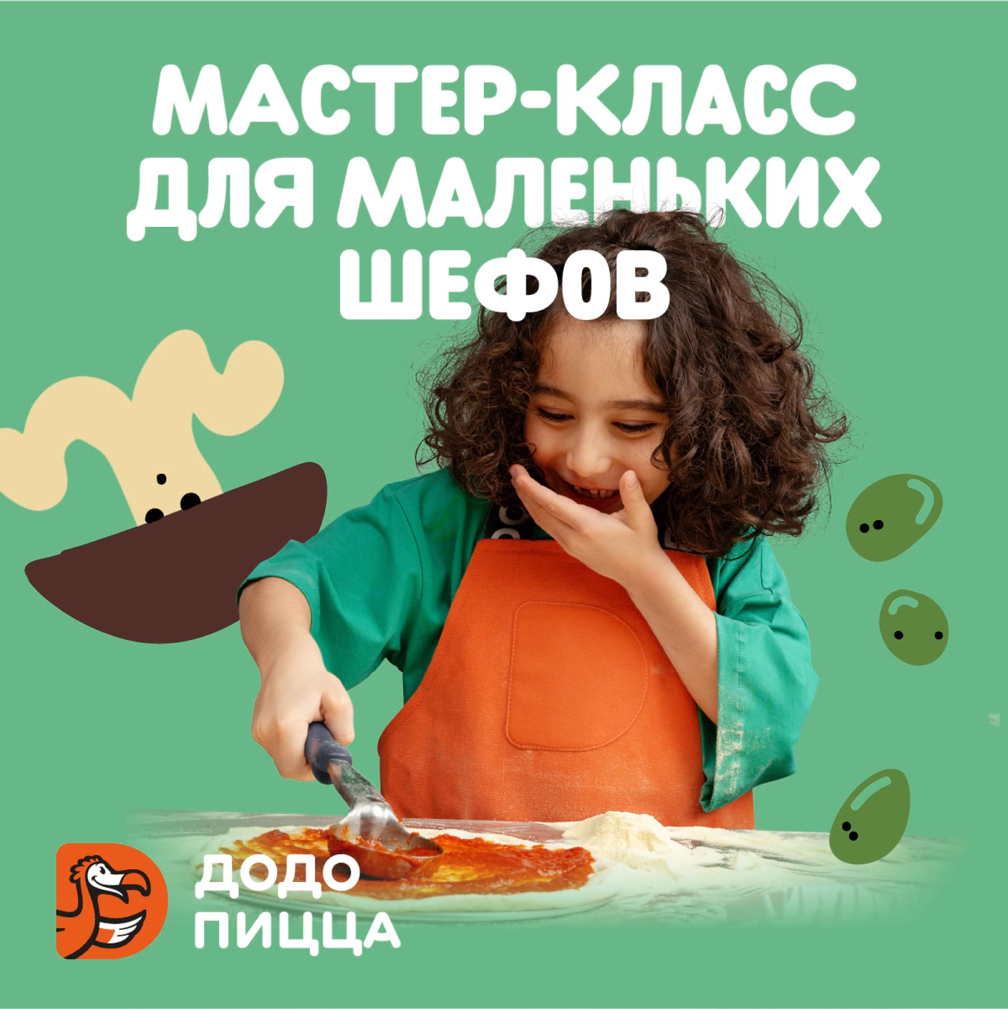
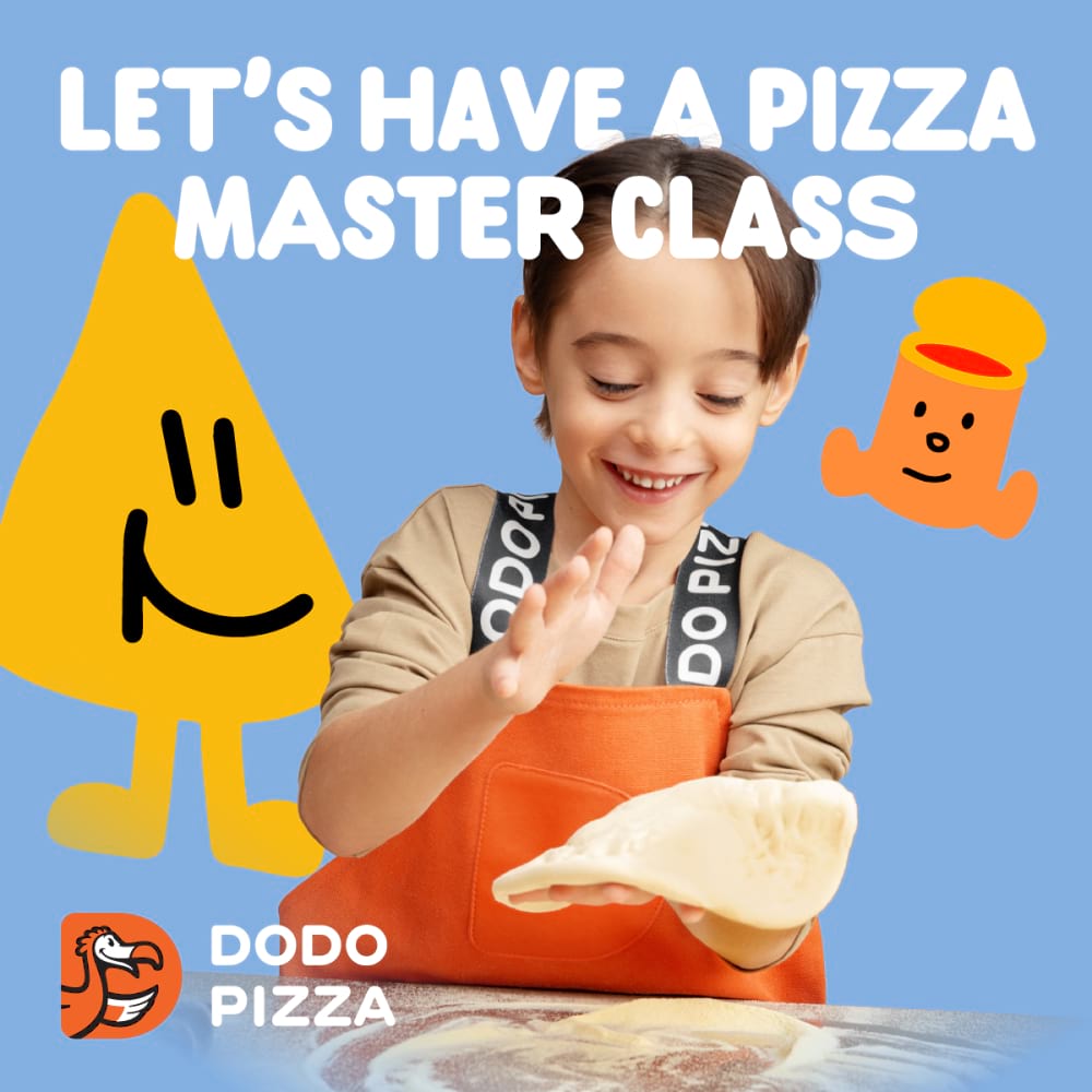
We have four standard layouts about children's workshops, where the slogans are the same, but the visuals differ. Choose a layout with models whose facial features are widely represented in your region. We recommend using the same layout in different formats for better recognition. The layout for children's birthday parties is the same for all.
Before using the layouts, make sure that the logo is currently in use in your country. At the moment in Russian layouts the logo is in Russian, in English layouts we use its English version.
Here are links to ready layouts in Russian and English in the most popular formats.
Photo
We recommend using only photos from our photo bank. They are relevant to our style and their use is agreed with the copyright holders. These particular photos are selected by the management company team for their style and philosophy: the children in them are not looking at the camera, not posing naively; they are genuine and just doing something interesting. The emotions on their faces are vivid. The light is natural.
Keep in mind the demographics of the regions with the target audience of the layouts.
When resizing layouts we do not modify photos: we do not merge several photos into one, we do not crop the person’s head with the edge of the format.
Graphics
In layouts with children's workshops we use stickers, small drawn elements. Stickers include three groups: characters, emotions and objects.
Characters. They are animated ingredients and tools of the pizza making process, each one with their own character. The cool Pizza Slice, the dreamy Pepperoni, the melancholy Tomato Sauce, the exploring Mushroom, the quiet Dough, the curious Cook, and a few naughty Olives.
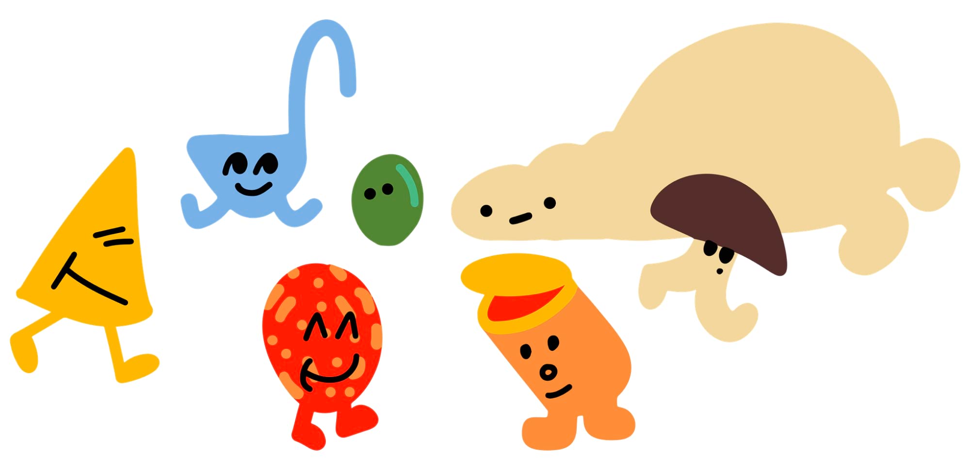
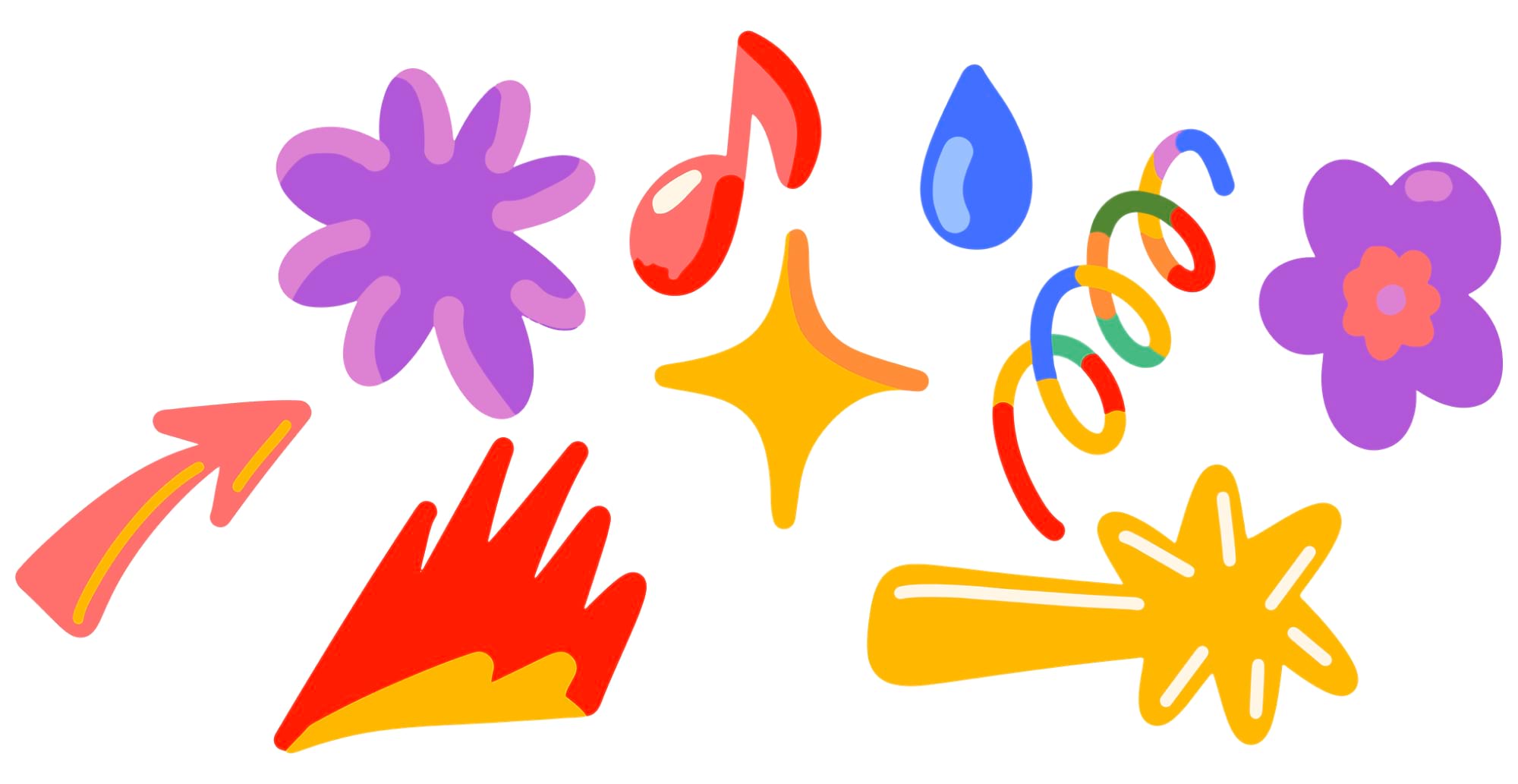
Emotions. These are abstract symbols and holiday attributes such as garlands and fireworks. They add dynamics and mood to the layout. They are used in holiday layouts or in combination with other stickers to convey the emotions of the characters.
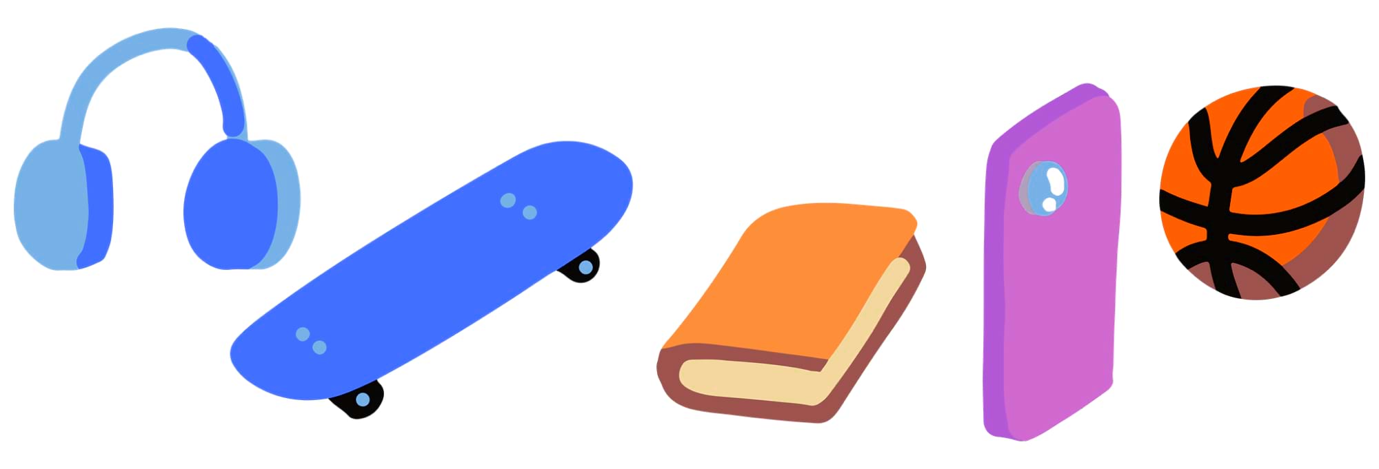
Objects. These are objects that represent children's hobbies. A ball, skateboard and any other object that can represent the target audience’s interests.
All three groups of stickers can be combined with each other and display different ideas on the layout.
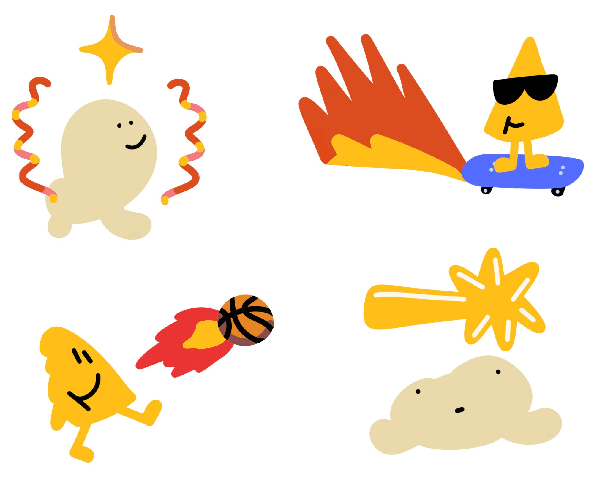
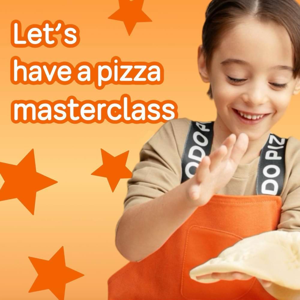
Stickers interact with the photo and add depth to the layout: sometimes they stay in the background, partially overlapping with the figures of children; or they are placed on top of the image. We do not use any other graphics in our layouts. There shouldn’t be too many stickers in the layout; 2-3 stickers is usually enough. We see a group of olives as one character.
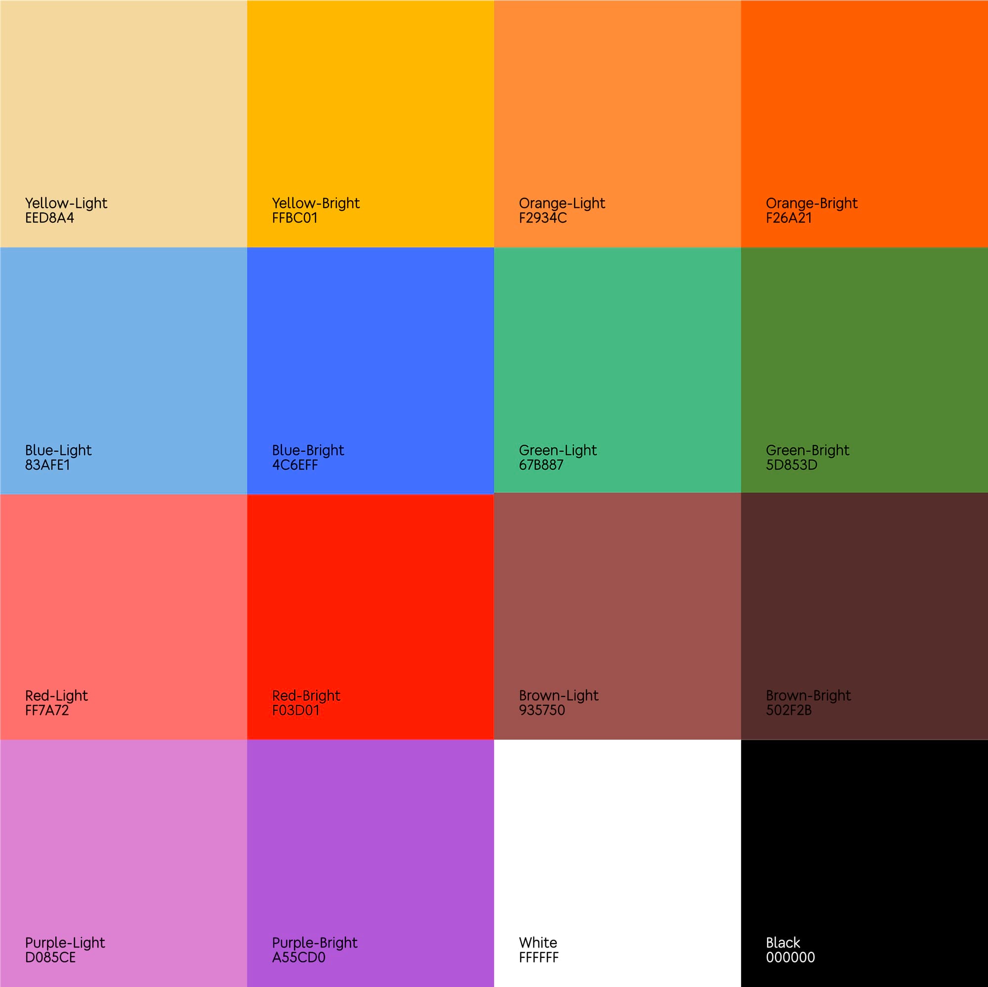
Colors
Backgrounds on layouts are solid fill, without gradients.
For promotional layouts we choose bright and light colors from the corporate palette:
- Purple-light (#D085CE),
- Red-light (#FF7A72),
- Blue-light (#83AFE1),
- Green-light (#67B887),
- Brown-light (#935750),
- Yellow-brigt (#FFBC01),
- Yellow-light (#EED8A4).
The other colors are more common in navigation and product layouts:
- Purple-brigt (#A55CD0),
- Red-bright (#F03D01),
- Blue-bright (#4C6EFF),
- Green-brigh (#5D853D),
- Black (#000000),
- Brown-bright (#502F2B),
- Orange-bright (#F26A21),
- Orange-light (#F2934C).
We do not use colors that do not belong to the company palette.
Typography
We use only two fonts in the layouts. For headings and age restriction text it’s Dodo Rounded Black Variable in Semi Condensed. For the main text it’s Dodo Rounded in Regular.
Text elements of the layout have their own features.
Heading. Located at the top of the layout, and is typed in capital letters with center alignment. We use the font Dodo Rounded Black Variable in Semi Condensed for it. The heading has no more than 3 lines. The color is white.
The heading, as well as the stickers, interacts with the photo. The bottom lines in the foreground go over the photo, the top lines overlap slightly with the children's heads.
Age restriction. It is typed in capital letters; the color is white with 54% transparency. We also use the Dodo Rounded Black Variable font in Semi Condensed.
Check with your lawyers whether there is the need to display any age restrictions in your country.
Main text. It is typed in Dodo Rounded font in lowercase letters with the first capital letter. It is left-aligned, and the color is white.
Dodo
Not Dodo
QR-code
The layout can have a QR-code that leads to the form for signing up for the workshop, if it’s necessary. There should be a caption under the code that says where it leads to: it can be a website or a social network page. Replace the QR-code in the layout with one that is relevant to your location.
If your pizzeria doesn't have an electronic entry form, simply remove the QR-code from the layout.