

Cropping layouts for cashier displays
In pizzerias we use two types of cashier displays: widescreen and square. We take into account the features of each type and crop the layouts so that important information is not cut off in rotation.
There are four functioning screen modes in which the layouts are displayed:
- Layout is fully visible.
- Layout occupies 2/3 of the screen.
- Layout is adjusted to the height of the screen, centered and cropped at the edges.
- Layout takes up half of the screen.
To make the main elements of the layout visible in either mode, we prepare layouts of two sizes, 1920 × 1080 px and 720 × 1080 px. We use the templates.
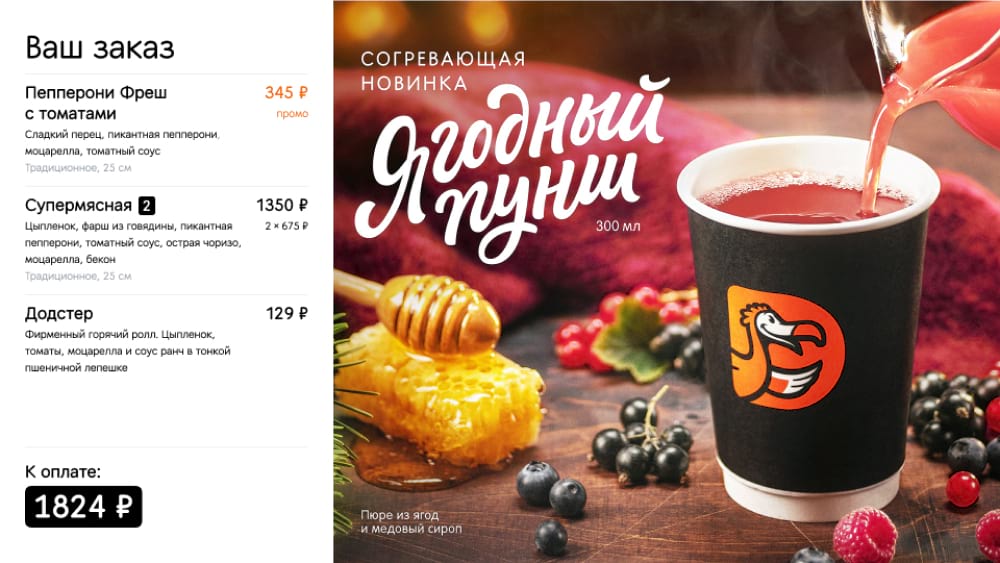
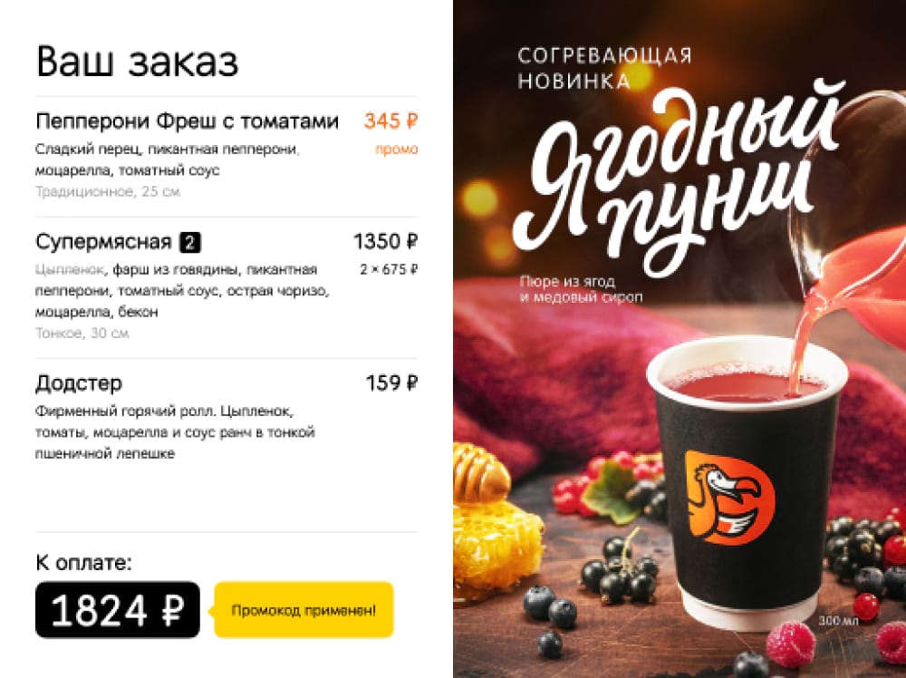
- 1920 × 1080 px layout. Required for modes 1, 2, 3. Visible when the monitor is in a standby mode. Layouts with new products and promotions rotate on the screen about every 6 seconds.
- 720 × 1080 px layout. Needed for mode 4. Visible when a guest is checking out. The layout takes up half of the screen, the other half displays the shopping cart.
When preparing layout for cashier displays, we take into account that on a 1920 × 1080 px layout the edges will be automatically cropped in some modes. We give an example of how it actually works.
Widescreen cashier display
On widescreen displays, a 1920 × 1080 px layout is used in two modes: it occupies the entire screen (1) or only 2/3 of the screen (2). In the second case, the layout is centered and cropped automatically, so the content width should fit in 1280 px.


Square cashier display
There are also two working modes for square displays: in the first case, the 1920 × 1080 px layout is adjusted to the height of the screen and then centered and cropped at the edges (3), so the content on the layout should fit within the 1440 px screen width. In the second case, the 720 × 1080 px layout takes up half of the screen (4).

Read next: