Editing and preparing layouts for printing
How to adapt a pizza box layout for the local market and prepare it for printing. Here are step-by-step instructions with illustrations.
Let's take a look at how texts and logos are developed in the language the designer needs, replacing QR code, and at how to add labeling and save the package layout for printing accurately.
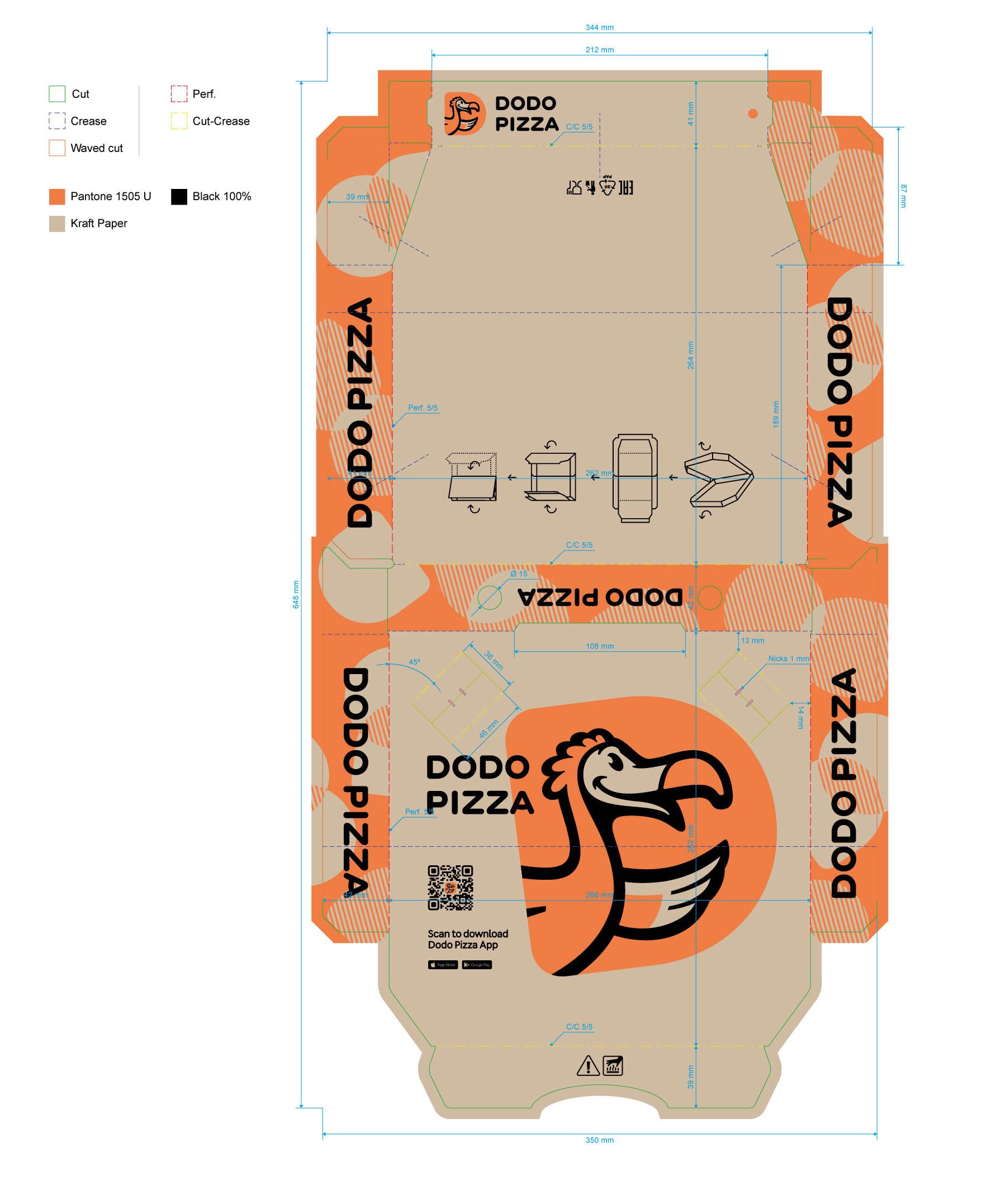
1. Detect the language
We provide layouts with the logo in English. If English is not widely spoken in your country, replace the logo and translate other text elements into your local language. If the English version works well for you, skip steps 4 and 5.
2. Figure out labeling and packaging requirements
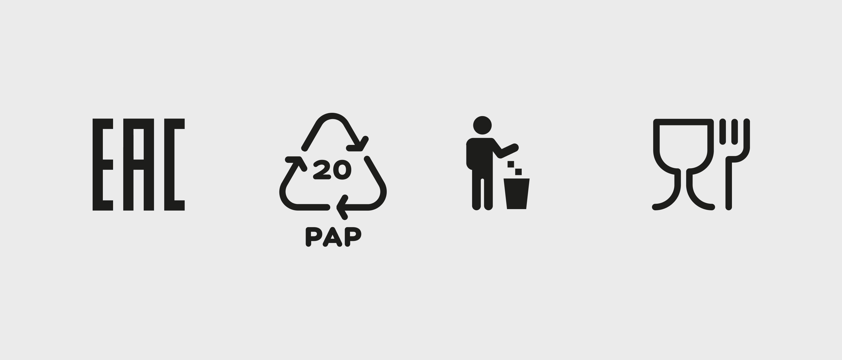
We normally place four icons that comply with European legal requirements on our pizza and snack packs. The requirements may vary from country to country. Therefore, before editing the layout, consult your legal or production team to figure out which mandatory elements must be placed on the packaging.
3. Open the Edit folder
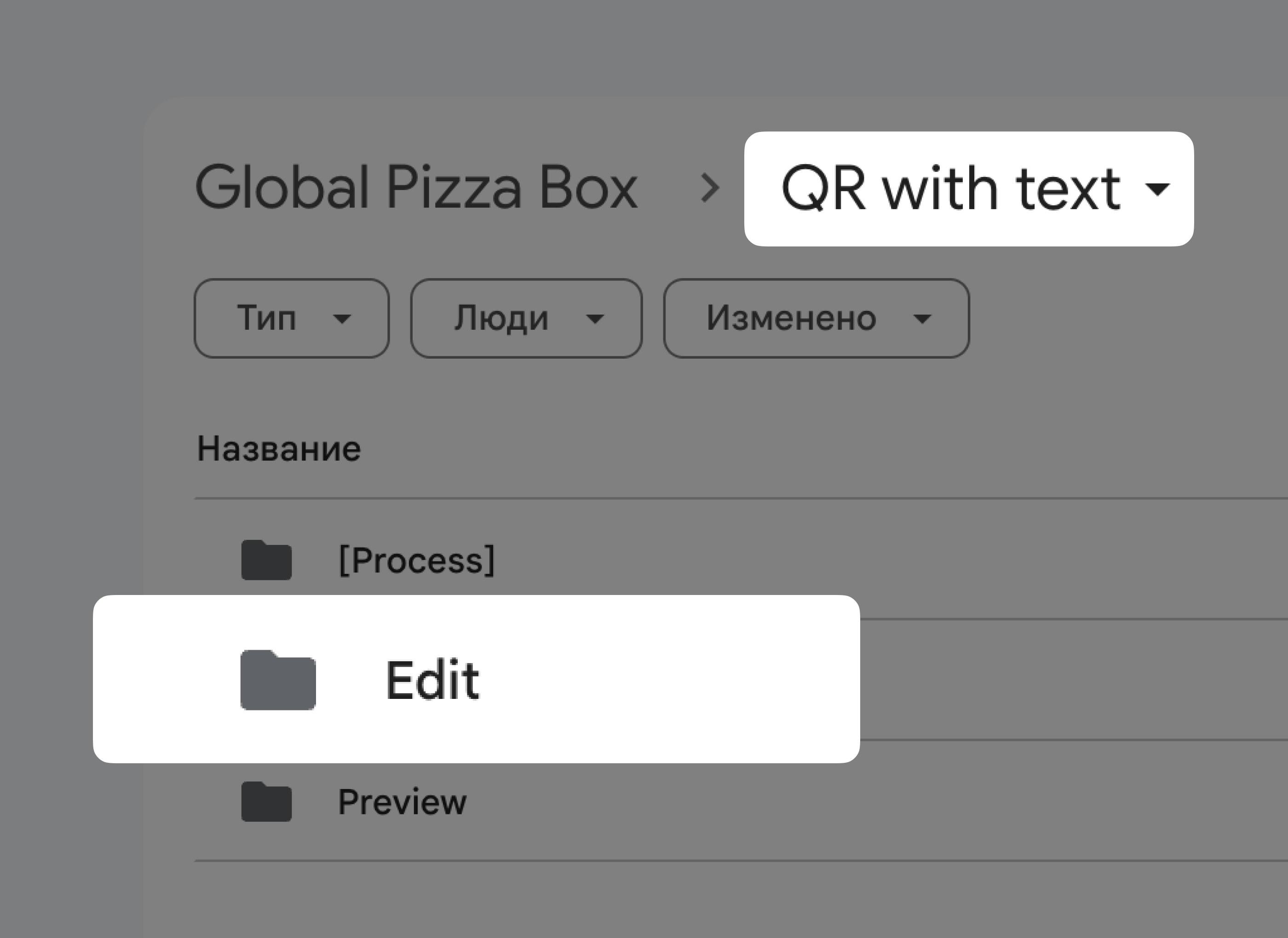
We use two types of layouts, "QR only" and "QR with text". Choose "QR with Text" if you want to adapt the layout to your local language or keep the English text. Open "QR only" if you are printing a single run of packaging for several countries at once.
After that, download the layout of the required size, 25, 30 or 35 cm, from the Edit folder. Open the file in Adobe Illustrator.
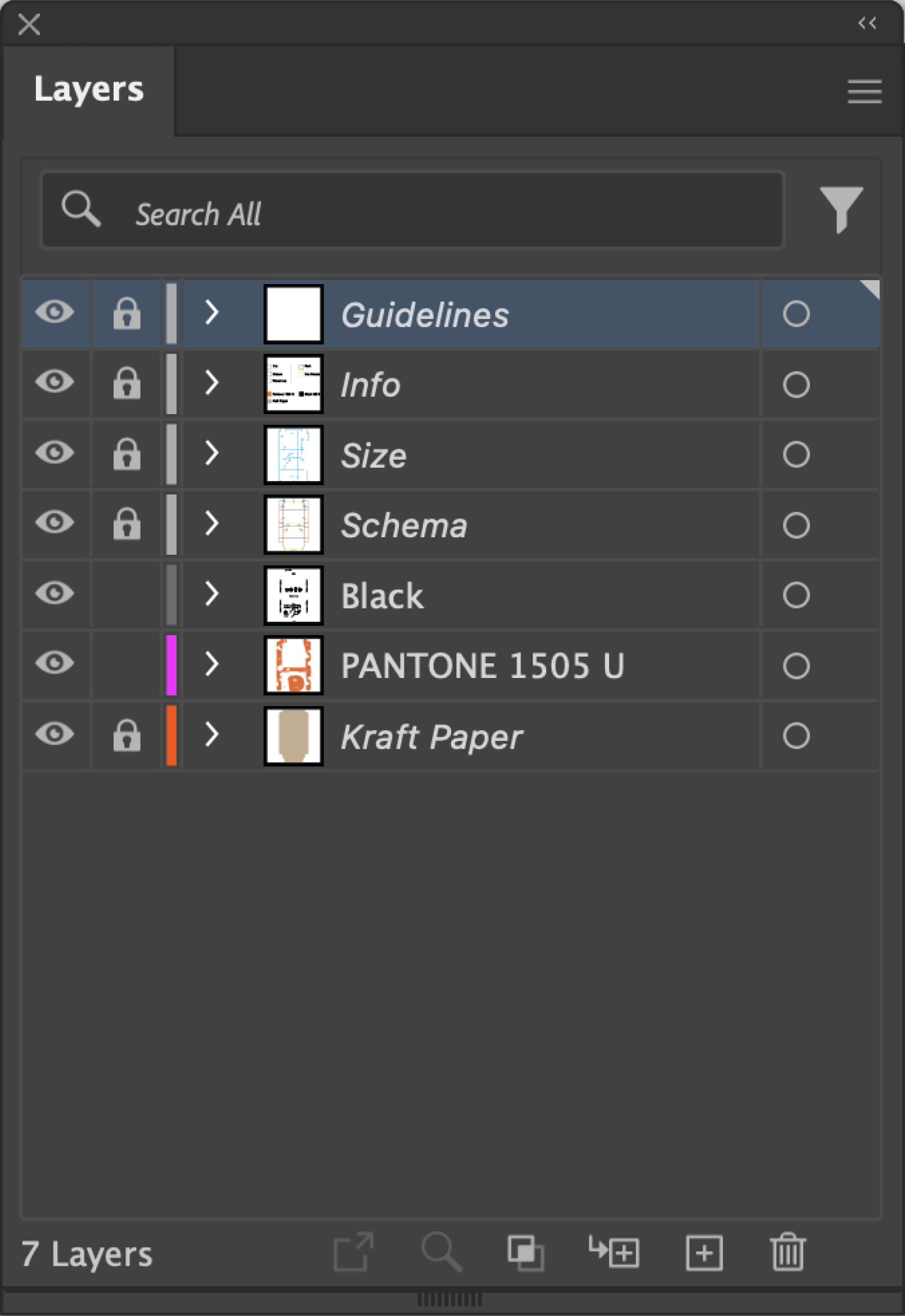
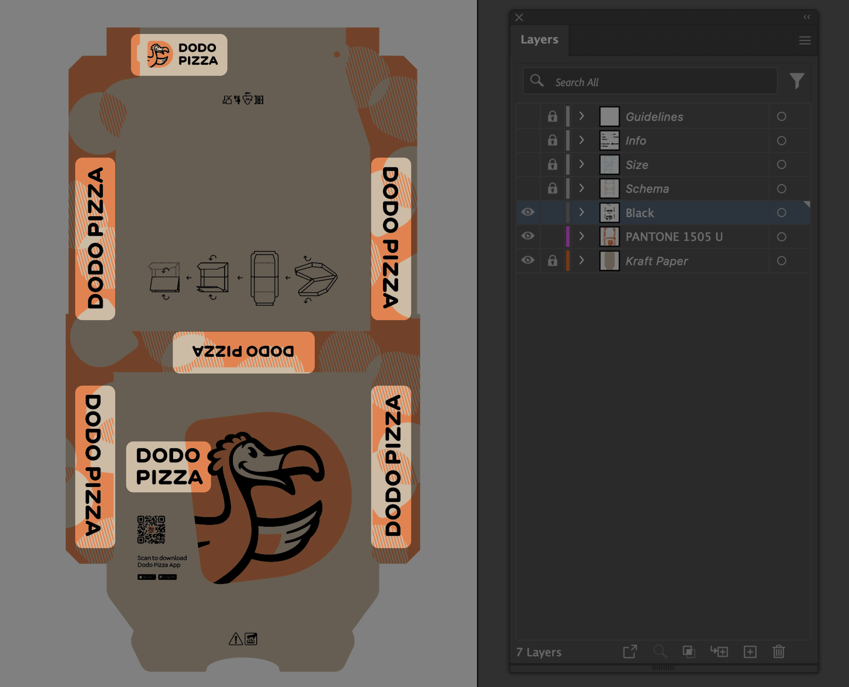
There are two types of layers in the layout, technical layers and layers with main elements.
Technical layers
All technical layers are marked with gray colour and are not for editing. While working with the layout, you can hide them by clicking on the ‘eye’ icon. These include:
- Info. Contains information about the colours of the package, as well as instructions on how the package should be processed and cut. The information layer helps the manufacturer understand what each colour and line type means in the scheme.
- Schema. This layer contains a diagram of the packaging drawn using different colours and line types. Each colour and line type has its own meaning with the interpretation of these meanings given in the previous information layer.
- Size. Shows what size each element in the Schema is.
- Guidelines. Auxiliary lines that help to accurately align and place the local logo instead of the Latin logo.
Layers with basic elements
There are only two main colours in this layout, with the addition of the colour of the cardboard used to make the packaging. There is a separate layer for each:
- Black. This layer contains all the elements of the layout, which are made in black: logos, the QR code, markings, outlines and the scheme of the box folding. This is the layer we will work with.
- PANTONE 1505 U. The layer contains all elements of the layout made in Dodo's brand colour, orange PANTONE 1505 U. There are no orange objects in this layout that need to be edited. We work with the Black layer only.
- Kraft Paper. This is the colour of corrugated cardboard. The layer is not printed, but necessary for previewing purposes only, helping us understand how the design will look on the media. The layer is blocked and highlighted with italic in this layout: this is how all layers not intended for printing are marked.
4. Replace the logo
Find the logo in the language you want in the Logotype folder. You will need Wordmark and the text part of the Two Line logo. There are 7 logos in the layout: 5 one-line logos and 2 two-line logos.
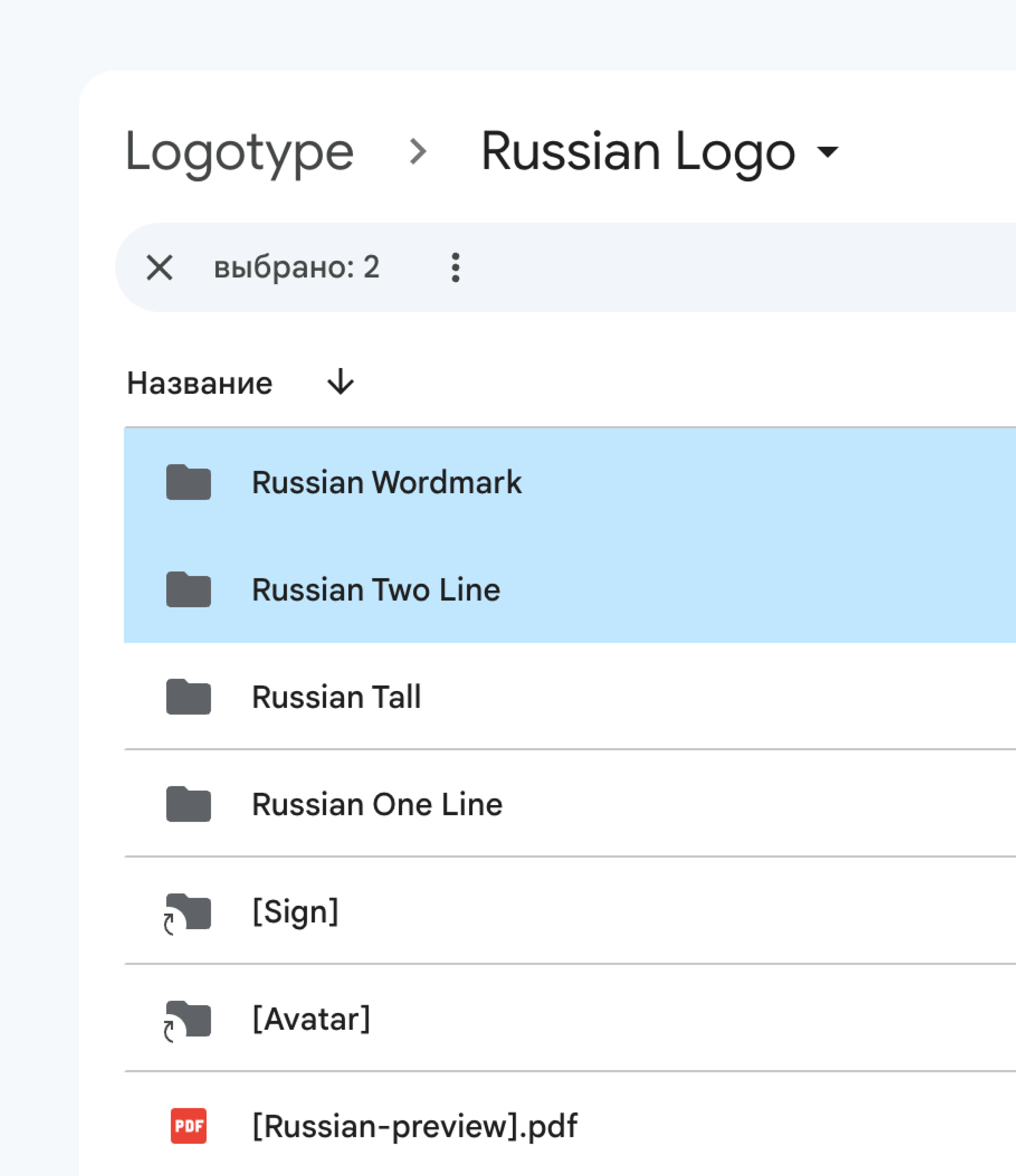
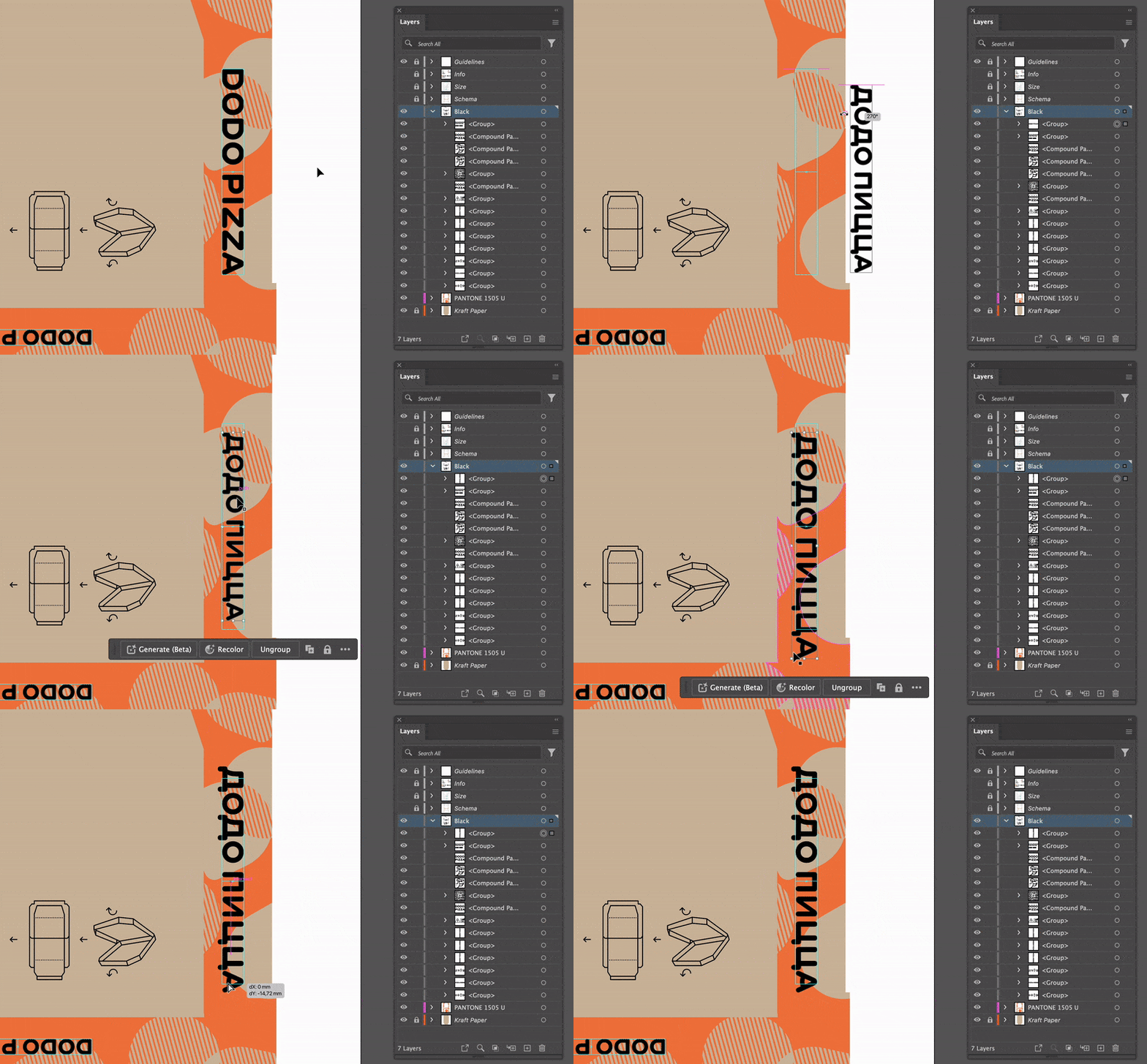
To replace the English language logo, copy the one in your language and bring it into the layout. Remove the old logo and paste the new one in its place. Align with the guides and the flat part of the letters, sticking to the font baseline.
The baseline is the imaginary horizontal line on which the letters "stand". Extraneous elements, such as the "tail" of Cyrillic letter “ц”, fall below the baseline and are not taken into account in the alignment.
If the two-line logo does not fit in the same frame or after the change there are unpleasant touches with other objects, you can make it smaller than in the original layout.
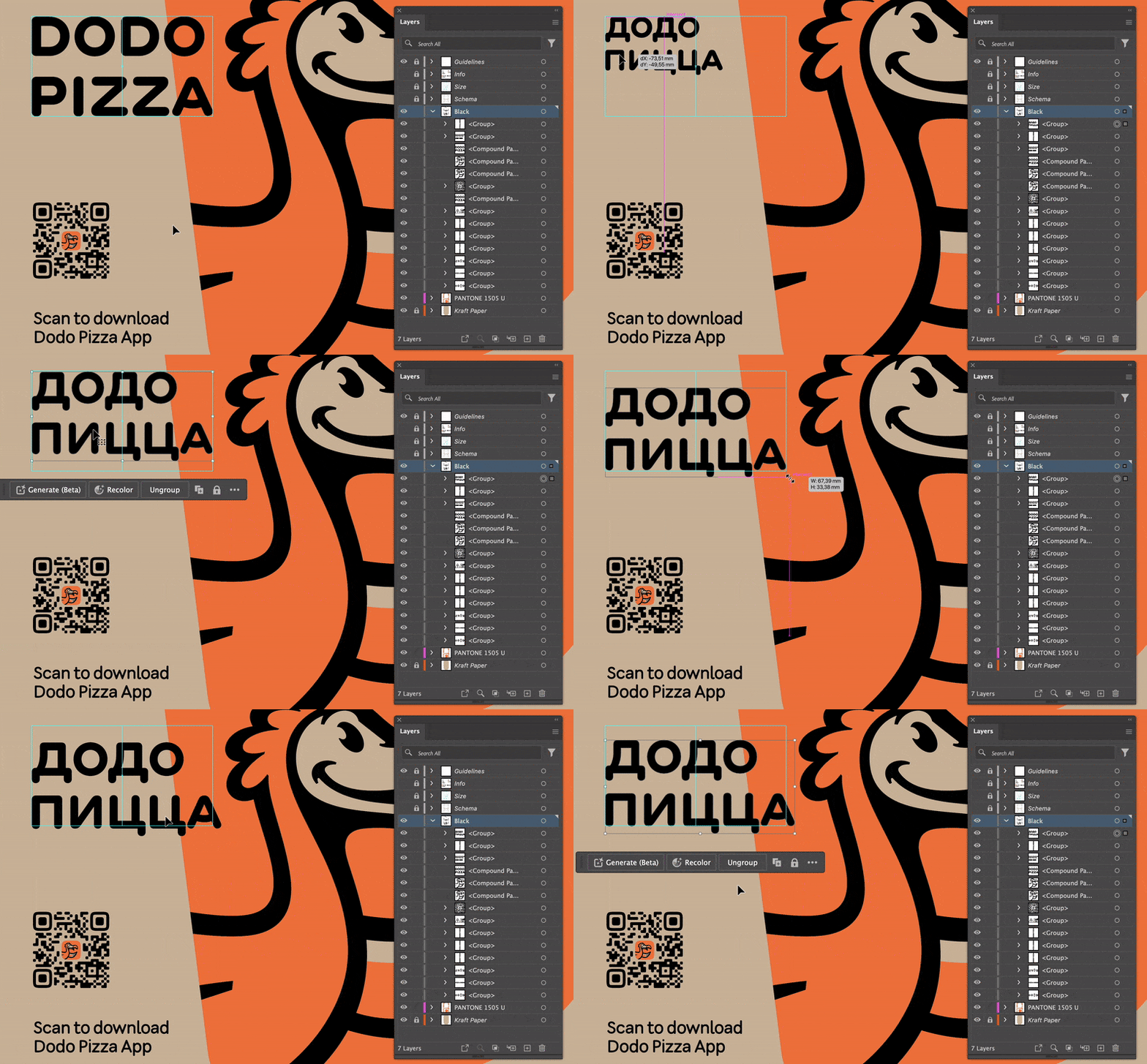
5. Replace the text next to the QR code
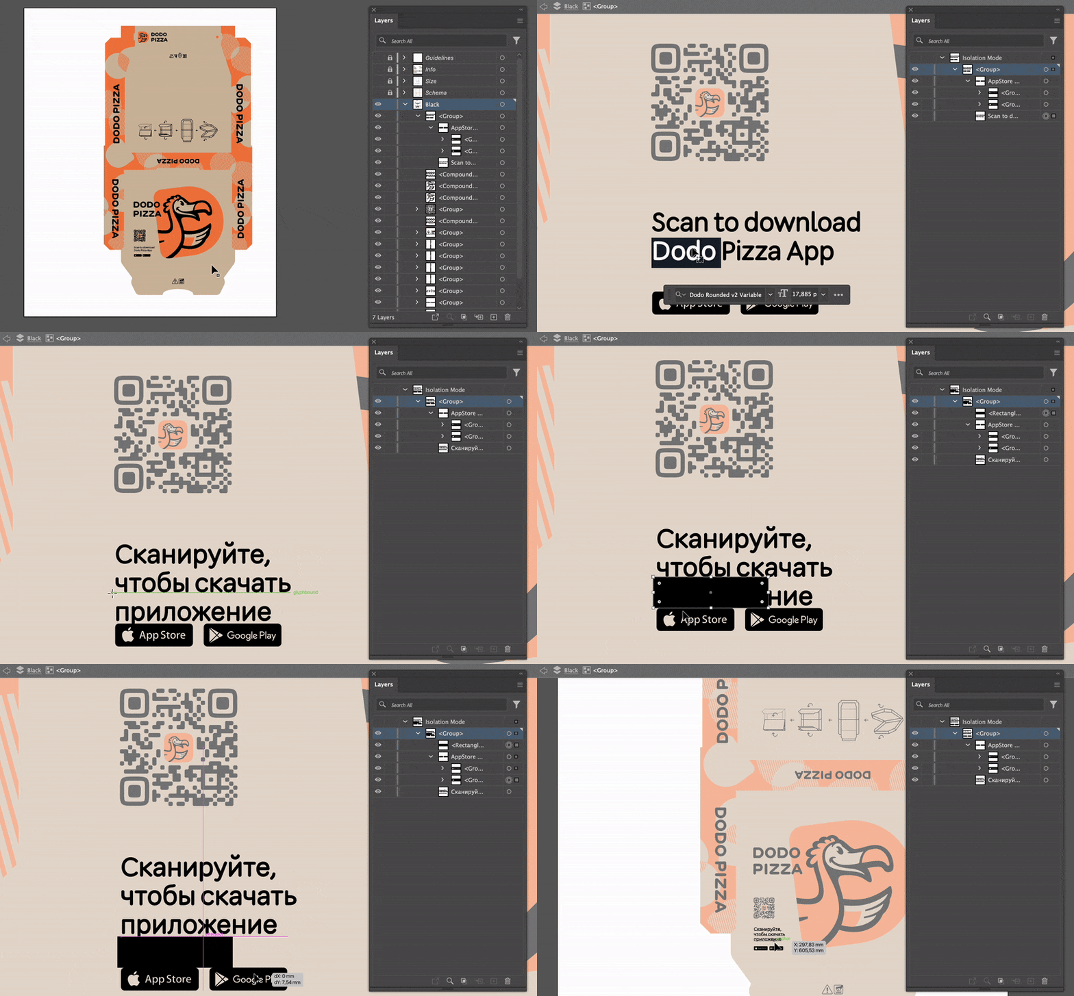
Translate "Scan to download Dodo Pizza App" into your language and paste the translation into the layout instead of the English version.
The standard text in English takes up two lines. If, after being translated, it takes up three lines, move the app shop icons carefully so that they don't cross the Schema lines and remain within the same distance from the bottom line of the text as before.
6. Replace the symbols
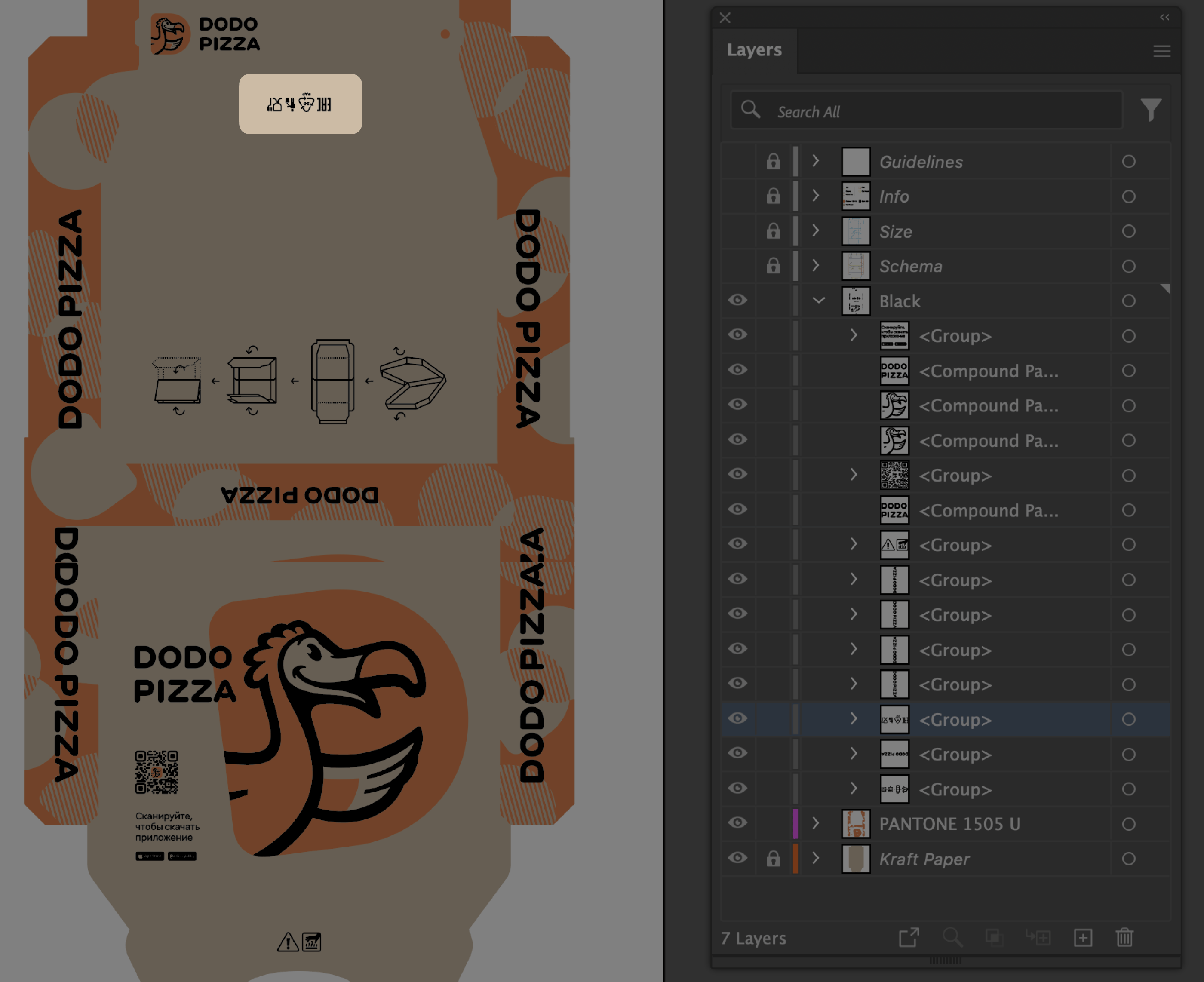
We do not yet have a uniform database of symbols for different countries. Therefore, check the legal requirements in advance, search the internet and download the needed symbols yourself. Remove unnecessary symbols and add markings relevant to the country in which the packaging will be used instead.
Make sure that the colour of the icons matches the other black elements in the layout. Use 100% black with a CMYK code of 0 0 0 0 0 100.
7. Replace the QR code if necessary
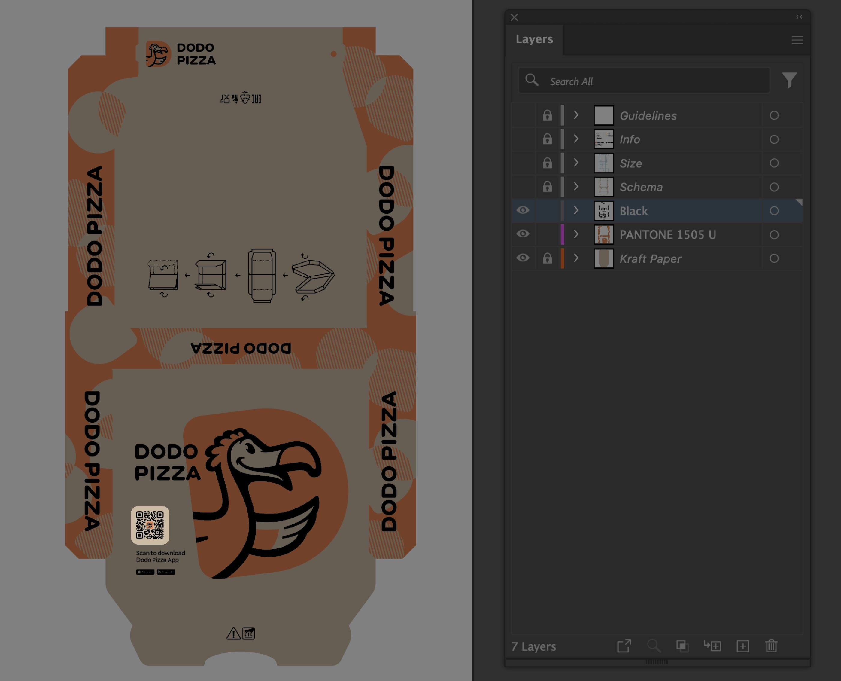
We use the same QR code for all countries, it brings the user to the Dodo Pizza app page in the app shop. You can replace the QR code with your own to measure the conversions from a pizza box. To do this, we recommend using the OneLink service: with its help you can create a single QR code that will automatically direct the user to the app shop compatible with their smartphone.
8. Save the layout for printing
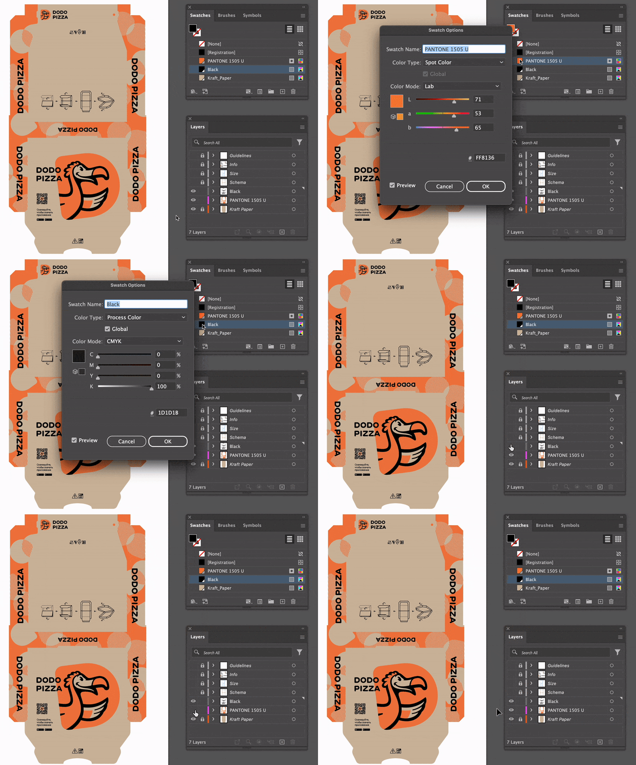
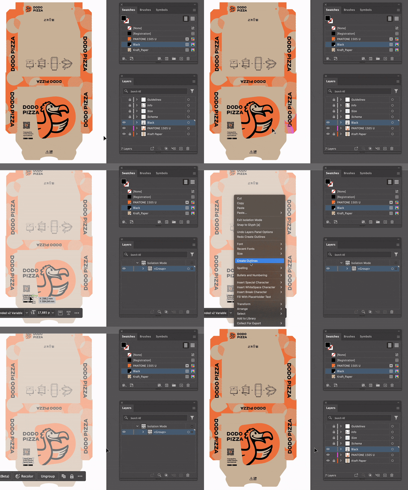
Convert the text to curves. Make sure there are no extra colours in the layout other than PANTONE 1505 U and black CMYK 0 0 0 0 0 100; and that all colours are on the correct layers.
Save the layout as a copy in .ai format so that you don't lose the layers and source data. When saving, change the ending in the file name from Edit to Print.
9. Done!
Now the layout is ready to be sent to the printing house. Send the folder with the Print file to the production specialists.
Read next:
