
Positioning MENA
A strategic framework that connects market context, audience segments, brand message, tone of voice, and visual communication into one simple and consistent system.
Context
Competitors
As of August 2025, these are Dubai’s top three pizza chains by number of locations. They are the most powerful players in the market and our key competitive benchmarks. Looking into their positioning helps us define the strategic space available on the market and spot a distinct territory available for our brand.
 |  |  |
|---|---|---|
| Pizza Hut | Papa Johns | Dominos |
| 73 outlets | 47 outlets | 37 outlets |
| 46 years | 20 years | 28 years |
| Product-focused | Quality | Value |
| “No one outpizzas the hut.” | “Better ingredients. Better pizza.” | “Real Pizza. Unreal value.” |
the leading pizza chains in Dubai each hold a clear product-driven position: Pizza Hut focuses on product authority, Papa Johns on ingredient quality, and Domino’s on value. This doesn’t leave much space to compete on product claims alone.
Around 70% of orders go through delivery aggregators, where delivery time and experience are largely the same across brands. At the same time, heavy discounting is not a key driver in the UAE, and Dubai’s multicultural audience requires a message that is simple and cross-cultural.
in this category, the product itself is rarely the main factor. As long as the pizza is affordable and good enough, people tend to choose based on the situation and who they are sharing it with.
If the product is hardly ever the key differentiator, the real opportunity is in understanding the when and why of the decision to order pizza. This is why we approached the category through the JTBD framework.
JTBD segmentation
Rather than focusing on who the customer is, we look closely at the job they are trying to get done in a specific situation. For each segment, we define the context (when the need pops up), the core motivation (what the person wants), and the desired outcome (what they are hoping to achieve). This helps us design communication that fits real-life moments — making the brand useful, relevant, and a natural part of everyday life.
| Segment | Situation (When…) | Motivation (I want…) | Outcome (So I can…) |
|---|---|---|---|
| Solo | I’m alone, tired after work or studies, and want something quick and tasty | To get food without any hassle, with a familiar taste and in a convenient format | Satisfy my hunger and recharge without spending too much time or money |
| Sharing | I’m meeting friends, and we’re looking for something fun and affordable | To grab something easy to share that lifts the mood | Enjoy time with friends without stress |
| Family | The whole family is home or together on the weekend, and the kids want pizza | To buy food that’s enough for everyone, at a good price, and in a family-friendly way | Feed the whole family quickly and keep the feeling of care and togetherness |
JTBD + emotions + fears
Understanding the situation is just the first step. People also make decisions driven by their emotions and possible concerns. Thus, we add two more layers: the key emotion behind the decision and the hiccup that may stop someone from making an order.
| Segment | Emotions | Fears |
|---|---|---|
| Solo | Satisfaction, lightness, the feeling of “I took care of myself.” | Waiting too long, overpaying, getting food that doesn't taste good. |
| Sharing | Joy, fun, the feeling of “sharing together.” | Not enough food, boring choices, feeling awkward if friends don't like the food. |
| Family | Care, warmth, pride — “I made my family happy.” | Too expensive, not enough portions, kids might be unhappy. |
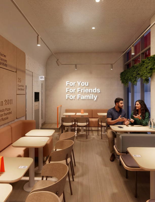
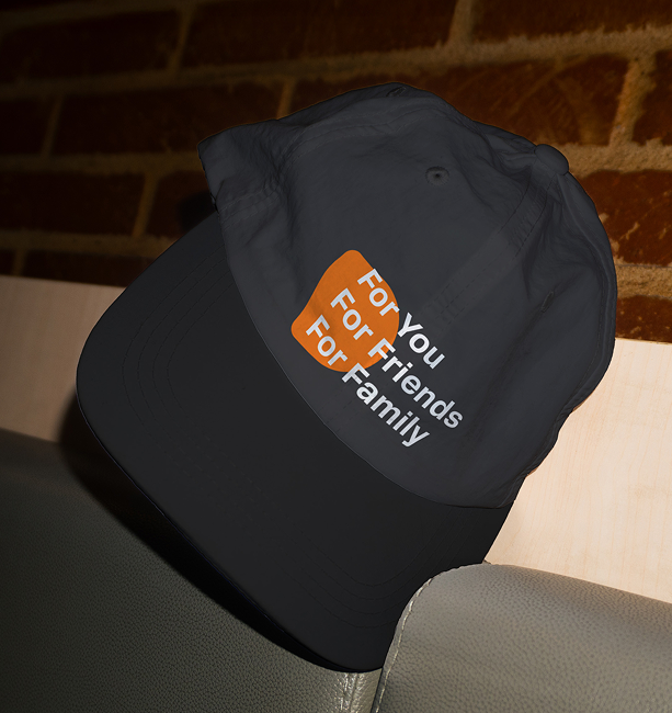
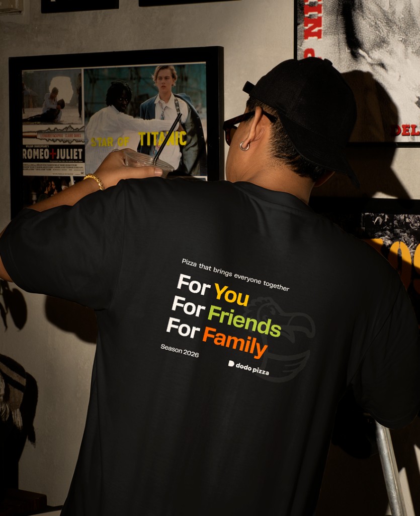
With our audience segments defined, the next step is deciding how we address them. so the “solo, sharing, family” in communication becomesyou, friends, family.
Based on real customer behavior, not abstract segments
Why this message is a perfect fit for the MENA region
Family as a core value
In MENA countries, family is at the heart of culture and everyday life. Ending the slogan with Family creates a strong emotional connection.
Hospitality and friendship
Sharing meals with friends is an important part of daily life. Mentioning Friends reflects the value of togetherness and local hospitality.
Personal care
Including For You highlights personal choice and shows that we care about each guest, which is especially important for younger audiences.
Simple and universal
The slogan is easy to translate into Arabic and other languages without losing meaning or sounding unnatural. It’s clear and works well for a multicultural audience.
Flexible for different segments
it covers all key consumption moments: from a quick meal , to meeting with friends, to family dinners.
Emotional and inclusive message
The phrase speaks to all target groups and all dining formats, creating a sense of a brand that cares about everyone.
Dodo tone of voice
Core tone principles
![]() Simple
Simple
Clear, short, easy to understand. No complex words. No marketing jargon.
![]() Warm
Warm
Friendly, caring, welcoming. We invite — we don't push.
![]() Human
Human
Real-life situations. Real moments. Sounds natural when said out loud.
![]() Inclusive
Inclusive
Works across cultures, ages, and languages. No slang, no cultural assumptions.
![]() Calm confidence
Calm confidence
We know what we do well. No shouting. No “best in town”. no comparisons.
Tone of voice by segments
For You
Simple. Direct. Focused on convenience and ease.
Examples: A quick meal for your day. Just for you. Simple. Tasty. Easy.
For Friends
Playful but not loud. Relaxed. Social, not salesy.
Examples: For the group chat. Made to share. Good food. Better mood.
For Family
Caring. Reliable. About everyone feeling happy.
Examples: Dinner made easy. Food everyone agrees on. For moments together.
Color coding
Color coding helps people quickly understand different content categories — For You, For Friends, For Family — and makes the brand feel more emotional and clear.
Orange, the core Dodo color, naturally becomes the color of for Family: it brings a feeling of warmth, openness, and joyful moments together.
With color, we're not just showing a product — we're showing the different ways people use it.
This system gives each scenario its own voice while keeping everything part of one Dodo visual identity.
Additional Color
RGB 249, 241, 230Color coding: For You
Category psychology: individuality, self-attention, comfort, self-care.
What matters: a feeling of comfort, lightness, and personal choice.
Why yellow? Yellow is the most noticeable color in the spectrum: the eye reacts to it faster than to any other shade. This makes it perfect for the For You category, where we want to highlight individuality and a personal touch.
In Arab culture, yellow is associated with light, endorphins, joy, and life. it doesn't carry religious or negative meanings — which makes it a safe color to use in marketing for a wide audience.
Color coding: For Friends
Category psychology: laughter, being together, friendship, energy, and shared moments.
What matters: openness, lightness, playfulness, and positive communication.
Why green? Green has no gender or age stereotypes. It feels neutral, modern, and friendly. In today's visual culture, it sits in a “universal” space, which makes it easy and comfortable for a broad audience.
In the MENA region, green is traditionally linked to harmony, wellbeing, and positive emotions. It's a culturally familiar and “good” color — warm, friendly, and uplifting. That's why it fits perfectly for a segment built around friends, social moments, and being together.
Color coding: For Family
Category psychology: support, trust, shared moments, and a sense of family comfort.
What matters: a feeling of warmth, lightness, and personal choice.
Why orange? In the food world, orange works perfectly: it increases appetite, creates a cozy mood, and adds a sense of “celebration at the table.” It's the right emotion for family communication, shared orders, and generous portions.
Since orange is Dodo's main color, it naturally becomes the color of the “family” category. People see it as the “primary,” “shared,” and “anchor” color. This supports the idea that “family = center,” without creating any visual conflict.
In the region, orange is also linked to the sun, desert warmth, energy, and vitality. It's a safe color, easy to accept, and it creates positive emotions for a wide audience.
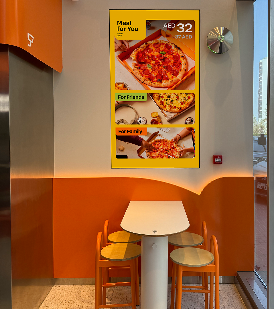
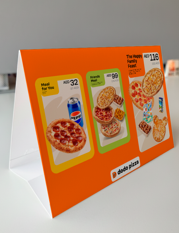
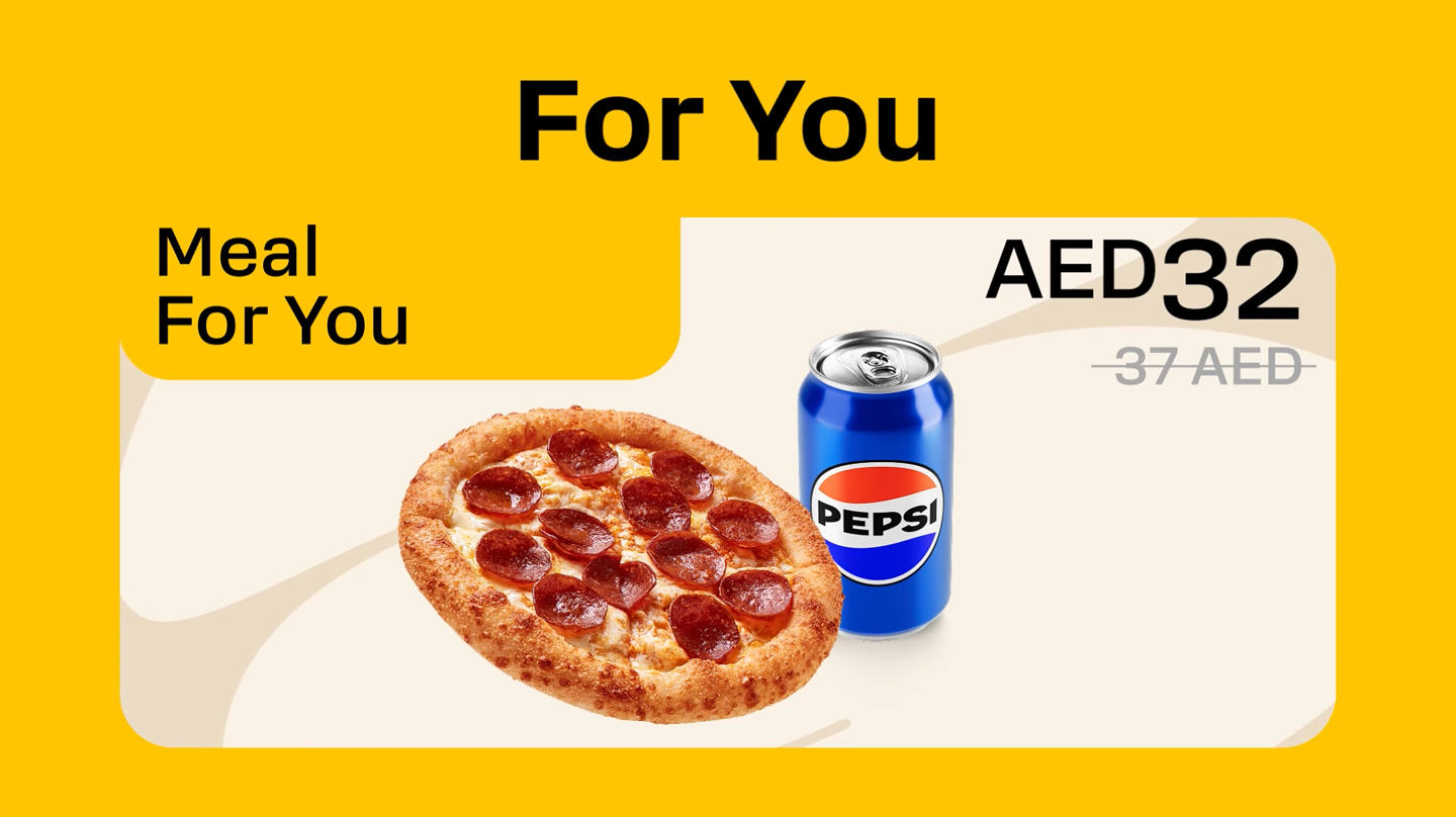
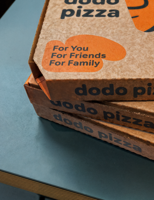
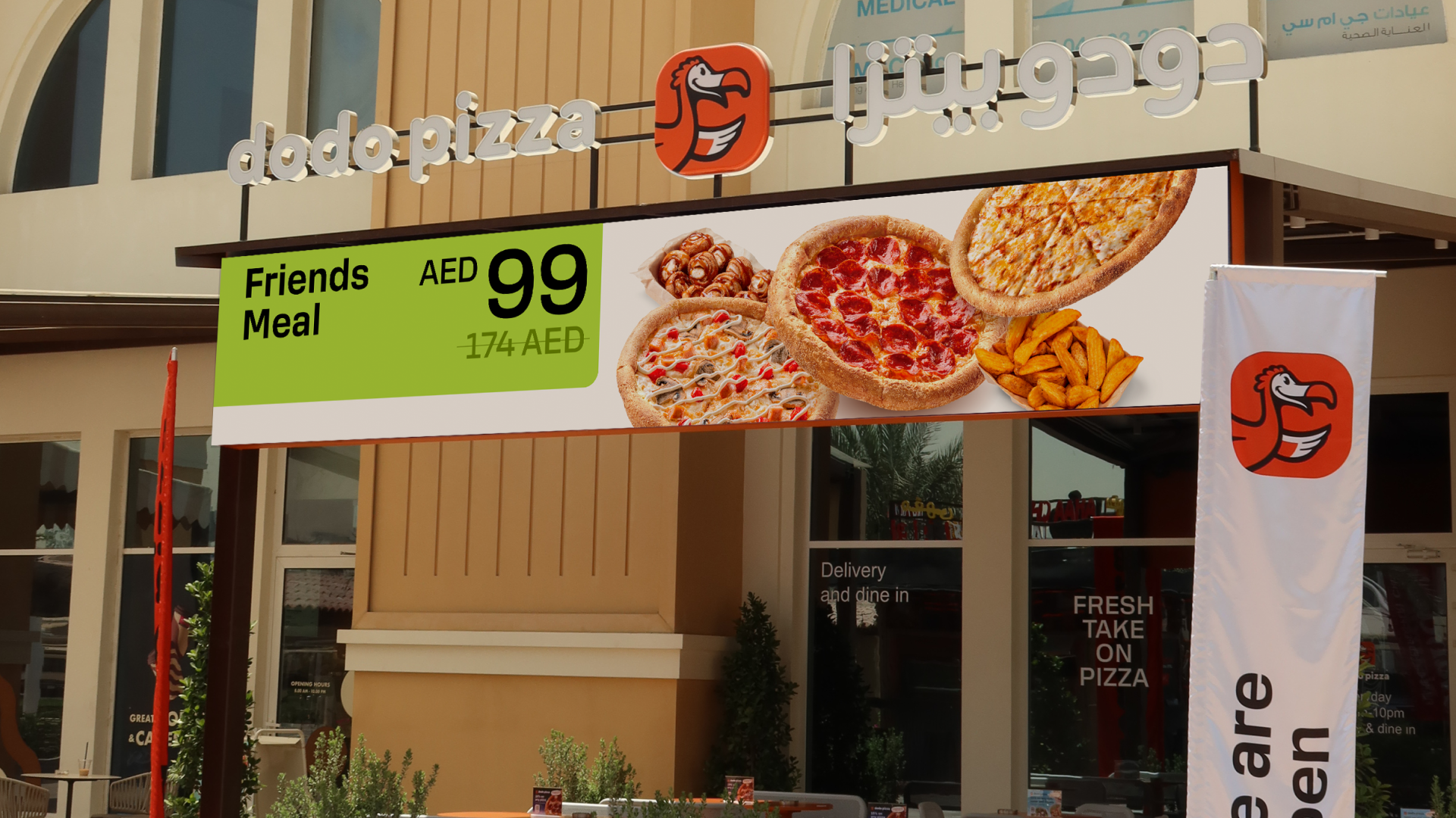
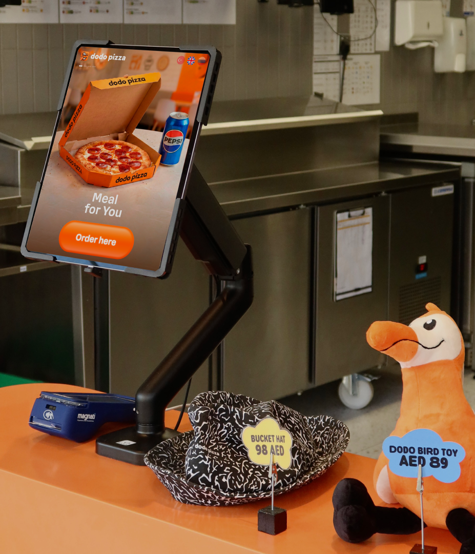
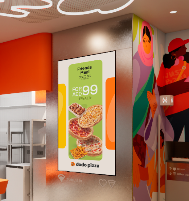
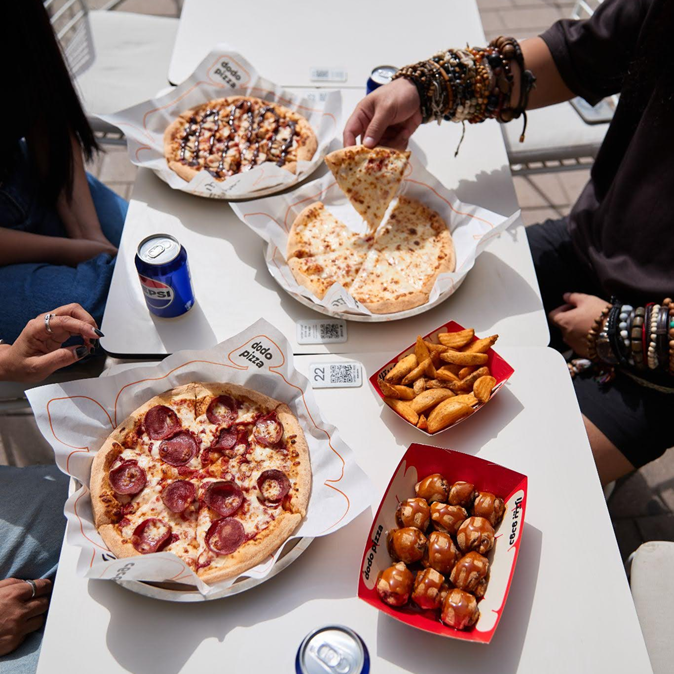
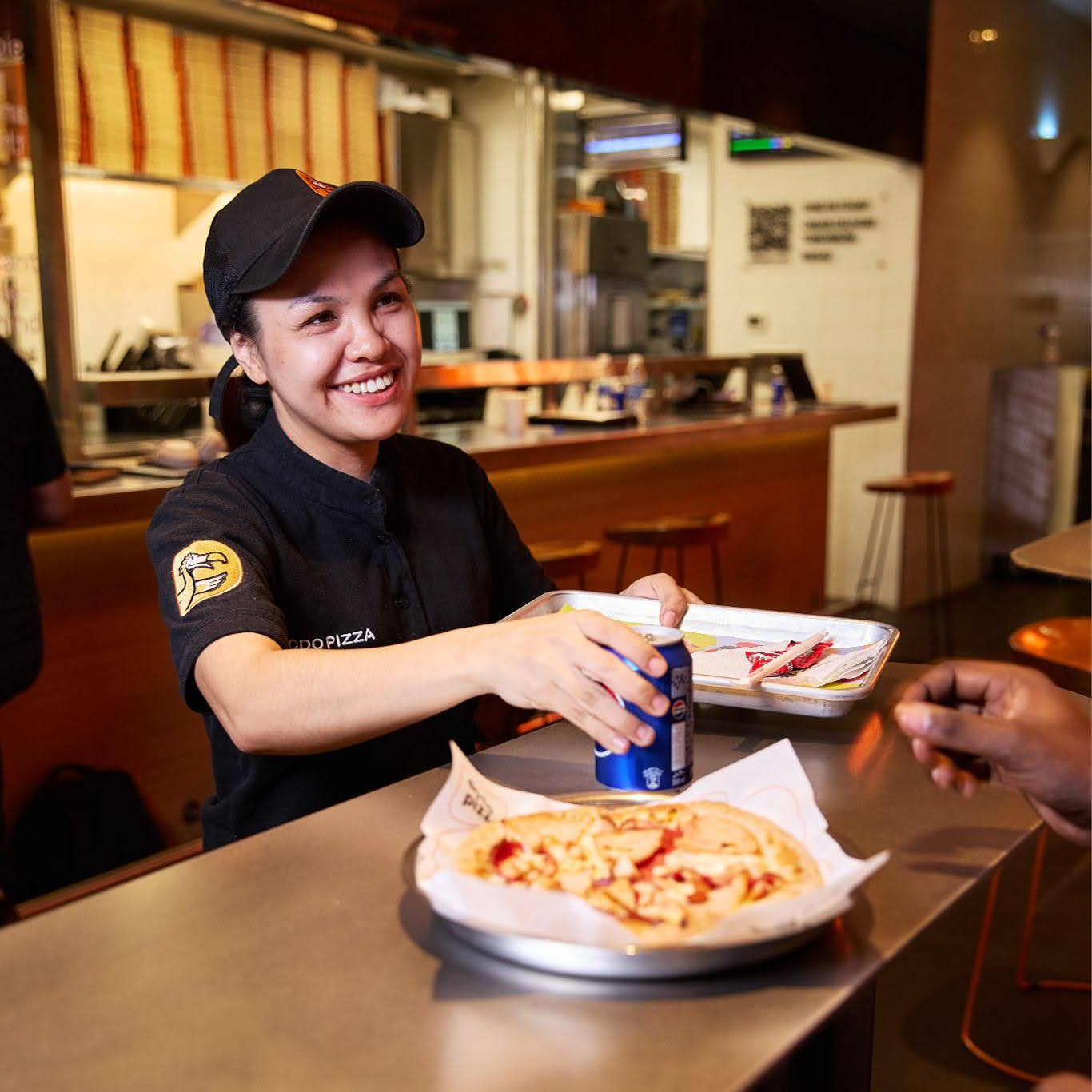
Communication in action
The following examples show how the brand strategy translates into real communication. They illustrate how the tone of voice, visual style, and brand message can be expressed across spaces, people, and marketing materials.