
Monotonous interiors are detrimental to QSR
Why being ‘different’ is not a whim, but a survival strategy.
In the QSR and fast-casual world, uniformity is treated like a commandment. Sameness is seen as safety, especially when it comes to interiors. Fewer variables mean fewer risks: that’s the promise of scale, but also its trap.
We’ll skip boutique brands like % Arabica or Blue Bottle — the ones that hire famous architects and spend years polishing their interiors for the sake of atmosphere. That’s not our focus here. This piece is about QSR and fast-casual chains that need to open fast, spend little, and make money right away — that includes McDonald’s and Chipotle, Starbucks and Shake Shack. It’s QSR and fast-casual that most often sacrifice interior design in the name of scale. But do they have to?
When standardization becomes rigid and absolute, it strips spaces of identity, killing off anything that doesn’t fit the template. With all the focus on replicability over expressiveness, brands start to ignore local context. The visual experience blurs into sameness — forgettable and interchangeable.
What follows is a look at how standardization can backfire: how some brands drown in their own bland replication, and how others manage to course-correct just in time. We’ll move along the edge between interior design and overall experience design, leaning one way or the other when needed — because, in reality, they’re impossible to separate.
Why do chains “damage” their own interiors?
I see three kinds of design damage that chains inflict on purpose:
- Bland repetition across the brand;
- Sterility within individual locations;
- Intentionally bad design.
Let’s break down why QSR and fast-casual brands keep doing this to us.
Bland repetition across the brand
Standardize the materials, the decor, the furniture — and suddenly you’re controlling quality, cutting costs, and speeding up rollouts. Templates scale easily: no need to invent anything for new locations. A junior designer can slap together the project in a couple of days.
Standardization also boosts brand recognition. But recognition alone doesn’t create delight or loyalty — we’ll get to that later, with the numbers to back it up.
Sterility within individual locations
QSR and fast-casual interiors often go sterile in an attempt to control chaos through simplification. Fewer details mean fewer chances to mess up cleaning routines or pick the wrong decor. For a designer, every extra detail means more hours — and when projects need to ship fast, there’s no time to fight monotony.
Bonus: a bland space won’t offend — nor excite.
Intentionally bad design
More chains than you’d think use interior design to drive customer turnover by making sure people don’t stick around for too long. Of course, no brand will ever admit it out loud. But we have eyes (and butts). And we know a “15-minute chair” when we sit on one.
Intentionally uncomfortable interiors are acknowledged by designers: seating comfort is calibrated to manipulate how long people stay. The author of the first Burger King concept in Singapore puts it bluntly: “…uncomfortable seating and glaring lights were taken out, as were garish red tones,” effectively admitting that regular Burger Kings are defined by exactly those features.
Design damage is often framed as guest care — as if the goal were to be more modern and welcoming. But “modern” usually means sterile and generic interiors built for scale. And “welcoming” becomes an excuse for stripping away identity in a desperate attempt to please everyone.
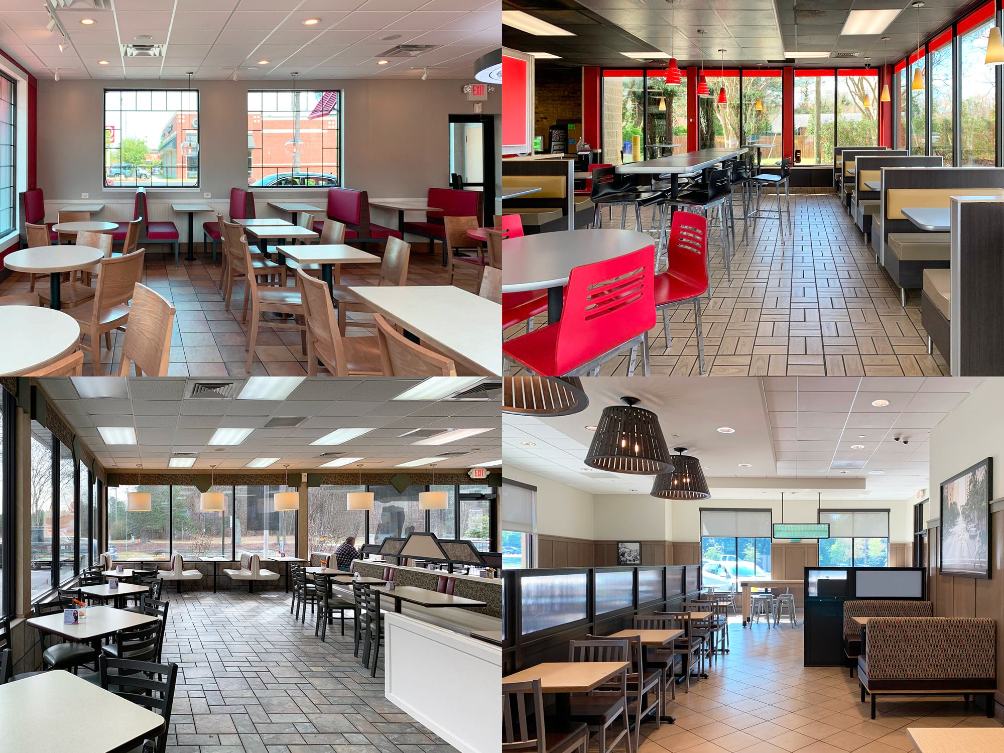
If every chain hits all three kinds of design damage, they end up looking the same. Below are interiors from several fast-food chains with the branding intentionally removed. Try guessing which one is McDonald’s, KFC, Burger King, or Chick-fil-A — the answers are at the end of the article. You don’t need to be an architecture expert to see it’s all more or less the same thing.
Fine. So chains look the same — within themselves and across competitors. But hey, people still show up, right?
What people think
Some see bland interiors as a downside. Darran Anderson put it dramatically in The Atlantic: “Everywhere looks like everywhere else and, as a result, anywhere feels like nowhere in particular.” Consumers miss variety and a sense of character. Sterile chain design leaves them, at best, indifferent, and at worst, annoyed.
“The further and further we get into this streamlined and minimalist aesthetic, everyone (in the US at least) seems to be heading into, I crave the sights of more wacky and crazy designs for food places and stores,” writes one Reddit user in a thread about fast-food design sameness. Another recalls with nostalgia the one-of-a-kind McDonald’s locations that became part of the local culture in Iowa City, where a franchisee once gave each restaurant its own identity. One was all sports memorabilia, another a 50s diner, and a third was decorated with a miniature Statue of Liberty. Judging by the timestamps on the forum, these places fell victim to McDonald’s “global design portfolio” about eight years ago.
Under an article about McDonald’s losing its uniqueness, opinions are split — from “You can’t eat atmosphere… So go have a Big Mac & enjoy” to “Apart from its possible appeal to millennials, I simply don’t get it.” The typical Starbucks catches flak too, despite positioning itself as a third place: “…a bright, loud, beige, depressing, bland office.”
“They [QSR and fast-casual interiors] are soulless… A well-lit, antiseptic environment is not a concept. It’s just nonexistent,” says Glen Coben, a New York–based restaurant architect.
But these are individual opinions — found in comment threads (even if heavily upvoted) and online articles. After all, everyone complains about iPhones having ridiculous camera bumps, yet they keep buying new models. As Glen Coben also puts it: “…fast food restaurants are essentially just designed in a lab to produce the biggest returns possible.” But the thing is — if everything really worked the way Glen says, the interiors would look very different. Because what we see in most QSR and fast-casual chains today isn’t maximized design efficiency — it’s the path of least resistance.
The difference between the best- and worst-rated McDonald’s locations in the US (according to Google Maps reviews) mostly comes down to franchisee competence. Best or worst, the interior experience at McDonald’s isn’t all that different. I’d call it “almost identical.”
The impact of interior standardization on business metrics
On one hand, standardization ensures brand recognition and operational efficiency. On the other, if the environment feels too uniform and predictable, customers will start seeking variety elsewhere.
How design affects revenue
What do chain restaurants miss when they damage their interiors? By deliberately damaging design to speed up turnover, they lose the chance to increase average check size and drive repeat visits. A uniform, purely functional atmosphere sets the tone for a bare-minimum scenario: walk in — order — leave. Convenient, but hardly inspiring anyone to stay longer, grab a dessert, or come back another day.
A more striking interior can help drive revenue: according to Black Box Intelligence, top-performing restaurants consistently receive about 13 percent more positive mentions of ambiance than their less successful competitors.
Loss of perceived value and the price race
We’ve established that excessive design standardization leads competing chains to offer the same kind of experience. For businesses, this can mean shrinking margins under price pressure. If you and your competitors look and feel the same, customers start seeing your offering as a commodity — a product that’s interchangeable with others and competes primarily on price, not quality. If that happens, it means your uniqueness is gone, and discounting becomes the only way to drive sales. The more your experience resembles others, the higher the risk of being chosen solely for being cheaper.
In China, a recent clash between commoditized chains speaks volumes: the CMO of Burger King China said that survival without discounts was impossible, while a McDonald’s spokesperson noted that customers were choosing brands based on promotions. Both ended up selling burgers for 10 yuan — that’s what happens when every other point of difference is gone.
Same-store data: repetition fatigue
Guests get bored when visiting the same restaurants frequently — not out of whim, but as a natural reaction to repetition. QSR and fast-casual chains are hit hardest, since their experience is the most standardized. In the US, from 2008 to 2017, same-store traffic across chain restaurants dropped by almost 15%.
McDonald’s CFO Kevin Ozan, in a short but telling interview with McKinsey, shared that the company initially believed it was losing guests because of shifting dietary preferences. But as their research showed, those who had stopped coming in “like quick-service restaurants and […] enjoy eating our food; we just weren’t giving them what they wanted.” The difference, it turned out, was in the design of the experience: comfort, modernity, and sense of warmth. The problem wasn’t the food — it was how the visit felt.
The solution they chose? Spending a billion dollars to give a thousand restaurants the exact same facelift. They simply replaced one template with another — which doesn’t solve the long-term brand monotony fatigue. Still, even that shortsighted move gave same-store sales an instant 4–6% boost.
When interiors feel personal
According to Epsilon, 80 percent of consumers are more likely to buy from brands that offer personalized online experiences. Could a soulless, copy-paste interior be missing a similar effect in the physical world?
Locally adapted interior design is the offline equivalent of digital personalization — an interior that steps away from brand templates and responds to local context: a city, a neighborhood, even a specific space. A meta-analysis of 319 offline retail studies found that when a store’s physical environment goes from “merely average” to “above average,” the share of those intending to return grows by roughly 25 percent.
Starbucks earned cult-like loyalty in part by rejecting total interior sameness. Many of its locations reflect local culture — with Ottoman-inspired elements in Istanbul, vibrant traditional tiles in Mexico City, and a Kengo Kuma–designed café in Japan that echoes local architecture. By doing so, Starbucks avoids feeling foreign and instead becomes part of the local community, driving deeper customer engagement — from social media activity to participation in local promotions.
Trader Joe’s takes it a step further — localizing their stores is a requirement, not an option. Beyond selling regional products and branding merchandise for each city, every location features a local touch: a mural by a neighborhood artist or references to local sports teams on the walls. Wherever they are, Trader Joe’s stays in dialogue with the community — people feel the store is “for them,” leave reviews, and defend the brand. As a result, Trader Joe’s consistently ranks among the most relevant and trusted brands.
Conclusion: when interiors are standardized to the point of “nothing personal,” chains lose a powerful driver of customer engagement.
Retention: keeping guests through fresh experiences
People are wired for novelty — marketers call it variety-seeking. Repetitive experiences push guests to look for new places — not out of dissatisfaction, but out of a natural desire for change.
In food service, this effect is especially evident. In the previously mentioned interview, McDonald’s CFO shared that after several years without refreshing their breakfast format, the company saw guest traffic decline during morning hours. It isn’t about interiors in this case but the takeaway applies universally: even loyal customers can burn out if nothing changes.
Capital One added cafés to its branches, turning them into places customers visit not just out of necessity, but to grab a coffee or work in a pleasant setting. Thus, in 2021, Capital One ranked first in customer satisfaction among national banks in the U.S.
Customers now expect flexibility and engaging experiences — and the brands that break the mold are the ones that win. If someone loves your product, give them a reason to come back: offer the same product in a reimagined experience.
NPS: how design drives customer advocacy
Companies with high NPS don’t just have satisfied customers — they have ones who are genuinely excited. Averaged-out, monotonous design doesn’t spark that kind of reaction.
This is easy to see in real-world examples. Starbucks consistently moves away from soulless templates toward locally adapted experiences — and that’s enough to maintain an impressive NPS of 77. McDonald’s, by contrast, offers a utilitarian, standardized environment that fails to surprise — even satisfied guests rarely become promoters. The result is a negative NPS of –8.
We already looked at Capital One, but another bank worth noting is the UK-based Metro Bank. With a customer-first approach — friendly interiors, seven-day service, and even pet-friendly policies — they’ve pushed NPS to an outstanding 82. These touches deepen emotional connection — and with it, the drive to recommend.
Examples across industries point to a clear conclusion: overstandardization of design and customer experience within chains hurts key business metrics. Profits are limited due to missed opportunities for localization; same-store sales stagnate as customers grow tired of monotony; average ticket size and upsell potential tend to drop in overly sterile environments that lack sensory appeal; retention and NPS suffer when the brand fails to spark emotion.
Companies bold enough to break the sameness — by adding local character, refreshing design, or personalizing the experience — see gains across all of the mentioned metrics. Standardization is a powerful scaling tool, but recent years have shown it needs nuance: a unified brand skeleton must be complemented by a “living” adaptation to local culture and customer expectations. Only then can a chain be both efficient and beloved — and avoid the trap of boring sameness.
Design overstandardization threshold
A working takeaway: standardize your location design — but not too much. The authors of “Franchise market as a driver of hospitality development” article warn that one of the biggest threats to franchise models is the loss of brand uniqueness due to excessive typification. Unfortunately, they only acknowledge the risk — without defining a term we’ll likely need more and more: design overstandardization threshold.
So how do you know when helpful unification crossed the design overstandardization threshold? When does short-term gain start eroding long-term value?
We’ve looked at how overstandardizing the guest experience — and interior design in particular — can affect key business metrics. But trying to trace every drop in performance back to an overly standardized interior is a fast track to losing your mind — especially for someone like me, running the design department at a large franchise.
To stay sane and effective, you need a logical sequence: which metrics to monitor first → how to detect their connection to interior design missteps → how to tell when standardization is the actual problem.
What do we track — and why?
Saying “just follow these metrics” would be a mistake. Financial indicators like profit, revenue, and average ticket size are useful starting points — they often signal when to dig deeper — but they don’t offer much detail. Or take a narrow metric like dwell time: in QSR and fast-casual, a drop is often seen as a good thing, since it usually means higher turnover.
So here are the key metrics I personally focus on:
- Same-store metrics— both traffic and sales, since guests leave in search of variety;
- CSAT— a drop here often comes before a drop in sales; it signals guests are ready to walk away;
- NPS— especially critical. If the interior doesn’t make an impression, even a satisfied guest won’t recommend the place. Food or drinks alone rarely drive a high score;
- Retention — no matter how tasty the food or pleasant the music, people don’t return to spaces that don’t feel good.
- And for dessert — one unexpected but important metric I’ve come to value through practice: staff engagement. I (not as often as I should) talk to our baristas, and they’re surprisingly eager to discuss the cafés’ interior design. I’ve noticed that team members who feel proud of their space show up differently. When someone is confident the guest will love the environment, they feel a sense of ownership — and lean in more. But when the space is bland and templated, they feel like just another cog in the system. That’s when service quality drops, and engagement fades. And disengaged staff don’t propose new ideas — over time, this kills a company’s ability to stay agile and adapt to change.
How do we know the problem lies in design or standardization?
The next step is to observe how often — and in what tone — guests mention the atmosphere or interior: from excitement and praise to complaints about dullness and sameness. Black Box Intelligence has already shown that the more often guests compliment the atmosphere, the higher the revenue. What’s left is to compare these mentions to competitor benchmarks — via review platforms or direct surveys.
Review analysis can help determine whether the issues are rooted in the templated design approach. Complaints about sameness, lack of uniqueness, or absence of new or memorable experiences are easy to understand — these are direct symptoms of overstandardization. But more subtle signals are harder to decode. Take discomfort or lack of coziness — is standardization really to blame? Should the brand’s design approach be reconsidered?
Let’s break down the coziness example: one goal of standardization is to speed up the design process. But coziness almost always requires more time — to select decor, refine details, coordinate extra steps. So yes, standardization may be the cause — but only someone deeply embedded in the brand context can trace the connection.
The downside of overstandardization isn’t always obvious. For a while, high efficiency and cost savings from using the templated approach can hide the emerging problem. But a clear-eyed view of the metrics can surface the signal early.
Brands that (almost) got it right
Starbucks
In the mid-2000s, the drive for optimization led to Starbucks stores around the world becoming nearly indistinguishable. The blender of corporate efficiency turned interiors into a monotonous cocktail, stripping away the original idea of a third place. Guest satisfaction dropped, and Starbucks stock began to fall.
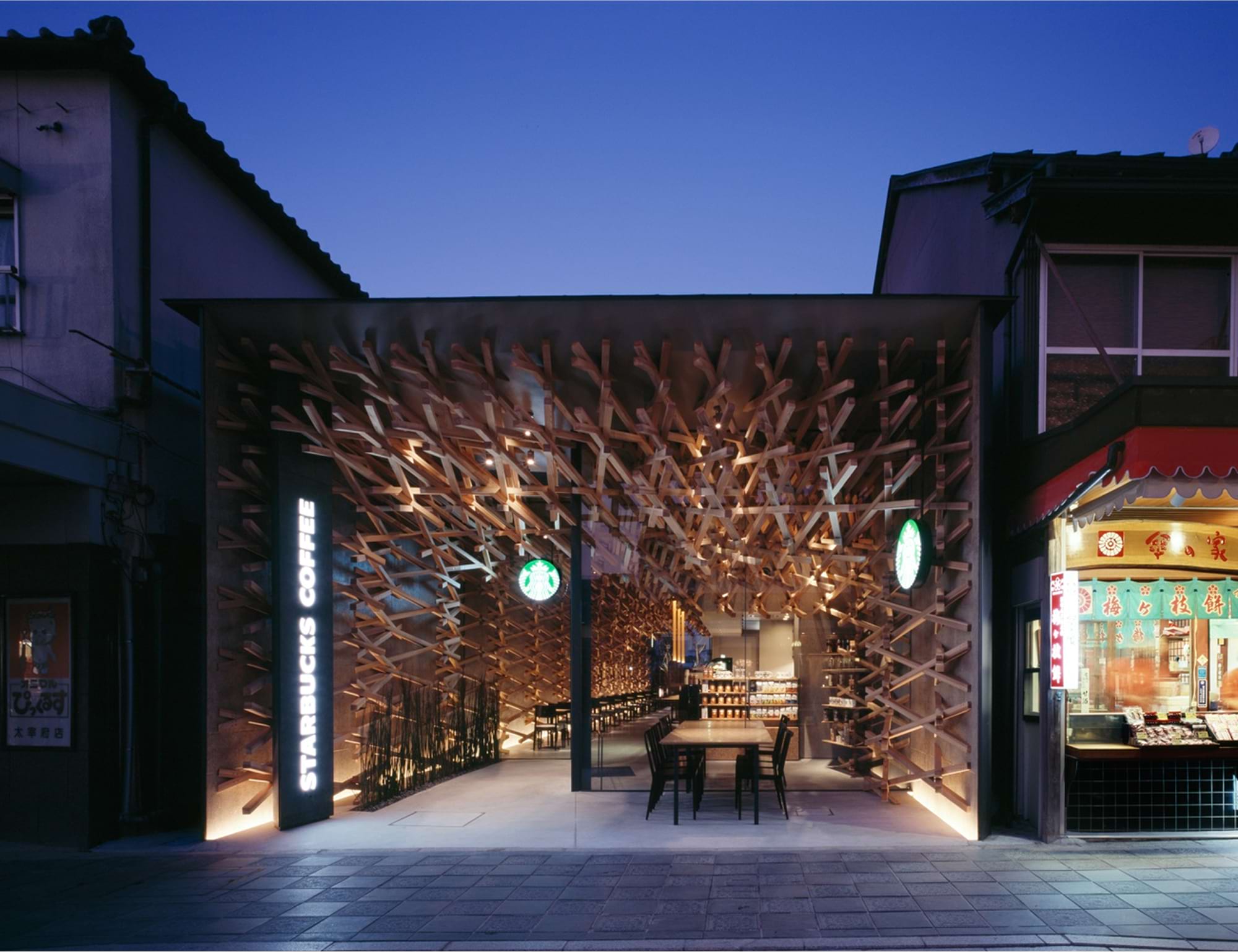
Recognizing the problem, Starbucks dropped its set of standard interior templates around 2009, admitting that “The best Starbucks are eclectic.” The company set out to create unique cafés, each with its own design language. To make this happen, a few hundred designers work across multiple regional design studios, continuously updating a catalog of local design ideas. The brand’s internal Starbucks Art Program helps integrate original works by local artists into the spaces. Today, the page dedicated to Starbucks’ design team reads: “We practice ethical, modern design thinking that embraces both familiarity and intentional variety.”
Things really did improve. While living in the U.S., I was mostly surrounded by Starbucks stores from the “corporate blender” era — and never liked their interiors. But walking through the Dubai Mall, I noticed something striking: among 10+ Starbucks locations inside the complex, not a single one looked the same. Each had its own character. If I weren’t picky about coffee quality, I might’ve even become a customer.
Shake Shack
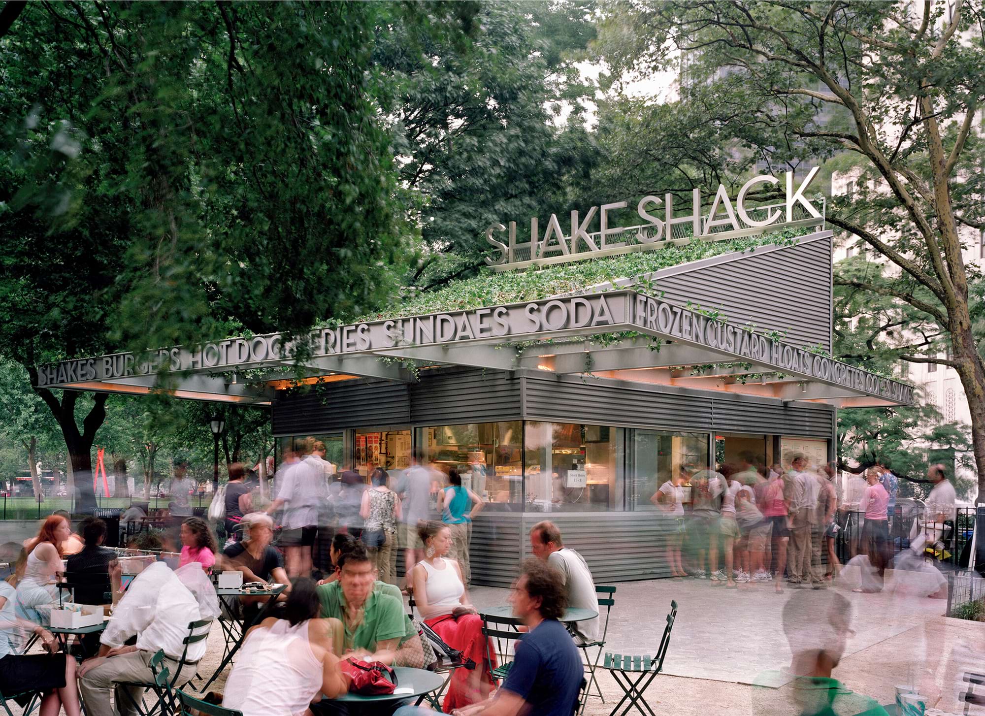
This American burger chain, you could say, started with a design case. Its very first permanent location was — and still is — a standout design piece: scaled to the surrounding park, built with carefully chosen materials, and most importantly, visually referencing classic American roadside pavilions. The space sparked massive hype and two- to three-hour lines (granted, Shake Shack also makes great burgers). But what stands out is the brand’s belief in good design: as it scaled, Shake Shack stayed true to that mindset — opening in prime locations and designing each new space individually, with local character in mind.
Over time, Shake Shack’s average interior quality took a hit from rapid expansion. But even in its simplified form, the brand’s spaces still carry more individuality than most competitors.
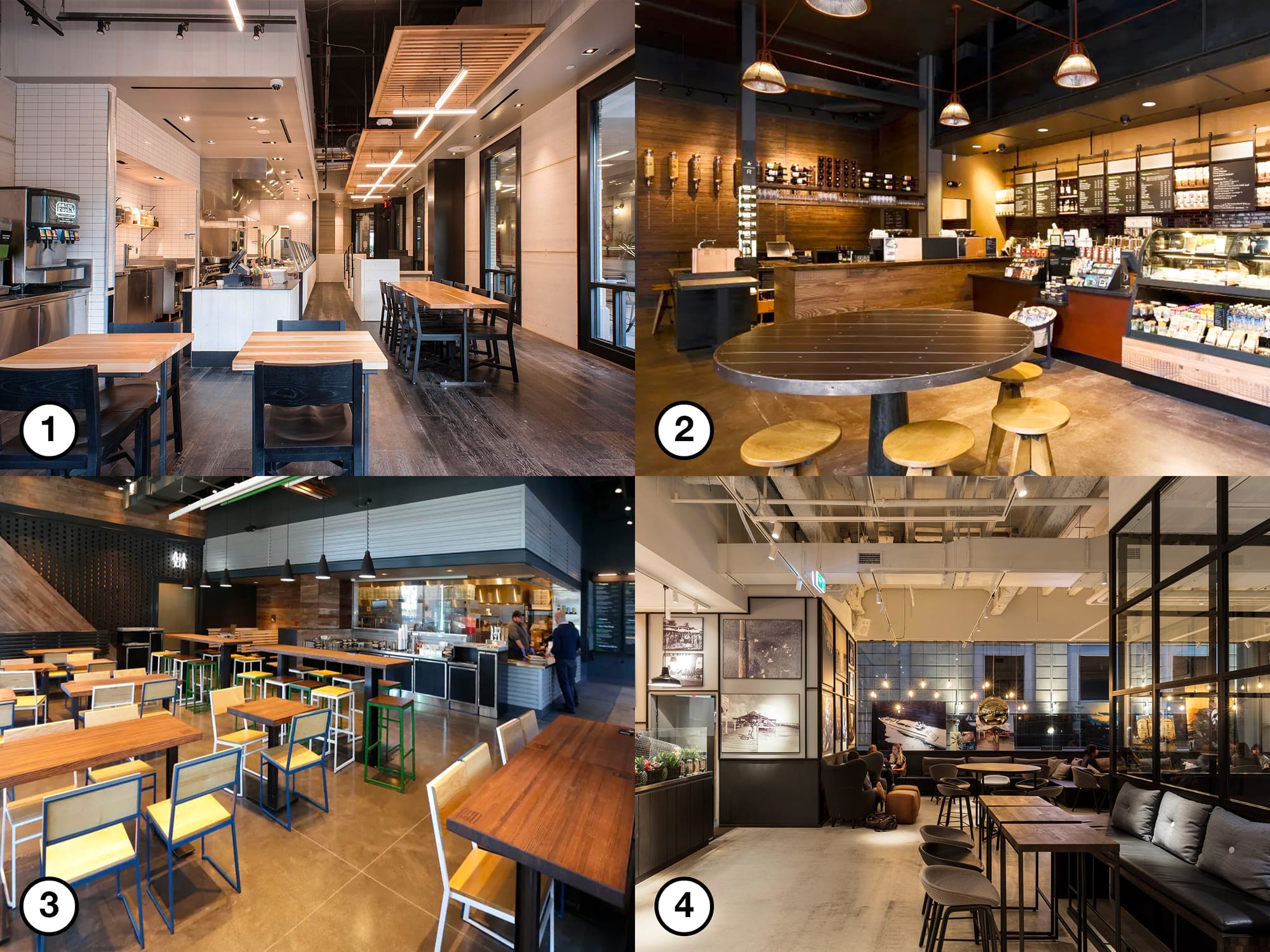
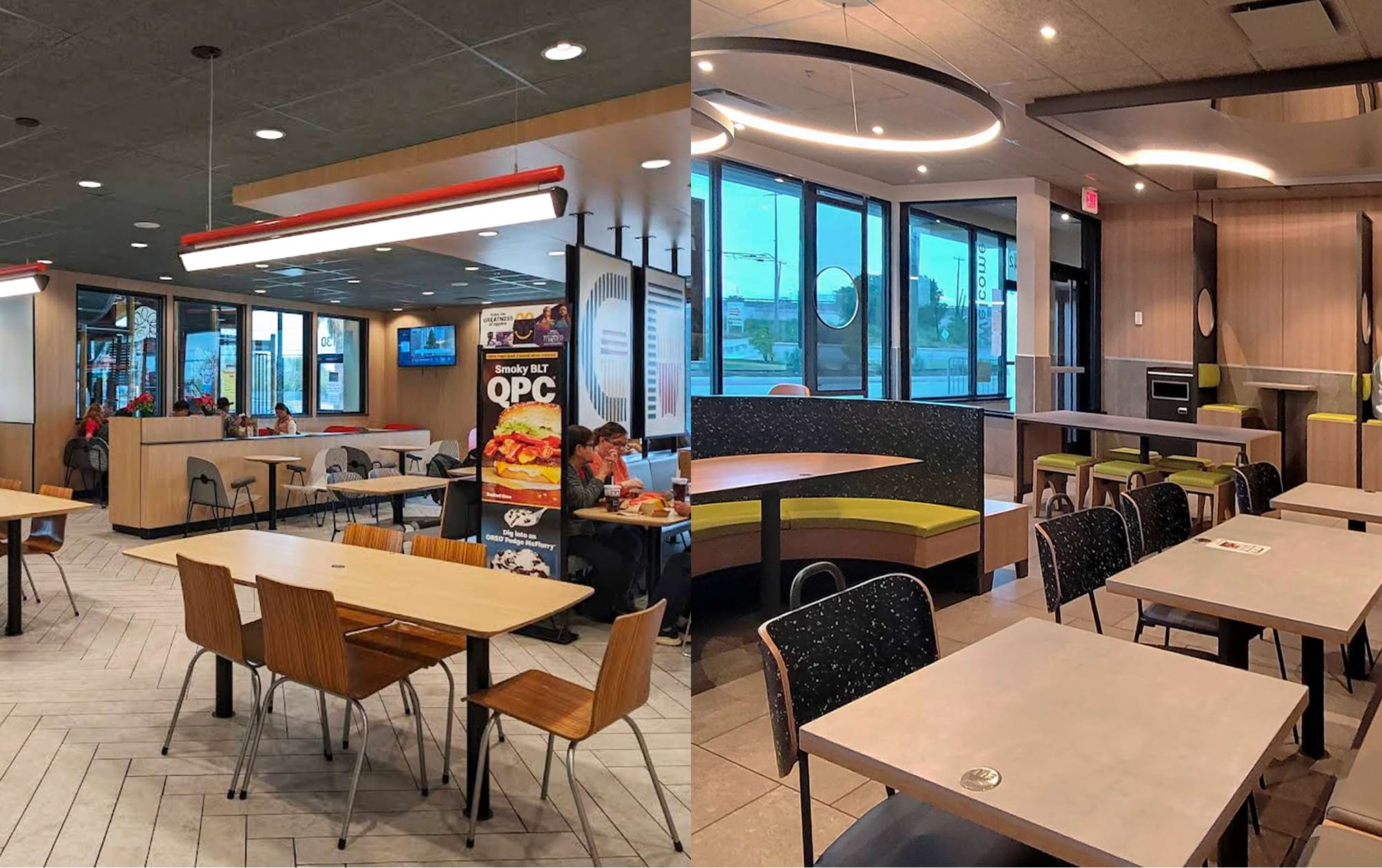
Let’s compare a new collage of interiors — again, with all branding removed. Compared to the earlier set, this one features more natural materials, better lighting, and a cozier color palette. Still, try to guess which space belongs to Starbucks, Shake Shack, Joe & The Juice, or Cava (before Project Soul) — answers are at the end of the article. They all look fine — but they all look the same. And in that sameness, each brand quietly erodes its own identity.
Cava
Arguably the most impressive case — not just in terms of numbers, but also in terms of design vision. The brand already had a recognizable interior style: in fact, Cava looked like what many other chains are only now trying to become (see collage above). But in 2024, they launched Project Soul — rethinking zoning to add more privacy, softening the harsh contrast between black and light surfaces, updating the palette with warmer, less contrasting colors, and adding greenery. Subjectively, the result looks great and feels like a designer was genuinely involved in each location — likely with more time than Starbucks or Shake Shack ever allow. Objectively: a 33 percent increase in systemwide revenue, a 13 percent lift in same-store sales, and 9 percent more foot traffic.
“Above average” isn’t enough
All the examples above are successful from a business perspective — but they don’t aim for cultural legacy or design significance. So what? At the end of the day, we’re here to make money, not to flatter designers’ egos. But here’s the thing: without strong ideas, even well-executed interiors won’t be remembered. The great Don Norman wrote: “Reflection is conscious, and the emotions produced at this level are the most protracted” (Norman, 2013, p. 44). Design needs to trigger not just instant emotion, but lasting memory.
To build emotional connection, you have to go beyond “above average.” It’s the idea that turns a setting into a memorable experience. For design to stick, it has to feel personal: to land in the guest’s heart. Such designs aren’t about creativity or decoration for their own sake — they’re built on clear intent.
That’s enough metaphysics for now — designers spend years studying and decades gaining experience to create meaningful spaces, so let’s leave that part to the professionals. And get back to facts: what happens to QSR and fast-casual brands that settle for just “above average”?
Lack of emotional connection with guests
The situation: A guest quickly gets used to a well-executed but shallow design. It may feel nice at first, but a year later, the space becomes “just another place.”
What it costs the business: The brand misses the chance to build emotional bonds with guests — and without that, there’s no lasting attachment or loyalty.
Loss of brand distinctiveness
The situation: Guests start confusing one brand with another — everything looks trendy and neat, but lacks a clear idea or story.
What it costs the business:The brand loses its competitive advantage. In a saturated market, bold, meaningful design can be a decisive factor that sets a company apart from a sea of identical chains.
Decline in long-term value
The situation:An interior feels outdated after just 3–5 years, because one trendy look was quickly replaced by another.
What it costs the business:Frequent redesigns become necessary — whereas a meaningful, well-thought-out design would age more slowly or even gain value over time.
Missed opportunities for additional monetization
The situation:Guests don’t feel genuinely connected — they don’t buy merchandise, don’t take photos for social media, and don’t tell their friends about the brand.
What it costs the business:The loss of key promotional channels and secondary income that could stem from guests falling in love with a distinctive interior and the story behind it.
By leaning too hard into standardization, a brand might speed up rollouts — but miss something far more valuable: the chance to turn interior design into a strategic asset. Without meaning or depth, a space won’t connect with guests, won’t inspire pride, and won’t be remembered. Which means it won’t sell itself, won’t spark word of mouth, and won’t work for the brand in the long run.
How to deliver extra value through interior design
So far, no QSR or fast-casual brand has matched the design quality of boutique chains like % Arabica or Blue Bottle. An average Starbucks doesn’t come close to even the most modest % Arabica café. The first brand to combine boutique-level design with the rollout speed of Cotti Coffee won’t just win — it will redefine the category. What’s left is to break the dichotomy between “fast and standardized” and “slow and captivating.” And to do that, you just need interiors that:
- Are designed in a month;
- Feel like signature work;
- Are built in a couple of months;
- Carry cultural weight and stay relevant for years.
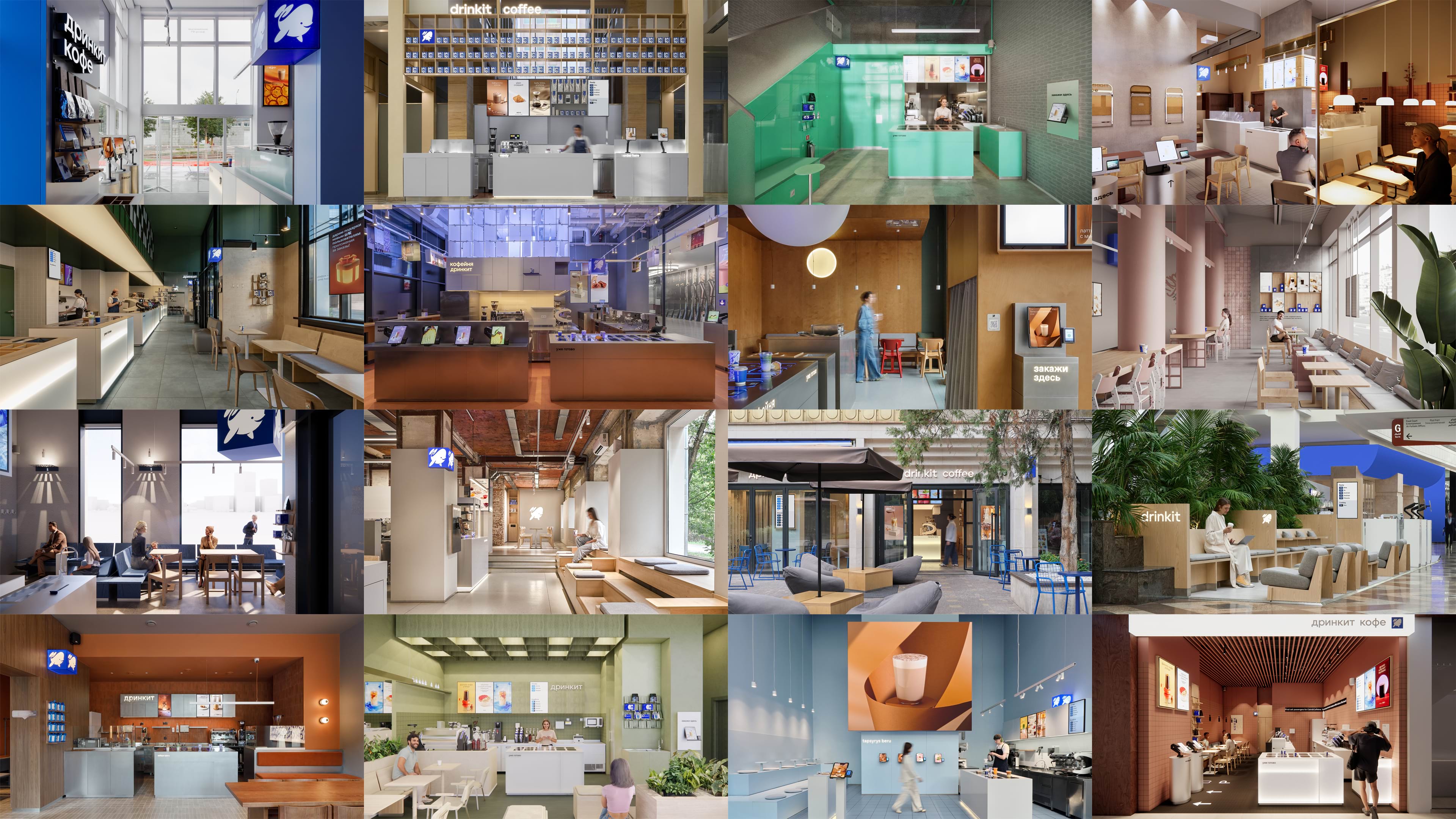
Of course, that “just” before the list is an ironic understatement. For all of this to come together, you need a serious, integrated approach — a design system. Below are a few principles I personally follow while building one at Drinkit. They’re aimed at franchise owners, entrepreneurs, design leads, and designers alike.
Standardize the essential, adapt what’s meaningful
Where reliability and consistency are critical — standardize. But everything that shapes how guests perceive your brand should be contextualized and made personal. You can unify documentation templates, communication tools, even some of the materials used in your interiors. Processes like furniture manufacturing can be standardized too. The key is to build these standards into a smart system — one that sets the boundaries and saves the designer time to explore new ideas and find deeper narratives.
That way, standards paradoxically help create unique spaces — ones that can’t be swapped with other locations in the chain or copied by competitors.
Design a methodology, not rules
Standardization helps save time — use it wisely. What your team needs isn’t a list of rigid rules, but a methodology. Building one is harder than writing a set of limitations or manuals — but it’s what turns interior design from craft into strategic thinking.
To make a system where every interior feels like a meaningful statement actually work, the team needs to understand the kind of effect it’s meant to create for the guest. Should the space feel like your best friend’s apartment? Or should every new location surprise, making guests think: “What did they come up with this time?” Define the brand’s message — and make sure everyone on the team truly understands it.
A methodology might include guidelines like creating contrast with the surroundings to trigger a dopamine spike — or ignoring trends and references to design spaces that feel timeless. One franchise has a guideline to review interior designs for clichés, so localization doesn’t turn into postcard stereotypes. This idea is brilliant — but their interiors still feel bland, and their localization tactics remain superficial. Which brings us to the most important point: the team.
Build a top-tier design team
If you hire average talent, you’ll get average interiors — and that’s a short-sighted move for any business. You shouldn’t be competing for talent with Luckin Coffee or regional studios. Your real competition is the best of the best: SOM, Foster + Partners, and the like.
Avoid decorators — look for people with true design thinking: a human-centered mindset that balances user needs, technological feasibility, and business viability. Design thinking was coined and clearly explained by Tim Brown in his Change by Design, so I’ll just say this — when you find a true design thinker, it’s okay to overlook some gaps in technical skills or less-than-relevant projects in their portfolio.
And once you’ve built the team — trust them. Don’t get in the way of people doing what they’re great at.
Be flexible
Successful businesses rely on proven solutions — and keep trying new things. Lean too far into standards, and your system calcifies and stops evolving. Allow total freedom, and you lose scalability and consistency.
That’s why, once you’ve defined the interior overstandardization threshold, don’t cling to it. Be ready to revisit it daily — based on feedback, economic shifts, or a bold new idea you truly believe in.
Conclusion
Interior design isn’t just a veneer. It’s part of the business model, a sales channel, and a driver of loyalty. When a chain underestimates design, it’s willingly giving up a competitive advantage.
Standardization is a powerful tool — but in the wrong hands, it turns brands into bland, characterless copies of each other. Rushing to unify for the sake of speed often masks strategic shortsightedness. A thoughtful, adaptable, human-centered interior is an investment in brand perception, team motivation, and revenue growth. It’s what guests remember after the coffee is gone.
Overstandardization is a curable condition. The remedy is conscious control over how far you take it — guided by data, common sense, and the willingness to introduce variety at the right time. Once treated, your brand’s interiors can become both scalable and loved.
This shift will change how franchisees, investors, and landlords see your brand: they’ll no longer want just a recognizable name — they’ll want an aesthetic asset that adds real value to the business.
For customers, chain interiors will no longer fade into the background. Each location will stop being just another coffee shop — and start being a reason to come back, tell others, and remember. This rebuilds trust in the chain format itself and raises the bar for the entire category.
The design community will start seeing chain brand design teams not as a compromise, but as a field for personal growth. Strong designers will join franchise teams — just like great directors once started creating masterpiece TV series after decades of neglecting the genre.