
How to prepare a hero block for the application
Let's take a look at how proper hero blocks for the menu in our application are created. This video gives a 20-minute in-depth tutorial with examples. The following is a written summary of the video.
How it works
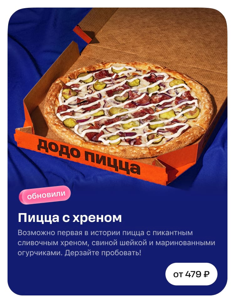
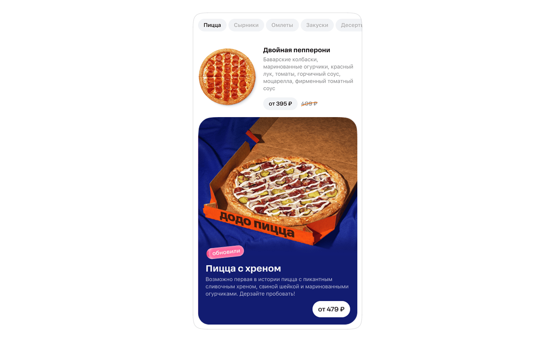
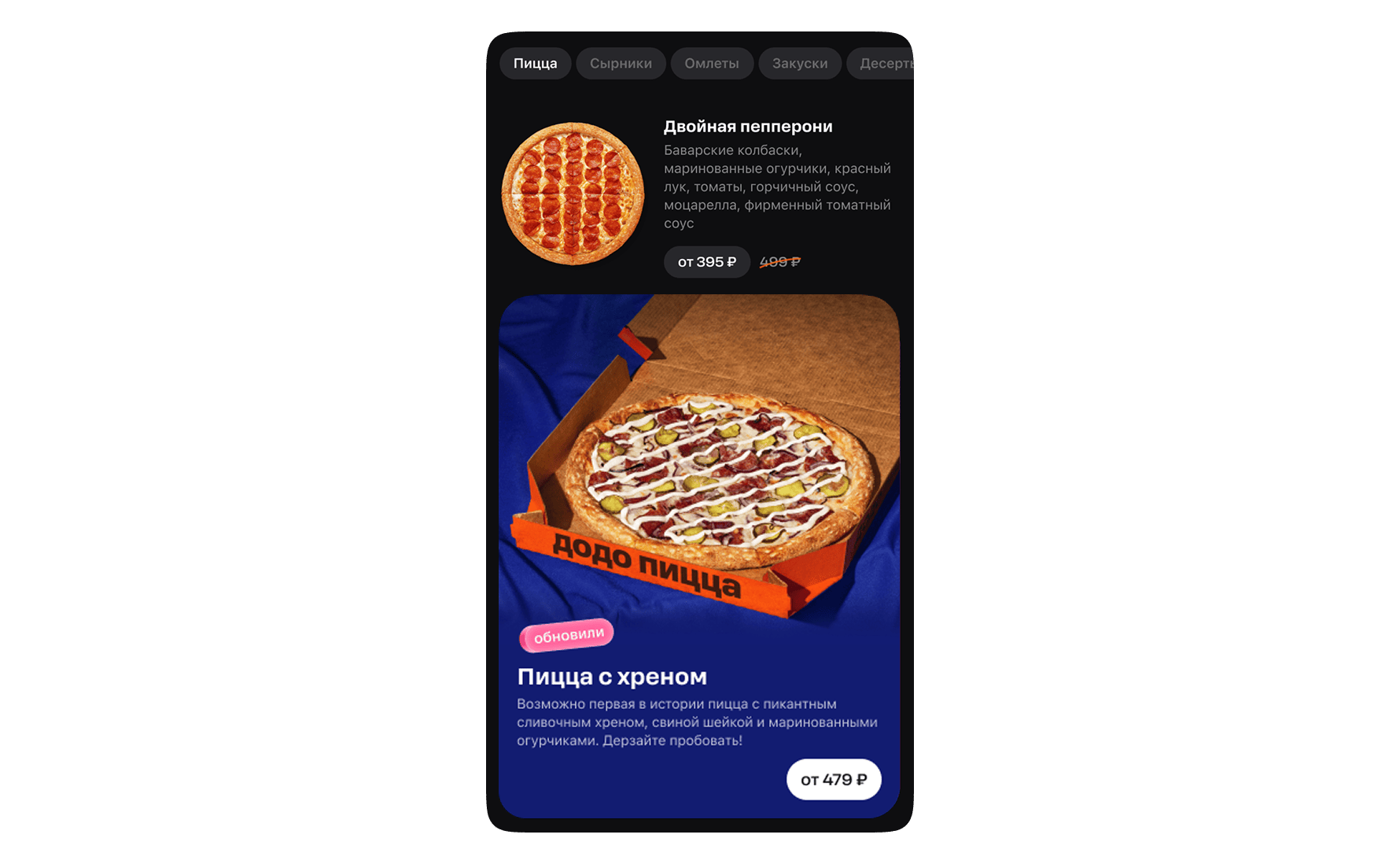
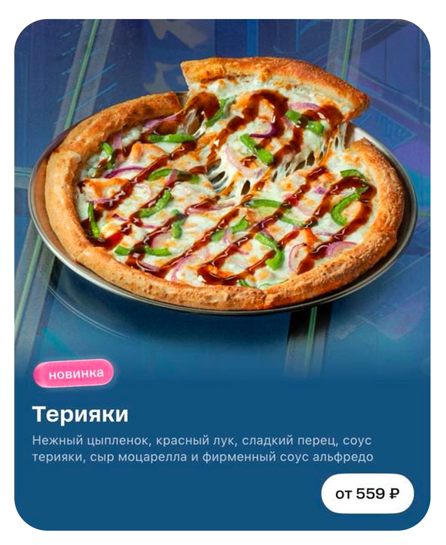
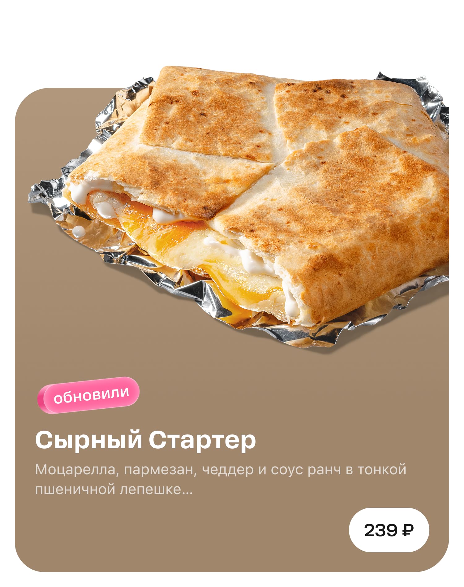
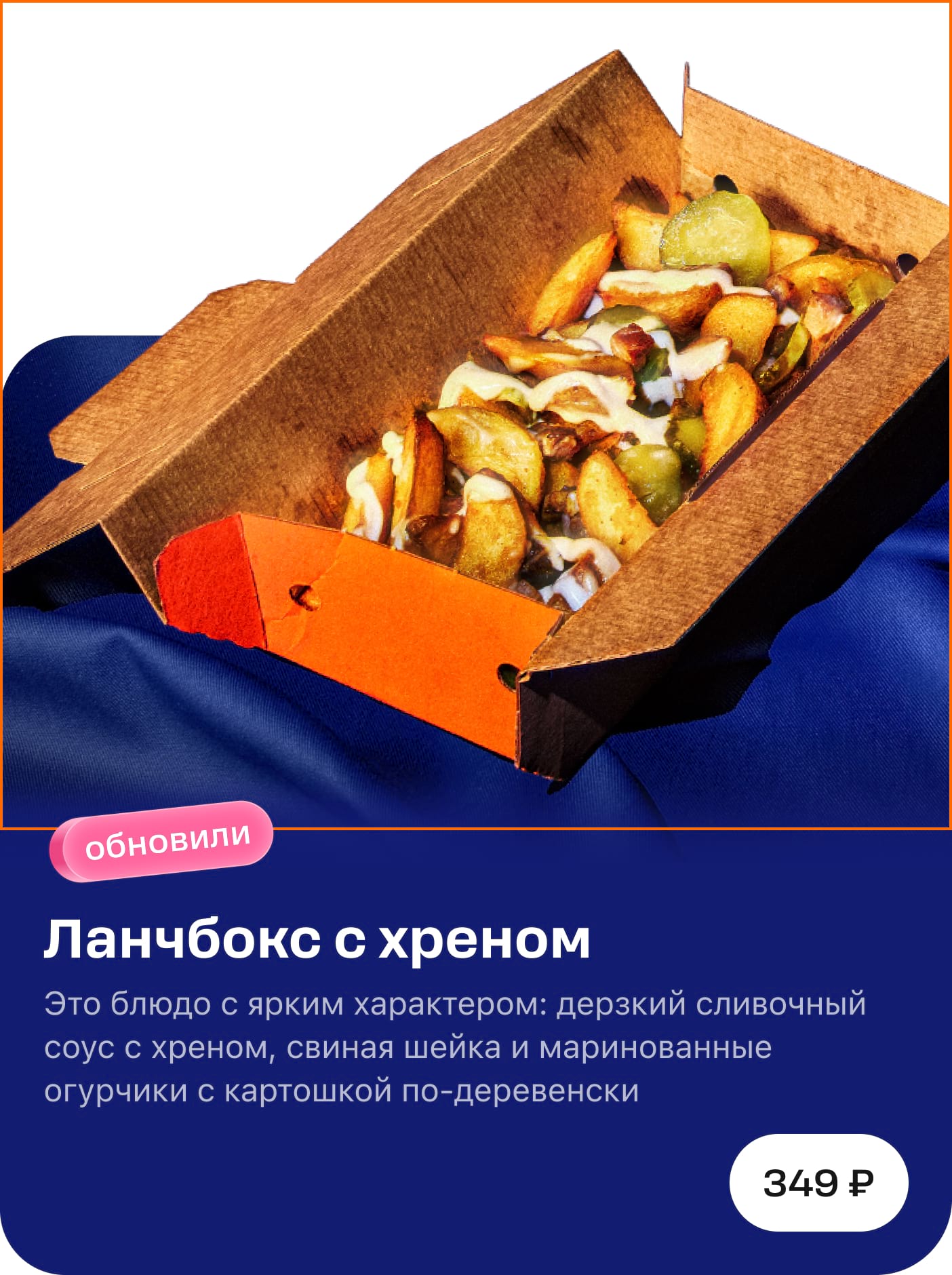
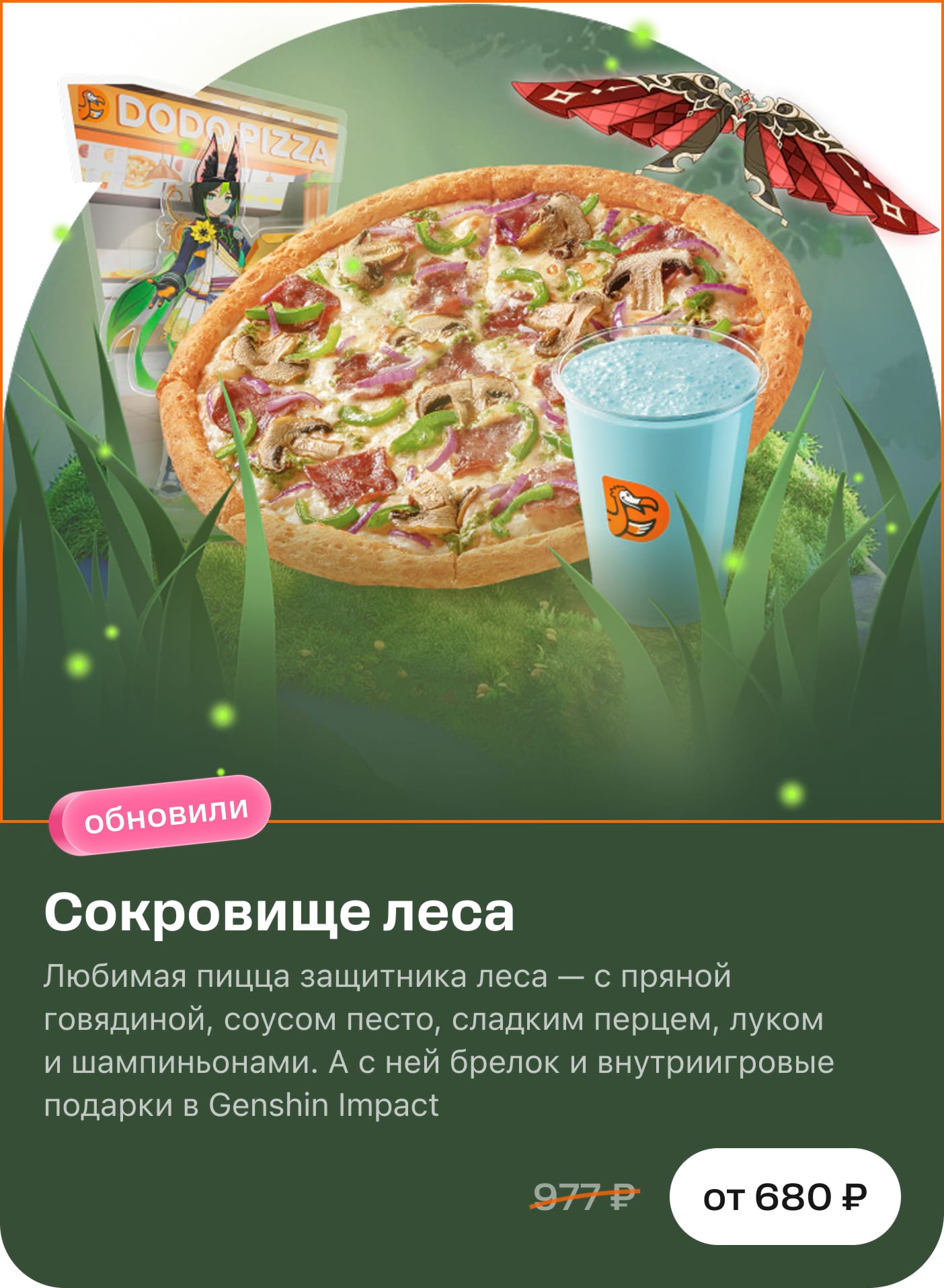
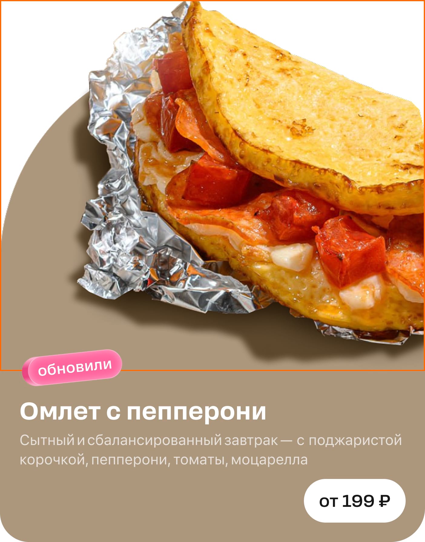
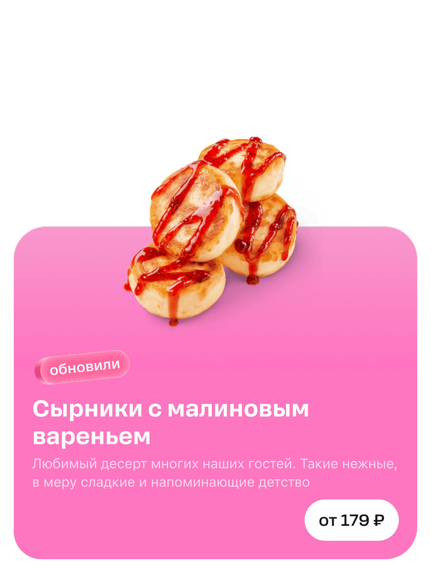
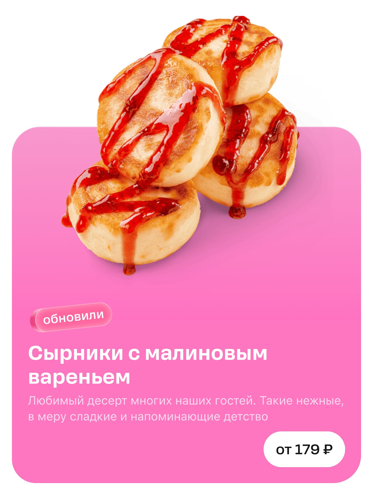
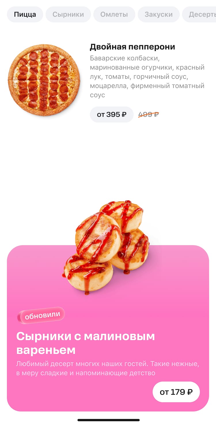
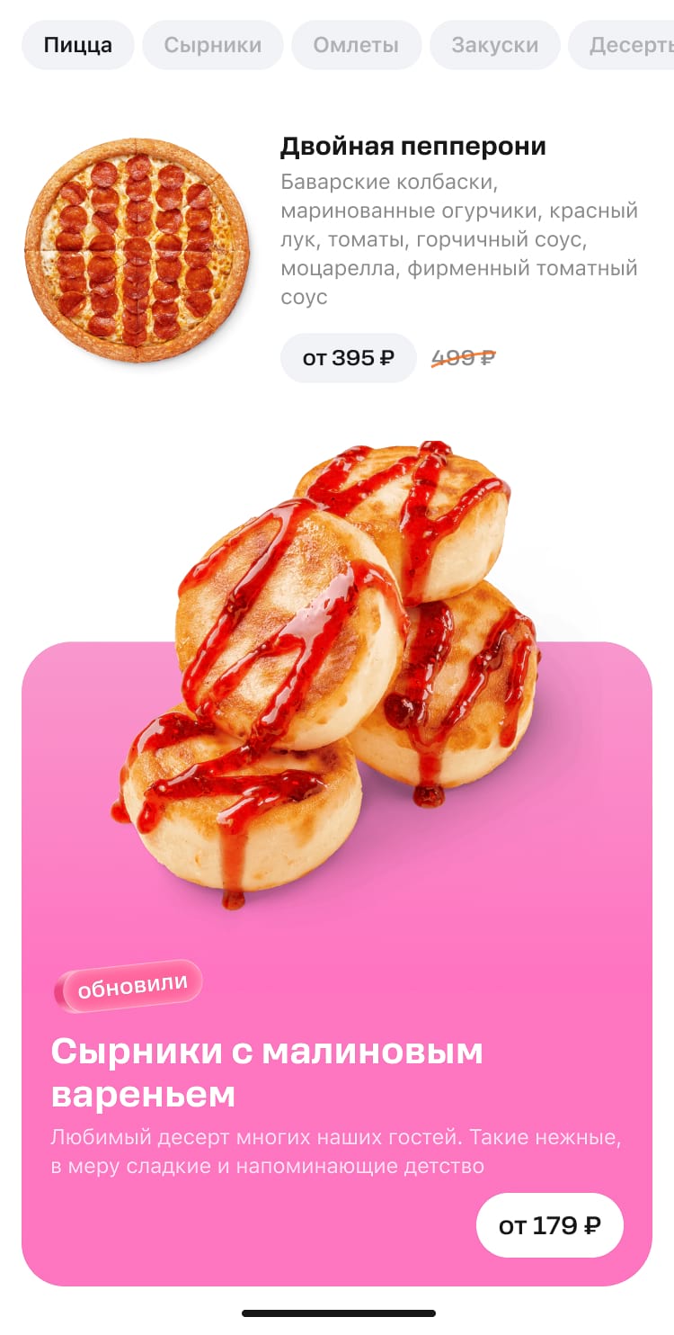
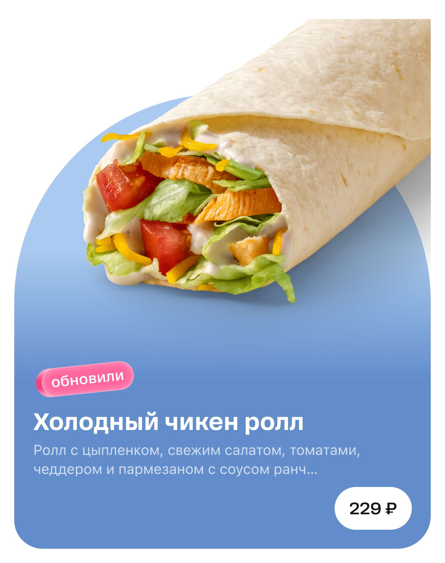
Hero blocks are items demonstrating a product on the application menu. Here's what they look like.
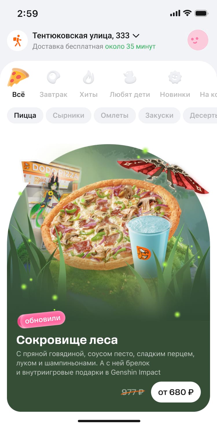
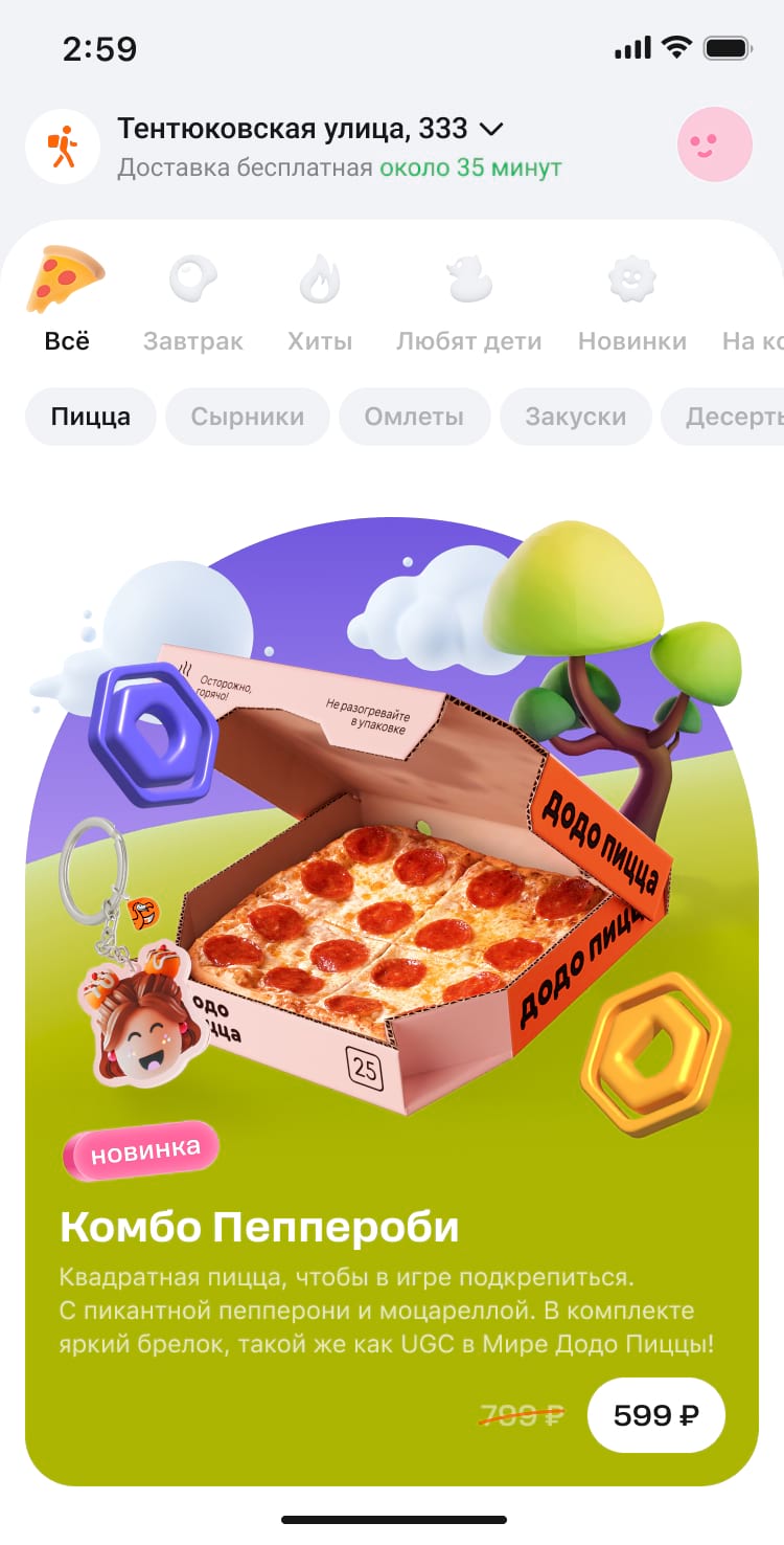
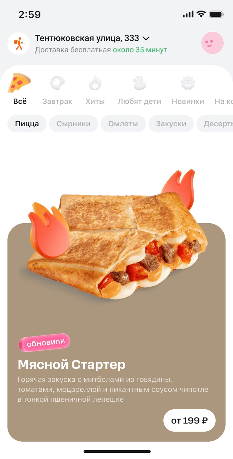

The hero block consists of two main parts: a product image and a text plate.
The lower part, where the text is displayed, is created automatically by the application itself.
The promo block looks identical on both light and dark themes, so you need to find a colour for the image that will look great in either theme.
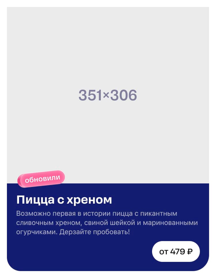
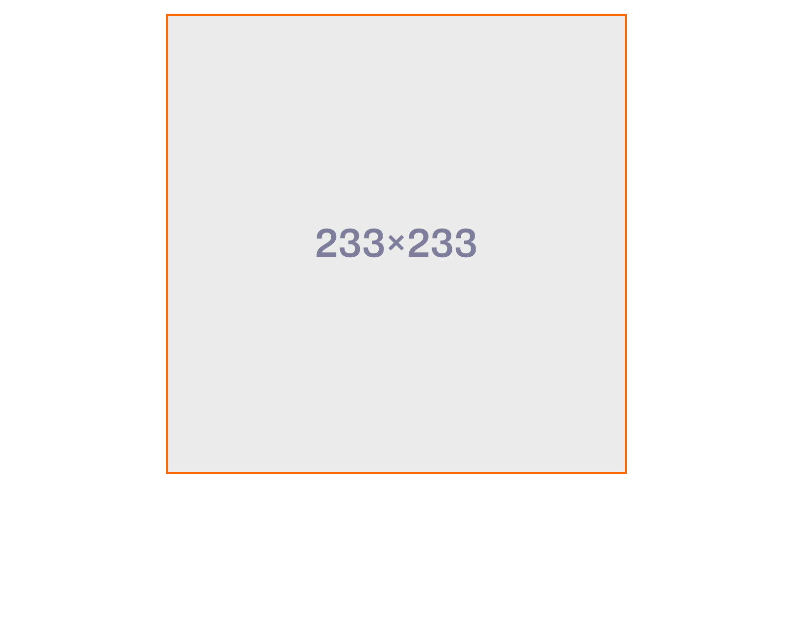
The dimensions of product images are unified: 351×306 pixels for the mobile app and 233×233 pixels for the desktop view. In the first version of the guide, we break down how they are created giving an example with the image for the mobile app.
Hero blocks can vary significantly in form and content so let's take a closer look at how to make them.
Background and colour
We prepare the background for the product image ourselves, while the background for the text plate is created automatically in the application. However, its presentation can be altered.
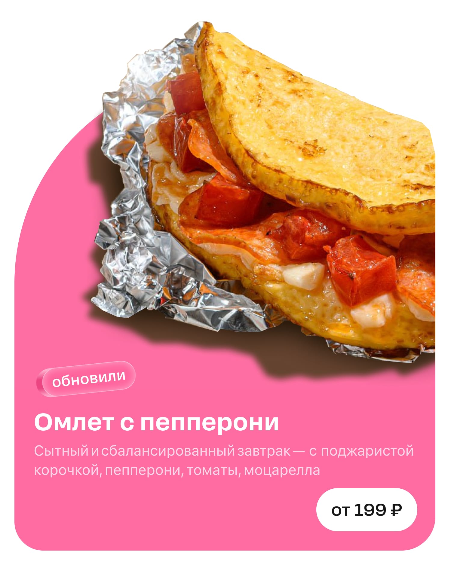
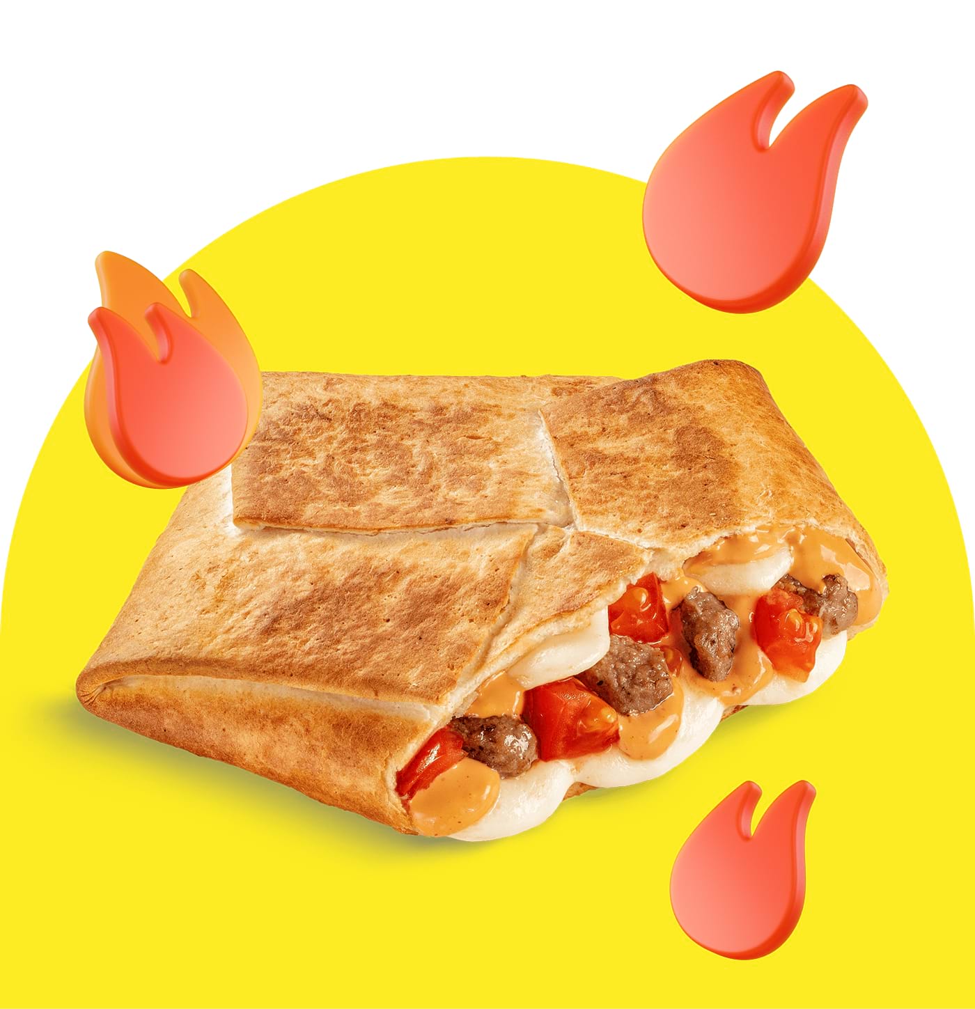
Background for the product. The product can be placed on a plain background or the one with texture. We stick to using photos most times.
If there is no photo, we create a uniform background. For regular hero blocks without any collaborations, we pick a colour based on the product category: grey for drinks, pink for desserts, brown for the remaining part.
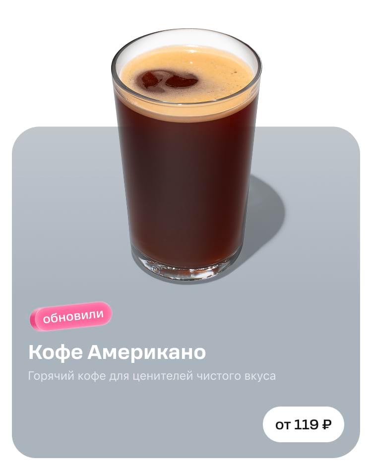
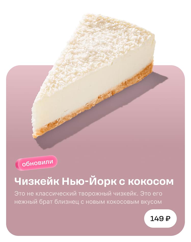
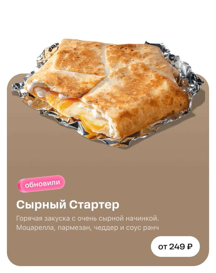
Background for text plates. This one is made automatically in the application based on the bottom pixel of the product image. Therefore, we leave a 2-pixel strip from the bottom edge of the image and fill it with a solid colour. This colour will be set as the background for the text plate.

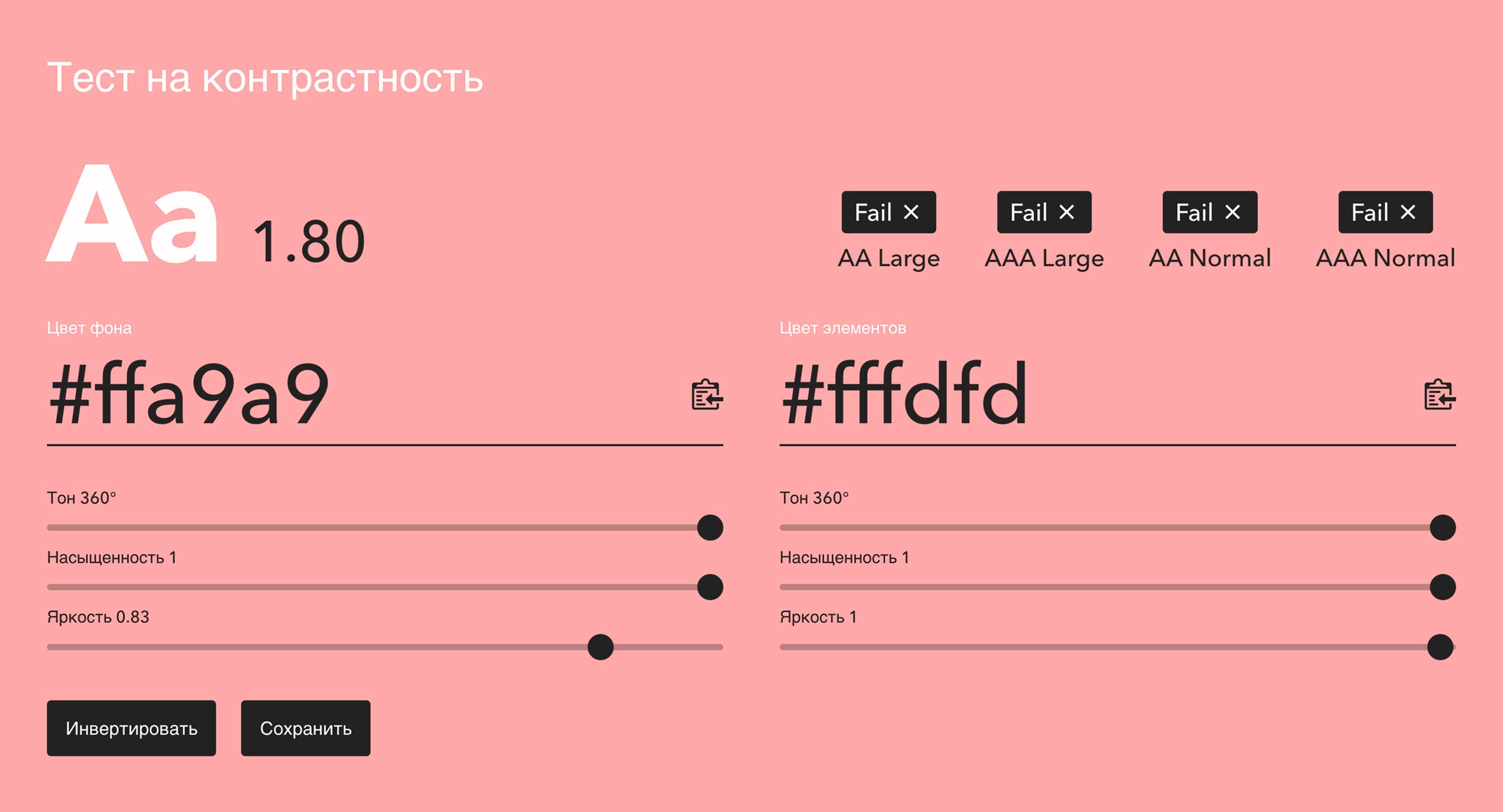
We don't use shades that are overly bright or too light. With dark and light themes, the text and buttons are always white, so we need a contrasting colour that won't blend in.
No
The text is hard to read, the background is too light

Yes
Contrasting background colour, everything is clear
We go to website get-color.ru to verify background contrast. The maximum colour brightness is 0.83 units.
We do not use tag colours for the background.
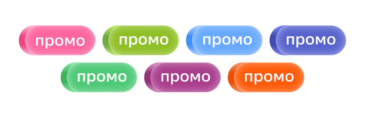
If we did so, they would blend in with the background, and the image would look unattractive.
No
Not really
Yes
Now it's great

Transition. You can skip this step if your hero block has a uniform background that does not contain any photos or textures. If there are ones though, make sure to create a gradient to connect the image with the product and the text with the plate through a smooth transition.
No
There is no transition, the texture in the image breaks off abruptly and looks sloppy.

Yes
There is a smooth transition through the gradient, and the image and text look cohesive.
To create a gradient, take the colour of the bottom pixel and stretch it upwards from the template by at least 30 pixels.
Make sure that the gradient matches the colour of the product image and is not too sharp. You can make the stretch larger if you need; 30 px is the minimum height. The key is that the gradient does not overlap the product itself.
No
Too sharp
Yes
Smooth, looks good
Upper block shape
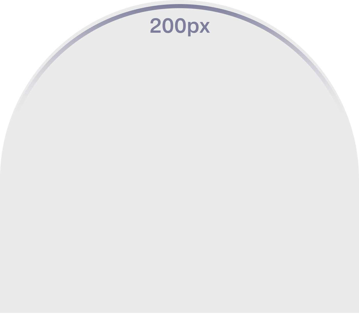
There are two types of upper blocks: rectangular arch and oval.
Rectangular
Oval
The height of the arches can be adjusted, while the product itself retains its proportions and position. The edges of the product may protrude the arch edges.
Rectangular arch. This is a block with 24 units of rounding on the sides. The height ranges from 180 to 306 pixels.


Oval arch. It is rounded on both sides by 200 units; the height ranges from 243 to 306 pixels.

Bleeds and crop
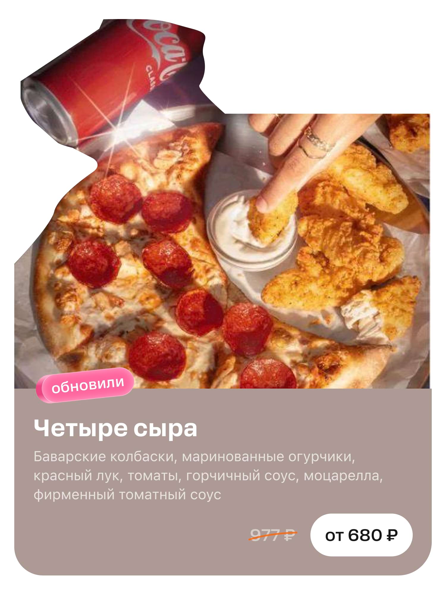
Bleeds. The product and other objects may extend beyond the arches. We even recommend making such bleeds since they make the design look catchier.
Keep an eye on the size of the product and don't make it too small.
No
Too much empty space above, the product looks too small
Yes
The product is positioned in the centre and is large, with no blank space above
And this is how it looks in the app interface.
No
A white hole in the feed looking as if something is broken
Yes
The interface looks beautiful and balanced.
We never crop photos with backgrounds.
Although the objects may cross the edges of the arch, they must always be placed within the boundaries of the block itself.
It may not be visible on the layout that the objects have exceeded the maximum height. But in the application interface the image will be cropped untidy.

Cropping is possible and even necessary so here are a few rules to make it look good.
Crop. Products can be displayed in full or zoomed in and cropped. With the latter, you need to pay attention to the cropping area and do not leave the product cut out ‘in the air’. The cropping area should coincide with the block boundaries.
No
The edge of the product is cut off on a white background, ‘in the air’, which looks unattractive.
Yes
The edge of the product extends into the arch, which looks nice and neat.
Logos, text, objects
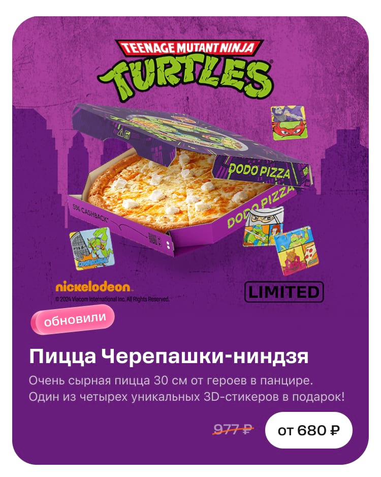
We do not place text on photos with products. The only exception is logos. They are a part of the collaboration. Additionally, logos do not need to be translated or adapted.
No
The text on the photo conflicts with the text on the template; it cannot be localised.
Yes
There is no text on the photo: the layout is not overloaded and is easy to localise.
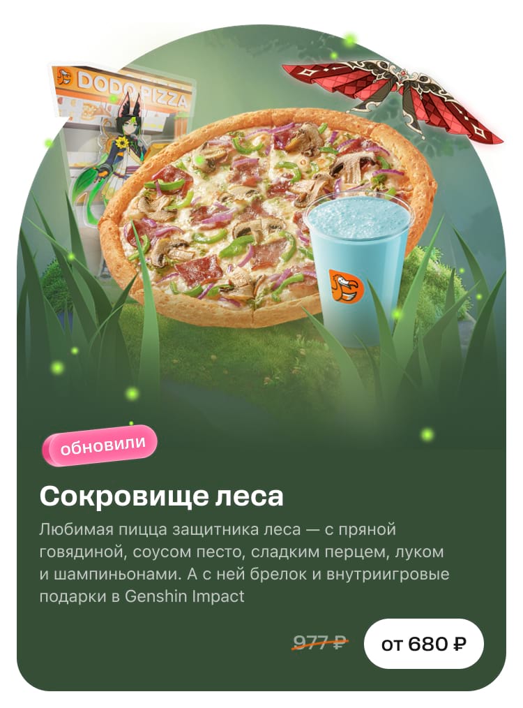
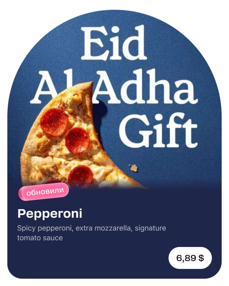
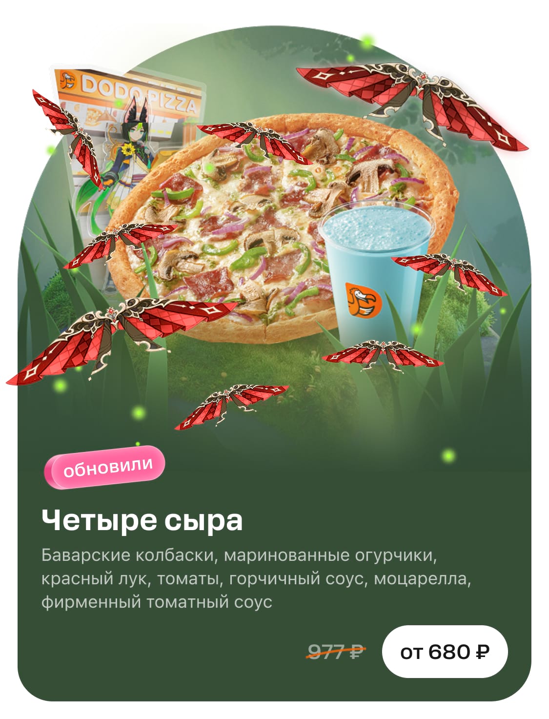
If we create a promotion for a collaboration, we place the partner's logo on the image. In addition to the product and logo, you can place 3 or 4 small objects that are attributed to the campaign.
No
Too many objects, the focus on the product is lost.
Yes
The product is clearly visible, there are collaboration attributes.
When everything is ready, go through the checklist below and upload the image.